I’m back from the comic shop this week and I got five new comics.
Check them all out here:
I’m back from the comic shop this week and I got five new comics.
Check them all out here:
I was moving some stuff around today and I found a street photo I made back in January 2010. Hard to believe that was over five years ago now. This was one of the first 10×15 inch street photos that I made and it’s done in my classic cut and paste different photos into one big photo style. No words to go along with the image but it does have a title. “Subject Unknown”.
I’ve always face a little problem with my street photos in that none of these people had asked to be my models. They have no idea these photos even exist. They were all taken in public places but I still feel protective of people who didn’t volunteer or get paid to be my muses. So I’m always trying to find ways to work around their identities. It also helps me be creative. Plenty of other photographers make photos all about the model and the model’s identity or the model’s pretend identity so nobody will miss out if I make mine about obscuring the model’s identity. That trail eventually lead me down the path I use now with many filter recipes that give me different looks and effects over my photos. But before I developed those I did a few photos with this mask technique.
The rest of this photo follows an anonymous model technique too but that’s by giving the viewer little glimpses of a persons face and not the whole face. We see a nose and lips, pieces of arms, the back of a shoulder, and a figure off in the distance. I also uses blurry out of focus figures. I’m big on blurriness as one of the words in my photography vocabulary. Sometimes things need to be out of focus. It adds to the visual variety of a photo. I’ve actually made photos where everything is in sharp focus and they don’t turn out well. They lack a certain depth that the eye can move into. So blurry is as important as sharp. But I couldn’t make the main figures blurry to obscure their identities. Blurry can’t be the main flavor of the dish.
So I came up with masks. I draw masks all the time. I draw odd faces all the time. It was natural that I reach the conclusion that I should draw masks on the main people in the photos. I even thought it was an easy solution in that good old way where I think things will take way less time then they eventually do.
At first I thought I could draw the masks digitally. I opened the photo in Photoshop and proceeded to use my Wacom pen to try and draw the mask over the person’s face. It didn’t turn out as I’d hoped it would. I thought maybe if I drew it at a larger size it would be better but that didn’t work either. I just plain don’t have enough time in drawing digitally to get a real feel for it. I find the whole process clumsy. Drawing on a piece of glass with a tool that won’t do exactly what I want it too is frustrating to me. I’m sure if it was my job and I was doing it all day every day I’d get the hang of it soon enough but that was never my job. So I decided, once again, it would be faster to draw on paper and scan in.
Now the first thing I had to do was draw all those faces. This is easy enough to do digitally since it wouldn’t be a finished drawing. I just trace over the faces and then print that out in blue line to draw over. Though the faces are only an inch or so tall in the final photo I drew them at four to six inches tall. Each was drawn on a different piece of paper and then I scanned them in to be colored on the computer. Coloring a drawing on the computer is something I do all the time and am very comfortable with. It’s totally different than drawing on the computer. It took some doing to get the masks to fit just right though. If I remember correctly I had to warp and bend them ever so slightly in Photoshop to get them to look the way I wanted. They had to be in the right place compared to the hairline and ears while bending slightly around the jaw. That took more fiddling than I thought it would.
The last thing I remember doing to the masks is knocking back their layer opacity to 90%. That means the color is not quite solid. Ten percent of the face behind it shows through. That’s really not enough to notice any features or such but it makes the masks slightly less stark. They sure do stand out against their photo backdrops but a little less so with the 90% opacity. I went back and forth with that trying to figure out exactly how much if any of the background face I wanted showing through the mask but eventually I settled on very little.
Overall I like how this photo came out. I like the boldness of the masks paired with the boldness of the figures walking towards us. Plus it makes some sort of statement about our faces and the masks we wear on them. “My mask is my true face” are the words that go with one of my old prints and they can be used here too. What is real the mask or the face underneath? I don’t have the answers just the questions.
Either way I only did two or three of these masked photos. They ended up taking a lot of time to do. One of the reasons I like working with photos is that it’s a faster way of working with images than drawing or painting. I can get more done in the same amount of time. If the photo is going to take the same amount of time then it has lost its advantage. But looking at this on makes me want to do more. Maybe I’ll figure out a way to speed things up. Sure I will.
I’m back from the comic shop this week and I got nine new comics.
Check them all out here:
Here I go again with another trip to Bryant Park in NYC. This time I’m taking a different way in. Instead of taking a train into Penn Station from Nanuet I’m taking a train into Grand Central Station from Tarrytown. That means a little more driving an a more expensive trip. First off Tarrytown is across the Hudson River from me. That means taking the Tapan Zee Bridge. Any bridge means a solid chance of a traffic jam but on a Saturday morning at 9AM I didn’t run into one of those. Right now they are building a new Tapan Zee Bridge next to the old one. There are lots of big cranes along the span and a bunch of pylons have been sunk with cross pieces on them. Most of it was fenced off for safety and I was driving so I didn’t really get more than a glimpse.

It took about half an hour to get to the Tarrytown train station as compared to twenty minutes for the Nanuet one. The cost of a train ticket is more from here too. I just spent $20.50 on an off peak round trip ticket as compared to $16.50 from Nanuet. Plus there is the six dollar bridge toll. And you have to watch the Yankees schedule because Tarrytown has a pay parking lot that’s free on nights and weekends except when there is a Yankee game going on in the Bronx. Then it’s an extra six dollars to park. That’s why even with the inconvenience of having to change trains on the Nanuet line I usually take that one. The train also run more often in Tarrytown.
I’m on the train now. The good thing about this line is that the trains run a lot more often. There are two or three an hour as compared to one an hour over on the Nanuet line. This train also ends up at Grand Central Station which is a great building. It’s wonderful to travel through as compared to Penn Station which is a confusing ugly nightmare. It’s like it wasn’t even designed with humans in mind. What kind of crazy person designs the doors that a thousand people have to go through all at the same time to be two people wide? Penn is nuts. I was looking at some photos I took in Grand Central in 2013 that made me want to take this train again. So I did.

It’s also a very pretty ride along the Hudson River. I haven’t taken this line in a couple of years so I haven’t seen this view in ages. I think I’ll stare out the window for a while. Look the Palisades!
Now I’m in Bryant park. I made it in time to catch the last twenty minutes of the Saturday morning dance class in the park. It goes from 9AM until 11AM. That was my plan. I haven’t had a chance to shoot any of the dancers since last year so I’m glad I got the chance today. Now I’m resting for a moment because the sun is hot today. It’s in the low 80s so it’s not super hot but it’s not cool out there in that sun. I had some back pain yesterday but I rested up and am feeling much better today. Still I’ve got some twinges so I might have to take it easy. I wanted to walk down to 14th Street but I’m a little unsure right now. I’ll see how it goes.
I’m back on the train. Only one break to write in the park today. I kept busy but took breaks so I wouldn’t wear down my back held up well. I felt some dull pain early on as I walked around with me camera bag on my shoulder but it went away quickly. My camera bag isn’t even a real camera bag. I’ve had plenty of those before buy I find for me a day bag works best. I don’t really have a lot of camera equipment to carry but I do have other stuff. I don’t always carry my iPad but I have on my last two trips so the bag has to fit that. Plus I got one with a place to carry my water bottle. I have to stay hydrated on these hot July days so I carry my water. Then I also need room for my food.
My camera doesn’t even fit in the bag very well. I just kinda push the camera to the bottom. It distends the bag but is surrounded by padding so it’ll be okay for short trips. The camera is in my hand all day so it doesn’t matter that much if it doesn’t fit in the bag well.
I stuck to Bryant park today. I didn’t make it out of the area at all. The park was crowded and full of things to shoot. The library steps at the back of the park was especially full of people. I made a few laps of the park but I think I was enjoying taking photos of all the people on the library steps best. There seemed to be a wide variety of people all full of life.
I saved a little time to shoot some pictures in Grand Central but it was less than I planned. On my final pass at the library steps as I was leaving there were two weddings being photographed there. Lots of dressed up people posing. I was taking a few shots of the first wedding. They seemed to be Japanese hipsters. Japanese Americans I guess because who else would be taking wedding picture in NYC except the locals? Hipsters is only guess too because that’s how the bride and groom seemed to be dressed. I think someone was dressed as Elvis too. Hipster Elvis though. Not Vegas Elvis.
After shooting a few photos I turned around and was startled to see a dozen pink bridesmaid dresses. That was a lot of pink. The hipsters were more my style but I took some pink dress photos too. Finally dragging myself away I walked the couple of avenues east and caught my train.
I’m back from the comic shop this week and I got seven new comics.
Check them all out here:
I am a bit tired this evening as I write this. Just normal life tired but also tired from doing a lot of coloring on my “Ghost of Fifth Street” comic project. I had mentioned before that I was having trouble starting the coloring because I didn’t have any idea what I wanted to do until I decided to keep it simple. That and it was a daunting forty two pages of coloring work.
I’m not a huge fan of coloring on the computer. Sure I do it all the time and once I start can get into it but I’d still rather paint and draw with real three dimensional tools. But often the computer is the most efficient and effective way to add color to something. Especially if that something is a digital project.
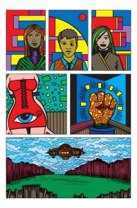
Normally it takes me a long time to color a piece on the computer. Always longer than I think it will. It’s mostly my art prints that I color on the computer and that could be why it takes so long. They’re not like coloring a sketch or a comic. An art print is a single image that’s got to stand on it’s own. That usually means that the color has to be just so. It has to say something in conjunction with the drawing and often the color is what holds the whole drawing together. It’s not uncommon for me to color a piece half a dozen different ways to get the one I want. And then I often do more drawing in the color. I build the color up as shapes and those shapes have to be drawn just right. I’ve had many prints that I wanted to color in a day take three or four days. It can really be a pain.
That’s why this forty two pages of coloring seemed really daunting. Was this really going to take me eighty days? That would be crazy. That’s when I finally figured out how to keep it simple. I just started adding flat color in Photoshop. No drawing with the color. That isn’t really needed either. My comic is not about the color like one of my prints is. I like it pretty well in black and white but wanted a color version too for some reason. Probably because more people will read it if it’s in color.
Keeping it simple means a lot of thinking though. It means I have to make the color work right here and right now and not leave anything to be decided in the future. Sure I can add technique over it later on if I want to but that’s not a necessity. I’ve got to find the right colors to define the drawing’s space right now. That was my task.
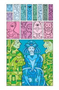
I fell back on the very old technique of doing the background first. That’s how paintings have been done since the beginning of painting. Work from the deep space forward. And lots and lots of neutrals. That was key. Neutral colors are earth tones. Browns and greys of every hue. They are what you have to set up so that all the bright colors can stand apart from them in the way you want. It’s essential to learn how to work with neutrals. They are also very safe and if you overdo it with them can make things boring. I’ve seen a lot of boring pictures where the artist was too timid with color.
I started with the skies. Somehow that was the key to me getting things done. I figured out what color the sky was going to be in each panel it appeared. Turns out I had a lot of skies in my drawings for this comic. I didn’t want them to all be the same color blue so I mixed it up. I had a few different shades of blue, some more blue/greens, oranges, and some occasional pinks. Clouded skies were done in shades of those colors. Once I had the skies all colored things didn’t seem so bad.
After the skies I moved on to the other background objects. That was where I did most of my work with the neutrals. Sometimes it was objects, buildings, and landscapes and sometimes it was design elements. I had a few pages that were full image splash pages made up of lots of figures and design elements. Not so much a real space but more like one of my art prints. I kept it simple and didn’t do any drawing with color on these pages so they went along fine like the rest.
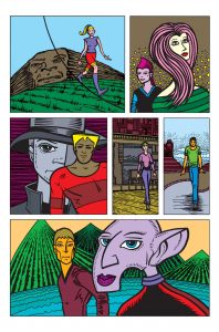
But what is the reason I’m tired you ask? Because I have been knocking out these pages like a crazy person. It seems that once I make my mind up to do something I have to put everything else aside and get it done. Every spare moment for the last three weeks has gone into getting this coloring done. At first I was getting a page a day done. It was taking about two hours a page. Then as the pages pilled up I could see that there was an end down the road. Some days I was able to get two pages done and on the weekends three pages a day. All my other art got pushed to the side as I did more and more coloring. It was a little frustrating because I couldn’t concentrate on anything else. I wasn’t even trying to get three pages a day done on the weekend but couldn’t get anything else done so I kept going back to it. I’d call it obsessive but I’m really not a very obsessive person. It was a little annoying though since I couldn’t switch from project to project as I often do but once I settled down and got more and more done I was okay with it.
I’m especially okay with it now since I only have two pages to go. It’s hard to believe I’ll be finished soon. Another stage down.
I’m back from the comic shop this week and I got six new comics and a trade paperback collection.
Check them all out here:
I’ve been a digital photographer for a long time now. I got my first digital camera back in the year 2000 and haven’t shot film since. I consider my second semester of college, back in 1985, to be when I first started shooting film so that means that I’ll soon be passing the point where I’ve been shooting digital longer than I shot film. Maybe I already have. It’s just a matter of months. But even though the vast majority of my photos never get made into prints these days I find there is tremendous satisfaction when I finish one up and make a final print out of it. I made a group of prints this week and they came out pretty cool.

These days I have a few different ways that I make finished photographs. The newest way is on my iPad. These are purely digital as of yet and I post them to my Instagram account. That means they’re in a square format and I use a bunch of iPad photo editing apps to make them. One type is mostly done in an app called Snapseed and these are my basic photos. I take one of my street photos, crop it, and then use various enhancements on it. Nothing too drastic and it falls into the realm of normal photography.
The second way I do things on my iPad is to add design elements and type. This is a variation of the style I call “Photocaps” (short for photos and captions) and involves using a few different apps. I use one called “Tangent” to add design elements of various shapes, patterns, and colors and one called “Over” to add type. Of course I could also use a cartoon app and a painting app to take the photo further into the realm of digital manipulation. Both of these iPad ways are for screen and I have yet to print any of them out.
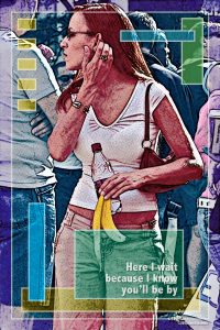
The photos of mine that I’ve printed out the most of in recent months are five by seven inch versions of my street photos. I have a little easel on my desk that I decided I wanted to put a street photo on it and then change the photo every couple of days. I had read that digital photographers should print out their work to see every day and motivate them and I thought that was a good idea. At this point I have a few dozen street photos finished and printed out that I can change whenever I want to. They’ve all got a little Photoshop work done to them but not so much that I’d call them digitally manipulated. Just regular darkroom stuff.
The photos that I printed out this week were my big ones. Ten by fifteen inches on eleven by seventeen inch paper. These ones were my digitally manipulated Photocaps. I’ve been working on a few of these over the last month or so. They’re different than my other photos not only in how they look at the end but in the fact that I know that I’m going to have to think up a sentence to go along with the photo. Not all photos lend themselves to that. I think it’s only a small percentage that do. That’s why I have to look through a lot of my photos until I see something that I think I can work with. Even if I don’t have the entire sentence right away I need a word or feeling that the photo evokes in me that I think I can work with.
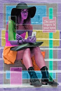
All my ten by fifteen inch Photocap photos are worked on in Photoshop. They all have lots of effects applied to them. I have what I like to call “Filter Recipes” that I run on the photos. That is that I don’t just apply a single filter to a photo but rather a series of filters in a certain order to create a certain look. It takes a while to perfect a filter recipe buy with macros I can record the steps and apply the recipe with the press of a button. Over the years I’ve developed four distinct recipes: one with color shapes, one with half-tone dots, one with brush strokes, and one with duo-tone colors. Each one also involves creating different geometric patterns on the photo. I use all sorts of rectangular shapes in all sorts of colors to create a design within the photo.
I’ve also learned to mix and match my filter recipes. The last two I did involved two of my recipes. I wanted some half-tone dots over the color shapes. These Photocaps also can involve a bit a preparation to get them ready to uses the filter recipes. Sometimes it’s a simple as adjusting the tones and contrast of the photo and sometimes it’s masking out or changing entire background elements. For one of my recent ones I deleted half a dozen people from the background of a photo. They were distracting and I wanted them out of there. This was one of the more involved bits of preparation I had to do but still it wasn’t too bad. The changes didn’t have to be perfect since running the filter recipe will obliterate a lot of the detail so the changes don’t have to be as flawless as they would if I was making a normal photo.
I haven’t been printing out these Photocaps that I’ve been making lately just because I haven’t wanted to use up my printer ink. No other reason but that. Ink is expensive and I hate buying it. But what is the point of having a printer if I don’t print on it? So after making a half dozen or so of these Photocaps of the last month I finally decided to print some them. After all I hadn’t even seen some of my never filter recipe mixtures printed out yet. I’d just seen what they look like on screen. So I printed one up. And then another and so on until I printed four of them. I liked the way they looked. And they made me happy. Sometimes you have to print your photos out. Especially the ones that were meant to be prints.
I’m back from the comic shop this week and I got six new comics.
Check them all out here:
Between jury duty and poison ivy it’s been a really tough week to get things done. Too many distractions. I didn’t have to actually go in and serve on a jury but I had to call every night and see if I was needed for the next day. Monday and Tuesday no one was called in and on Wednesday they only wanted numbers 1-60. I was number 72 and therefore didn’t have to go in. All in all it was only a minor distraction compared to the poison ivy.
This is the same poison ivy I mentioned in my Bryant Park blog and it was mostly on my lower leg. By the time I went to Bryant Park I had already had the poison ivy for a week and I was expecting it to go away soon enough. But soon enough turned out not to be soon enough. The poison ivy turned out to be at its worst on the Monday and Tuesday after my Bryant Park Sunday. It was crazy itchy. I was using all sorts of anti-itch cream which calmed it down for the most part but there were times it felt like little insects on fire were crawling on my legs. At one point on Tuesday I went to the store to get more anti-itch cream and on the drive home I had to grit my teeth because the irritation was so bad. Going out and walking seemed to really irritate it the most. By Wednesday it had calmed down and by Thursday it didn’t itch at all. The skin is still healing though. The whole time I had the poison ivy I managed never to scratch it. Scratching makes it worse so at least I didn’t do that.
Trying to get any art done that week was a tough chore. I did do some things though. The first thing I was glad to get started was the coloring on my “Organics: The Ghost of Fifth Street” story. I was having trouble figuring out how I wanted to color it and the sheer number of pages I needed to do was daunting. It really had me stuck. The I applied the “Keep it simple stupid” approach and got things going. I abandoned the idea that it had to be in some sort of style and decided to do it as basic cut color. Style really doesn’t matter as much as getting the basics right. I can always add style later if I lay the groundwork now.
I went back to Coloring 101. I opened the first page in Photoshop, set up the document properly, and then started coloring the backgrounds of each panel. That is generally how you figure out the color in any work of art. First the background and then the foreground. First you have to establish the color of the world around a person and then the color of the person. And be sure to have a good palette of neutral colors. Those are the key to getting things right. You need browns both warm and cool plus some various greys for the brighter foreground colors to play off of. I find things go much smoother and faster if I figure out my background and neutrals first. And they did. I managed to get a page or so done a day in my off moments. Since I was keeping it simple it helped relax me.
The other two things I managed to get done that week were two ink pieces. One came out okay and the other was a failure. They both came from a box I have that holds some of my current work that has yet to be completed. When I can’t think of anything I want to do I open the box and see what’s there. I picked a piece that need to be inked with a lot of straight edge work. Often I find that can be dull and I don’t want to do it but sometimes I like to do it because it’s all I con concentrate on. I found a drawing called “Judge Too Much” that needed some inking.
Using a straight/curved edge and a pen can be tedious because it has to be done carefully and there is not a lot of room for variation. It’s all drawn with the same line. I moved pretty quickly on it and as I was getting it done I wasn’t too fond of the way it was coming out. It was looking a bit bare. I don’t think I ever really finished the drawing on this one and maybe was going to draw a bit more on it rather than go to inks. Either way I decide to add a whole lot of black shapes to the drawing as I now inked it. That took a bit more time. I had to figure out which shapes would be blackened and which would stay white. I liked it in the end but it was touch and go for a while.
The second piece was called “Beat Holder” and was another drawing that needed to be inked with a pen and an edge but I didn’t feel like doing that again. Instead I decided to try a bit of an experiment. I would use my broken brush dry brush/wet brush technique. That’s where I use one of my old brushes that no longer comes to a point and use it to dab on ink in a flurry of little marks. I’m never making a line or just one mark but multiple ink marks. I like this technique but it works best on large images. This piece had lots of small shapes in it so I wasn’t sure how well it would come out. Turns out not so well.
I tried my best but I could get the big bends of space like I could in a larger image. I couldn’t get a shape to bend into darkness because there was not enough space. The shapes kinda look pasted on in a shallow space. That was not what I was looking for. Turns out I didn’t like the drawing very much either. I think I picked it because I was going to abandon it anyway. It’s listless and awkward. Working on it in ink brought that out more than it changed it. After a while I stopped trying to fix it because it was impossible to fix. Sometimes art is like that. You have to know when to abandon certain pieces because they’re fundamentally flawed. But at least I got passed the distractions and got something done.