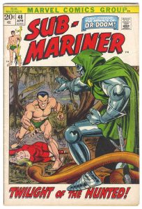
I’m back from the comic shop this week and I got eight new comics.
Check them all out here:
I’m back from the comic shop this week and I got eight new comics.
Check them all out here:
This week I decided that I wanted to turn as much of my art into prints as possible. It’s going to take months and months to do but I want some ready to go in case I need them. Some things are easy to turn into prints and I have plenty of things that are already prints. But still they all need to be set up properly at the same size.
Though I want to print them all out as 8.5×11 inches a lot of my stuff is at 11×17 inches. So my first step is, rather than shrink them down, I want to set them up at the larger size and then shrink them down. That way they’ll be set up at 11×17 inches just in case I ever need them to be.
Photoshop Actions make the process go a lot faster so it’s good to learn how to use them. They are also called macros and actions record what you are doing and then you can play back those steps on a new digital file.
One of the things I am making prints of are my “Covers to comic books that don’t exist” series. Specifically I’m starting with my “Dreams of Things” cover series in which I have finished 230 covers. That’s a lot of art to set up.
The way I make the “Dreams of Things” covers is to print out the logos and trade dress on a piece of Bristol board and then draw the cover with black India ink and color it with markers. I like the logos to be printed on the board with the art because I think that makes the original look cool. But that doesn’t make a print look cool.
When I scan in a finished “Dreams of Things” cover and then print it out the logo looks a little grey and fuzzy. The original looks fine but the print not so much. So my solution to this, that I figured out many years ago, is to replace the logo with a new clean digital version pasted right over the printed out and scanned in one. The logo replacement method works well but I only did that to a handful of covers back in the day. I have most of the 230 covers to do if I want them as prints.
The steps went like this. I have the logos set up in a template but I had to make the template a higher DPI. It was set up at 300 DPI for printing but the scans of the art are at 600 DPI. Rather than lower the DPI on the art I raised up the DPI on the logos. It’s always better to have more DPI than you need then to have less.
After the DPI was set I picked either the horizontal or vertical logo and copied it. Then I chose the document with the cover in it and pasted the logo in. I had to move it right over the fuzzy logo that was already there. It takes some fine tuning to get the new logo in the right place and cover the old logo perfectly.
I also ended up using a patch of white underneath the “Radiant Comics” logo. The part that has the rays of the sun. The points of those little triangles that make up the rays were fuzzy and weren’t getting covered up by the new logo very well. They’re really small and I didn’t know if anyone but me would ever notice but it was easy enough to cover them with a white patch and make myself feel better.
After the patch was in I had to set up an adjustment layer for the art itself. I wanted to adjust the “Curves” on the art. Since the file was a scan of a pice of paper I could see the color of the paper which was an off white. I wanted it to be white. So I turned the bottom 10% of color into pure white. I also wanted the black ink to be a little darker. It scanned in grayish. So I went into just the black channel and darkened that making the blacks 100% black.
The final step was to type the issue number and month over again since the scanned ones were especially fuzzy.
All of this took about ten minutes a cover. Not the longest time in the world but I had a lot of covers to do. So I decided to sit down and make an action to do as much of that as I could. It took about half an hour to get the action right but in the end it cut my time down to about three minutes a cover. That’s much better. Actions are so good at cutting down the time of repetitive tasks.
I still have a lot of other things I want to set up as prints. I set up one of my “Big Ink” drawings so far but I have a lot of them to go. Plus I’m not even sure if the scans for those are all ready. I had to scan those in four different pieces and I’m not sure if I assembled all those pieces into one file per drawing. I know I put some of them together but I think I have quite a few still to be assembled.
I also want to see if I can make prints out of my paintings. They are too big to scan in but in the past I’ve photographed them to make prints out of but it’s been a long time since I did anything like that. I think I took photos of my paintings as I finished them but it’s been a while and I can’t quite remember if I did. We’ll see.
I also have about one hundred 11×17 prints to make 8.5×11 prints out of. Those are mostly good to go but I still have to set them up in this format. I have a lot of work in front of me.
I’m back from the comic shop this week and I got seven new comics and a couple of back issues.
Check them all out here:
In my younger days I often read the phrase, “He was a good artist but not good at business.” That made me think that I should make sure I was “Good at business.” It sounded like a good thing to be good at. It took me years to figure out that was a nonsense phrase.
Do you know who is “Good at business”? Business people are. Y’see business is a job. People do it full time. That’s all they do. They look for ways to buy and sell stuff and make money. They are not interested in some random artist unless they see a way to make money off that random artist. And even that is rare.
Business people do business full time. They can even be passionate about it. They might even have the advantage of having access to money. That’s a huge boost in business. There is no way that an artist, or anyone else, can compete in business with a person who does it as their job.
It took me a long time to learn that lesson. Being, “good at business” to me now means not bothering with opportunities in which the business person isn’t looking out for me. It means turning things down that offer me nothing but promises. There are a lot of offers to work for “Exposure” in the world of creatives. That’s business people looking for free work to make money off of. It’s a long shot that the creative will ever make any money.
I bring this up because of what I was doing yesterday. I was making some new “Business cards.” I put those words in quotes because although I made my first business cards in the early 1990s and have generally had some ever since I don’t think I’ve ever got any business through them. For me they are more social than business.
I was at the MoCCA Festival in March and the night before I realized I didn’t have any cards for what I wanted. All of the cards I have made up are for this very site. My webcomic and blog site. In recent years I’ve been sending people to my jaredosborn.com site because that has my social media and PDF link but I had no cards for that.
The lack of cards lead me to get the idea of putting a QR code to jaredosborn.com on my phones lock screen. That did the trick as anyone who wanted to exchange contact information could just scan my phone with their phone and go to my site.
That worked out pretty well and is also an example of what I mean by my use of business cards is more social than business. Over the years I have mostly used them to exchange contact information with other artists and creative people. I can’t think of any example of when business cards got me any business but I do find creative people to follow on social media with them.
That brings me to my new painted coats. At the beginning of last winter I painted on my new winter long coat, a duster, and then just last week I finished painting on a new spring short coat, a blazer. I wear them on my commute into NYC and on my walk from Penn Station down to 14th Street.
If you are going to wear coats with eye catching paintings on them then you had better be prepared for people to stop you in the street to compliment and talk about them. That’s okay with me because I expect it and don’t mind. It’s a nice change of pace from my normal commute where the social rule is that you’re not allowed to talk to any strangers.
So during my commute I got it in my head that I should have some cards to hand out to the people who compliment my coat. If they want to see more of my work then they can. I still have some cards with my blog/webcomic site (yeah, this one) but I wanted to have one with my list site on it. That one links to this one anyway. I guess jaredosborn.com is my master site these days.
For weeks I’ve been meaning to make those new cards but then I started on painting the short coat which took me a week, caught a cold which put me out of commission for two weeks, and then took another week to finish up the coat. The new cards were on the back burner for a while. Until this weekend.
I make the cards myself. They are the size of playing cards rather than business cards. That’s probably bad business but, as I wrote, I don’t get much business with them and I like that size. It’s a familiar size to people too.
I have some double sided inkjet paper so that I can have a back and front to the card. On the front I have a piece of my art and on the back I have the QR code, a design, and my name. All the backs are the same but the fronts each have a different piece of my art on them.
I have the digital files set up (nine cards to a 8.5×11 inch page) so that I can print all the backs, flip the paper over, and then print all the fronts. They line up fairly close to perfect. They’re no more than a sixteenth of an inch off from back to front. I can work with that. After printing them I laminate the cards and then cut them out by hand with an X-Acto knife and straight edge.
The cutting is the most time consuming part. I’ve tried doing it with a paper cutter but that way is not exact enough. Plus the lamination gives paper cutters trouble. It’s more exact to do it but hand with the razor but I have to really pay attention. Plus since the cards can be up to a sixteenth of an inch off I had to trim that small a slice off of about third of them. So sometimes instead of four cuts per card I have to make five. Even six on occasion. That adds up to more time and effort.
The final step is to use a corner rounder on them. Over the years I’ve had many different corner rounders but a few years ago I bought this big industrial looking one. It works better than all the small hand pressed ones I’ve had. It’s so effortless to use I wish I had more corners to round.
I went through the digital files of my work and set up twenty seven new pieces as cards. I also used nine cards I already had used in my old radiantcomics.com cards for a total of thirty six new cards. I printed them out, laminated them, cut them out, and rounded the corners. Then I decided I needed two of each and did that all over again.
Now I’m ready to wear my new short coat. I’ll keep some cards in the breast pocket and if anyone compliments my coat I can offer them one. It may not be business but it’s social.
I’m back from the comic shop this week and I got eleven new comics.
Check them all out here:
I’m finally over a cold that was with me for about two weeks. From around the 20th of March to about the first of April I got no art made in those two weeks. I didn’t have the energy. Now I’ve got to get back to doing stuff and that’s not as easy as just feeling better. I have to build up momentum again.
Being self motivated to get art done is no easy task. In this world where we have no choice but to have a job and work for our money making art with no profit in it is not seen as a worthwhile way to spend your time. In order to be self motivated and overcome that takes a lot of effort and a bit of ego.
What this piece of writing is about is figuring out what I have to do to get back on track. I’ve already gotten a couple of things done, I inked a “Dreams of Things” cover and marker colored another one, but I still don’t feel back on track. I’m still a little bit lost in the tall grass.
I think that’s also because the cold hit just as I was a few days away from finishing painting a coat. I painted a new long winter coat back in November but then I decided to paint a new short coat for the Spring. A denim blazer. Painting coats takes a lot of work and is not a thing that I do normally so they interrupt the stuff I usually get done. I spent a solid week working on the coat right before the cold hit so it has really been about three weeks since I got any of my usual art done. That’s a long time.
So what is the stuff I want to get done? First off I have to finish that coat. I’ve worked on it another two days since my cold ended and I have at least one more day on it. All the hard stuff is done but I still have a few more decorative elements I want to put on it.
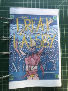
I think the biggest thing I want to get done is to finish my “Great Gatsby” illustrated book. I’ve been working on that for over two years and I think I’m close to finishing it. Right now I’m not 100% sure what I still need to get done on it. I have to look the whole thing over and see what details need to be taken care of. I know there is one illustration that I want to tweak part of and get it to my likings but the other illustrations are finished.
I also gave myself more work to do with the book since after I printed out the small first proof of it I decided that there should be a small black and white paperback version of it too. That means the whole thing has to be set up at the smaller size and the illustrations have to be changed to black and white. I think I’m going to have to dig up the inked versions of everything before they were all colored. I’m not exactly sure how I want the black and white version to look so that all has to be figured out. I think I can get that finished over the summer.
I had just started and gotten done a couple of prints in a new series that I started. “Last Night I Dreamt I Had a True Love” is the name of the series and I had it under way. I made two finished prints, a third under way, plus that was the one I was messing around making AI prints with too. I was just figuring out the direction I wanted it to go in but now I haven’t thought about it in weeks.
Of course I have to get my “Dreams of Things” drawings going again but I may be burning out on them anyway. I’ve gotten over 225 of them done in the series and I wonder how much longer I can work on it. That’s kind of why I started the “Last Night” series of prints but they really are a different thing. With “Dreams” I can do physical coloring with markers rather than computer coloring and I like that.
As I mentioned earlier I already got some “Dreams” pieces done but I wasn’t feeling them as I was working on them. Of course that could have been the cold lingering and I’ll feel better about doing them next week but I’ll have to see.
I started making some new “Message Tee” drawings for next year. Originally the idea for my Saturday comic was to make fifty two drawings of people in t-shirts and recycle them year after year with new messages on the shirts but over the years I’ve made a bunch of 52 sets of people. I haven’t drawn any new sets in a few years so this year I got it in my head to make some new drawings.
It started when I bought a new 9×11 inch sketchbook. I buy more sketchbooks than I can possible use and I like to try out different brands and sizes. After I got this one I thought that it would be a good one to draw Message Tee figures in. The last time I drew such figures they were in a smaller sketchbook so I thought it would be fun to use this bigger one. I got about twelve pencil drawings done in it before the cold hit so I have a lot more to go.
Of course the last thing I have to get going again is doing some writing. Though I have these blog pieces done weeks ahead of time and didn’t miss any weeks of posting I haven’t gotten any new ones written for the last two weeks. There was nothing I wanted to write about when I had that cold. So here I am getting started again. It feels pretty good.
I’m back from the comic shop this week and I got five new comics.
Check them all out here:
Back in the 1990s, when I was a younger man, I had a couple of coats that I wore that I had made paintings on. A long duster and a short denim jacket. Then time went by, the coats wore out, and for the last fifteen years or so I only wore plain coats. That was until last fall when I bought a new duster and painted it.
I’ve enjoyed wearing that painted duster this winter. I wear it mostly when I commute and it keeps me warm as I walk down to 14th Street on cold Manhattan mornings. I’ve enjoyed it so much that it inspired me to paint a new Spring coat too.
I still have my two old denim painted coats in a closet. At first I thought about pulling one of them out and repainting the coat. I would add new stuff to it. But I’m not as fond of denim jackets as I used to be so I decided to poke around online and see what else is out there. That’s how I ended up finding out that there is such a thing as a denim blazer.
I like suit coats, blazers, and sport coats. They have been what I’ve been wearing for the last 20 years. But they are very hard to paint on. About 15-20 years ago ( I painted more on it every year for a while) I painted on a zootsuit that I would wear to the Halloween parade in NYC. That suit fabric was not easy to paint on. I didn’t want to go through that again. That’s why I was happy to see a denim blazer. Denim is easier to paint on than whatever sport coats are usually made out of.
I ordered the coat and as I was waiting for it to arrive decided to work on a drawing for it. I had the photos of the coat, front and back, to use to set the proportions of the drawing. I went through my archive of scans of my thousands of drawings from over the years and used various drawings to make a composition for my jacket painting. That archive makes my life a lot easier when I’m working on something like this.
Then the coat came and guess what? The proportions of my drawing were off. The proportions of the actual coat were wider than the photo of it that I was using. So I went back to my archive, picked more images to work with, and redrew the composition. I went from four main figures/faces in the drawing to eight. It was a big change but I think I made it look even better. I had also done a digital color sketch for the painting so that had to be reworked too.
I already had a lot of fabric paint left over from the coat I painted at the beginning of the winter but I quickly noticed that I was running out of opaque white. I use that white as a ground so it goes quickly. The denim of the coat is black so anywhere that I’m going to paint has to have an opaque white coat of paint applied first. This meant the whole back of the coat as well as some smaller parts on the front. I quickly ordered some more opaque white.
The coat took a long time to paint. Day One: I worked on the drawing and color sketch. Day Two: I reworked the drawing and color sketch and primed the back of the coat with white. Day Three: I transferred the drawing to the back of the coat and painted the drawing in black line. Day Four: I painted on the base color of the painting. Days Five through Seven: I worked on finished the painting on the back of the coat. Day Eight: I painted small stuff on the front of the coat. Each of these days was at least eight hours of work. A couple of them were ten hours because I want to keep going and get it done. It’s a lot of work to paint on fabric that isn’t stretched and taut.
I still have some more to go on this coat. There are just a couple of simple things I want to do on the front of it that I haven’t gotten done yet. Just a couple of blue stripes and maybe a small face on the top front pocket. I already painted art wasps on the two bottom pockets.
I also want to paint a couple of figures on the sleeves but that might take some doing. I have the drawings picked out but I have yet to do color sketches for them. Plus I have to figure out exactly where they are going on the sleeves. I’ve done such sleeve painting on my old denim jackets and they are in the tradition of pin-up tattoos on a sailor’s arm. I’ll get to that eventually but I might need a break first. It has been a lot of work to paint the back of the jacket. The painting is around 16×28 inches.
The main reason I painted the long coat earlier this winter was because I got tired of wearing a boring coat all winter. I just couldn’t take it any more. With my interesting coat people even occasionally talk to me about it on my commute. I find that nice.
On the warmer days of the winter when I wore a boring short coat I began to feel a little disappointed that I didn’t have any cool paintings on my coat. I’d look down at my coat and sigh. This new coat won’t even replace that boring short coat because, as a blazer, it’s really a coat for mild days. I think I’m going to have to plan to do something with that short winter coat for next year but I’m not sure what. It’s not denim or canvas like my duster. I’ll have to think about it.
I’m back from the comic shop this week and I got twelve new comics.
Check them all out here:
A month ago I wrote about painting Funko Pops. I had painted the first one back then and had no idea what I was doing. Since then I have painted three more and now have much more of an idea of what I’m doing. Both from the physical painting side and from the conceptual side.
On the physical painting side I’m no longer priming the Pops before I paint them. I only did that for the first one (I painted the whole thing white) but for the next three I just painted right over the color paint. It turns out that the acrylic paint pens that I’m using are opaque enough to cover most of the original paint.
I’ve also learned to use small brush strokes of color and build up texture and a new color pattern as I paint. The small brush strokes of color give good visual interest to the Pops. They look a little like Impressionist paintings with a strange inhuman quality to them too. I’ve also been painting black mouths on all the Pops with crooked white teeth in the blackness of their mouths. They’re creepy looking little Monster Art Pops.
I also stumbled unto why I have been painting these Pops. At least there was a subconscious connection to a past museum show that I now remember. As I’ve been painting these pops I’ve been putting them on a shelf that is fairly high up in the air. It’s slightly above my eye level. I mention this because sometimes I glance over in that direction and the Pops startle me because I don’t expect them to be there. That and they look creepy.
I think I’ve succeed in making them look weird and scary. Especially in the low light. Sometimes when I’m turning off the lights in my studio and glance over in their direction they creep me out. It’s like a Twilight Zone feeling looking at those grinning little Art Monsters. It makes me want to do more of them. Plus it triggered a memory.
Flash back with me to the 1980s. Specifically it was the Spring of 1988 and I was in my senior year of college. I was in art school and I had a class called “Visiting Artist Painting.” As part of some New York State art grant the artist who won the grant would have to teach a class at a state art school. The visiting artist changed from semester to semester but that semester the visiting artist was Emilio Cruz.
Emilio was a terrific teacher. I had a good time in that class and learned a lot. Often for the first part of class he’d sit and talk with us students about art, culture, and whatever else was going on. It was a Friday class (our classes were all day long) and I remember always looking forward to the end of the week and his class.
Emilio also took us on a trip to the Brooklyn Museum one Friday. The school was in Westchester NY and had big vans that we could use to take trips into NYC. So that’s what we did. There were probably about eight to ten students in that class and we piled into the van and drove to the Brooklyn Museum.
The show he was taking us to was about the art of New Ireland (New Ireland Wiki). That’s an island in the South pacific that has a long tradition of making art. Emilio did a great job of telling us all about the art and how the people of New Ireland lived with art in their everyday lives. It was an essential part of their existence and they had various pieces all throughout their homes. It was a good show with a good teacher.
There is one piece that stood out to me and still stands out to me in memory. It was a small statue of a screaming demon. It was only about a foot tall but it was a scary looking thing. Emilio explained to us that the people of New Ireland would make these scary statues and the point of them was to remind them to stay on the straight and narrow. They’d keep them in their homes as an example of what could be waiting for them is they misbehaved. I that that was a cool idea and it has influenced my own drawings of monsters over the years.
I’ve never been a sculptor. As much art as I’ve made over the years in many different mediums sculpture has never interested me. I’ve never even taken a sculpture class. So maybe that is why I didn’t even think of that New Ireland statue as I was painting these Pops. But I think somewhere in my mind I was.
It was one of those times that I was turning off the lights in my studio, by the way the light switch is a few feet away from the shelf I have the Art Monster Pops on, when the creepy things caught my eye and for the first time I thought of the art of New Ireland. That’s when the light bulb went off in my brain. That’s why I was making Art Monster Pops. I was making little monsters like the artists of new Ireland.
I’ve never been able to track down that little demon sculpture from the Brooklyn Museum again. It turns out that the people of New Ireland made a lot of art for export that they sold to the world back at the end of the 19th Century. So there are quite a few examples of their small sculptures. Some scary and some not.
Back in 2010 I bought a book on the art of New Ireland in hopes of finding a photo of that monster piece. It wasn’t in there. It is a nice book though. It’s from 2007 when there was a show of the art of new Ireland in the St. Louis art museum. I think there were a couple of other stops for the show in other countries too. It has lots of good photos of the art but not the one I want. Oh well..
So the Monster Art Pops will continue. I’ve got a few of them sitting around unpainted and when I get a few minutes sometime I’ll get to painting them. Painting them scary.