I’m back from the comic shop this week and I got one new comic.
Check it out here:
I’m back from the comic shop this week and I got one new comic.
Check it out here:
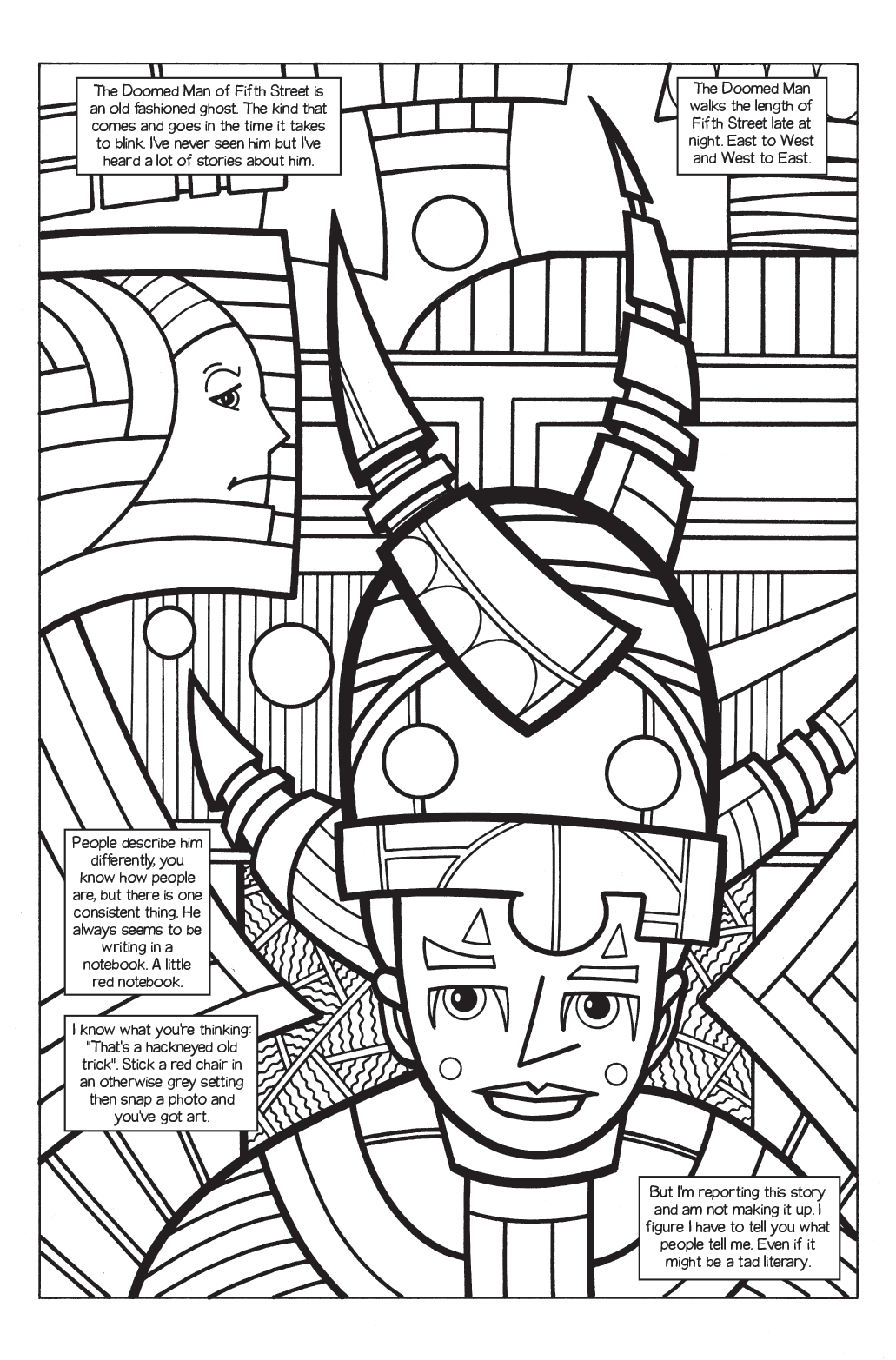
“The Ghost of Fifth Street” Page 1
As I often do I’ve been contemplating comic books lately. This time I’ve been thinking about comic books and how they’re written. Not the nuts and bolts of how to write something but the style that a comic book is written in.
Over the years I’ve heard comic books (and other things) described as “Dated.” It’s not a compliment. The speaker usually means the comic book seems old fashioned. That’s a synonym for dull. I’ve always been of the mind that everything is dated. Everything is of its time. We just can’t always see the markers of that time until some more time has passed. Every comic book that is made today will seem dated in a certain amount of years. That’s the way of the world.
One of the criticisms I hear of comic books from the 1970s and 1980s is that they are over written. There are too many words on the page. Some time around the late 1990s a new writing style developed that was called “Decompressed Storytelling” and it took over a lot of the comics biz. It was a storytelling style that had a lot fewer words in it. Gone were thought balloons and omniscient narrators but first person narration in captions was here to stay.
I was down with decompressed storytelling when it was new and on the fringe. It depended a lot more on art and needed a good artist to pull it off so not everyone could do it well. But soon everyone was doing it and there was a big downside. Stories that used to be told in one or two issues now took six issues. I found it insane that Marvel retold Spider-Man’s origin story, which was originally only ten pages, over the course of six issues. That’s roughly one hundred and twenty five pages. That’s nuts.
So the bloom came off the rose for me somewhere in the early 2000s. I was no longer interested in decompressed storytelling in any way. Not that I never read any again but, as a style, it no longer held my interest in any way.
I also want to say that most of that kind of storytelling came out of mainstream comics in which the writer and artists were two different people. Being mostly an indie comics guy I have read and continue to read a lot of comics that are written and drawn by one person. I’ve noticed these one person comics are almost never accused of being over written. I think that’s because there is a natural economy of words when the person writing them is also the person drawing.
When a comic book writer hands off his writing for someone else to draw I think there is a tendency for the writer to want to put as much of himself on the page as possible. Drawing takes a lot more time and work to do than writing so maybe a writer can overcompensate a little bit. Then the criticism of overwriting can come into play.
I’ve recently come to a new conclusion. I prefer over writing to under writing. I’ve never had this thought before but I must have been leaning that way all along. I’ve read way too many comic book where almost nothing happens. I’ve heard other people make that same complaint but it has never occurred to me before now to call that out as underwriting. A comic book where not much happens is an underwritten comic book. It’s very frustrating when that happens.
Recently I’ve been reading a lot of one dollar Marvel True Believers comics. The ones I’ve read have been reprints of key 1970s comic books. That’s the era where there were lot more words on the page. It turns out that’s okay with me. If the writing is good how can more of it be bad? That’s what it really comes down to. If the writer is good with words and weaves them together in a pleasing way why do I care if there are a lot of them on the page? As long as it doesn’t interfere with the art and story all is good.
If the writing was bad in one of these overwritten stories I skipped stuff. It wasn’t holding my interest so what did it matter if there were ten words or two that I wasn’t reading? A story I don’t like doesn’t get better if there is less to it and a story I do like I want more of.
Early Conan the Barbarians are a good example of a comic with a lot of writing that I liked. Marvel reprinted four or five early issues and they were all good. There was a lot of writing in them but it was good writing. I was drawn in. The story was well crafted and a lot happened in those short twenty two pages. I got a beginning, middle, and end. Often today’s underwritten stories are a muddle of middle.
One last thing that got me thinking of this was that I bought a comic this week that was underwritten. It was the last issue of a six issue mini series. Over all the series has been a good one. I bought all six issues after all. But the last issue was over a quarter of the way through. Issue five ended with a cliffhanger after a surprise plot twist but then issue six resolved that cliffhanger right away which pretty much resolved the whole story. The last three quarters of the last issue was cleaning up the mess. It was a little disappointing.
That’s the word I’d use with most underwritten stories. Disappointing. They’re not necessarily bad stories but they offer me very little. When you go out to lunch and they serve you a handful of grapes you will be disappointed. I expect a meal for my money when I’m buying lunch and I expect a story with my comic book when I buy one. I don’t always get one. When something is overwritten I usually get a story. “At least the portions are big” is a real thing for me when it comes to comic books.
I’m back from the comic shop this week and I got two new comics.
Check them all out here:
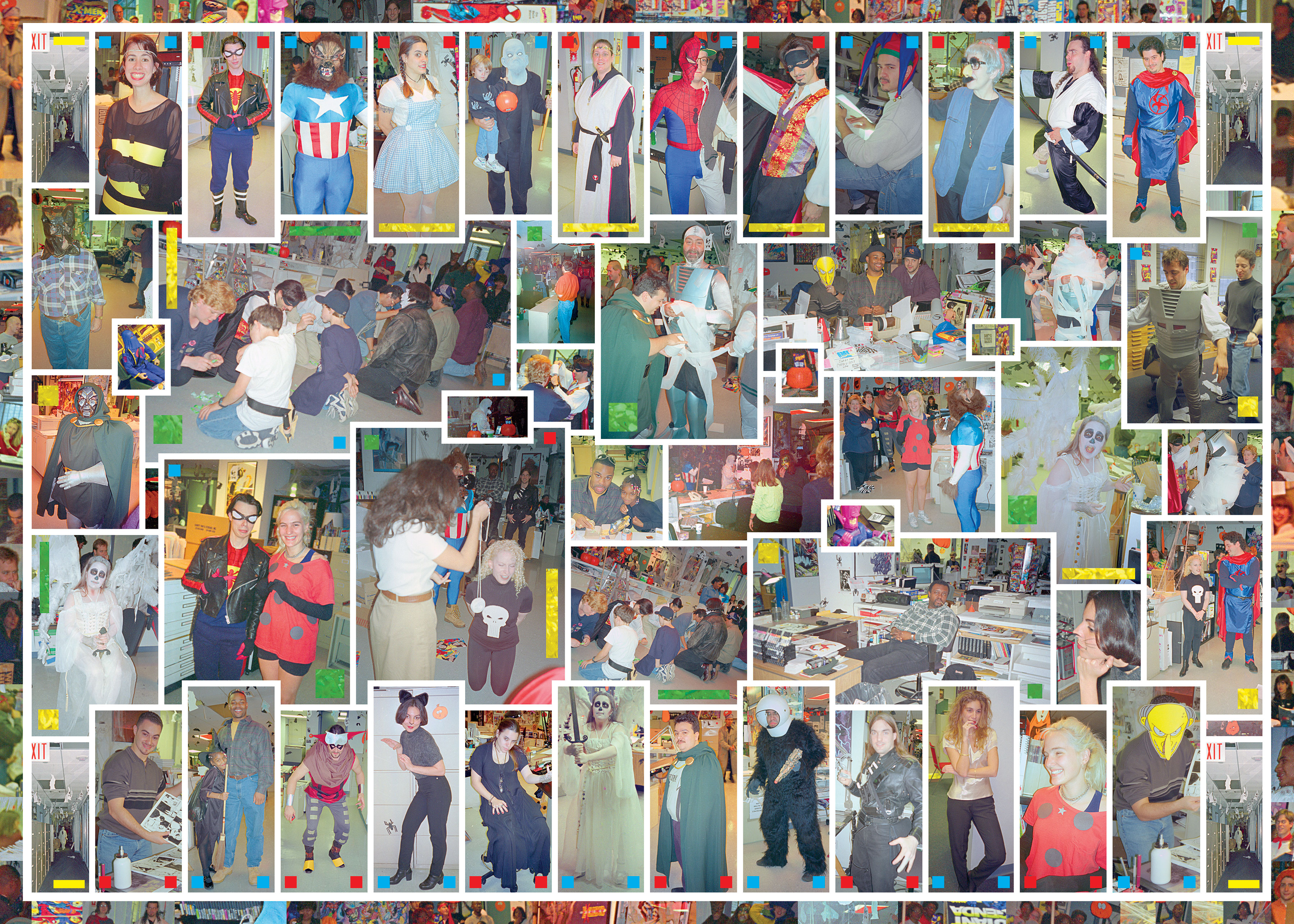
I’m taking a break from working on a large photograph to write about working on a large photograph. I’m not sure how much of a break this really is but I’ll give it a go. Recently I was looking through some of my old photographs from my Marvel Comics days to find something I wanted to post on Facebook. I settled on a photo of Fabulous Flo Steinberg in a Groucho mustache and glasses combo from Halloween of 1996.
I took a bunch of photos all through my Marvel days but not nearly enough. They were the days before digital photography so photos weren’t as easy to take and were a lot more expensive to develop and print. Sometime in 1990 or 1991 I bought an Olympic Stylus camera. That was a small (about the size of a large bath size bar of soap) 35mm film camera that I carried around in my pocket as a matter of course. I’d pull it out every now and again to take a photo of something or someone. I took more photos than anyone else there at the time but I still wish I had taken more.
The Halloween day that the photo of Flo was from was a day where I took a lot of photos. Or at least a lot for my days of shooting on film. I took 51 photos that day all at the the office Halloween party. Those parties were a big deal at Marvel in those days but this was a weird one.
Marvel was having money troubles due to all sorts of shenanigans by the big wigs and was heading towards bankruptcy which it finally declared in December of that year. On top of that editor Mark Gruenwald, who for years was the master of ceremonies for all of the Marvel office parties, had died suddenly and unexpectedly just a couple of months ago in August. This was the first Halloween party without him. Everyone wanted to carry on in his honor but it wasn’t the same without him. He usually had a bullhorn and ran all the goofy party games. He loved them.
In looking at these fifty one photos from the day I was inspired to make one of my large photo collages out of them. Inspiration is one thing but you’d better have more than that if you want to finish a project. Luckily I seem to have some sort of compulsion to finish is as it takes a lot of work. I’m on my fourth day of working on it and I’m not even done yet. But I’m getting close.
It was really tough going at first. After I was inspired to make this photo collage I noticed that the scans of the negatives had a lot of problems. Back in the early 2000s I scanned in all of my 35mm negatives from 1985-2001. It took weeks to do. I kept all my negatives in sleeves so they were pretty well protected but these particular negatives had a lot of dust and scratches on them. I’m not sure why but they were worse off than my usual negatives. So I would have to clean up the scans in Photoshop by hand. Lots of color correcting, using the healing brush, and the clone tool.
The cleaning of the scans part took three days. It’s a task that had to be done but it’s not the most interesting thing to do. Sometimes I’m okay with tasks like that. I’m just using my eyes and reacting to whatever I see. If I see a dust spot I click with the healing tool. Over and over. Sometimes it can be very meditative but mostly it’s tedious. At least I can listen to shows, music, podcasts, or whatever as I do it.
By the end of the third day I was ready to start working on the actual large photo rather than cleaning the individual pieces. The problem was I still had no idea what I wanted the final piece to look like. I had fifty one pieces but no puzzle box to look at. I noticed I had two types of photos. Pictures of individual people and pictures of the event. I decided to make two rows of individual people on the top and bottom and place the event photos in the middle of them.
At first I guessed wrong about how wide the individual photos should be. I set up guides and gutters at two and a half inches apart and started to layout the photos in that pattern. I ran out of room before I ran out of photos. It was back to the drawing board to set them up at two inches apart. This time I got it right. It took a few hours to get all the photos in place but this was the easy part. Thinking up the pattern can be difficult but once the kinks are worked out following a pattern is easy.
Now I had to work out the middle but I had nothing. Usually when I make one of my large photo collages I work around a large central image or three. But I didn’t have that for this one. I had taken these photos before I developed my large collage style so they weren’t taken with that in mind. After a few false starts I decided to just start placing photos and not worry about a central idea until I saw one developing. So that’s what I did. I’d place one photo, resize it, place another, try to find a place for a third, and so on.
I did that all morning and finally after about fifteen photos were placed I started to see what I wanted to do. Then I dropped the final five in the middle section and everything fell apart. But that was okay. I knew I could get it. I knew I had a good visual idea and all it would take was time and perseverance. So I kept at it until I got it done. At least that part. The hard part.
Now, as I take this break, I only have the border to do. I often string a bunch of images around the outside of the photo collage to make a border of images. This time I’m using my “Border of Faces” technique. That’s where I search all the individual photos for people in the background. I cut out their faces and place them around the edges. People who may have been cut out of the main picture get into the Border of Faces. That takes a while to do but it ends up looking cool.
Well, I gotta get back to it now. I have to finish and I’ll probably even print it out and make a physical collage out of it. That’ll take a while.
I’m back from the comic shop this week and I got seven new comics.
Check them all out here:
It’s a strange feeling when I don’t finish something after getting a lot of finishing done. First of all it’s tough to get anything done as an artist. You’ve got to get over the initial hump of, “Why do any work if you’re not getting paid for it?” That’s what stops most people who want to be artists. Why make a piece of art that takes up your time and money that no one cares about when you finish it? I can’t even tell you how to answer that question. At best I can tell you it’s an obstacle of self doubt that you have to put aside and ignore. The question never goes away but can be put away in a drawer. At least for a little while.
Four about five months I was getting a lot of big ink drawings done. I finished 28 of those 22×30 inch big ink drawings. Since each one takes about three days to finish that is a lot of work. I was into it though. I had first made about a dozen big ink drawings back in 2014-2015 but then I stopped. Who knows why except that these things just run their course. I thought I would make more but I never did until five months ago. Over three years later. What got me started again? I’m not even sure of that except that I wanted to. I was feeling constrained by the 11×17 inch paper I usually work on.
I worked on the drawings on the weekend. I’d work up a drawing during the week, transfer it to a big piece of paper, and then draw with ink all of Saturday and Sunday. Sometimes I’d have to finish a bit of it on Monday. Sundays worked well with the drawing because I could put a football game on in the background as I worked. Otherwise I might have the TV on with a movie or TV show that didn’t demand too much attention. It’s not like I could watch something closely as I was working.
I finished the last one two weekends ago. It came out nice. I’ve generally been happy with all the big ink drawings I’ve done so far. You can’t make a drawing that big that takes that much time without planning and that planning usually weeds out the bad stuff that I wouldn’t be happy with. So that’s what’s good about this big ink drawings. By the time I get to the finished stage I’m happy with it.
Working on smaller drawings with less planning can lead to frustration. It’s just part of the process. Sometimes it is the process. At the beginning of making a piece of art I need to be jamming out ideas and not thinking about quality. That’s the stuff I do in my ink book/sketchbook. I have to get stuff down on paper and quality doesn’t matter.
After I have a lot of drawings I pick some out and try to make new drawings from them. That’s where the quality control comes in. It’s not easy to make a drawing out of a small idea. Often it doesn’t work out. I have a bunch of drawings that I bring to this stage and then abandon. I think I can do something with it but then I can’t. Frustrating but that’s the way things work. I have to put aside the frustration and keep going.
So the big ink drawings were all vetted through this process. Some were new drawings that I came up with and some were old drawings that I brought back to life. Like I said I have plenty of orphaned drawings so I looked through them to find something I liked. But that was the key. I already liked the guts of the drawing. The basic premise and style so there was almost no chance I’d hate it when I made a big ink drawing from it. That’s key when working big. Keep yourself as happy with it as possible.
So as I was working on the last one I was feeling some burnout. The sense of satisfaction of getting one done wasn’t there. It was felling a little to by the book. I often work on things in bursts. If five months can really be considered a burst that is. I’ll work on a bunch of “Dreams of Things” covers in a row, a bunch of small paintings, photographs, or some comics. Inevitably whatever grove I get into with a particular thing ends. I don’t know why it ends but it does. I get a “That’s enough of that” feeling and can’t go on. That’s what I hit with these big ink drawings.
It’s the feeling that come after the burnout that’s tough. It’s that sense of “What do I do now?” When I was on a roll with those big ink drawings I didn’t have to ask myself that question. I knew what I was doing and why I was doing it. It all made sense. I know that feeling doesn’t last but I ride it out as long as I can. That’s how I get things done. But how do I get things done after a roll? I have to start small.
This week I did some little things. I’ve made some art cards, worked on some ink book drawings, and drew a few 6×9 inch drawings. There is not a lot sense of accomplishment in those small things. They’re all about starting things and not getting things down. Of course starting things is a necessary part of the process but of the things I start only a percentage of them get finished. So they’re less satisfying to do.
Just yesterday I finally got something done. Not quite all the way done but nearly done. I took one of my new 6×9 inch drawings, set it up as one of my “Dreams of Things” comic book covers, and inked it. I ended up with a new 11×17 ink drawing. It’s not finished in the sense that I eventually will color it with markers but I usually don’t do that right away. I’ll put it in a pile with other drawings like it and one day I’ll pull it from that pile and color it. But that day is not today. So I’ll have to be satisfied with almost finishing something for now.
I’m back from the comic shop this week and I got five new comics.
Check them all out here:
As I was reading a bit of Twitter the other day a comic book related subject came up that I had contemplated before and it brought it to mind again. It has to do with pencilers, inkers, and original art. They way comics books have traditionally been made, especially Marvel and DC comics, is that one person draws the comic in pencil and then a second person draws over the pencils with ink. They’re generally known and a penciller and an inker.
A second thing that you should know is that the penciller is generally considered more important than the inker. The penciller makes a lot of the storytelling decisions, has to be able to draw well, has to be able to draw quickly, and generally make everything look pleasing. The inker deals with how the drawing is going to look as a finished piece. With ink he sets the lighting and mood and well as making sure that things will print properly. Two different inkers working over the same pencils will yield different results but both should be recognizable as the work of the same penciller.
In the business of commercial art publishers usually buy the rights to art but not the art itself. So if a publisher wanted to hire Norman Rockwell to paint a cover for them they get the reproduction rights to the art but not the physical painting itself. That is returned to the painter. For many years comic books were different. After the artist handed in his work to the publisher they wouldn’t give it back. They said it was theirs and kept it. It the 1960s artists started to fight for the return of their original art and by the late 1970s Marvel and DC started return the art to the artists.
The first problem the publishers has was who to return the art to. Both the penciller and the inker worked on it (we won’t mention the letterers because they got nothing returned to them). The penciller was considered to be more important but none of his actual pencils still existed. They’d all been inked over. Eventually the publishers decided to return half the pages to the penciller and half to the inker. Or two thirds to the penciller and one third to the inker. I’ve heard it both ways but the tweet I read mentioned the two thirds to one third split.
That’s the way it stayed for years but then technology changed things. Besides things being done digitally, in which case there is no physical artwork to give to anyone, digital has also made it possible to easily separate pencils from inks. I do it all the time with my own work. You scan in the pencils, e-mail them to the inker, and then the inker prints them out in non-photo blue line on a new piece of paper. The physical pencils and the physical inks are never even in the same room.
Marvel Comics used to have an art returns department (it was usually one person and an intern) whose job it was to make sure that artists got their original art back. They don’t anymore. They don’t even want the physical art sent in. Scans are all they need. This means the artists are on their own when it comes to original art issues these days.
John Byrne doesn’t tweet. He only posts on his own website www.byrnerobotics.com. But there is a person who goes by the Twitter name of “NotJohnByre” who reposts some of Byrnes stuff so the wider world can more easily keep track of Byrne and his work. It was there that I learned that Byrne had been working on a new X-Men project that he wants to get published. Byrne has pencilled some pages of it and he was thinking that he’d like to have them inked over blue lines rather than the original pages. None of that was unusual. The unusual part was that he said he wanted not only to keep his pencils but also have two thirds of the inks returned to him. So he would end up owning all the pencil pages plus two thirds of the inked pages while the inker would only end up with one third of the inked pages and no pencil pages.
That sounds unfair but Byrne’s argument was pretty straight forward. No matter if inked over the pencils or over blue line it was still his work and he deserved his fair share of it. If the inks were done right over the pencils he would get two thirds of the finished pages so why should things change? His work was as integral to the finished pages as it always was and so he deserved what he always got.
That’s not a bad argument but it overlooks one very important item. Things have changed. First off neither Byrne nor the hypothetical inker own the intellectual property they are creating. Marvel Comics owns the X-Men and all the X-Men Comics that they pay anyone to make. All the artists own is the physical manifestation of what it takes to make the comics. John Byrne owns the physical pencils that he draws but once he scans them in and sends them to Marvel his ownership of the intellectual concept of those pencils is gone.
Once Marvel receives Byrne’s scans of the pencils they can do what they want with them. Byrne’s ownership over the pencils has ended except for the direct physical manifestation of the pencils which he still has in his studio. Marvel can send the, now digital, pencils to an inker, they can send them to six inkers, they can forgo inks entirely and print directly from the pencils (which used to be tough to do but now is much easier), they can never publish them, they own them.
So let’s say Marvel sends Byrne’s pencils to an inker and he inks them. What is Byrne owed from that inker? Nothing. Why? Because things have changed. The days of pencils and inks having to be done on the same page are gone. When they had to be done on the same page there was a need to compromise. The penciller could get some of them in proportion to how important he was seen to be to the book and the inker could get some of them. Not anymore. The penciller can own the exact work he did and so can the inker. That seems very fair to me.
For John Byrne that doesn’t seem to be a good enough argument but for me it is. All the artist owns in the case of commercial art is the physical manifestation of that art that he makes with his own hands. He doesn’t own the conceptual rights that he sold. He has no say over them. So once Byrne hands in the scans and keeps his own pencils he owns nothing that is made form those pencil scans. The inker gets to keep his inks.
I’m back from the comic shop this week and I got five new comics.
Check them all out here:
I don’t usually dress down my own artwork. I’ve been making art for a long time and I generally know how to make good art. Or I at least know how to make art that satisfies me. It’s usually young artists who are the most dissatisfied with their own work. I’ve seen plenty of young artists who finish a piece and then hate it and have a hard time looking at it. That’s normal and understandable.
It takes a long time and a lot of practice to be able to make good art on a consistent basis so if you’re young and inexperienced you’re not going to hit the mark as often as you’d like to. I’ve also know artists who never like to look at their old work from when they were young because all they can see are the mistakes. I used to be like that until I learned to give my younger self a break. He was trying his best with his limited skills and there is no need to get upset about that now. I try to look for the good things in my old work to learn from them.
Certain artists always have a feeling of insecurity. I’m not sure why but they’re hard on their own work. I’ve known an artist or two who did some spectacular work but then dressed it down because they didn’t like it. For some reason they were never satisfied with they own stuff. They could see the value of other people’s art but not their own. I’ve always been glad I don’t have that trait because I could see how hard it was to shake off.
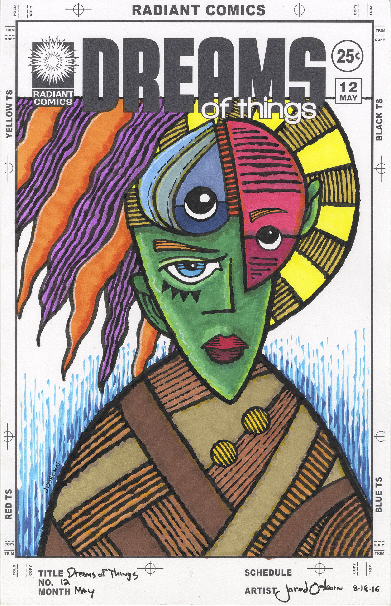
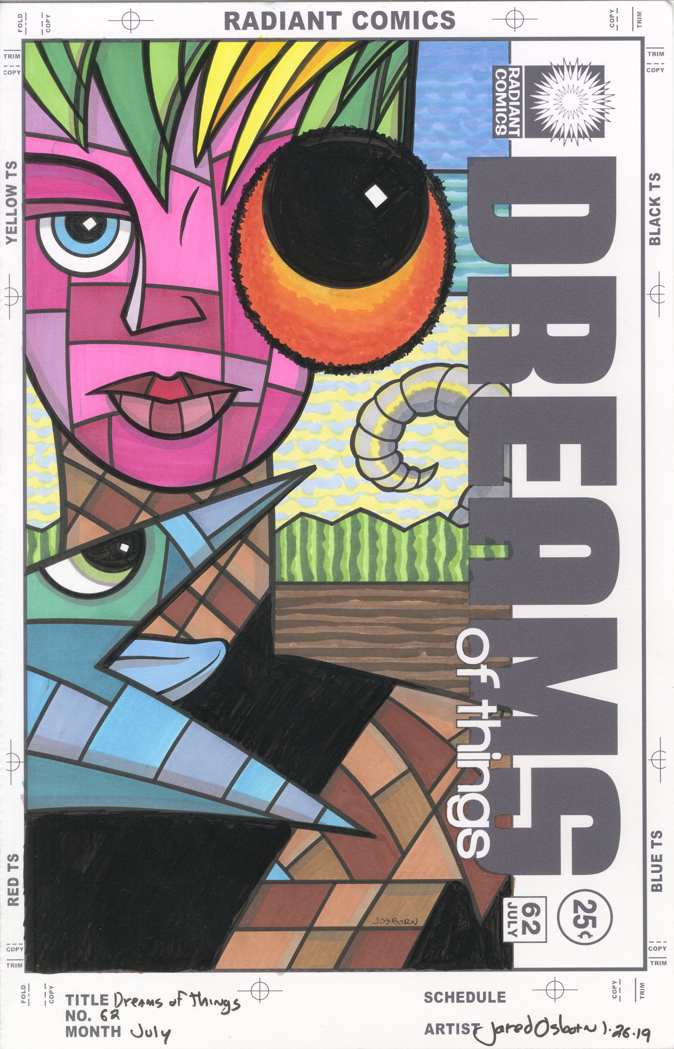
I bring up this topic because I just finished a piece that I’m not happy with. I didn’t like the way it came out. I’m not one of those artists who has a complete vision in his head of how a piece will come out but I do know a general direction I want to go in. I have a process. For these “Dreams of Things” covers it’s: thumbnail sketch, pencil drawing, maybe a second large pencil drawing, ink drawing, and then color it with markers. I’ve done over sixty of them so I have the process down. I have had some misses with them and this is another one of those.
I can’t even tell you what I think is wrong with this cover. If I could figure it out then maybe I could fix it. It could just be that it didn’t come out like I thought it would. It got away from me. You might even think it’s just fine and like it. I’ve made other pieces that I’ve been unhappy with that other people have liked just fine. This might be all about me rather than about the art.
The art in question is one of my faux comic book covers. “Dreams of Things” number sixty two. Since I haven’t been making any of my big ink drawings lately I switched back to making some of my “Dreams of Things” covers. So far I’ve pencilled four of them, inked two of them, and colored one of them. This is the finished colored one. As I look at it now it bewilders me.
I penciled it just fine, set it up on the computer with the logos and trade dress, printed it out to be inked, and that’s when I think things started to go wrong. It turned out that the pencils were pretty thin. The idea for the hair, face, giant eye, and strange animal profile were there but the body of the figure wasn’t. There is not much form to it. Or at least the form is simpler than I intended it to be.
I wrote that the face was there but maybe it wasn’t. I added more dividing lines in the face then were there in the pencil version. There are about thirteen color shapes in the face but there were only about six in the pencil stage. The same with that animal profile. I addd more shapes into that too.
The background I find okay. It’s a little dull and flat but it has a lot of color and texture. Often I keep the backgrounds simple for these covers because the foreground figure are so wacky and weird. The background has to tether the image to reality a bit to make it more comprehensible. Though I’m not thrilled with the background in this one I don’t hate it either.
It’s the body, the person’s shirt, that bothers me the most. That’s where I spent the most time. That’s an annoying thing about making a piece of art that doesn’t satisfy me. They take more time than a piece that I get right. When things aren’t working out I keep chasing “Getting it right.” I pour more time and work into it thinking that if I can figure it out I can get to where I want to be with it and be happy. But it rarely works out that way. Since my vision of it is compromised there is no way that adding more stuff to it will make it better.
I ended up adding a lot more shapes to the brown shirt than I first had. The shirt had pretty big shapes in it to start but then I cut those shapes in half. After that didn’t satisfy me I cut them in half again. I ended up with a lot of little shapes in that shirt and you know what that did? Nothing. It didn’t help one bit. I decided I had put enough time in this piece and would try one more thing before I quit it. I blacked in half the shirt.
There is an old saying in cartooning. “When in doubt black it out.” This means that often you need to strip things down. Too much detail can be distracting. It can also make you question if it should be there. If that question comes to mind then black out the detail. The drawing is almost always better off that way. So that’s what I did here. The black area helps pop the animal head out and off the shirt a bit plus it gives the flat shirt a little bit of shape. The little bit of black on the bottom right of the shirt gives the illusion of a chest and arm. It was not a bad idea for a last ditch effort.
I’m not going to tell you I’m happy with this drawing because I’m not. But maybe you’ll like it better because to you it’s just another drawing. To me it’s one that went off course and got away.