I don’t usually dress down my own artwork. I’ve been making art for a long time and I generally know how to make good art. Or I at least know how to make art that satisfies me. It’s usually young artists who are the most dissatisfied with their own work. I’ve seen plenty of young artists who finish a piece and then hate it and have a hard time looking at it. That’s normal and understandable.
It takes a long time and a lot of practice to be able to make good art on a consistent basis so if you’re young and inexperienced you’re not going to hit the mark as often as you’d like to. I’ve also know artists who never like to look at their old work from when they were young because all they can see are the mistakes. I used to be like that until I learned to give my younger self a break. He was trying his best with his limited skills and there is no need to get upset about that now. I try to look for the good things in my old work to learn from them.
Certain artists always have a feeling of insecurity. I’m not sure why but they’re hard on their own work. I’ve known an artist or two who did some spectacular work but then dressed it down because they didn’t like it. For some reason they were never satisfied with they own stuff. They could see the value of other people’s art but not their own. I’ve always been glad I don’t have that trait because I could see how hard it was to shake off.
I bring up this topic because I just finished a piece that I’m not happy with. I didn’t like the way it came out. I’m not one of those artists who has a complete vision in his head of how a piece will come out but I do know a general direction I want to go in. I have a process. For these “Dreams of Things” covers it’s: thumbnail sketch, pencil drawing, maybe a second large pencil drawing, ink drawing, and then color it with markers. I’ve done over sixty of them so I have the process down. I have had some misses with them and this is another one of those.
I can’t even tell you what I think is wrong with this cover. If I could figure it out then maybe I could fix it. It could just be that it didn’t come out like I thought it would. It got away from me. You might even think it’s just fine and like it. I’ve made other pieces that I’ve been unhappy with that other people have liked just fine. This might be all about me rather than about the art.
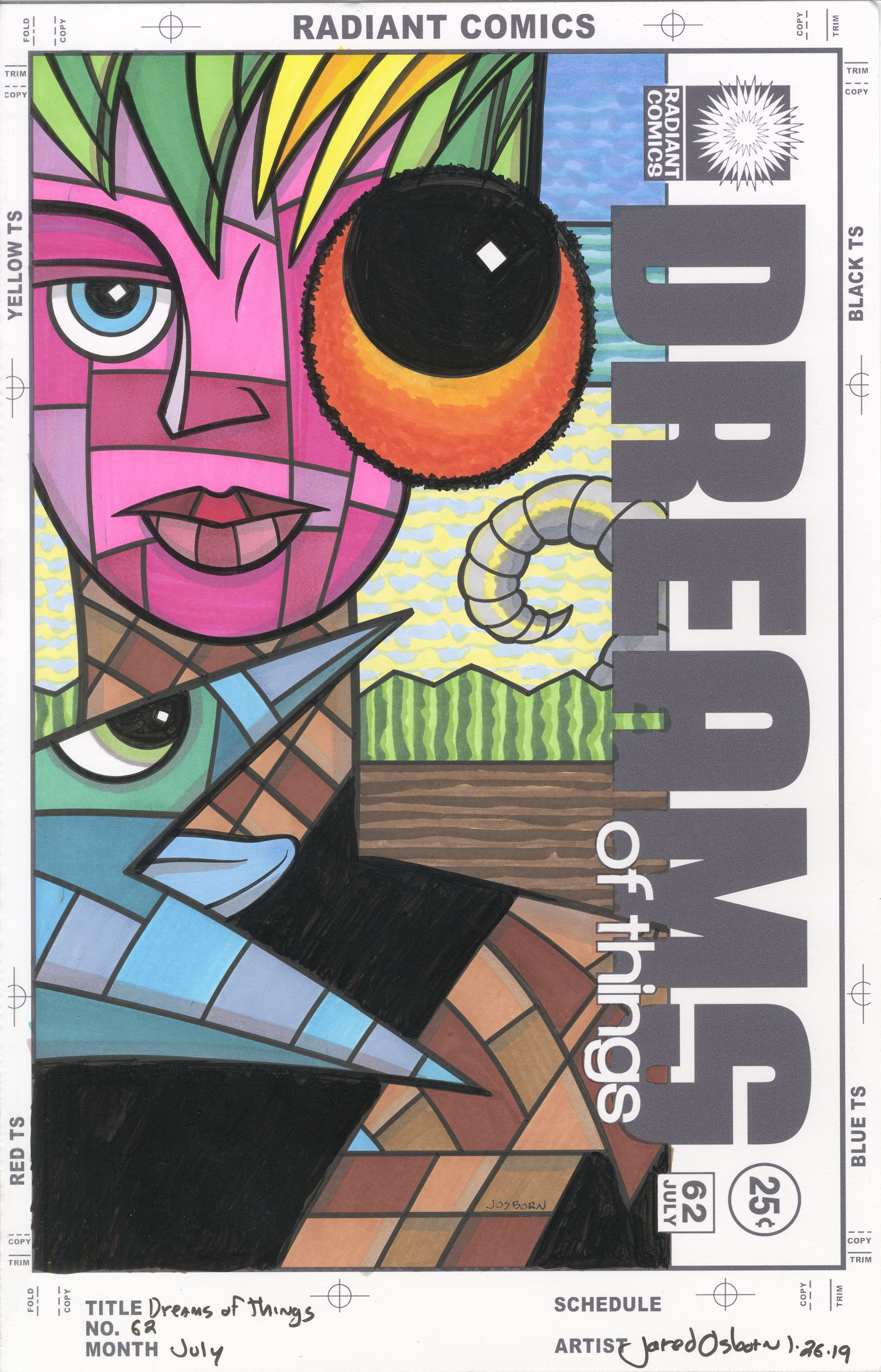
The art in question is one of my faux comic book covers. “Dreams of Things” number sixty two. Since I haven’t been making any of my big ink drawings lately I switched back to making some of my “Dreams of Things” covers. So far I’ve pencilled four of them, inked two of them, and colored one of them. This is the finished colored one. As I look at it now it bewilders me.
I penciled it just fine, set it up on the computer with the logos and trade dress, printed it out to be inked, and that’s when I think things started to go wrong. It turned out that the pencils were pretty thin. The idea for the hair, face, giant eye, and strange animal profile were there but the body of the figure wasn’t. There is not much form to it. Or at least the form is simpler than I intended it to be.
I wrote that the face was there but maybe it wasn’t. I added more dividing lines in the face then were there in the pencil version. There are about thirteen color shapes in the face but there were only about six in the pencil stage. The same with that animal profile. I addd more shapes into that too.
The background I find okay. It’s a little dull and flat but it has a lot of color and texture. Often I keep the backgrounds simple for these covers because the foreground figure are so wacky and weird. The background has to tether the image to reality a bit to make it more comprehensible. Though I’m not thrilled with the background in this one I don’t hate it either.
It’s the body, the person’s shirt, that bothers me the most. That’s where I spent the most time. That’s an annoying thing about making a piece of art that doesn’t satisfy me. They take more time than a piece that I get right. When things aren’t working out I keep chasing “Getting it right.” I pour more time and work into it thinking that if I can figure it out I can get to where I want to be with it and be happy. But it rarely works out that way. Since my vision of it is compromised there is no way that adding more stuff to it will make it better.
I ended up adding a lot more shapes to the brown shirt than I first had. The shirt had pretty big shapes in it to start but then I cut those shapes in half. After that didn’t satisfy me I cut them in half again. I ended up with a lot of little shapes in that shirt and you know what that did? Nothing. It didn’t help one bit. I decided I had put enough time in this piece and would try one more thing before I quit it. I blacked in half the shirt.
There is an old saying in cartooning. “When in doubt black it out.” This means that often you need to strip things down. Too much detail can be distracting. It can also make you question if it should be there. If that question comes to mind then black out the detail. The drawing is almost always better off that way. So that’s what I did here. The black area helps pop the animal head out and off the shirt a bit plus it gives the flat shirt a little bit of shape. The little bit of black on the bottom right of the shirt gives the illusion of a chest and arm. It was not a bad idea for a last ditch effort.
I’m not going to tell you I’m happy with this drawing because I’m not. But maybe you’ll like it better because to you it’s just another drawing. To me it’s one that went off course and got away.