Sometime a few months ago I started a new comic book habit. I have a section on my comic book collection called “I bought them just for their covers.” These are comics that I don’t have a lot of interest in but I liked their covers. Sometimes that’s enough to make me buy a comic. That and if it’s cheap. I’m not spending more than a few dollars on a comic just for the cover. My new habit is that I keep one comic laying around, on top of my printer, so I can pick it up and look at the cover. It sits there for a few days or a couple of weeks depending on my interest or indifference to the comic. It’s usually indifference that makes it stick around longer because I forget it’s there. But eventually I take a new one out. Often from my “Just for their covers” section but not always so.
Let’s take a look at the one that’s there this week. It’s “Creatures on the Loose” #23. It has a May 1973 cover date which means it was on sale in February of 1974. COTL was a Marvel Comics series from the 1970s that had a bunch of different main characters over its lifetime. It was a genre tryout book of sorts and this book’s genre was monsters. Except Thonogor wasn’t a monster. Thonogor was born of the 1960’s popularity of Conan. Lin Carter wrote a series of novels staring our sword and sorcery star and then Marvel licensed the stories to make comics out of them. After all Conan was a success for Marvel so why not copycat yourself?
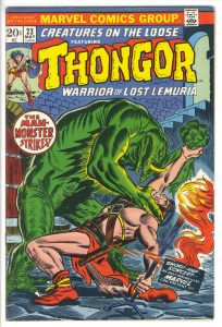
This cover was drawn and inked by John Romita. You can see his signature on the left side in the wood grain of the door so there is no need to look up who drew it. Romita was on the Marvel staff at the time as Art Director and he also drew a bunch of covers for them as well as drawing various interiors. I often wonder who colored these Marvel covers. I know that George Roussos came on staff at Marvel some time in the early 1970s and colored lot of Marvel’s covers but he wasn’t credited for them. This could be his work but who knows?
The cover has a lot of logos at the top of it. It has the Marvel Comics Group logo, the COTL logo, a small “Featuring”, the Thonogor logo, and finally a “Warrior of Lost Lemuria” tag line. That is a whole bunch of words to fit on one cover but they’ve done a good job of it. They even threw in two cover copy blurbs for good measure. We get a story title and a brag blurb. If you were to describe a comic cover with that many logos on it I’d put money on the fact that the cover would look really crowded but this one doesn’t. The top logos stack into as small a place as possible and the blues are even compact. I question the necessity of the “Sword and Sorcery” brag blurb as it doesn’t seem to add much and gets in the way of the composition a little but it’s still fairy inconspicuous. Overall the type and trade dress might be too busy but they get an “A” for making it work so well.
The first thing that jumps out at me is, of course, the giant green monster. He takes up most of the cover and is the dominant figure in the composition. Our hero doesn’t even get to be very heroic as he’s getting his butt kicked by the creature. I think the green is a little bit dark. It almost works as this cover is supposed to take place in a dark setting but I flattens the picture too much. Even with the rim lighting along the creature’s back it’s tough to get any visual separation between the creature and the background. The green and the blue have similar values and blend together easily. The bright yellow rim lighting on the creature’s arm is odd. I think it’s supposed to represent the light from the flame that Thonogor is holding but it’s not quite in the right place for that.
Thonogor stands out as much as the creature blends in. His light pink color is the brightest bright on the cover so it moves forward in my eye. It moves forward so much that it messes with the perspective of the flame lamp he’s holding. That flame is supposed to be the thing closest to us in this picture but because the light pink moving forward in my eye the flame looks about even with his head and back arm. This visual confusion tend to flatten things.
I like the drawing and inking on the cover. The monster is suitably monstrous and has some nice heavy inks and texture to him. It’s tough to draw a menacing monster head at that angle but the sharp teeth and horn help. I can imagine them wanting the teeth even sharper but not being able to get that passed the Comics Code Authority. They wouldn’t let you make the monsters too scary. Thonogor’s figure is also well done. He’s bent over at such an extreme angle that he doesn’t even have both feet under him. That is an unusual twisting pose and tough to pull off but Romita does it.
It’s strange how little details can stand out at me when looking at a cover. Like why does one entranceway have a door on it and one doesn’t? The top right doorless exit lets out eye move into deep space but storytelling-wise I’m not sure why there is no door. But the bigger mystery is that flame that Thonogor is holding. It’s obviously a floor lamp because it has those four feet on it but why isn’t it a regular torch? It would make sense to be carrying a torch in a dungeon. Did Thonogor pick it up off the floor to use as a weapon? It might be explained by reading the story but for now I’m just looking at the cover. Looking at it and contemplating its mysteries.
Discussion ¬