Comics I Bought This Week: October 26, 2013
I’m back from the comic shop this week and I got eight new comics.
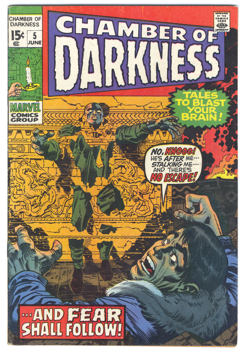
This week’s comic book cover to look at and examine is “Chamber of Darkness” #5 published by Marvel in 1970. Jack Kirby does the pencils and Bill Everett does the inks. You generally can’t go wrong with a Kirby cover but I find this one extra fun. Everett on the inks makes it especially lush.
First off I like the image of the monster walking right through the wall. That’s not an easy thing to pull off and here it’s done perfectly. The guy at the bottom recoiling in fear is nicely done too. There is a lot of Everett in that guy’s face of fear. It’s a composition that’s unusual. You hardly ever see a large character on the bottom of a cover looking up. That monster is practically stepping on him. I think that composition is what draws me most to this comic. I also like the decorative elements that are on the wall. From the dragons to the bricks to the repeating design elements it’s all good stuff.
The colors here are unusual but I like them. It reverses the normal warm/cool order by putting the hot colors in back and the cool colors in front. That orange wall brings me in like a bull’s eye in the middle of the cover. The logo stands out in white against a deep purple box on top of a full strength red background. Not to mention green areas on either side of the logo. That is just crazy. None of it should work but it all does. The blue of the man on the bottom even grounds the whole thing. I find the color remarkable.
There is a lot more type on this cover than it needs but that’s okay because the cover is trying for over-the-top. In the cover’s story it’s capturing a chaotic moment and all that type in different color and styles adds to the chaos in a good way. There is black, white, yellow, and red type on this cover. You don’t see that all the time and for good reason. But here it works.
I like the story, I like the drawing, I like the color, I like execution. How much more could I ask from a cover?
Discussion ¬