Comics I Bought This Week: October 19, 2013
I’m back from the comic shop this week and I got eight new comics.
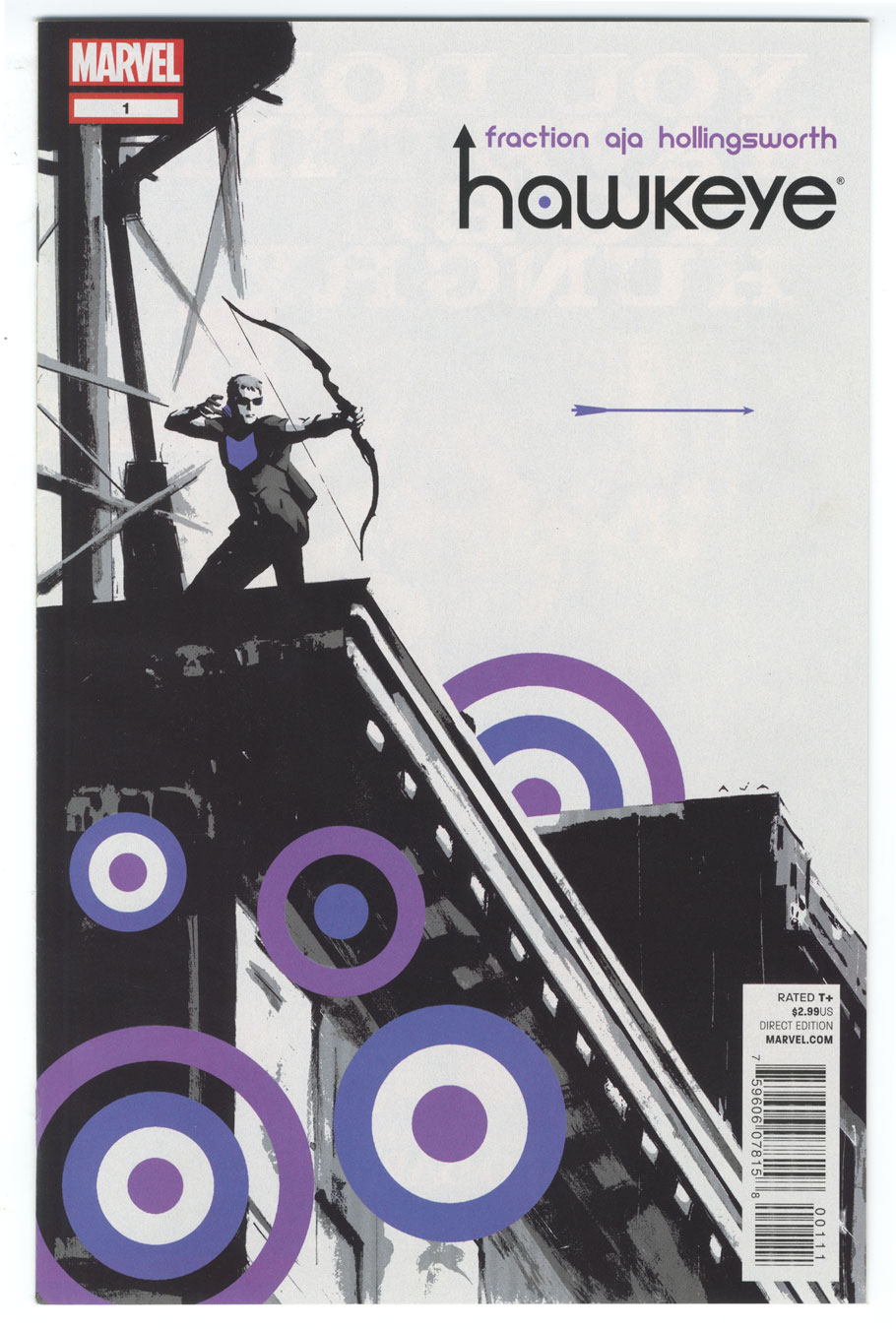
This week’s comic book cover to look at and examine is “Hawkeye” #1 by David Aja. I thought I’d bring us into the modern era with a comic that I bought last year. It’s the first issue of the new Hawkeye series from Marvel. The cover is a lot different than the average mainstream super-hero comic as it’s more about design than it is about illustration.
The first thing I notice is the negative space of the sky. There is a whole lot of it and that’s unusual for a comic book cover. They even kept the sky the white of the paper rather than making it blue. I guess that was to keep the purple the only cover on the cover. Except for that now annoying red in the Marvel logo. They should have made that a grey or purple but branding is branding and why let a good cover illustration get in the way of your branding.
The purple bull’s eyes are interesting. They’re there as part of Hawkeye’s story of being a marksman and as large design elements. It’s rare to see such obvious design elements integrated as part of the story of a comic book cover. They’re also a very modern element of flatness to contrast with the deep illustrative shape of the buildings. The arrow that Hawkeye has fired into the air hangs between an illustration and a design element. It’s interesting because depending on how you are looking at it it changes between the two. By itself in the white space it’s a pure design element but if you’re following the story from left to right of Hawkeye shooting the arrow it becomes an illustration.
The creator’s names and logo work nicely on the cover. They’re a nice size and shape and work amongst the negative space of the sky. As I said before the red Marvel logo looks out of place to me but it’s the UPC box that’s really annoying. UPCs are annoying on most covers but here it really gets in the way. At least it’s not a distracting color.
Discussion ¬