Comics I Bought This Week: March 22, 2014
I’m back from the comic shop this week and I got six new comics.
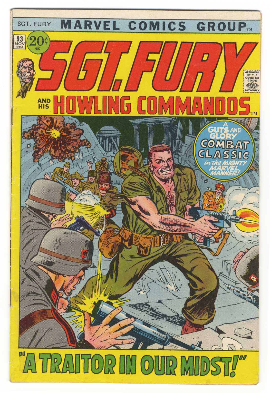
This week’s comic book cover to look at and examine is “Sgt. Fury and his Howling Commandos” #93 from 1971 and is by Dick Ayers. I have a vague memory of buying this one some time in the late 90s when my local comic shop had a sale. I bought it just for the cover as I like those early 70s Marvel comics covers that used a box design. A lot of people hate the box but I think it was often used well. Here it’s used just as a frame and not as a compositional element. That’s a little disappointing.
I don’t find anything particularly special about this cover except that it’s a solid example of a fun war comic book cover. It’s all about heroism, action, and very little death. A fun war comic rather than one about the realities of war. The explosions aren’t hurting anyone and The Howling Commandos are even bloodlessly shooting the guns out of the Nazi soldiers’ hands.
I once read an interview with Dick Ayers where he said that the Sgt. Fury comic was obviously in no way meant to be realistic but was more like a bunch of old soldiers sitting around telling war stories. They became adventures that way. The comic made a lot more sense to me after reading what Ayer’s intentions were and this cover really captures those intentions.
Fury is solid as a rock in the middle of the action firing away with his submachine gun. Chomping on a cigar with his helmet flying off he’s built like a bull and it’s going to take more than a few Nazis to move him. He’s even got all the Howling Commandos backing him up so he looks like he’s on his way to victory. The drama of this cover doesn’t come from any danger Fury is in. The drama comes from his heroism.
The yellow border on the cover doesn’t do the drama any favors as it flood the cover with a brightness it doesn’t need but the colors of the actual illustration are pretty good. I guess they’re in Greece or Rome because of those coulombs in the background but they’re all knocked out in a dull blue so they fade away and are not so noticeable. Other than that we get the dull colors of the uniforms with some flashes of bright colors here and there. I can see why someone decided to brighten things up with the yellow border and the red logo but they’re out of place to me.
In the end I still like this cover a lot. It’s solid and satisfying.
Discussion ¬