Comics I Bought This Week: March 15, 2014

I’m back from the comic shop this week and I got eight new comics.
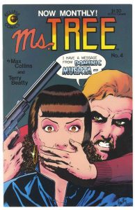
This week’s comic book cover to look at and examine is “Ms. Tree” #4 by Terry Beatty. This one came out way back in my high school days. 1983. I bought this one at my local comic shop when it came out.
I’m not sure why I pulled this one out except that it caught my eye as I looked through the covers of some of my old Ms. Tree comics. It’s not among my favorite comic book covers and I don’t think anyone would say it’s one of the best but still there was something about it that I liked or it wouldn’t have jumped out at me.
First off that guys hand is clumsily drawn. Or maybe it’s not the hand that’s clumsy but the way it’s over her mouth. I’m not buying it. I’m not buying the whole gesture. As I wrap my own hand around my face and look in the mirror I have to say that the hand as drawn is entirely too small. My own hand covers up a lot more of my face and my fingers wrap around my jaw more. Any though there is nothing wrong with the drawing of the gun it’s boring. It’s too mechanical and perfect. Or maybe it’s where it falls in the composition that I don’t like. I’m not sure.
So what do I like? I like the whole scene and Ms. Tree’s eyes. I think Beatty caught the surprise and confusion in her eyes nicely, I may not believe the hand but I do believe the eyes. And they’re interestingly drawn too. I like the way the eyebrows and the lines around the eyes form a shape that makes her eyes look even more wide open. And I like her pupils. For some weird reason I always have a problem with the way I draw pupils but I don’t with the way anyone else draws them. It’s a weird quirk of mine. The guys behind her with his heavy eyes in shadow and gritted teeth is nicely threatening.
The color is functional but not spectacular. The little bits of airbrushing are a little odd but in general gets the job done. Nice little sparkle on the eating to counter the overall mood. The dark background works well too.
I think why I like this cover in general is the interesting situation. Rarely do we see the hero of the book in danger and scared about it too. It’s an out of control situation and that’s cool. At least in a comic book cover.
Discussion ¬