Comics I Bought This Week: January 25, 2014
I’m back from the comic shop this week and I got nine new comics.
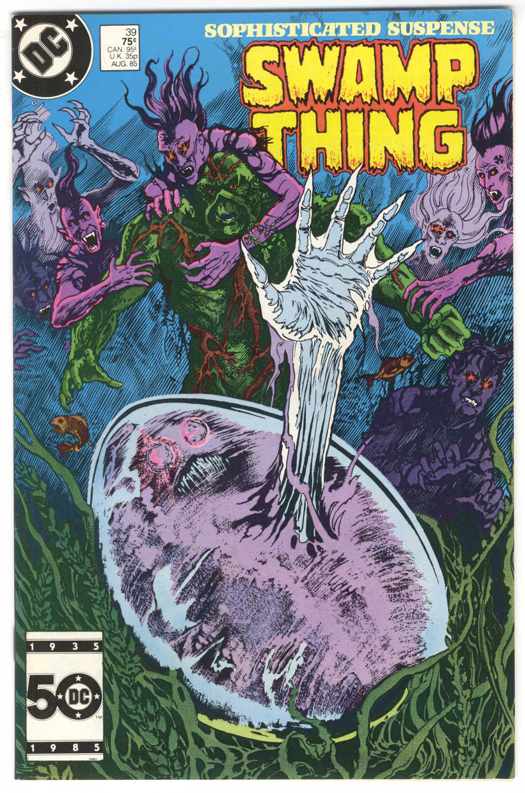
This week’s comic book cover to look at and examine is Swamp Thing #39 by Steven Bissette and John Totleben. This one if from my early college years, August 1985, and is one I got from what was then my local comic shop. I was a big fan of the Alan Moore written “Swamp Thing” but I haven’t read this issue in a long time and I can’t quite remember what happens in it. I think this is about the time the book got really weird and trippy.
Yeah, if I were to try and describe this cover in one word “Trippy” might be it. It’s got some crazy stuff going on in it. The centerpiece is that giant egg with the clawed hand coming out of it. I don’t know what’s being born there but I don’t want to be around when it comes out of that egg. Throw in a half dozen long haired mohawked demons and set it all underwater and you really got a weird scene. Swamp Thing looks like he might have a chance against those demons but what happens when that thing is born? Intrigue!
The layout of this one is interesting too. They shrunk down the logo and moved it to the right to have more room for the figures. This isn’t seen too often. I’m used to seeing giant logos that the rest of the art has to work around. I still hate UPC boxes though.
Bissette and Totleben are both excellent artists either on their own or together. Here they create a lot of mood and texture. They use the underwater setting to have figures fade away into the murky water in an effective way. I like the way they’re grabbing at the Swap Thing from out of the blue. Their drawing has always had a strange structureless quality to me. Though there is obviously a lot of structure to their drawing and inking. Maybe because there is more texture and surface then I usually see.
The color is nice too. They used a limited color pallete that’s mostly greens, blues, and purple. They saved a little yellow and red for the logo to make sure you see it but the mood set but the color in the rest of the piece is more low key. Everything sits back where they’re supposed to be and the hand jumps out to be the center of attention.
Fun, creepy, and well drawn. That’s everything I expect in a Swamp Thing cover.
Discussion ¬