Comics I Bought This Week: December 7, 2013
I’m back from the comic shop this week and I got three new comics.
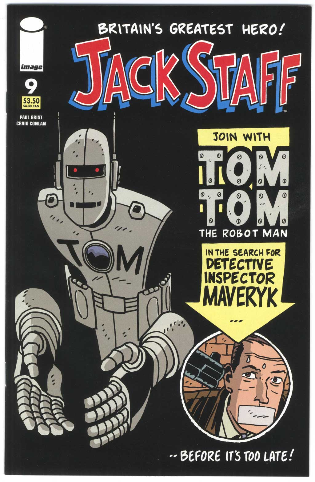
This week’s comic book cover to look at and examine is “Jack Staff” #3 by Paul Grist from September 2005. Here is a newer comic for a change. Yep, eight years old counts as newer around here. As you can see from my list of comics that I bought this week I buy a bunch of new ones every week but often the covers aren’t that interesting. I think less thought and effort goes into comic book covers these days because they’re less important to sales than they once were. But not always.
Paul Grist does things a little differently than most comic book artists. This cover shows that sensibility. I like most of his covers but this one jumped out at me because of its use of black. The blacks in Tom Tom the Robot Man blend right in with the background in a very Ditko-esque way. It’s a striking image that goes along with Grist’s style of simple line cartooning. He’s one of the guys who can use just a few lines to create interesting shapes and characters. I don’t know how he does it.
Grist’s covers are also very self conscious. He presents the cover to us. It’s a nice concept. The layout and type are all about talking directly to the reader and trying to get them involved with the comic. We have a cool looking drawing of a robot, he’s given a name, and then a situation as we are shown another character put in peril. It’s like an old time circus poster where they show you what you’ll see at the circus if you go.
The colors are also simple but effective. The cover is dominated by black and grey but we get some full strength color on the logo to liven things up. Then things are toned down with a light yellow arrow behind the type. If they had gone with a full strength yellow it would probably have been too distracting. A touch of orange and brown rounds out the cover colors. There are decidedly fewer colors on this cover than are on most but they’re all well chosen.
This is a fine example of how an artist doesn’t have to do things like everybody else to make a good cover. After all he still has the three things that I say makes a good cover: good drawing, good design, and a good story. Though done in an unorthodox way Grist has got all three here.
Discussion ¬