Comics I Bought This Week: December 21, 2013

I’m back from the comic shop this week and I got ten new comics.
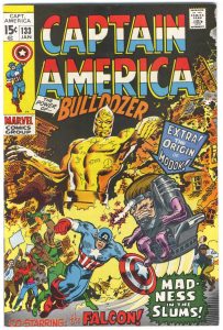
This week’s comic book cover to look at and examine is Captain America #133 by Marie Severin and Sal Buscema from January 1971. This cover was from before my time so I didn’t buy it off the stands. I picked it up from my local comic shop sometime in the mid 1990s when they had a sale. I picked up a bunch of other Captain Americas too to fill in my collection. I don’t think I’ve looked at this cover much over the years but today it caught my eye.
This is another 1970s Marvel cover where I like its busyness. The composition is complex and swirling. The star of the comic, Captain America, is one of the smaller figures on the cover and it looks like he’s tripping over his own two feet. This is the second comic in a row I’ve written about where the hero isn’t depicted so heroically. Maybe that’s because I like oddball stuff. I’m not positive. Either way it’s Bulldozer (who I don’t remember at all) who is the largest figure on the cover. Why is he twenty feet tall and gold? I don’t know. But I do like the writing etched into his skin. That’s kind of cool. Modok looks smaller here than usual but there is a lot of wonky stuff on this cover. It all adds to the chaos.
The pointless type is another thing that adds to the chaos. It’s crazy. Two pointer box/arrows with type in them, three characters names, and a title burst. That is a lot of words that tell us nothing. Do we need “Co-Starring the Falcon” right underneath a drawing of the Falcon? Did anyone buy this comic because of the origin of Modok blurb? Even with all that type this cover still works for me.
The color is a bit of a mess but not too bad. It’s mostly dominated by yellow and orange and that works well. And I like that they continued the yellow in the corner box. Down the bottom is where things get bland. Of course they had to stick with the colors of the character’s costumes but it all ends up being bland. Every color in the rainbow is down there adding to the cacophony.
I’ve always liked Marie Severin’s drawing. I don’t have a lot of stuff by her but I know she did quite a few covers back in the early 1970’s. I would even say that most of her covers are better drawn than this one but this one still jumped out at me. I like its weirdness and I like its sense of chaos.
Discussion ¬