As I was thinking of pieces to write about for this week I remembered a series of words and images I did a while ago. According to the dates on the computer files I have of them I made these back in July of 1997. Those look like the dates I finished them so I guess I was working on this series of drawing all through the first half of 1997. There are sixty four drawing in the series all together. They’re from my “Mail Art” series. I think I had only just heard of the concept of “Mail Art” back in those days. That’s basically when you make a piece of art and mail it to someone. I read about a lot of people who were into it and the marks that got on the piece of art in transit all become part of the art so they said. I kind of though it would be cool to mail pictures to friends.
In looking back at these images I’m remembering what paper they were drawn on. Marvel Comics scrap bristol. These were days I was working in the production bullpen at Marvel. One of the things comic book companies do is have special drawing paper printed up with blue line guides on them to give the artists to work on. This way the artists drew things the correct size. The paper is called bristol board and the paper company would print three sheets of 11×17 inch paper on one sheet of 22×28 inch paper. After the three sheets were cut apart that would leave a single sheet of 5×11 inch bristol left over. Those scraps got shipped to the Marvel offices with the 11×17 inch paper. Since there was no official use for the scrap paper and yet it was still good drawing paper everyone in the office would get some and make drawings on them. I must have used a thousand sheets of that scrap bristol over the years. Anyway that is the paper that I drew these pictures on. Two to a sheet.
The original drawings are small: about 3.5×4 inches. With the words added on they become about 5×4 inches. I have no idea why I chose this size. It’s an odd almost square size. If I were making them today I think I would make them 4×6 or some other standard size. 1997 Jared may have had an explanation but I don’t. These are also the early days of Photoshop for me. I had probably been working in it for about two years at this point and I don’t see too many novice coloring habits in them but I can see some.
I was also using my early Surrealist automatic drawing method to make these drawings. I would draw the box first which would define the boundaries of the composition, close my eyes, scribble on the paper with a pencil, and then open my eyes and see what I could find and draw in those scribbles. It’s a way of making images that would be hard to make with the conscious mind.
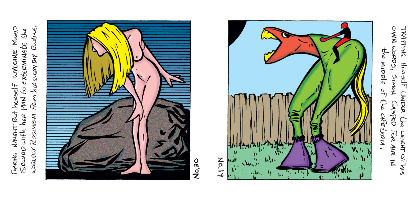
The first two I’m going to look at are Mail Art numbers 20 and 19. I must have scanned them in together since they were on the same sheet of paper and never separated them when I colored them. Once again I don’t know why I did this but why separate them now? Number 20 is a nude woman in front of a rock. Who doesn’t like a nude? She is the main interest in this drawing but the rock has some nice bold brush work in it to beef things up. There is some Photoshop “Add Noise” texture in the rock to give the piece a little more visual interest. Those parallel lines in the back are not computer generated but made with my Haff hatching machine. It’s like a little t-square arm that you press a lever on and the arm moves down that exact amount. So if you set it for three millimeters and press the lever the arm moves down exactly three millimeters. That makes it easy to make parallel line patterns. Number 19 is a man riding a monster steed. It’s kind of creepy looking. The background is one of my sky/fence/grass motifs and its boringness makes the main figures a little more strange. That thing’s teeth match the color of its tail. Weird.
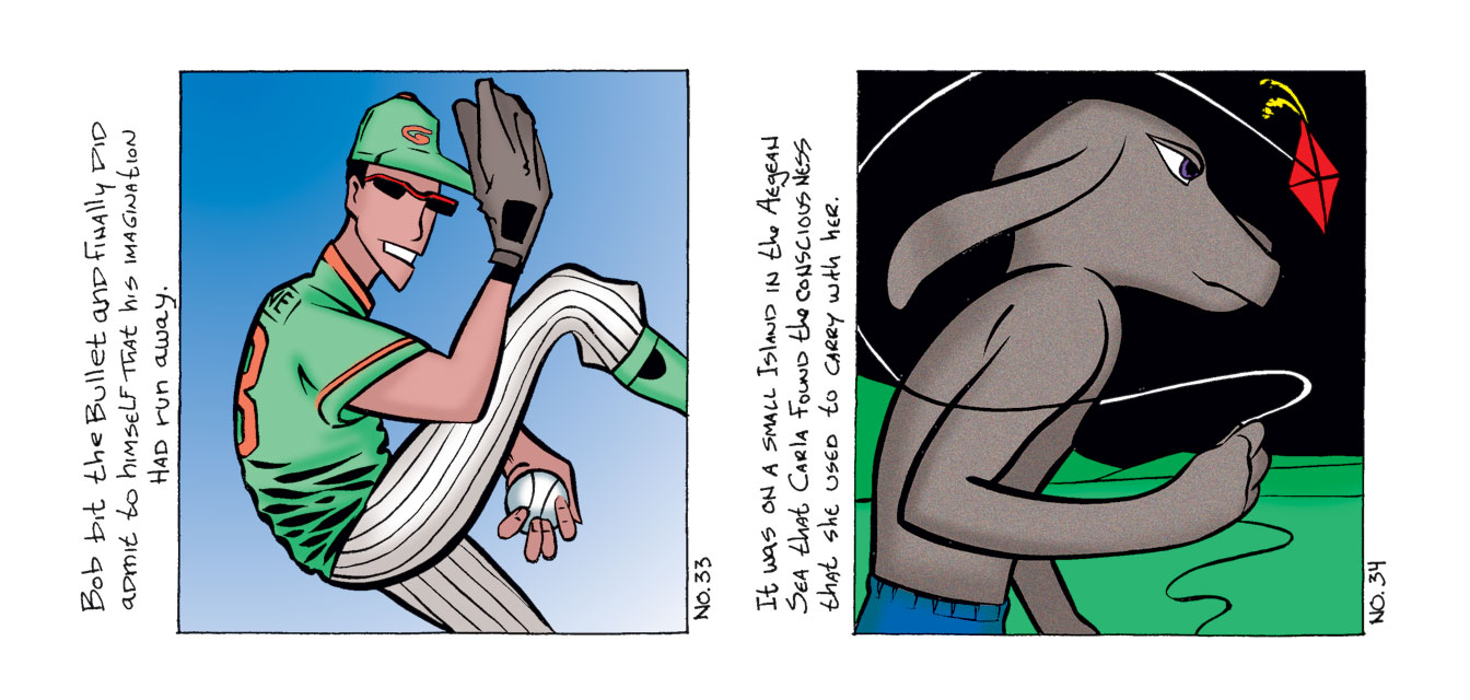
The second sheet of drawings holds numbers 33 and 34. Number 33 is a baseball player. I haven’t drawn many baseball players in my day but here is one. A pitcher pitching. It’s pretty straight forward except for the strange grip he has on the ball. That seems to be the hidden centerpiece of the drawing. Everything else looks fairly mundane to me except for its leaving me with the question, “What kind of weird pitch is he about to throw?”. The colors are light and basic with a little bit of airbrushing thrown in. It’s all sunny day calm except that grip on the ball. Number 34 is a dog flying a kite.For some reason that seems more normal to me than the pitcher. The drawing of the dog doesn’t have a ton of detail in it but the Add Noise texture makes up for that. The background is also bland but I like the black sky. All in all this one seems like a typical weird drawing of mine.
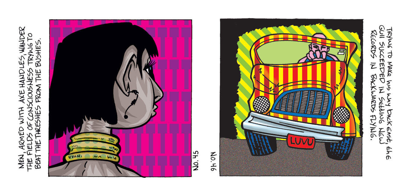
The final sheet we’ll look at contains numbers 45 and 46. This is a latter one and I can see my latter vector coloring style starting to emerge in number 45. A woman’s head with some kind of necklace around her neck. It’s colored not with any gradations but by creating shapes out of three different values of color. It looks fairly clumsily done to my eye because I went on to use this technique a lot more and got better at what shapes I created from my colors. Still it has its charms. And a pattern in the background. Number 46 continues this pattern theme as I put some stripes on the car and in the background. This kind of unites the two areas but not really. Leaving the windshield a solid color is the key to getting the right amour of separation. And it’s a man driving a funny car. That is not a car I could ever draw without the Surrealist method.
I haven’t looked at these in a while. My website has a section on them when, years later, I made them into individual pieces and typed out the words but I like these original versions best.
Discussion ¬