Comics I Bought This Week: April 5, 2014

I’m back from the comic shop this week and I got seven new comics.
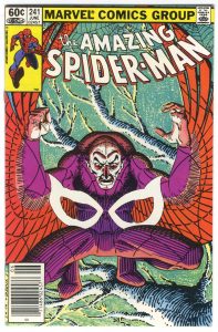
This week’s comic book cover to look at and examine is “The Amazing Spider-Man” number 241 by John Romita jr. and Terry Austin. It’s cover dated June 1983 and though I bought this one off the stands I don’t remember it at all. I probably only read it once and then put it on my shelf where it’s been all these years. I didn’t even remember this cover but it jumped out at me as I was looking for covers to write about.
This is an unusual cover because of the imagery and technique. It reminds me of the style Frank Miller was drawing in at the time. I’m guessing John Romita jr. and Terry Austin were looking at Miller’s stuff but who knows? It’s mostly drawn with single weight lines. There is plenty of cross hatching but no thick to thin tapering lines as is usual in comics. The tree branch is made up of lines suggesting the form of tree branches rather than delineating the branches. The background color is also odd in that it’s textured. It looks like some sort of charcoal or dark pencil was used on textured paper and then it was color held into that blue green color. Not something you see very often.
I image is unusual too. Especially for 1983 when the pin-up cover was less in vogue. Plus it’s not quite a pin-up cover. Sure the Vulture is squatting there perched in a tree but he’s also staring at some floating Spider-Man eyes? What are they? Why are they there? Are they literal or symbolic? I have no idea but the eyes add both a graphic and story element to the cover. It’s also odd that the eyes seem to be sinking into the Vulture’s legs. I kinda expect the eyes to be floating out in front of the Vulture but they’re not. They’re sinking into him. Weird.
The colors are even different for a Spidey comic. It’s mostly made up of tints and secondary colors. The primary color red of the Vulture’s wings is the main thrust of color and then we get the rest of his costume being a violet/magenta with some orange thrown in. You don’t see that color combo every day especially with a light green and light blue background. No wonder it stood out to me.
The Vulture is swallowing up the eyes, the Vultures wings are swelling up the viewer, and the tree is swallowing up the Vulture. I like it.
Discussion ¬