This week I found a new thing to do with unwanted old comics. Yes, there is such a thing as comics that no one wants. Comic shops are filled with them. Lately I’ve been trying to clear out some space in my closets and get rid of some comic books and trade paperback collections that I don’t want. They’re books that I’ve accumulated over the years rather than collected. Some of them I’ve read once and have never cared to read again and some I’ve never even read at all. They’re books that someone gave to me because they didn’t want to throw them out. I’ve been putting them up on eBay to see if anyone will buy them but even if they’re really cheap sometimes it’s still not cheap enough. That’s how is was with my early 1980’s issues of World’s Finest Comics.
I was a Marvel Comics kid in the late 1970s. DC Comics didn’t interest me very much. That changed in 1980 when Marv Wolfman and George Perez started doing a comic for DC called The New Teen Titans. It was a really good comic more in line with the stuff I liked over at Marvel. That got me to try out more DC books including these ones that no one wants anymore. World’s Finest was a comic that starred both Batman and Superman. Neither of these characters are among my favorites but the book was okay. When I first started buying it in the early 1980s it was a larger than normal comic book and instead of having one story in it had three or four. That got me to like the book. It may not have been great but it had variety. Three or four different creative teams to see each month. I thought that was pretty cool.
So I put a bunch of these World’s Finest issues on eBay and got no takers. Even in a bundle at a dollar an issue with a “Best Offer” button on them they sat there for two months. That was enough for me to give up on the idea of selling them. So I got another idea. I would turn them into art.
I’ve written about the self-bound Walking Dead sketch covers I’ve been doing lately (Here you go). I take a 25¢ Walking Dead #163, pull the staples, fold two ply Bristol board (with a logo printed on it) around the comic, put the staples back, and then draw on the new blank cover. This is what I had in mind for these old World’s Finest comics. After all they were as worthless as the 25¢ Walking Dead comics so who would miss them? And it’s not like they were high grade comics either. They were mid-grade at best. Besides I don’t think wrapping my art around them ruins them. It makes them better.
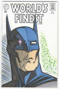
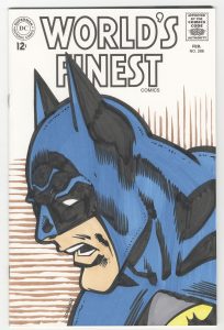
I needed a different concept for the covers other than the monsters I was drawing on the Walking Dead ones. I decided on taking a face from a panel inside the comic book and using that as a basis for a new cover drawing. It was a decision born out of practicality. Y’see I’m not a huge fan of drawing other people’s super hero characters. I find it a chore and so my drawings of such usually turn out mediocre. Instead of drawing from scratch what I did was go through the comic and pick out one face that I liked. Then I scanned in that face, digitally isolated the black line drawing (as much as I could), blew up the drawing, and printed the drawing and the logo I recreated onto a sheet of Bristol.
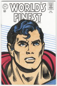
First of all I went with an older World’s Finest logo that was from long before this era. The actual logo, or rather logos, on these comics were a new and smaller World’s Finest plus the Batman and Superman logos. That was a little too cluttered for me. I recreated the 1960s logo instead and printed that out in black and white along with the rest of the 1960s cover trade dress. I like the look of it.
I did no redrawing of the faces. After blowing them up really large they got fuzzy and distorted a bit. Going from an inch tall in a printed comic to six or seven inches tall makes a difference. But all the basic drawing was still there as done by the original artists and all I was really doing was presenting it in a different way. I broke out my ink and brush and worked right over the original drawing on the Bristol. Most of the shapes remained the same but the lines became my own.
After working in ink I put the color in with my Comic markers. Since the inside color was simple I kept it that way. Just a few flat colors. No shading or dark to light techniques. The biggest challenge was getting the color in flat. When working with a marker it takes some doing to get flat color where the marker strokes aren’t obvious. I do this by filling in a broad are of color either with even strokes or by moving the marker brush in little circles. I also put down two coats of color. That makes the color more dense and fills in the areas more evenly.
I’ve made four of these World’s Finest covers so far. Issue numbers 287, 288, 292, and 297. None of these are actually the larger four story issues that I mentioned. They’re the regular size issues that came out just after the oversized $1 comic era. I started with these once because they’re the ones I like the least. But it also means that I’ll have to figure out a different size if I do the dollar issues. One step I forgot to mention is figuring out exactly what size to cut the Bristol paper so it can be wrapped around the comic properly. You’d think it would be easy but it takes a few tries to get right. I measure the comic, make the outline of a box that size in Photoshop, print out the box on scrap paper, cut out the box, and see if that gives me the exact size paper I need. Repeat that three times adjusting the digital box size each time until I get it right. There you go. That’s all there is to it.
Discussion ¬