I pulled out two five by seven inch marker drawings from my pile to write about this week. They are called “Edge of Empire” and “Missing Man Formation” (yes, more random names). In checking the dates on the back of them it turns out that I made both on the same day: May 13, 2013. I guess that’s why I thought they looked visually related to each other as I wanted to pick out a pair of drawings to examine. Both drawings have their origin in my books of ink drawings as I pulled the basic images from one of my inkbooks and worked them up into these drawings.
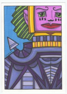
I’ll start with “Edge of Empire”. The first thing that strikes me is that it’s the more somber of the two drawings. Probably because the face is not smiling and the top of the eyes are curved downward in a sad-eyed way. The purple color that dominates this one also seems a bit somber. Overall this piece is a good example of my love of composition, faces, and geometric shapes. The face is the central part of this picture but it’s not in the center. It’s pushed up into a corner but is emphasized by being the second brightest color in the piece while being framed by the brightest color. The eye is drawn in by the orange and settles into the bright pink. And it’s shape reflects the shape of the paper.
A lot of my pictures use geometric forms rather than natural ones. That’s easily seen here with all the triangles that make up this person’s shirt There are also plenty of little rectangles in there. The shirt could even be referred to as armor. It seems to me to be influenced by my love of ancient art and looks vaguely like a cross between some sort of ancient Japanese and Mayan outfit. The triangular spike on the shoulder is interesting in that it’s the element that separates the foreground from the background yet it doesn’t call attention to itself like the face does. That’s because the color is the same as the shirt and it’s a triangle that sits in a triangular space so it settles down. It’s important but fairly silent.
The white highlights in this drawing go a remarkably long way in defining the space in this piece. They take the flat geometry of the piece and bend them towards us a little bit. The small rectangles gain a third dimension and pop out of the the deep purple gaps that separate them. The collar under his chin seems to be made of some sort of precious stone rather than just flat rectangles. I often use white highlights that I draw in with a white charcoal pencil but they’re rarely as important as they seem to be here. Since this piece has a lot of geometric flatness in it that small amount of dimension goes a long way.
Overall I’m happy with this drawing. It says something to me. I like its limited color palette, its blue sky, the framed face, and the Chiclet-like space of the costume. They all come together to make me believe this piece is taking place for real somewhere out in the world. Or some world.

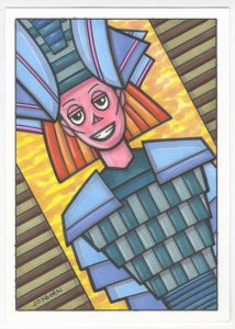
The next piece, “Missing Man Formation”, is much more peppy. It has an odd smiling man. Once again I’ll point out that a lot of my figures are androgynous. I think of both of these drawings as pictures of men but they could just as easily be women. Especially the first one. So if you think they’re women go right ahead with that. This one looks even more Japanese than the last one as he seems to be wearing old time Japanese armor. Sure the color is wrong and the rectangles don’t overlap in a real way but the gesture it there. Plus I think there is an ancient Egyptian look to the headdress. I really have been influenced by the art of long ago people.
One of the interesting parts of this drawing is that the brightest color in the piece is the background. The orange and yellow sky is the whitest white and stands up in the drawing. It almost makes the piece look like a backlit photograph. It’s a strange use of color and something I don’t usually do. It takes the idea of a foreground standing out and a background receding and flips it on its head. But it doesn’t go too far because the neutral brown striped walls on the sides help balance things out. Without them there the background would be too strong.
The coloring is also odd because it flips the cool colors recede and warm colors come forward idea on its head too. The whole outfit, from shirt to headdress, is made up of cool colors while the background is warm. Even the hair, which is in the back of his head, is a warm color. Normally I wouldn’t even make hair and the rest of he figure complimentary colors since complimentary colors often clash with each other but here they separate from each other in a pleasing way. Somehow the pink of his face make the orange and blue play together nicely.
The composition in this one is yet another example of my use of asymmetrical symmetry. It appears to be somewhat symmetrical but isn’t. The diagonal horizon line takes care of that. If this picture weren’t on a slant it would actually be symmetrical but instead we have the appearance with a bit of interest thrown in. I usually don’t go for diagonal horizon lines but it works here.
The armor has the same little highlights in it as the other drawing but I think they’re less important here. The geometry of the armor is more important than its three dimensionality. Its shapes are the basis for the order in the drawing. This drawing has a lot of order in it which contrasts with the blurred shapes of the sky.
It’s been a little while since I made one of these marker drawings. I made a bunch of them back in the spring or early summer but I’ve been working on my new “Organics” comic as of late. I’m going to work a few of them into my comic though. We see how it goes.

Discussion ¬