There were a couple of times this week where I couldn’t get anything done. It could have been the sinus headache or it could have been general artistic directionlessness but either way I had nothing going on. So I decided to dig into my pile of drawings that I have printed out in blue line to ink. Sometimes I feel like drawing and coming up with new things but I’m not in the mood to ink and therefore finish things. So I scan in the pencil drawing, print it out on bristol board, and put it on the pile for another day. Today was that other day.
Inking, for me, is mostly about reacting rather than acting. I’m trying to finish off a drawing with a definitive black line rather than the grey of a pencil. That grey can look a bit indecisive at times. You can always go back and fix it later but with ink you’d better get it correct now. But since ninety percent of the drawing is already done it’s easier to get it correct. I find I can ink my own work with less mindfulness than drawing it. I can pick up a brush or pen and just go when I got nothing going on. So that’s what I did.
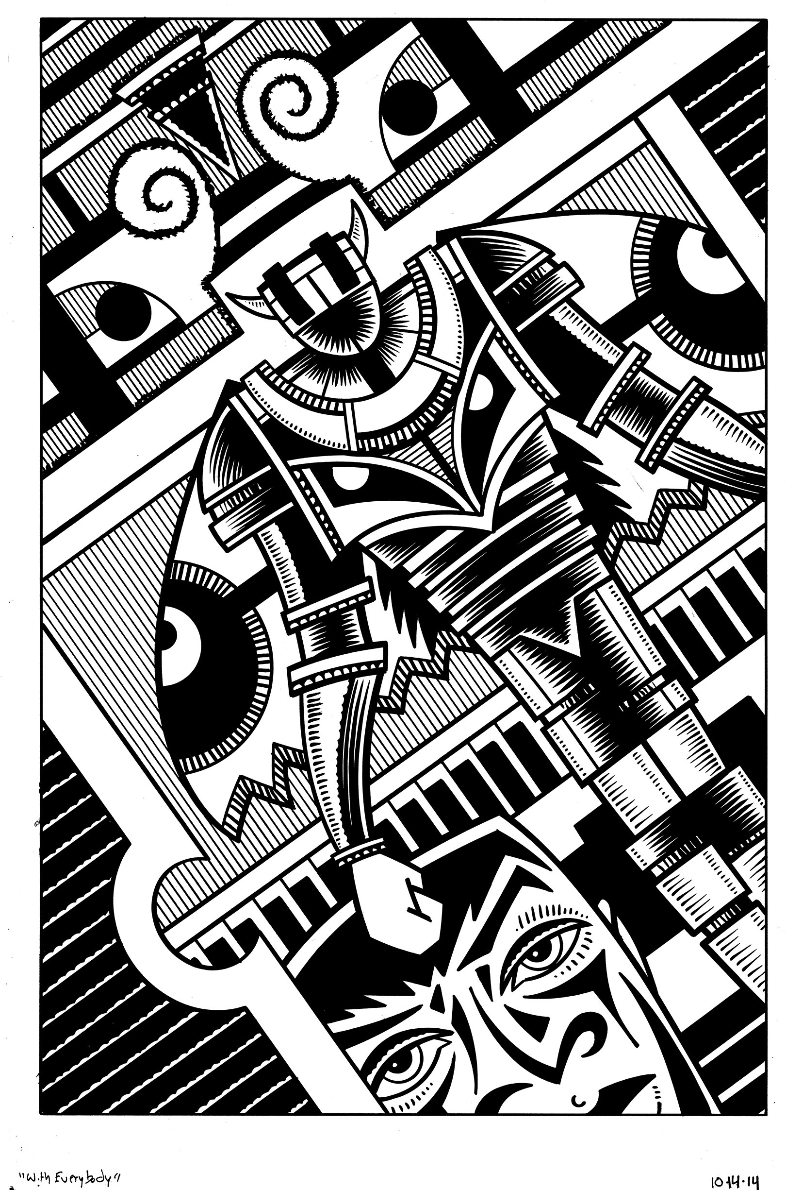
The first piece that I inked is called “With Everybody”. This is a case of the inking taking me longer than I expected because I didn’t have as much of it worked out as I usually do. Instead of the ninety percent that I mentioned above I probably had about seventy five percent worked out. All of the basic shapes were there but I still had to figure out what I was going to do with them, And none of the blacks, greys, or positive vs negative shapes were worked out.
The first thing I notice about this piece is the guy ended up looking like some sort of moth man. He didn’t start out that way since I didn’t have all the black spots worked out but he sure ended up looking like a moth. He has wings that are spotted and even extra eyes on his chest.
I started this drawing, much like I’ve started many drawings in recent years, with a felt tip pen that’s been refilled with india ink. The regular ink in a felt tip pen isn’t really suitable for artwork but if you refill the sponge in the body of the pen with tech pen ink you can get a nice black line out of it. You have to be careful though because it makes a mess out of French curves and straight edges. You have to clean them a few times a day. Make that a half dozen. At least.
After I make the mechanical lines with the pen and straight edges/curves I pull out my brush and bottle of India ink. That’s where those thick to thin lines across the center of the body come from. I also thicken up some of the outlines that I made with the pen. I don’t always want the perfectly even line of a pen. Often the less even brush line is livelier. And if I mix the two I can get the best of both worlds.
I also had to figure out where to put the small parallel lines that make up the greys of this piece. They’re not really grey, of course, but create the illusion of a mid tone. None of that was indicated in the original drawing so I had to figure it out here. That took a while since the space is all about flatness and it’s often easier to organize the illusion of space because that follows rules. Flatness has rules that are different and not always easy to see. I think I figured it out here but it took a while. I’m not sure exactly but I’d say the ink work on this drawing took five to six hours.
The next drawing that I did this week probably took half that time. It’s called “Race Away” and is mainly the marked up face of a person. I think of him as a male figure but he really is a bit androgynous. Most of the black and white parts were figured out in the drawing except for on his shoulders and chest. And they were fairly easy to figure out.
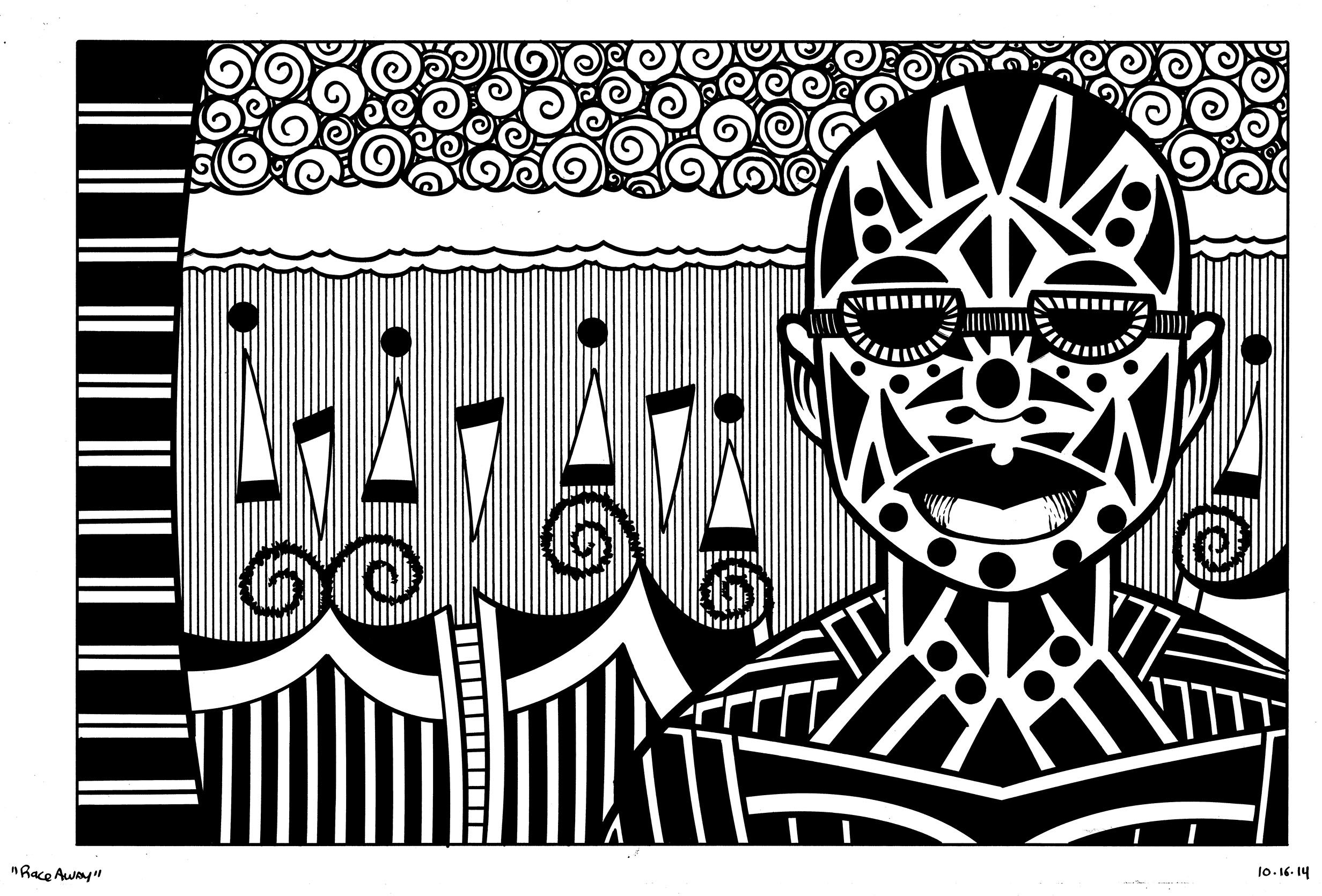
This one is made up of two of my favorite things. Faces with designs on them and spirals. I’m forever putting triangles on faces and often filling the sky with spirals. Sometimes I make spirals out of hair two but I got baldness going on in this one. I’m not sure why but the whimsical triangles and circles in the background remind me of music or musical notes. Maybe it’s a “Follow the bouncing ball” thing. I’m not sure but I can almost hear a song when I look at them. That’s unusual for my drawings. I don’t think they often suggest sound.
The space in this drawing was a lot easier to figure out than the first one because it’s mostly “Real” space. It’s not real in any exact location sort of way but there is a sky and some ground with maybe a fence on it. Could be some waves and water behind him but it seems like he’s in a real space. The Mothman could be anywhere. His space is more of a story space than a real one. I have no idea where he is. And where is that giant face coming from? Who knows?
In both of these drawings I not only mixed the line of a brush with the line of a pen and edge but I also mixed in some freehand pen work. In the glasses of the man and the spots of the Mothman’s wings I made some short pen marks. They don’t have the perfect spacing of the mechanical background lines and so add to the natural flavor of the piece. Really, too many “Perfect” lines to deaden a thing.
So there you have my week of not having it going on. I always find it a good idea to have something in reserve for when I just want to get zen with things.
Discussion ¬