I made two ink drawings this week but they are different from my usual ink drawings. I made a few of them like this last year but not many over all. My usual ink drawings come in two categories. This first is a finished ink drawing that is done over finished pencils. I go through one, two, or even three stages of pencil drawing before I hit the ink. That’s my most refined way of making a drawing in ink. The second way is my spontaneous ink drawing. I grab a pen and start drawing with no pencil underdrawing at all. That method can make for some interesting images but also many awkward ones. That’s the price of not being able to erase but it also frees the mind from worrying about making the drawing perfect.
This new method on ink drawing starts like my pencil drawing in that I look through my sketch book of small spontaneous ink drawings. But instead of finding a drawing that I want to use, printing it out in blue line, and then making a pencil drawing over the blue line I follow all those steps but instead of pencil I use a brush and ink. I go right from the crude single weight spontaneous ink line to the dark and polished brush ink line. So far I’ve found that a very interesting but weird jump. That might be because when I’ve finished the drawing there is a lot of blue line showing through.
Almost all of the time when I’m inking over blue line I obliterate the blue ink. You can’t see the blue line because it was a thin line to begin with and I’ve drawn over it with black ink. You’d have to be really looking hard for it to find any trace of the blue line. With this new method of ink drawing there is lots of blue line showing through at the end. Since the drawing is so crude to begin with I’m not following it as closely as I would a refined pencil drawing. It’s more of a rough guide where I follow certain parts and go off the trail on many others. Plus I’m blowing up a small 2×3 inch drawing onto a 6×9 inch piece of paper so the original line gets very big. Sometimes bigger than the final ink line I use. Overall the final effect is of a duotone drawing done in both blue and black. It gives the drawing a different sort of liveliness.
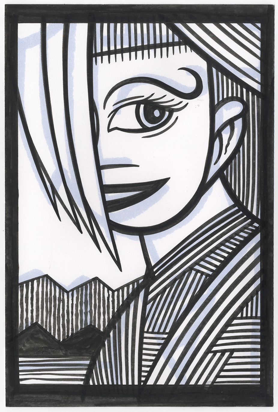
The two drawings I did are called “Hard Hand” (the face) and “Big Thing” (the tentacle monster). I drew them on bristol board with my new white sable brush and some Black Cat India ink. The face is a very familiar subject matter to me and this one seems fairly typical of me. First off I’m unsure if it’s a mask or a true face. I often am until I color a drawing. With such a big eye and mouth I often lean to “mask” and probably would if I were to color this drawing but I could go either way. I also like to go “Mask” because that gives me the freedom to make the face any color I want. I’m not limited to human skin tones. I’s make the ear and neck a human skin tone though. That’s how I often do things.
Another thing I do with faces is to have the hair fall down over the face. This time with knife edge hair. That’s what I call this hair made up of pointed curves. It’s not really an illustrative hair technique but is more of a use of shape. It doesn’t look anything like real hair but the shape works for the drawing.
The features of the face also work for the drawing but not in real three dimensional space. The eye is way too big for there to be a matching eye on the other side of the face but it works in the two dimensional space between the hair and the edge of the head well. The mouth is also too big to curve around to the other side but since it’s covered by hair anyway it doesn’t matter. It’s even too low on the chin for reality despite me moving it up higher than the original ink drawing but it works in two dimensions. Most of my drawing is getting things to work in two dimensions rather than three.
Most of the rest of the drawings seems to be all about patterns. Lines made in different directions butting with one and another buy not crossing. I’d call it hatching but the lines are a little big to be called that. Overall the lines give a bit of an op art effect. I’m happy with it for an a not quite spontaneous ink drawing.
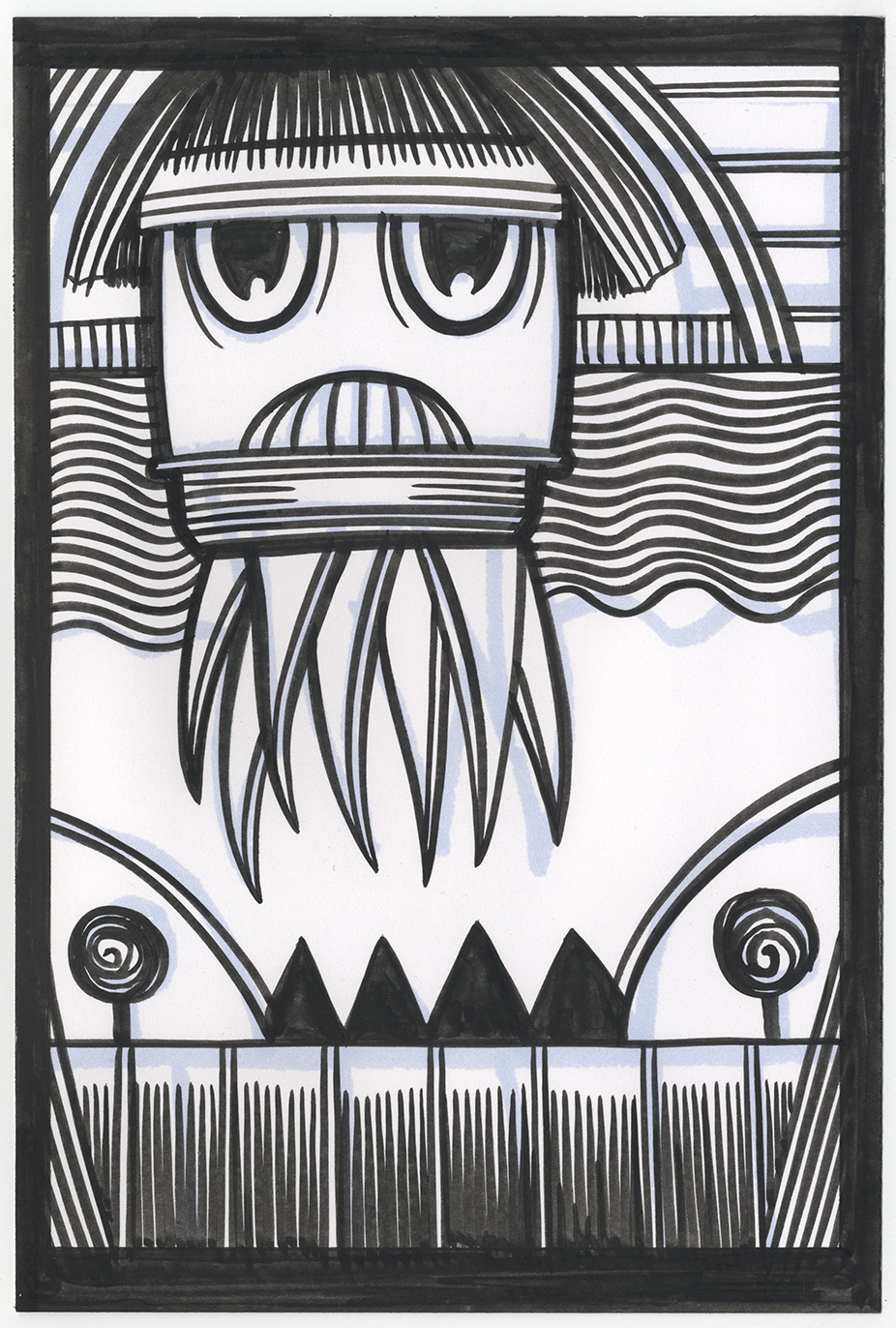
The second drawing turned out to be one of my tentacle monsters (a group of color drawings I did) but I didn’t really notice at first that it was going to. I don’t know how I didn’t notice it except that I was concentrating on how to make the top part of the creature work so I wasn’t paying as much attention to the tentacle part. The top part of the drawing changed the most as it went from an arc behind the creature to the top of the creature’s head. That visually moved the background at the top forward in space and made things more complicated for me to figure out. As a result the patterns in this drawing are more chaotic than the previous one. I even needed a thick holding line around the barrel of the monster in order to ground him a bit.
This tentacle monster has hair and even bangs. I don’t think any of the others have that. He almost looks like a tentacle cartoon Beatle. Kind of weird. Wavy lines, big eyes, odd mouth, two spiral lollipops, and pointy teeth mountains make this drawing a strange sight. Plus the tentacle monster is bumping his head on the top of the drawing. Overall I find this a satisfyingly odd and mysterious drawing. One I’m not even sure where it’s comic from.
I think that is one of the main points of these new type of ink drawings. To find something that I’m not sure where it’s comic from. Sometimes the old ways bring sure things and new ways are needed for taking chances.
Discussion ¬