Once again I’ve been digging through some old paintings to try and find some dates. These are my eight inch by ten inch acrylic paintings on canvas. I started making these ones because I wanted to make more paintings. I wanted to create more images. Sure there is something to be said for painting large. Most famous paintings are measure in feet and not inches but my paintings are not famous and I was running out of room to put my large ones. Plus it takes a couple of weeks for me to finish a three foot by four foot oil painting and I wanted to be able create more images/paintings in that same amount of time. Of course they’d have to be smaller.
The earliest date I could find in my quick glance at my eight by ten acrylics is March 2005. There a few paintings that I have lying around that I think were the first ones I did but they have no dates on them. That’s because they were awful failures that I abandoned and didn’t bother putting a date on. Yeah, things didn’t start out so smoothly.

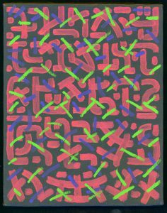
In my first example the image is no image. Well, not quite, the image is paint and brush strokes. I had been painting in oils and gouache for a long time by this point but I wasn’t sure what to do with acrylic paint. In general it dries faster and doesn’t hold a brush stroke the same way oil paint does. The failure of my first few acrylic paintings lead me to concentrate on just using the paint. For years I had already been using a fake writing style for some of my paintings and drawings. That’s when I make something that looks like ancient writing of some sort but isn’t actual writing. That’s what I started with here. The red brush strokes I did in a writing style and then layered the blue and the green on top of them. I liked the way this one came out and it helped me get used to acrylic paint. I have a few more like this one so it took a while for me to learn how to use acrylic paint.

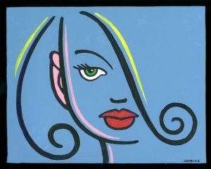
With this second painting we have an example of the next stage in my acrylic painting. The image is of a face but it is done with minimal brush stokes and colors. I was stripping it all down to the basics before I built things up. I would often start these paintings by covering the canvas in one solid color. This was the opposite of the way I used oil paints. With oil paints I would first paint the black line on the canvas and then build up the color and push it towards the black line. The black line would end up looking like it was carved into the paint because the color was thicker and raised higher off the canvas. With these acrylics the black line would go on top of the background color. The black line is and looks like it’s on top of the blue. This one is very much about the image rather than the paint. Usually I have more of a balance between the two but this was early on.

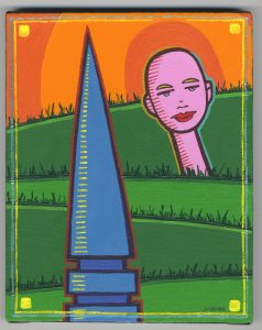
The third painting is one from a few years later. October 25, 2009 to be exact. It has more of a balance between the image and the paint. It doesn’t even have a black line. Rather it has a brown line, a green line, a blue line, and even a red outline. Obviously I had figured out how to use acrylic paint by this time and had a much wider vocabulary of marks, paint strokes and techniques to use. I got the dry brush double frame strokes, the yellow tick marks, yellow square stokes, the transparent green grass, and the solid orange butting against orange shapes in the background. Overall this is one of my favorite small paintings that I’ve made. I’m a fan of simple and I think I’ve achieved that here. A lot of these small paintings can get really complex on me. Lots of different brush strokes and colors. I like that too but often it is the starker and more straight forward images that stay with me.

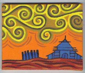
For my final painting I’m talking about this week I have one of my rare landscapes. Don’t ask me why but I’m not much of a landscape guy. I love the human form and I especially love faces so maybe there is not enough room for landscapes. But here is one that I like. First off I like spirals. I draw them all the time in all sorts of ways. Often I annoy myself by drawing them because spirals are not always easy to execute. Especially in ink with a brush as I often have to make them. In pencil, spirals are easy because I’m not looking for perfection. Then when I get to an inking stage I get mad at myself for drawing a huge complex spiral that I now have to make perfect. Or at least close. The spirals were a lot easier to make here, in paint, because I wasn’t looking for perfection. I want the imperfection of brush strokes running into one and other. It reveals the hand of the artist and creates a sense of time. You can see the strokes being made.
The brush strokes of the house are different than my usual ones. The blue strokes are dominating and defining the black strokes. Normally I’d use the black stokes as an outline to define the blue parts the house is made up of but here it’s different. I swapped the normal positive and negative shapes. That’s something I don’t find easy to do but I pulled it off here. There is a lot of swapping of positive and negative space going on in this painting. Maybe that’s what makes it work for me.
So there you have it. I guess you could say it takes me a day to do a single eight by ten inch acrylic on canvas painting but that doesn’t count the time it takes to come up with the image. That’s kind of immeasurable since I’m always working on drawings to use for prints and painting. Only a small fraction of them eventually get used. Plus I normally work on four of these small painting at a time. That speeds things up as I don’t have to wait for the paint to dry. I just pick up another painting and keep going.
Discussion ¬