I’ve been working on my “The Painted Lady” faux comic book cover series for a while now. I even put them in a Blurb print-on-demand book. I made them all the same way too. I find a photo to use as reference (I wish I could shoot my own photo reference but alas…), make my basic drawing from the photo, decorate the body and face (with black shapes) of the figure I just drew, figure out a pattern for the background, and then ink the whole thing on a piece of 11×17 inch Bristol board. After that it took me a while to figure out how to color them. I ended up coloring them digitally and I thought they came out fine.
I did fifteen of those and then I was done. I had it with those faux covers. They take a lot of meticulous energy. I was fine with them and went on to other things. I moved onto doing a lot of another of my faux comic book series “Dreams of Things.” Those are done almost the same way except without the photo reference and after the inking I color them right over the black ink on the Bristol rather than digitally. I color them with my Copic markers and I enjoy the way they come out. I’ve started and stopped numerous times on that series but I’ve drawn a lot of them. Somewhere around thirty five of them at last count.
During that long run of “Dreams of Things” I went back to “The Painted Lady” for a brief time. Except this time I did them a little differently. Instead of using photo reference I drew the women out of my head. I use a totally different drawing style when I do that as I exaggerate and distort things. Eyes get bigger, backs arc a little bit more, necks elongate, and some impossible anatomical things happen. That’s what I’m looking for. If I wanted things to look more “Real” than I’d use photo reference. So I did a few of these. Then the question became if I wanted to color them.
I haven’t been fond of coloring things digitally lately. Digital is fine if I have an end product in mind such as that Blurb book that I made or any of the cartoons that appear on this blog but if I’m making art for art’s sake I want a finished piece that’s tangible rather than one made out of pixels. After finished two or three new “The Painted Lady” pieces I decided that I wanted to color one with markers as I have been doing with my “Dreams of Things” covers. Of course then the ladies sat there for a few weeks.
The biggest problem I had in coloring my “The Painted Lady” pieces was that they worked very well in black and white. I designed them to be black and white Op Art and all the crazy black and white patterns fit with each other snuggly. Inserting color into them proved to be a bit of a task since the color couldn’t interfere with the patterns. The wrong colors could mess up the shapes and the wrong technique could mess up the space. It took me a while to come up with the digital color. I kept the bodies simple and added a little texture while making the background pattern even more complicated. Could I do the same thing in marker?
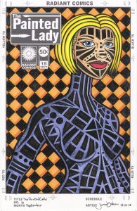
The odd thing that happened next was that I wanted to draw and ink a whole new piece. Despite the fact that I had recently finished a couple of “The Painted Lady” drawings I didn’t want to uses any of them for this new technique. Somehow in my mind those three pieces were already done and if I was to color them in marker and not like the way it turned out I would be ruining a drawing that was already finished. If I was to make a whole new drawing and ink it up to the stage the other drawings were already at and then try the new technique on it and fail I wouldn’t be ruining anything. Despite the new drawing being at the exact stage of finish as the ones already done I didn’t consider it done since I was going to color it with markers. How is that for a weird quirk?
In the end I decided to keep the marker work simple. But then it began to enter the territory of too simple. I did the face and hair first since and kept them close to reality. The hair is yellow, the face is pink, and the lips are red. Nothing too crazy. It might be a little too boring too. I didn’t add any texture or technique to the marker at this point. It was just the pure color. My “Dreams of Things” covers are filled with technique and texture so I really had to restrain myself with this piece. After the face I chose a purple for the body. I find purple to be the trickiest color to use. It can easily be too dark, too red, or too blue. I’m not even sure why but more seems to go wrong with it. It was pretty stable here though.
After I had the whole body colored I knew I would have to add some texture and shading to it. It wasn’t working as is. As a criticism for the drawing I especially didn’t like how her back arm blended with her waist. I tried to use the black pattern to differentiate the two but it still didn’t thrill me. I chose only one darker color for each color already in the piece and stumbled on some shadows to add a little bit of roundness and texture. I erred on the side of caution and didn’t make things too dark. I thought it came out okay.
The last thing I did was put the orange in the background. I couldn’t make the background nearly as complicated with color as I did with the digital ones so I could only add a little bit more color. I went with a darker stroke of orange at the bottom of the boxes and a stoke of yellow on the side of the boxes. The yellow barely changes the orange underneath it but I stopped sweating it. Since the other color pairs were only that, pairs, I decided the two oranges didn’t need anything else. I was done.
This is a piece I’m still a little undecided on. I like it but I don’t like it without reservations. At least I didn’t ruin one of my finished pieces.
Discussion ¬