Sometimes I struggle with technique when it comes to coloring or painting on the computer. There are so many different ways to do a digital task that finding the right way for me isn’t always easy. Plus computers can be incredibly precise and the urge to control things right down to the tiniest lever can eat up time. Add the possibility of endless re-dos and I can easily find myself in a quagmire when it comes to digital coloring.The computer is a versatile tool but sometimes the choices can be too many. Especially since, as a comic book reader, I see so many great and varied examples of good work being done on the computer. That can’t help but influence my thinking and I want to try them all. And then there is the DaVinci effect.
The DaVinci effect is what I call the desire in almost every artist to draw like DaVinci. He’s the ideal in our heads because he’s society’s ideal of drawing as art. Basically if, when you’re a child, you can draw a picture of someone (or something) and it looks like that someone (or something) you’ll get tons of praise and encouragement. Every artist wants encouragement so, consciously or subconsciously, we want to draw like DaVinci. I don’t even want to draw like DaVinci (not that I have the talent or temperament to) but still I occasionally feel the DaVinci effect. Especially when I’m trying to figure out the right technique to digitally color in.
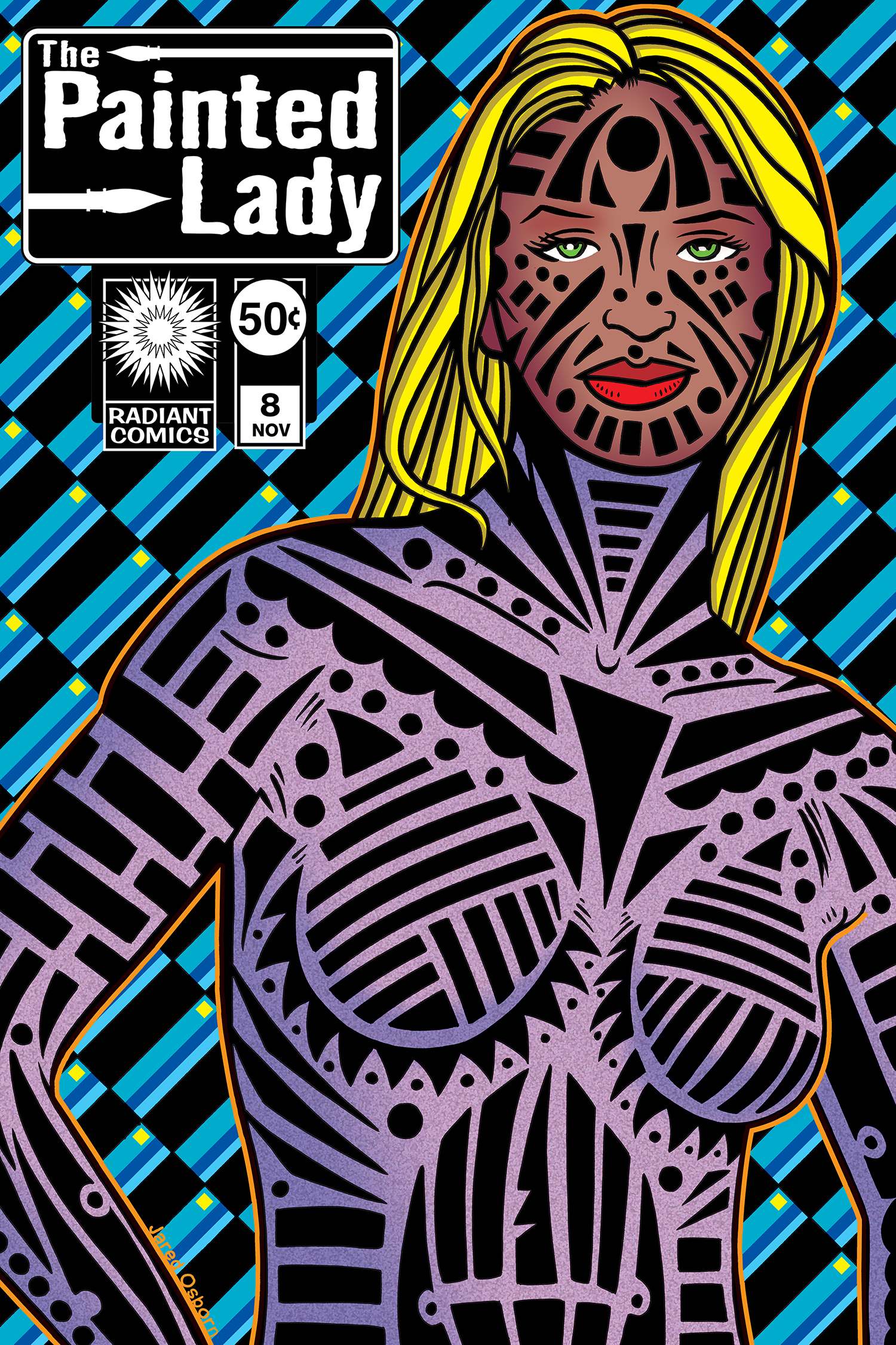
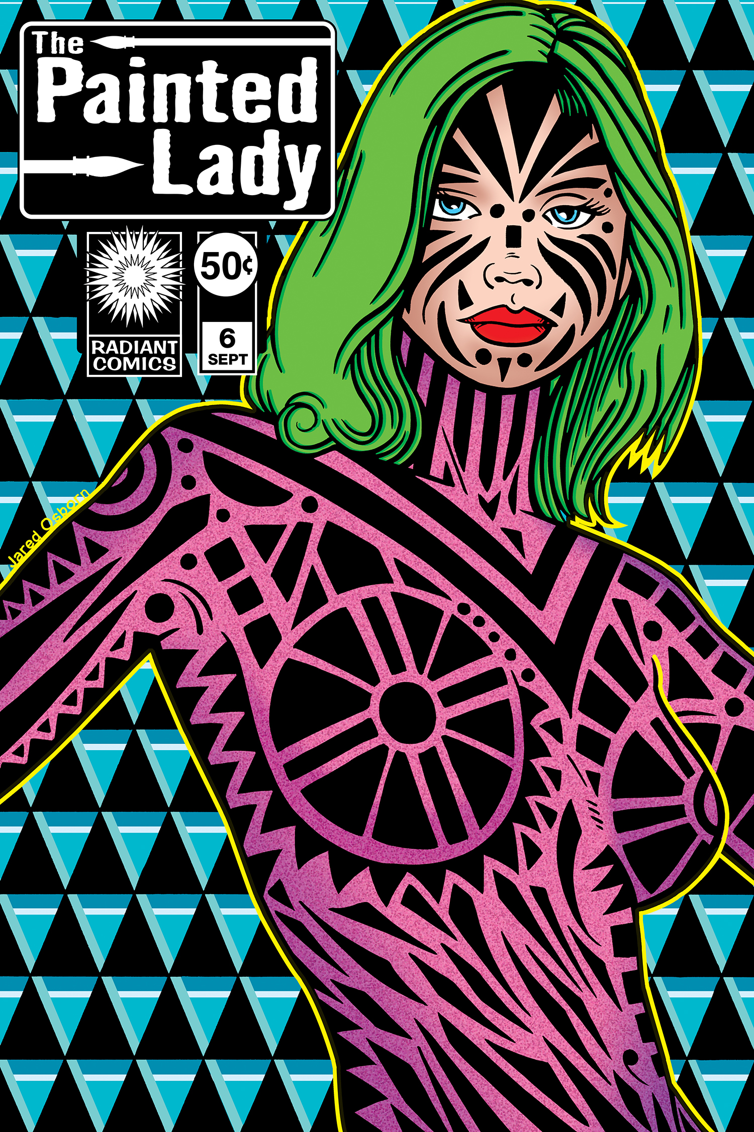
This is why I had such a hard time figuring out how I wanted to color my “The Painted Lady” faux comic book covers. I drew thirteen of them before I finally figured it out. I almost had it figured out after the first four but not quite. I tried coloring one of the first four a few months ago and got most of it done but then when I tried to color some of the other three I failed. I couldn’t get anything I liked out of them. So I went back to drawing more of them in black and white until I had thirteen done. Then I decided I had better figure out the color before I went any further.
One of the problems I find with computer coloring is just how long it takes. It seems like a computer should speed things up and often it does but sometimes the level of complexity that can be reached with a computer slows things down. It encourages complexity when it might not be called for. The pull of the DaVinci effect is real strong on a computer since a computer really helps with photographic realism. You can reference and digitally enhance images until the cows come home.
The complexity question I had was amplified by the fact that my “The Painted Lady” covers were already visually complex. I have a lot of shapes in them and tons if interplay between positive and negative space. There is a whole op-art thing going on in them and op-art doesn’t usually lend itself to complex rendering with light and shadow. Yet somehow that’s what I had in mind to do. And I had a hard time getting it out of my mind.

The first thing I had to decide was if these women were naked or not. They’re basically decorated bodies and the black and white drawing gives no indication if the decorations are on their skin or on something else. I decided the marks were on some kind of clothing because that would give me more options for color. Plus it would make them too alien if I colored them from head to to blue. I much preferred to keep the face a human skin color and use whatever bright color I wanted for the body. That was the first key to getting things done.
The second key was using just a little bit of shading. Usually when I shade I use a highlight, a shadow, a mid-tone, and a few other indications of light and shade. The base three layers plus some icing on the cake. For this one I decided to go with just some shadows. And shadows as a blunt instrument at that. I made a large and not very precise selection and used the gradient tool to create some very basic shadows. I didn’t even bother with highlights. All the black graphics flattened things anyway so that too much light to dark modeling would muddy things up anyway. I had to stay away from it even if the DaVinci effect pushed me in that direction.
The third key was making the background pattern even more complex. I kept the relative visual simplicity of the figure intact by making the background even busier. I generally added another two pattern shapes and color to the background. I like how that made things busier but not too busy.
Another key involving the foreground and background relationship was that I added a color outline around the figure. I’m usually against outlining or haloing a figure and it and I poo-poo it when I see it done but that’s when the figure is in a more natural 3D space. In a design-y op art space it’s okay to outline things as the outline is just another bit of color in a graphic space that’s not meant to reflect any kind of normal space. So I went with it here and it works well in slightly lifting the figure forward yet still keeping it relatively flat.
I did most of that stuff in the first cover that I colored but I still wasn’t happy with it. It was the modeling that bothered me. I liked it but didn’t love it. The two color modeling wasn’t enough to be interesting but adding anymore didn’t work either. It was finally when I decided to add some texture over the modeling that things came together for me. And I didn’t add that texture until my more recent attempt at coloring a cover. It’s a simple texture too. I dropped a color in and then used two filters: Add Noise and Pixelate. I did that on its own layer and turned the layer opacity down to about 25 percent. That gave me just the amount of texture I was looking for. Such a simple procedure but it took me a while to figure it out. That’s how it goes though.
In the end I was able to color a half dozen or so of my “The Painted Lady” covers. It takes a while to do them but it took an even longer while to figure out how to do them.˙
Discussion ¬