It’s been a quiet week for me art-wise. I did manage to get four “On the Rough” drawings done though. Numbers eighty five through eighty eight. These are the spontaneous brush and ink drawing that I make on really rough watercolor paper that doesn’t seem to be good for anything else. At least I can’t manage to draw anything else on it. But it takes a brush and ink real well if you’re looking for some rough around the edges line work.
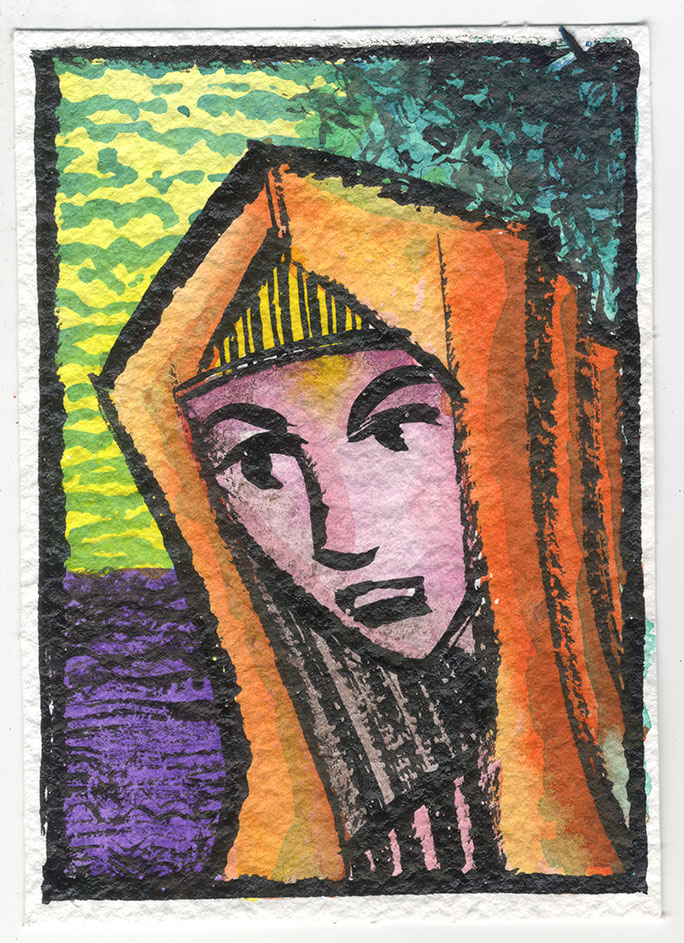
Number Eighty Five – This one looks a little Mary-mother-of-Jesus-ish to me. I guess it could be a man too but the face looks feminine to me. It’s the head piece that make it look biblical but I think Mary usually was painted with a blue head piece and not orange. I could be wrong about that since it’s just a memory. I like the orange head piece. It makes a bold color statement. It dominates most of the picture but is knocked back a little bit in spots with a blue wash to give it some depth. The yellow sky just kinda limply sits there but the violet ground (or is it water?) holds its own and demands a bit of attention. I find the green tree sneaks up on me. At first I don’t notice it but then in draws my eye in. I think the fact that the woman is looking away from us makes this painting a little pensive. She seems to be thinking. I’m not sure if I like her yellow bangs or pink shirt. These are spontaneous paintings so everything is not going to work out every time so I’m okay with the things I don’t like. The orange is nice though.

Number Eighty Six – Here we have a woman looking into the distance as she raises her hand. That hand is problematic. It’s barely a hand. Like I said, this paper is rough and the brush I use on it is in rough shape so it’s often tough to make something as delicate as a inch tall hand. But that’s how it ended up so I made the best of it. It was even more awkward before I turned it into a silhouette. I like the woman’s face. It has a happy quality to it. And who doesn’t like crazy orange hair? I like the rough lines of the hair because they echo the hand a bit and make the hand seem a little more normal. The purple sky makes a nice backdrop for the orange hair as it fades into the darkness that is the ground. The rectangular collar on the dress makes her neck even longer than it is. Long necks almost always work in art. The light green color of her dress almost acts as a neutral. It’s where your eye can rest. The orange, pink, and purple are very active but the green with a wash of red on one side is a calm presence. Overall I’m happy with the way this one came out.
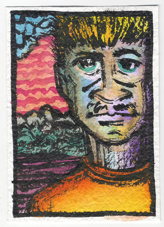
Number Eighty Seven – Here we go with a person who is looking right at us. This is more usual for me. And he is an unusual looking man. First off his skin tone has so many colors in it that it’s threatening to turn into mud. “Muddy” is usually how painters describe the brownish colors that result from too many pigments mixing together. I think I avoided that but just barely. In his face we have blue, violet, yellow, and orange. Not to mention his green eyes. That’s an unusual color combination and I’m not saying that it works but I do think I stopped short of making it not work. There is some damning with faint praise. I like the orange of his shirt best in this one. It glows. The yellow and orange of his hair is tamed by all the black brush strokes but the same colors in his shirt are free to be themselves. The whole background on this one is just there. It doesn’t do much for me. The black lines and shapes don’t say much and neither does the color. It’s not terrible just perfunctory. I’d say this painting is the weakest of the four.
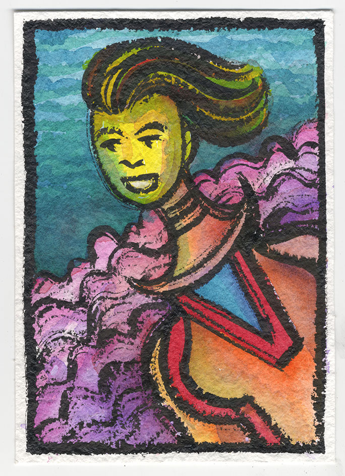
Number Eighty Eight – The final one for today is the most out there image. We get a diagonal composition and what may be a woman flying through the air. Or she could be on the ground. Those pink and purple clouds behind her might be land. I’m not sure. Her hair is also blowing in the wind as if the wind was in her face. That would seem to put her on the ground. I like not knowing. This woman also has a very long neck. So long, in fact, that it seems detached from her body. Her head is off center of her shoulders but that’s okay with me. It may not work anatomically but it works compositionally. I really like the blue/green of the sky next to the yellow of her face. Some of that blue/green is brought into her face as a wash both giving her face a little bit of dimension and harmonizing it with the background. That doesn’t always work but here it does. The brush strokes in her hair are about my favorite brush stokes in all of these four paintings. I think it was the only time I managed to get a smooth and pretty line. The hair looks flowing. It’s tough to do flowing on this paper. The oranges and reds of her top also harmonize well with the light purples and pinks of the fluffy clouds. I don’t think I use that color combination very often. The piece of blue in her collar is a good change of pace bit of cool color amongst all those warm oranges and reds. Overall this might be my favorite of the four.
So there you go. I didn’t get a whole lot of my own artwork done this week but there is a look at a few of the things I did manage to do. I hope you like them.
Discussion ¬