I’ve decided to go back in time again. I pulled out an old painting to look at and write about. It’s from December 5, 2000 which is before I named all my stuff and instead this one just has a number. It’s oil #18. I also didn’t put a date on the canvas but back in those days I used to keep a paper calendar in which I wrote down what I worked on each day. I did that from about 1999 until 2005 before I stopped. In 2008 I took up the habit again except now I keep a digital calendar. That makes things easier to find. Someday I’ll sit down and transfer all the info from the paper to the computer but for now I have to flip pages to find what I want.
I haven’t painted with oil paints in quite a while. I switched over to acrylic paints some time back just because I wanted to work a little faster as to explore and make more images. That’s when I started making my small 8×10 inch acrylic on canvas paintings. Until then this was about as small as I worked on canvas. Oil #18 is on a ten by eighteen inch canvas that I stretched myself. When I paint at an 8×10 inch size I buy pre-stretched canvas but this one is from the days when I stretched all my own canvas. This canvas is an odd size. It has a very vertical configuration. It’s not a size you can buy as a pre-stretched canvas and I wonder why I picked this size? It could just be that those were the size stretchers I had laying around. Sometimes people have given me stretcher bars that they don’t want and sometimes I bought my own, not for a specific project, but just to have around. That part of my decision making process is lost to time.
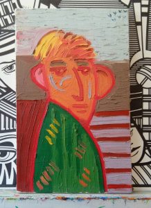
Oil #18 is different from all my other oil painting in that I did it quickly. I’m guessing that it’s one of the paintings that lead me to doing small acrylic paintings. Almost all of my oil paintings were well worked out. I did a lot of preliminary work on them to make sure the drawing and colors were right. Method is important to me and as a consequence I am a methodical worker. But with this painting I wanted to do something different. I wanted to make it spontaneous. As a result I don’t think it’s a very good painting. It’s funny though because it presages a lot of my future work. This was painted the same year that I started my first ink book where I draw spontaneously in ink trying to pull strange images out of my head. I’m on Inkbook 17 right now so I have a lot more experience with this type of drawing than I did back in 2000.
The first thing I notice when looking at this painting is that it’s drawn with a red line. I almost always used a black line back then so the red really makes a statement. It warms up the whole picture. The line is also very spontaneous. My usual line is well defined and worked until it’s exactly how I want it to be. The lines that define the person in this picture seem to be instant. It looks like they were the first line that came off my brush. There is a bit of shakiness to them and the edges are often blurred and not defined. Without the line being dark the shapes don’t seem as strong. The color all seems to be in the midrange with no darks and lights. Except that one bit of yellow.
Speaking of color, when painting like this an artist has to be really careful with color. If you mix together too much color on the canvas it makes everything brown. That’s an easy pit to fall into with spontaneous painting. I knew that when making this and therefor was bold and definitive with my color. I mixed two different greens in his shirt and blended his hair from orange to yellow. Those simple combinations won’t ever get muddy but they’re also not terribly interesting. I like the hair with all its brushstrokes but the shirt does nothing for me. You can see that I put a few strokes of color in the shirt but none of those strokes are strong and the orange is even just starting to get muddy. Working wet-on-wet isn’t easy.
Another problem that I have with this painting is the ill-defined geometry. This background shapes aren’t working. I want to straighten them and line them up more distinctly. The way the blue sky meets the brown could work if only the shapes were more clear. The dark red and light purple stripes on the right side are also a bit of a mess. They don’t do much for me. I don’t think the color combo works and the brush strokes let me down.
The part of this painting I like the best is the face. It’s not great and I don’t like the wishy-washy ears but the stroke of the nose works. That and those three grey strokes in the face are my favorites. I’m not positive what those three grey strokes are but they look like they’re supposed to be there. The eyes are okay but the eyebrows start to get a little muddy. The hair is nice. It has a lot of good strokes in it.
Overall this was an odd painting to look at because it’s not a good one. But it is a signaler of a new direction of my work so that makes it more interesting. I can see a lot of my future work in it. I have to say the strange thing about it for me are those “V” birds up in the top right corner. What are they doing there? I’m sure I put those in last as a finishing touch but they don’t do much for the picture at all. Sometimes “V” birds work and sometimes they don’t.
Discussion ¬