This week I pulled out some eighteen month old drawings to work on. And I don’t mean small starter drawings from my ink books that go back years and years but drawings that I had finished way back in August 2013 but then abandoned. The original idea for these drawings was the message dress. I guess it’s similar in concept to my “Message Tee” comic (and that may be the problem) but instead of messages on drawings I was going to have messages on dresses. But the messages weren’t just going to be like type on a T-shirt. They were going to be drawn in sort of a 1960s style psychedelic poster with the words flowing all around the shape of the dress.
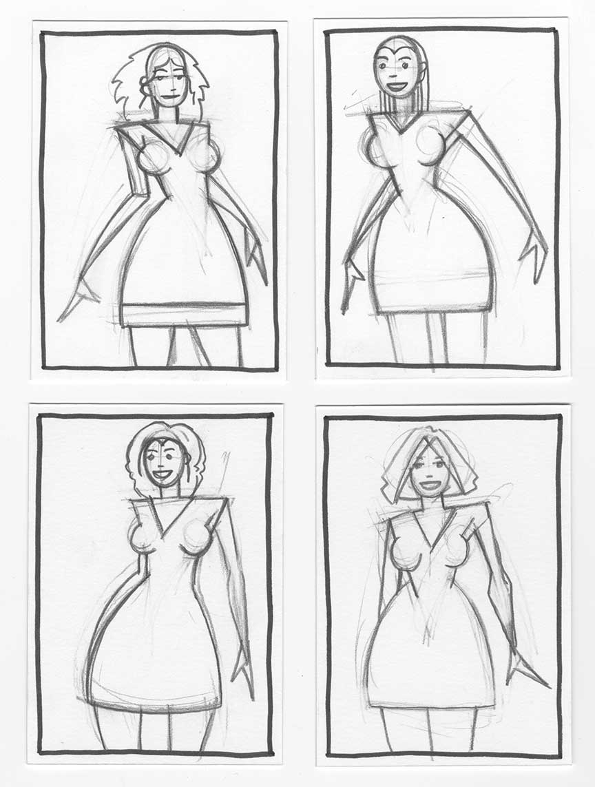
Here are the four small initial drawings.
I worked up four drawings back in that summer. Oddly enough I made the initial drawings on trading card size paper (2.5×3.5 inches). I do that on occasion but not very often. I blew up the small drawings onto 6×9 inch paper and drew them at that size. After drawing them again I blew them up on 11×14 inch paper and inked them. Then what happened? Nothing. There they sat untouched. I just didn’t like them very much and moved on to other things. But they stuck in my mind because I still liked the idea a bit.
I pulled out the drawings this week and looked at them. I still didn’t like them. There was something missing in them. They had no life. I also didn’t like my inking. I can remember that I tried to keep the drawings simple. I wanted basic lines and shapes to fill in with whatever message I had to say in type. The colors and the words were going to make up the most interesting part of the drawing. But that doesn’t mean I should start with a boring drawing. A boring drawing is always a problem. And keeping things simple isn’t as easy as it sounds. It’s actually easier to make something complex with a lot of lines than simple with only a few. With complex you can easily be off with five percent of your lines and it won’t be noticeable. They’ll blend in with all the rest. With simple if even one line is off there is nowhere for it to hide. And my bad lines were out in the open.
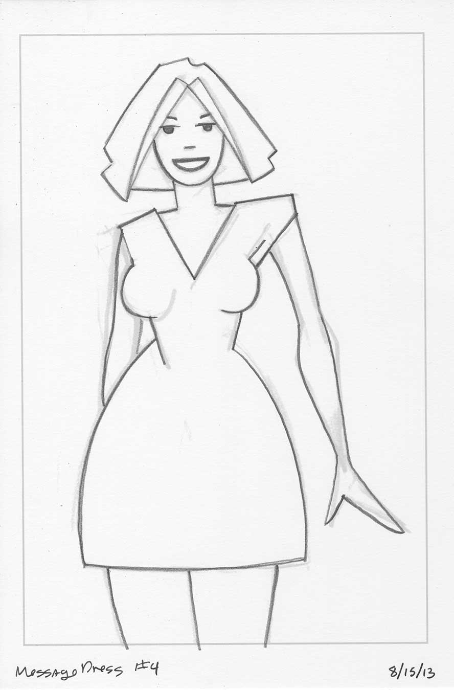
Here is the version one pencils.
I decided that if I was going to work on Message Dress again I would have to go back to the beginning. I still liked the initial 2.5×3.5 inch drawings so I pulled them out again. I also decided that it was a mistake to only draw them at 6×9 inches. I think I did that in order to keep the shapes simple but it ended up making them inaccurate. This time I decided to break out the 9×12 inch paper for the pencil drawings so that I had a little more room. I think that extra room helped. At least I ended up liking the new drawings much more than the old ones.
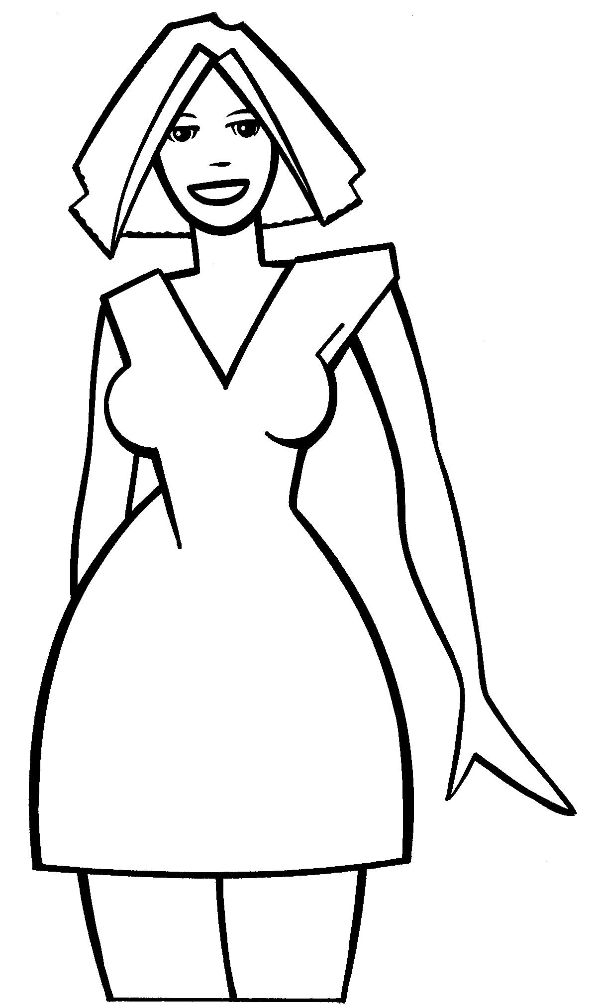
Here is the version one inks.
After that I went with a bigger size for the inks too. I’m not even positive why I went with the 11×14 size originally. I almost never do finished pieces at that size. I went with my usual 11×17 inch size and made the drawings sixteen inches tall on that paper. I also took the time to redraw the faces at the larger size. I think the faces were a real weakness in the earlier drawings. Since I was trying to keep things simple and not make the drawings about the faces I didn’t give them the attention they deserved. The original faces were a bit too clumsy and awkward for me. I took more time with these ones and though I don’t think they turned out as perfectly as I might have wanted them too they are much better.
Now, of course, I have to finish them. I still have no messages to put on my dresses. Unlike before I like the drawings but I still haven’t finished them. I was planning on coloring them on the computer but I really haven’t done a ton of computer coloring much lately. It’s not a process I enjoy much these days. Oddly enough though I did finish one computer colored print this week. I kind of forced myself to. I was working on a large drawing using my Monster a Day dry brush style and I really wanted to finish it as a computer colored print. I must say that it took forever. I wanted to try some new coloring techniques but in the end decided to keep things simple. And simple took a lot of time. I couldn’t believe how long. And how many printouts it took.
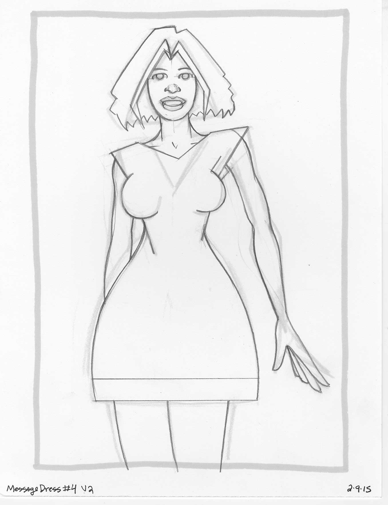
Here is the version two pencils.
When making a piece that’s destined to be a print on paper I can’t just rely on what the screen shows me. That’s because almost everything looks good on screen. Al the colors are bright, vibrant, and usually behave themselves pretty well. Those same colors on a print have a totally different act. So just when I think I have things finished I print out an 8×10 proof of the art (not its full 10×15 size) an inevitably don’t like something. I think it took me at least six proof before I got it right. The whole process was about five hours long. And that was for some simple non-illustrative color. Psychedelic 60s poster art color will probably take longer. Especially since I’m not quite sure how to pull it off. I don’t think I’ve ever done that type of color before.
So there you have it. I pulled some old work out of a drawer, improved on it, but still didn’t finish it. I consider myself a finisher so it’s a little disappointing that I still haven’t figured this out yet but I’m happy that I’m a bit closer. Now I think I’m going to have to figure out a few things to work on that don’t include computer coloring. I’m still pretty sick of it.
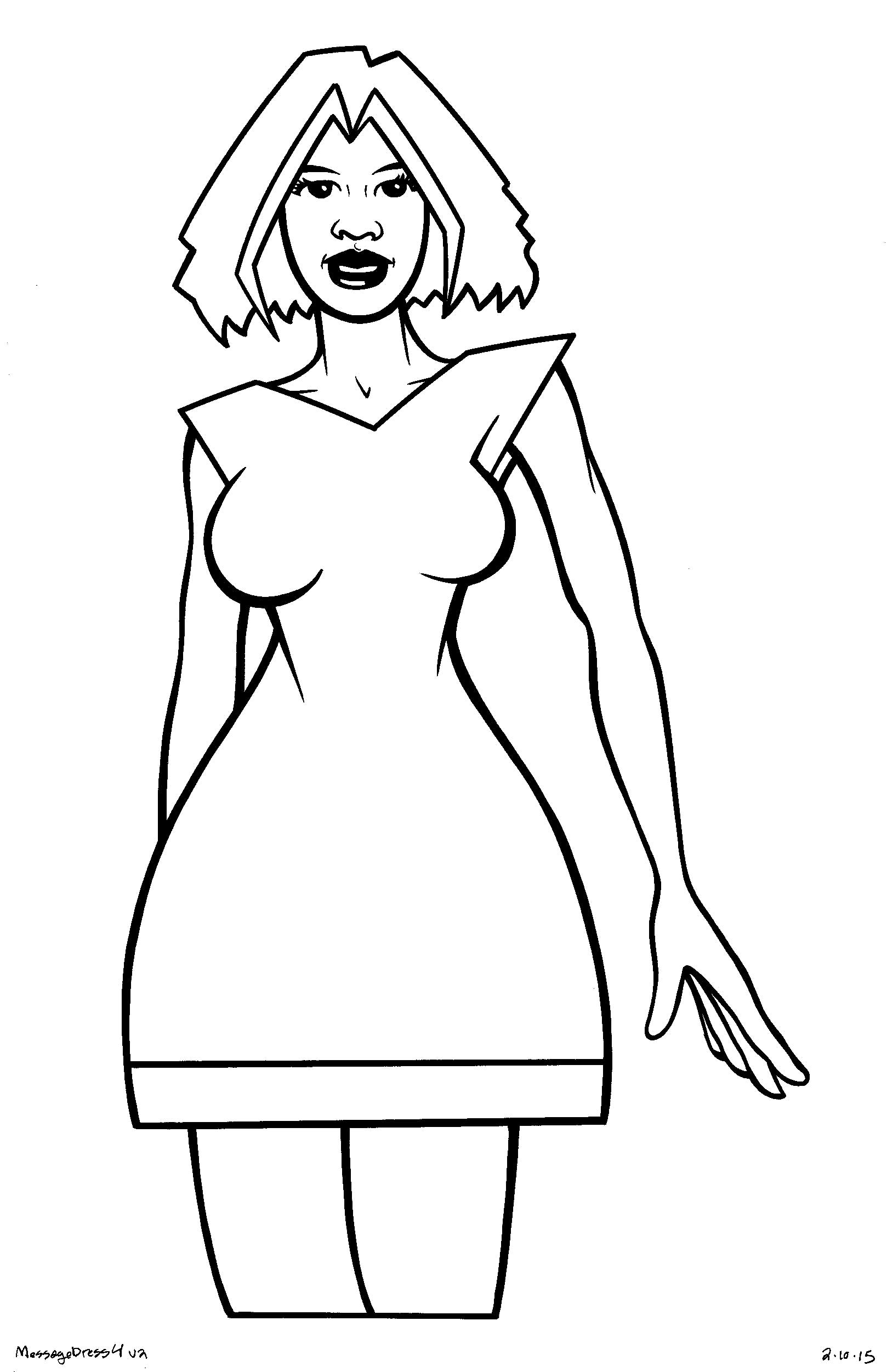
Here is the version two inks.
Discussion ¬