I got a bit of advice for artists out there. Sometimes you have to do things even if you really don’t know what you are doing. You might have a little starting point of an idea but no real direction for it so just start. You might not finish it right then and there but starting something can lead you in a direction that’s unseen at the moment. That’s what happened to me with a couple of little drawings that I was working on a while ago.
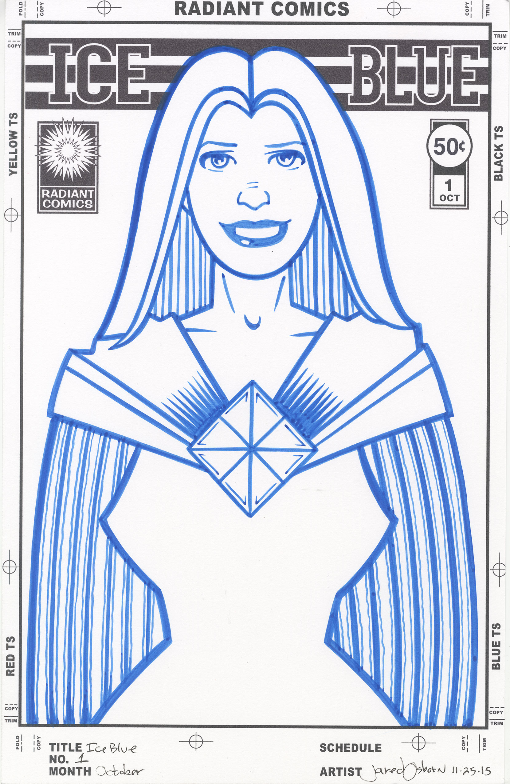
It all really started some years ago. Maybe ten. I worked on a group drawings that I never really figured out what to do with. They were pencil drawings of a woman’s figure done in a minimal outline with a, sort of, highly decorated cape all around her. I did some pencil drawings on paper and even some pencil drawings on canvas drawings. They were okay. There was the germ of an idea there but nothing ever really became of them. But recently I began thinking about them again. I began thinking about the idea of a female figure done in that outline and white silhouette style.
At first I made some small drawings in pencil. My baseball card size art cards. I kept it simple and drew the basic outline without even any arms and a simple cape-like cloth on the outside of the figure. I didn’t get all fancy with the shapes and patterns of my old ones and kept things uncluttered. I only made two little drawings and they say there for a week until I finally decided to ink them. Ink is how I refine my line and define the drawing. Once again I kept in simple and used a single weight pen line to ink the figures. I was happy with the little art cards.
It took me another week to decide to make some larger drawings out of the smaller ones. I still had no plans for how I was going to make them into finished drawings but I decided to get on with the next step anyway. After scanning in the card sized drawings I printed them out in blue line on six by nine inch pieces of paper and started redrawing them. I kept then relatively small at the six by nine six in order to keep them simple. Often if I make a drawing large I start to get too complicated with it too quickly. I was trying to avoid that. I ended up with two pretty good drawings after that but then they just sat there too. I still had no finishing move.
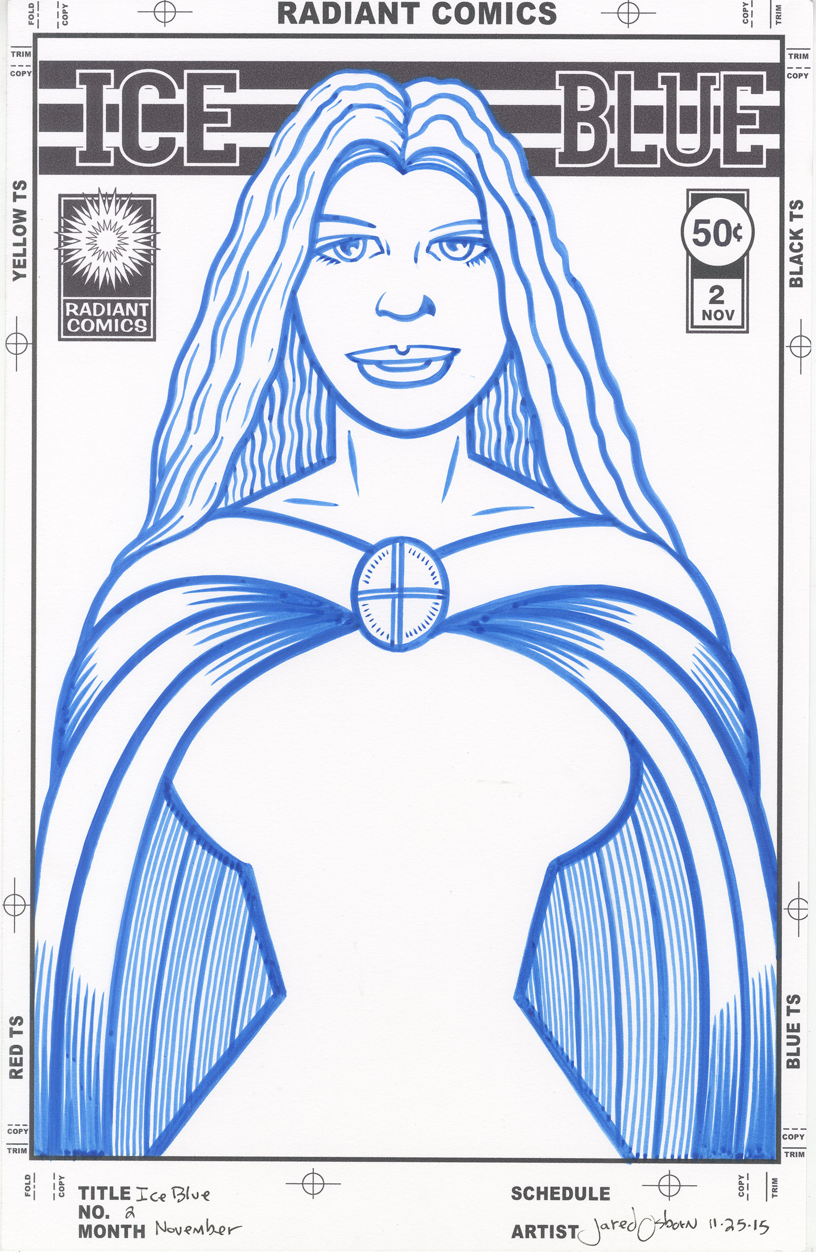
Lately I’ve been doing a lot of my faux comic book covers. I thought about making these drawings into one of those but didn’t know which one. They didn’t seem to fit any of my existing comic book cover concepts and I didn’t want to work up a whole new idea complete with logo and trade dress. So there the drawings sat. I did take the time at this point to work up a third drawing. I had two female figures with long hair so I decided I wanted another with short hair. So I worked it up. Art card pencil, inks, and then six by nine inch drawing. Now there were three of them sitting there doing nothing.
As I was riding my bike one morning I started thinking about the drawings (before my brain turned off and riding took over) and the phrase “Ice Blue” came into my head. I don’t know why. Maybe it was because the drawings reminded me of Disney Princesses or maybe it was just the cold of the morning but I suddenly thought that would be a good name for the faux comic to put these drawings on the cover of. I got back into riding and put the idea in my pocket. I sat on the idea for another week mostly because I didn’t want to work on a logo.
One final thing triggered me finishing these drawings. I remembered I had a big bottle of blue ink. Last spring I bought three big bottles of colored ink: blue, red, and yellow. I wasn’t sure what I was going to do with them but I wanted to give them a try. I’ve worked on a few small drawings with them but nothing clicked with them so far. I even bought a couple more small bottles just to add to the collection. A green and a second shade of blue. In thinking about the name “Ice Blue” I decided I would ink the drawing in blue ink. That’s something I had never quite done before.
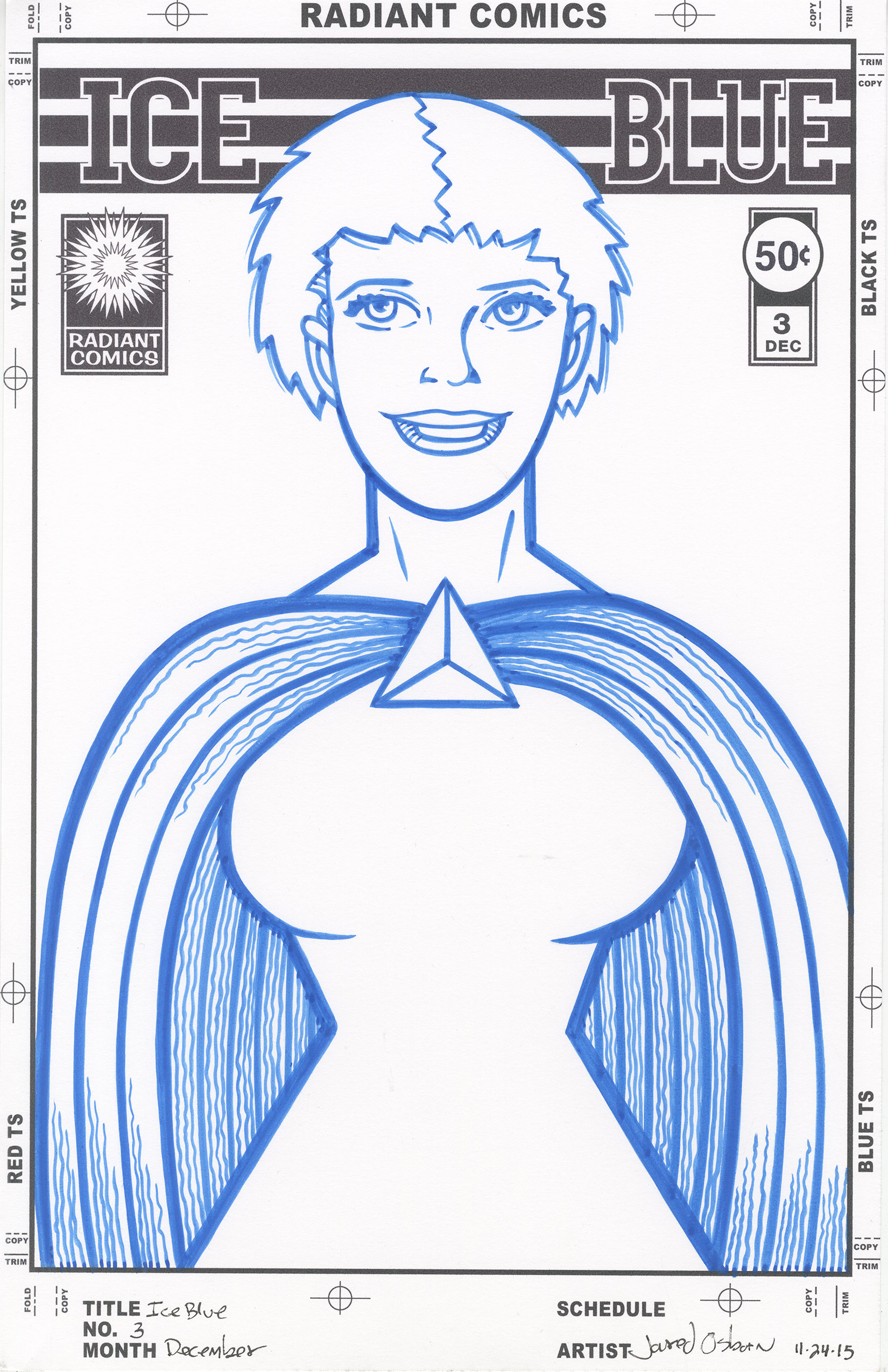
First I had to work up a logo. That takes a lot longer than you might think. There are a lot of mediocre logos in this computer age where people just take a word and type it in an interesting font and that’s that but I try to avoid such a path. I use a computer and fonts but that is my starting point. It takes a lot of time and manipulation after that. Usually a full eight hour day. Yeah, that’s for one logo. You can see why I didn’t want to work another one up. But luckily for me this one took me half that time. I don’t know why. I could have been that I had been thinking on the project for so long but the logo went quickly. I also decided that even though the figure would be inked in blue I’d print out the logo in black as usual. It would look weird to me if it was all in blue.
I was almost ready to set all three drawings up to be printed out in blue line and inked when I realized some work needed to be done on their faces. I would be inking them at ten by fifteen inches and they needed a little more detail and refinement in their faces. I was thinkings about redrawing them at a larger size but that seemed like too much of a chore. I ended up erasing the faces on the six by nine pencil drawings and reworking them at that size. That ended up doing the job so I scanned them in again, set them up with their logos and trade dresses, and printed them out in blue line to be inked.
I liked working with the blue ink. It was a nice change of pace. It has almost the same coverage strength as black ink so the process was mostly the same. I put some of the ink from the big bottle into a small Rubbermaid container and used that as an inkwell for my brush. I ended up liking that container. All in all “Ice Blue” issues one through three covers came out to my satisfaction. They look good in blue.
Discussion ¬