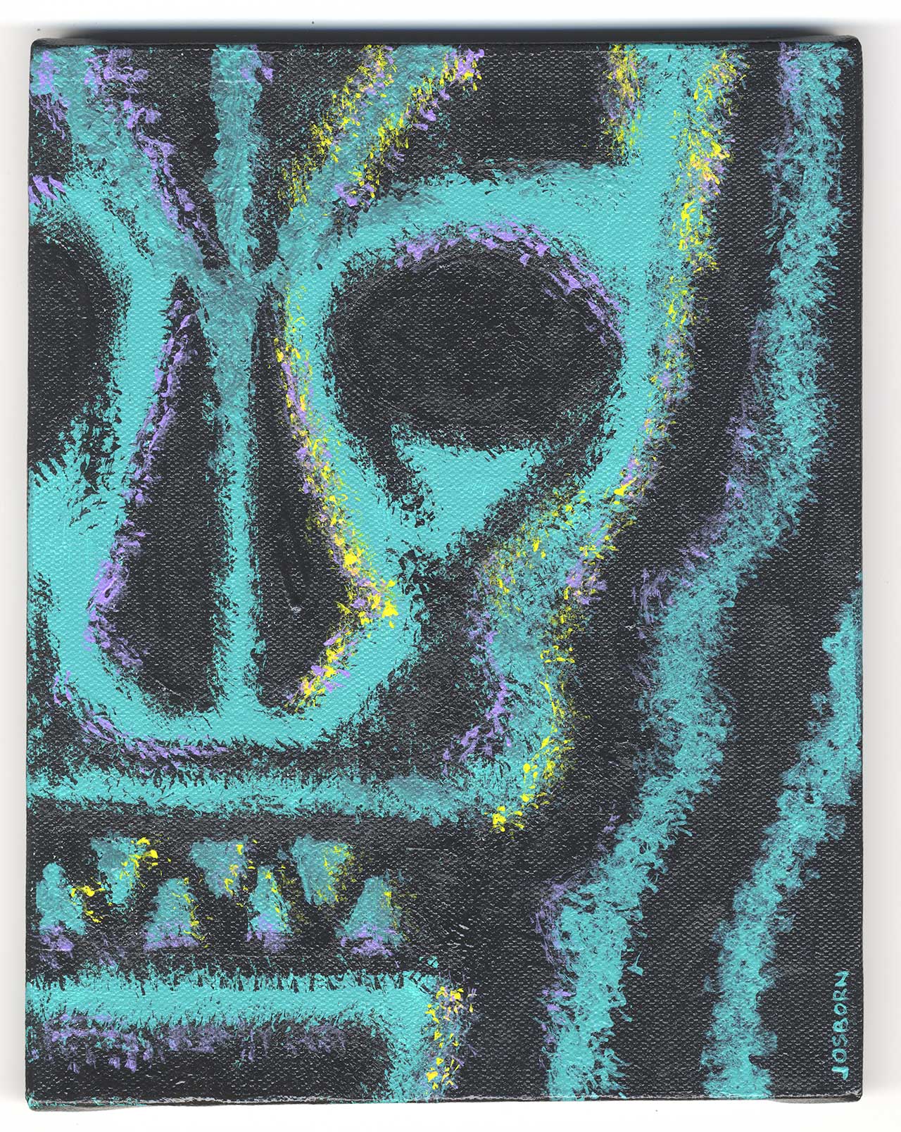
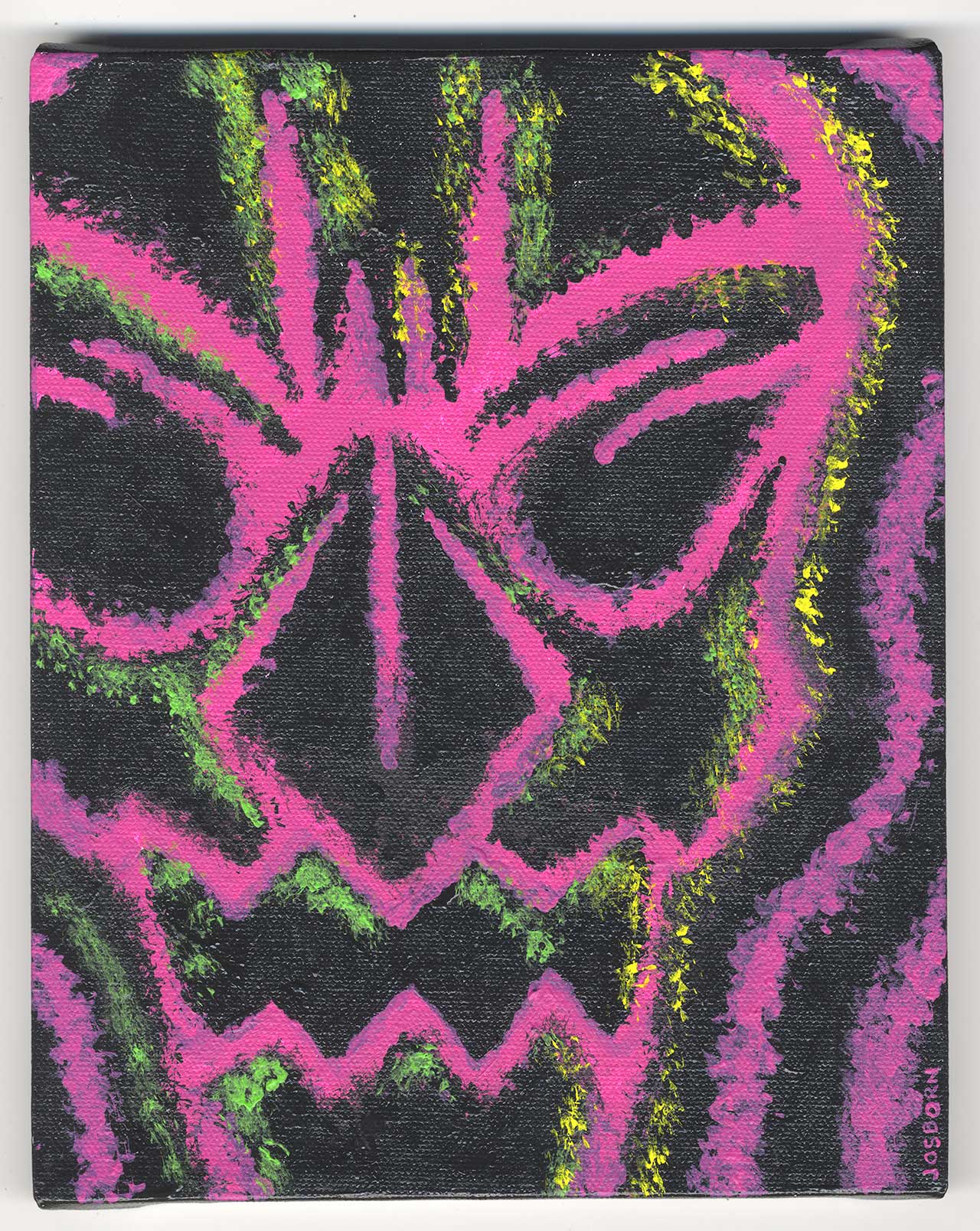
I’ve been looking at these four finished paintings of skulls that I recently painted for about a week now and I’m still not sure what I think of them. They started out as drawings that I was unsure of so it’s not a great surprise that they ended up this way but it doesn’t make me happy. Usually I’m more confident in my work but usually doesn’t mean all the time. I don’t hate them but I’m not sure if they came out they way I wanted them to. Of course not knowing how I wanted them to come out put me in quicksand to begin with.
It’s funny because when I drew them I took pains to make sure the skulls were symmetrical. I drew them at 2.5×3.5 inches and then scanned them into the computer so I could blow them up, print them out, and redraw them at 6×9 inches. But before I printed them out I made them symmetrical. I deleted the left half of the drawing, duplicated the right half, flopped the right half, and then lined it up in place with the left half. Then I printed them out and redrew the now symmetrical drawings. I had every intention of simply centering the skulls on the canvases and painting them that way but in the end that seemed way too dull. I’m not a huge fan of symmetry so I’m not sure why I wanted to do it like that in the first place.
After I scanned the finished 6×9 inch drawing back into the compute I recomposed the drawings. I made eight drawings but picked the four I liked best. I often make theses 8×10 inch canvases in groups of four so that three can be sitting there doing as I work on the fourth. It keeps me moving at a pace I like. I went with four asymmetrical drawings with two shifted right and two shifted left. That seems balanced to me.

The actual painting wasn’t too hard at all. I decided to work in just one color on top of a black canvas. At first I tried using line but ended up not liking that so I switched over to an ink technique that I’ve been doing a lot of recently. That’s where I take a battered old sable brush that won’t come to a point anymore and use that to make rough drawings. The brush tip splits apart into three, four, five, or even six different points and I use all those points to get a rough line made. It takes a bit to get used to but I’ve made a bunch of drawings that way so I’m okay with it. It’s sometimes like using a dry brush technique except the brush is loaded with ink. And it’s a good thing that I keep my battered old brushes.
This technique was a bit different when using paint though. Ink is a lot thinner a medium and the paint would blob up on the canvas if I wasn’t careful. I couldn’t use it in the exact way as with ink on paper but I got a decent approximation. With paint I was also working back and forth with the the color and black. With ink I only work in black and don’t use white. The only white is the white of the paper. With these paintings I would paint the blue (or green, magenta, or orange) on the black canvas and then work back in with the black paint. I was painting with both colors trying to get the shapes I wanted. I ended up with a type of line that I haven’t used before and I’m not sure if I like it.
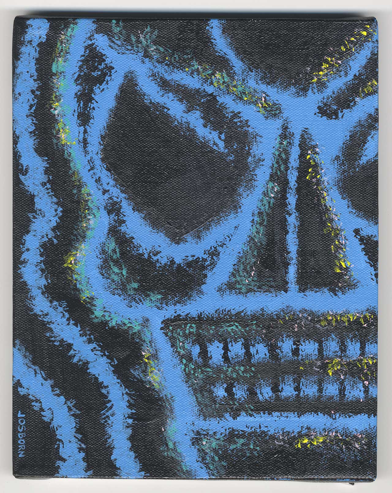
At first I only had the drawing of the skull in the painting. I was satisfied with the drawing but there was something about the composition that I didn’t like. It was too flat. Oddly enough the way that I dealt with it was to make the painting even flatter. I used outlines of color next to the skulls. I could have used a second color for these lines but that would have flattened the painting out even more. Oddly there is a bad flatness to painting and a good flatness. Bad flatness is when it looks like there is supposed be depth to the image but the painting fails to deliver and good flatness is when the painting abandons the pretense of depth and the painting as a window until another world and emphasizes the painting’s two dimensionality. I tried the second approach.
I liked the painting a lot better after I put those outlines on them. They made the space much more interesting to me. I was still trying for something different than I normal so I stayed away from my usual geometric shapes of paint and small brush strokes and tick marks but I still wanted some more color in there. I wasn’t sure how. I ended up going with a weird a approach that is loosely based on my more illustrative painting. I decided to add two more colors with one being a highlight and one being a shadow. They bore no resemblance to actual highlights and shadows though. Since I was going for flatness in these paintings there is no roundness for a highlight to indicate. Instead I used the lighter color to move the eye across the canvas. I used the darker color to give the eye a place to peer into as it moved across the canvas. I think this worked out best for the green line canvas but the others a bit less.
Even after writing about them I’m still not sure about these four paintings. I look at them some times and they’re interesting and I look at them at other times and they don’t hit any notes for me. I do like them better when I sit them next to other paintings. Right now I have them stacked on my easel with four of my abstract geometric painting and I like the way they interact. Maybe instead of making eight paintings I really made one painting in eight parts. I actually had a plan to do that years ago and never did. Maybe I snuck it in on myself.
Discussion ¬