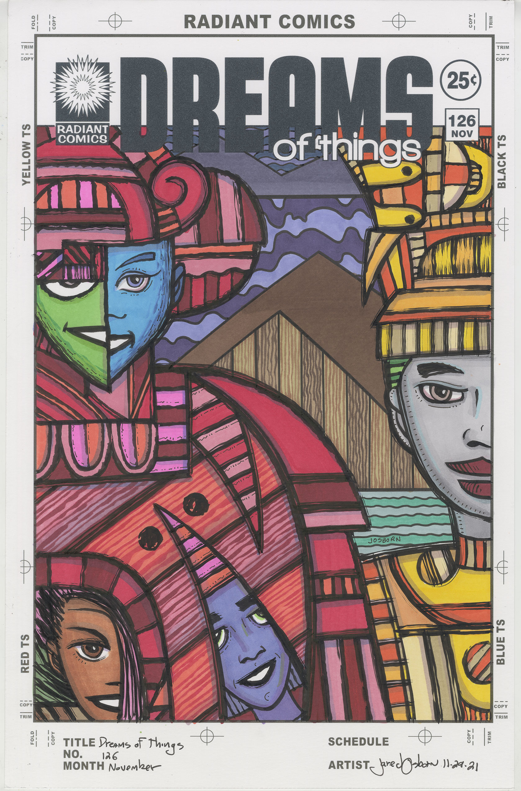
I just finished marker coloring “Dreams of Things” #126. It’s a comic book cover to a comic book that doesn’t exist. This series of drawing started out many years ago as a way to create some simple dream like images but hey have morphed into more complex images. They used to take a fairly short time to complete but not anymore. Instead of about six to eight hours to make one it now takes twelve to fourteen hours. That’s a big increase.
I mention the time they take because even though they take a while I can break them down into three four hour stages: pencilling, inking, and coloring. That has allowed me to get some of them done over the last month when I haven’t been able to get much else done.
It’s November 29, 2021 as I write this and I often find it hard to get my own art done as the year is winding down. Between Christmas, Thanksgiving, and various paying jobs a lot of my time is taken up with things than making art. It’s tough to be self motivated so I have to find ways to keep going.
I finished a lot of big stuff this year. I got five 24×36 inch acrylic on canvas paintings done plus I finished another one bigger than that. The big one had even been sitting around my studio for 20 years. I also got a lot of big ink drawings done. I’m not exactly sure how many but it’s a least a dozen. I also started my Patreon and finished three 68 page magazines filled with my art. I can say I accomplished a lot this year. But still it brings me down a little when I slow down.
So I’m going to take a moment and contemplate “Dreams of Things” cover number 126 to bask in something I managed to finish. I pencilled it fairly recently. Sometimes I have ideas and do drawings for these covers but then they sit around for a while. Not with this one. I ran out of “Sitting around” drawings so I took a few days and did some new ones.
That’s another thing that plays with my felling of “getting something done.” It takes time to draw one of theses covers. It takes about four hours. After I finish the drawing I scan it in, put the logos on digitally, and then print it out to be inked. It’s still far from done at that stage so I never feel like I accomplished anything at that point.
I made this one using my side of the brush technique. That means I wasn’t going for a smooth and pretty line but a rough and ragged line. Not as ragged as my busted brush technique but it gives the line more texture than usual. All the lines on the two characters are rough edged but the background lines are smooth. That helps give it a sense of depth. Years ago, one of my teachers said to forget everything else; it’s overlap that really creates depth. I’ve got a lot of that going on here too. I’ve taken that lesson to heart.
When I pulled my markers out this morning the first part of this I colored was the background. That’s another thing I learned in art school. When making a painting always paint the background first. It’s actually hard to do since the background is usually the most boring part and we all would rather paint the interesting parts but it’s also really helpful.
I knew I wanted the background to be dark and neutral so I colored the sky at the tipity-top first. The part under the logo. It’s two different dark blues and they are barely visible. Then I colored the mountains below them in another dark blue. That was the easiest part of the whole cover. After that I made the second, and bigger, sky a dark and light purple. The brown and wood grain pyramids came after that. Then the greenish water. I flew through all of those because the color choices were easy and the areas small.
I colored the person on the right next. I knew his clothes should be orange so I pulled some orange and yellow markers out and went to town. It was just a matter of arranging the color. That part went down easy too but I had no idea what color his (or her) face should be.
I decided on red for the left hand character but his clothing was more complicated. He takes up half the drawing and is more flat than round. Plus he has a split face and two more faces in his shirt. I think I used five reds.
Actually the first thing I did was color the lower left face brown. For some reason I knew I wanted it that color. The half blue face was decided on next and that lead me to the half green one. The purple face was the last one chosen. Almost the last one. I had to go back and choose a color for the person on the right. I ended up going with grey. I couldn’t see any color working there so I went with a neutral. I usually don’t make faces grey but here it works.
Let me say something about the texture in the red shirt. Those are large flat areas of color and can become a visual hole in the picture if the artist isn’t careful. In marker I tend to use some indications of texture to give areas like that more visual interest. Otherwise the viewer can fall into that visual hole, be bored by it, and skip out on the whole drawing.
I’ve done 126 of these covers so far. I generally like them otherwise I wouldn’t still make them but some I like more than others. This one is middle of the pack. I don’t know why. It’s okay. I generally like the drawing, color, and imagery but it doesn’t move me like others do. I’m okay with that though. Sometimes I don’t like something I do but someone else does. I have to leave room for that in my judgement. I try not to get too high or low with any individual piece. At least I got something done.