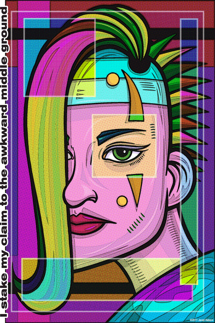
This week I pulled out a print of mine at random from my pile of prints. I’m glad I pulled this one because it’s one I like. It’s called “I stake my claim to the awkward middle ground” as you can see by the fact that the title runs up the left side of the print. According to the date on the digital file I finished this one on September 14, 2011. That seems like such a long time ago but it’s only a couple of years.
Though this is one of my prints that features words and images the words are less prominent than on most of my other ones. That’s the way things work out sometimes but in this case I also think it fits the phrase very well. When someone is claiming awkwardness I don’t think it would be done in a bold way. Awkward pairs more with shyness and the type here is a little shy. It’s off to the side and small. There isn’t even much type-work to the type. It seems to be just the font being itself. I may have changes the spacing a bit as I often do but if I did it was subtle. The type is content to be off to the side.
The image itself is interesting in the way it came about. You could almost describe this as a serendipitous print. In a way it came about by chance but in another way it didn’t since I was looking to make a print. I just didn’t make it in my usual way. That’s because I drew this face back in February of 2009. I drew it, I inked, I scanned it, and there it sat for two and a half years. That’s what happens sometimes. I will draw something with all intentions of making a finished piece out of it and it never happens. In this case, by the way it turned out, I’m guessing that I was bored with the usual way that I’d color the face to make a finished piece. I didn’t want to go through the same old process.
This coloring process comes from a different task entirely. During the first few months of 2011 I was making some stuff I call “Lo-fi Found Art Photography”. I’d scour Google images for obscure snapshots that people posted, run them through a Photoshop filer recipe I made up, and add some type to them. I enjoyed doing that and posting some of them for a little while and then stopped. But, of course, the series of Photoshop filters that I used were saved as a Photoshop “Action” and sat there waiting for me to notice them some future day.
One day I decided to pull one of my two year old face drawings out to try and finish it. Who knows why but it probably struck my fancy that day. I still didn’t want to color it up in my normal way so I must have remembered my recently abandoned filter recipe. First I laid down some basic colors in Illustrator and then I brought it over to Photoshop to run the filter recipe on it. I ended up liking the results. Here we can also say that the results were a bit serendipitous because the way the filter recipes work I control the color like a blunt instrument rather than my usual sharp one.
After the basic colors are chosen when I run the filters it first ads the dot patterns into the color. It’s almost like the dot patterns in old comic book printing that Roy Lichtenstein made famous but even a bit cruder. Plus they are right over top of color rather than being the color itself. After the pattern down I choose a rectangular selection in Photoshop and then change the color in that particular selection. Hence the block of green hair becomes magenta hair. A light transparent outline is also added around the rectangle. I repeated this process four times to get what I wanted.
The first thing I notice on this face is the eye. The ol’ window to the soul. It’s got its own box around it making a bullseye of a lighter orange color on top of magenta. Once again the person in one of my pieces is staring hard at the viewer. I’ve also got a half-face again. But instead of a half-masked face, as is my habit, I went with a peek-a-boo bang. Once again it’s an androgynous face but I think of this one as a woman. Maybe it’s the red lips.
I like the basic shapes in this one. The swoop of the hair and the jutting of the jaw work for me. I also like that the hair comes out of a black hole in her scalp. The triangles of the spiky hair make for a nice counterpoint to the sweeping curves in the rest of the piece. The low-slung ear balances out the nose. This seems to be one of my more precise face drawings and the coloring technique emphasizes that.
That coloring technique brings order to chaos too. I’m not quite sure how it does it. There are a myriad of colors in this piece and they’re not entirely literal but somehow it all becomes harmonious. I’m used to being very precise with my color and knowing exactly why something works but with this technique it’s a bit more of a mystery. When selecting the color changes in the boxes I have a lot of choices as I move the slider from right to left so I end up picking one I like but I just kind of go with what my eyes tell me. That’s different than my normal way of contemplating each color individually. But I was looking for something different now wasn’t I?
A soft and subtle bit of words and type and a staring image full of restrained but chaotic color. That’s how I’d describe this one in a sentence. I’ll take that.
Discussion ¬