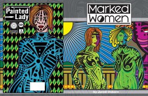
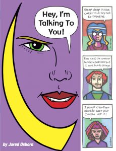
I’m back from the comic shop this week and I got six new comics.
Check them all out here:
I’m back from the comic shop this week and I got six new comics.
Check them all out here:
For years the Winsor Newton Series 7 Number 3 brush has been my go-to inking brush. It’s the high end of watercolor brushes and the brand has served me well for many years. The main problem with it has alway been that sable hair watercolor brushes aren’t made for India ink. Unlike watercolor the India ink eats away at the brush until it ruins it. At some point the brush will no longer hold a point like it’s supposed to and it becomes useless to me. Well, not quite as useless as it used to be as I’ve developed a technique to draw in ink with an old battered sable brush but that doesn’t help me if I want to use my normal inking technique. For that I need a good brush that comes to a point.
The second problem with a Series 7 brush is that it’s expensive. Then around 2014 through 2015 there was a shortage of the brushes and the cost rose even more. The price on a number three used to be around thirty dollars at full retail but I could often find them for fifteen to twenty dollars. Not too bad. I could even find some of the second tier sable brushes for twelve bucks a piece. I used to stock up on them when I could.
I’ve been using Series 7 brushes since the early 1990s and I always heard they weren’t quite as good as they used to be. I found them to still be pretty good so I wasn’t bothered about the stories of their decline in quality. After all I didn’t know how good they used to be. Occasionally I’d get a lemon of a brush but that was unusual. In the last decade I’ve heard “They’re not what they used to be” said with increasing frequency and I have to agree with them this time.
I stocked up on some brushes before the shortage and managed to keep going with my ink drawings. Except the last few Series 7 brushes I used weren’t that good and didn’t last very long. They were tough to make come to a point and the point didn’t stay in place very long. Disappointing.
Last year since I couldn’t get any new Series 7 brushes I looked around for some other ones. I ended up finding some cheap sable brushes for around ten to twelve dollars a piece. These ones weren’t even the second tier ones I had bought before (they were out of stock too) but were completely unknown brands to me. They ended up being of varying quality but overall of pretty low quality. They rarely came to a good point and were usually smaller then the same size Series 7 brush. This meant they had fewer bristles to hold the ink and so I had to dip the brush in the ink bottle more often. I don’t think I ever found any of theses brushes to be anything more than merely adequate.
When the Series 7 brushes finally became available again this year I balked at the price. Now the price on them is fifty dollars at full retail and thirty two dollars is the discount price. Ouch. Especially since the quality of the last brushes I bought had dipped. I was disappointed in them at twenty dollars so thirty two dollars was crazy. I decided there was no way I wanted to get one of those. Too much of a gamble. But what to get?
This lead me to try out some synthetic hair brushes. I guess they’re basically plastic bristles but I’m not really even sure what they’re made out of. I have tried synthetic watercolor brushes over the years for inking and have always found them lacking. Usually they did not come to a good point nor did they have very good rebound. That’s when after making a brush stroke on paper the bristles rebound back to their original shape and point. All the synthetic brushes I tried would bend over with the pressure of use and stay bent over. This made them hard to use and I stayed away from them.
Still I’ve kept my eye on the synthetic brushes over the years and would browse them when at an art store. I noticed some of the points looking better on them as the years went by. The one good thing about synthetic brushes is that they’re cheap. I decided to try one of them out and it was only four bucks. Not a lot to lose if it didn’t work out. Beats losing thirty bucks on a bad Series 7.
The first one I tried out I got from my local arts and crafts store. It’s a Simply Simmons Number 4 round with a short handle. I think it was three dollars and change and I got it on sale for half price. I must say I was very impressed by it. It was about the same size as a Series 7 Number 3 but didn’t quite hold as much ink. But it came to a pretty good point and had good rebound. It didn’t have nearly the flexibility of a Series 7 and ended up being more of a liner brush. That’s a brush that makes a good line but it a little more difficult to use when making other sorts of marks. It goes in one direction really well. I made a bunch of drawings using that brush and was happy with it. But I wanted a more versatile brush.
Further searching brought me to another Simmons brush. This time the Robert Simmons White Sable Number 3. It’s called white sable because it tries to mimic actual sable hair with synthetic white bristles. I have to say it does a very good job. The number 3 is smaller than both the Simply Simmons and the Series 7 so it doesn’t hold a ton of ink in its bristles but it has a very good point and very good rebound. Unlike
the other synthetic it’s good at making a variety of marks.
I found myself working very quickly with the White Sable brush. I hadn’t realized how much the not-quite-good Series 7 brushes were slowing me down. I had to spend more time dipping and pointing them than I once did but I really didn’t notice that it added up to so much time. I knew I was going a little slower but chalked that up to getting a little older. Turns out it was a bad brush and with a good one my speed came back.
Overall I’m really happy with the White Sable. I want to try a larger size but besides that I have no complaints about it. I’ll have to stock up.
I’m back from the comic shop this week and I got five new comics.
Check them all out here:
I’ve been looking at these four finished paintings of skulls that I recently painted for about a week now and I’m still not sure what I think of them. They started out as drawings that I was unsure of so it’s not a great surprise that they ended up this way but it doesn’t make me happy. Usually I’m more confident in my work but usually doesn’t mean all the time. I don’t hate them but I’m not sure if they came out they way I wanted them to. Of course not knowing how I wanted them to come out put me in quicksand to begin with.
It’s funny because when I drew them I took pains to make sure the skulls were symmetrical. I drew them at 2.5×3.5 inches and then scanned them into the computer so I could blow them up, print them out, and redraw them at 6×9 inches. But before I printed them out I made them symmetrical. I deleted the left half of the drawing, duplicated the right half, flopped the right half, and then lined it up in place with the left half. Then I printed them out and redrew the now symmetrical drawings. I had every intention of simply centering the skulls on the canvases and painting them that way but in the end that seemed way too dull. I’m not a huge fan of symmetry so I’m not sure why I wanted to do it like that in the first place.
After I scanned the finished 6×9 inch drawing back into the compute I recomposed the drawings. I made eight drawings but picked the four I liked best. I often make theses 8×10 inch canvases in groups of four so that three can be sitting there doing as I work on the fourth. It keeps me moving at a pace I like. I went with four asymmetrical drawings with two shifted right and two shifted left. That seems balanced to me.
The actual painting wasn’t too hard at all. I decided to work in just one color on top of a black canvas. At first I tried using line but ended up not liking that so I switched over to an ink technique that I’ve been doing a lot of recently. That’s where I take a battered old sable brush that won’t come to a point anymore and use that to make rough drawings. The brush tip splits apart into three, four, five, or even six different points and I use all those points to get a rough line made. It takes a bit to get used to but I’ve made a bunch of drawings that way so I’m okay with it. It’s sometimes like using a dry brush technique except the brush is loaded with ink. And it’s a good thing that I keep my battered old brushes.
This technique was a bit different when using paint though. Ink is a lot thinner a medium and the paint would blob up on the canvas if I wasn’t careful. I couldn’t use it in the exact way as with ink on paper but I got a decent approximation. With paint I was also working back and forth with the the color and black. With ink I only work in black and don’t use white. The only white is the white of the paper. With these paintings I would paint the blue (or green, magenta, or orange) on the black canvas and then work back in with the black paint. I was painting with both colors trying to get the shapes I wanted. I ended up with a type of line that I haven’t used before and I’m not sure if I like it.
At first I only had the drawing of the skull in the painting. I was satisfied with the drawing but there was something about the composition that I didn’t like. It was too flat. Oddly enough the way that I dealt with it was to make the painting even flatter. I used outlines of color next to the skulls. I could have used a second color for these lines but that would have flattened the painting out even more. Oddly there is a bad flatness to painting and a good flatness. Bad flatness is when it looks like there is supposed be depth to the image but the painting fails to deliver and good flatness is when the painting abandons the pretense of depth and the painting as a window until another world and emphasizes the painting’s two dimensionality. I tried the second approach.
I liked the painting a lot better after I put those outlines on them. They made the space much more interesting to me. I was still trying for something different than I normal so I stayed away from my usual geometric shapes of paint and small brush strokes and tick marks but I still wanted some more color in there. I wasn’t sure how. I ended up going with a weird a approach that is loosely based on my more illustrative painting. I decided to add two more colors with one being a highlight and one being a shadow. They bore no resemblance to actual highlights and shadows though. Since I was going for flatness in these paintings there is no roundness for a highlight to indicate. Instead I used the lighter color to move the eye across the canvas. I used the darker color to give the eye a place to peer into as it moved across the canvas. I think this worked out best for the green line canvas but the others a bit less.
Even after writing about them I’m still not sure about these four paintings. I look at them some times and they’re interesting and I look at them at other times and they don’t hit any notes for me. I do like them better when I sit them next to other paintings. Right now I have them stacked on my easel with four of my abstract geometric painting and I like the way they interact. Maybe instead of making eight paintings I really made one painting in eight parts. I actually had a plan to do that years ago and never did. Maybe I snuck it in on myself.
I’m back from the comic shop this week and I got four new comics.
Check them all out here:
I’ve been reading a lot over the last two weeks. Catching up on things. When I sit back and think about it maybe “A lot” gives the wrong impression since I’ve increased my reading to, maybe, an hour a day. But that adds up. Some of that hour came out of my “Taking a break” video game time. Often when I want to sit down and rest for ten minutes or so I take out my iPad and play Subway Surfer, Drop 7, or some other video game. A game that I can play briefly and then put down and get back to doing something. Other times I read some comics instead.
I always have comics to read. I go to the comic shop each week and buy new ones. Those ones don’t generally pile up but other things do. Like the trade paperback collections I get. Usually I get four to six comics a week. A TPB is about the equivalent of that. It collects anywhere from four to ten comics. So each TPB is about the equivalent of a week’s worth of comic reading to me. With each comic book taking about ten minutes to read (plus I read them all twice about a week apart) each TPB should only be an hour’s worth of reading but with ten or twenty books piles up it turns into a lot. Plus I got a few extra comics that I won in a YouTube contest that I wanted to read. So I decided to put down the video game and read a comic. I’ve read a few of them that way recently.
Oddly I read my collected editions much like I read my regular comics. Most people say they like collected editions because they find reading “A huge chunk” of a comic all at once to be satisfying. I don’t like that so much. I prefer to skip around from comic to comic much like they were individual issues. So I sometimes have two or three TPBs going at once. I’d read an issue in one of them and then next time pick up a different one. I like that comics are periodicals and that I have time to digest what happened in one issue before I read the next. I’m not in a rush. I also like the variety of reading many different comics in a short space of time. I find that a lot of fun.
I finally got around to reading my magazines too. “My magazines” used to have a totally different meaning ten or twenty years ago when I had subscriptions to twelve or more magazines a month. Now I have only two subscriptions left. Yet I had four issues of “The Sun” piled up to read. I’m not sure how that happened. With only two subscriptions, the other being “Archeology”, magazines rarely pile up these days. There have been months when the new issue of “The Sun” has arrived and I had yet to read the old one but never have I let four of them pile up.
“The Sun” is a literary magazine that is often filled with heartfelt and sometimes sad stories so on occasion I’ve found myself not wanting to read it because of the sad stories. But I always enjoy the magazine when I actually do read it. I think the fear of the sad stories somehow got to me this winter and I avoided reading it. I’d look at it and then push it aside. The issues just sat there until I decided to start a new reading habit.
My new habit was to read before I go to bed. I know this is something a lot of people do but it’s not something I’ve ever done. Often by the time that bedtime rolls around my eyes are too tired to want to read and I don’t have the concentration for it. So I said to myself I’ll only read for ten to twenty minutes. I seem to have that much time anyway between turning off the TV and getting into bed. I also don’t read in bed. I read in my regular reading and sitting chair. I’ve always found it uncomfortable to read in bed. Plus they say it helps people to fall asleep if they don’t read in bed. I can go along with that.
I read all four of those magazines in about two weeks. I enjoyed them too. “The Sun” is a good read and once I got started with them I didn’t want to stop. Of course I stopped every night after my allotted twenty minutes were up but I also read them during the day instead of my video game break. Sometimes reading is like that with me. I don’t want to put the concentration into reading but when I do it’s always enjoyable. I think sometimes I just have a hard time sitting still.
Now that I’ve finished my magazines I can move on to some of the books I have piled up on my iPad/Kindle app. I read mostly non-fiction when it comes to books and have at least a half dozen books on various subjects that I’m in the middle of or haven’t started that I haven’t gotten back to in months. Plus I’ve been getting a free novel every couple of months or so from Amazon and I haven’t read one of them. They come as part of my membership in Amazon Prime so I pick one when they send me a choice even though I haven’t had the inclination to read any of them yet. I can’t pass up a digital book since it takes up no physical space in my life.
One more category I want to add to my reading list is some of my old comics. Every comic fan I know says “I should really re-read that comic” but who has the time? Especially if you are buying new comics every week. But now that I made a little more time I’ll have to keep going with it.
I’m back from the comic shop this week and I got five new comics.
Check them all out here:
I’m taking a break from trying to draw skulls. Though I’ve drawn many a face in my day I haven’t drawn a ton of skulls. Maybe it’s just that I’ve never learned to draw skulls but faces seem a lot easier to draw. Probably because they have a lot more leeway built into them. I can draw eyes a dozen different weird ways and they’ll still easily read as eyes but how about eye sockets? Maybe people who draw skulls all the time have a dozen different stylized ways to draw eye sockets but I don’t. So far I only have a couple of different ways. One is triangular and one is round. Those are the two shapes I’m riffing off right now.
Teeth are another thing I don’t have down yet when it comes to skulls. Teeth in general are problematic in art. They don’t quite belong in drawing and painting. Teeth belong in photography where they don’t take much extra thought but in drawing and painting they need their own special technique and there isn’t a grand tradition of teeth techniques. “They look like Chiclets” is the thing I’ve often heard about anyone’s badly drawn teeth over the years. I wonder what today’s saying is since Chiclets have mostly left pop culture? It’s usually easiest to keep the mouth shut in a drawing.
The only teeth I’ve been drawing lately have been monster teeth. It’s usually a good idea to give monsters big, sharp, and pointy teeth and it’s fairly easy to pull off. They’re supposed to be jagged and unattractive and I find that easier to do with teeth than making them pretty. I’ve only been doing the monster teeth in ink though and not paint. The way I often draw monster teeth is a battered brush technique that makes a lot of rough lines all at once. It doesn’t take a whole lot of time and I like the look of it. My alternate technique is to draw some teeth out of jagged and rough lines. Nothing complicated.
The problem with those teeth and these skulls is that I’ll be making paintings and not ink drawings. Neither of those two techniques will work in paint the same way they do in ink. Plus the drawing I’m working on now are too small for teeth techniques. The final paintings will be fairly small at eight by ten inches but right not I’m working on the drawings at two and a half by three and a half inches. I’m just getting the basic gesture of the teeth in there at that size. And figuring out that basic gesture is not easy when I don’t have a lot of those arrows in my quiver.
I like working at a small size at first. I find it a lot easier than starting off at an eight by ten inch size. In general I like to work large but at the beginning small is better. I’m trying to figure out the basic composition and shapes. That’s easier to do when it takes less time to erase and move things around. If I don’t get an eye in the right place it’s a minor matter to move it around. Plus I’m not using much drawing technique at this point. When figuring out basic composition stuff at a larger size I often get caught up in making a good drawing of an eye rather than figuring out where it should go. It sucks to spend time on the drawing of an eye, like the way it came out, and then notice it’s not in the right place compositionally. It needs to drop down a quarter of an inch. That’s a tough erase.
My noses are a bit similar too but since skulls don’t really have noses it’s tough to do something with them. They are just holes in the skull. I’ve been going with two slender triangles next to one and other for the nasal cavities but that’s going to get tiresome. I’ve been varying the three points on the triangles and that seems to be all I can do. The nose is important in drawing a skull in that it can’t be there but I think the eyes and teeth have a lot more impact on the drawing. Maybe that’s why I’ve been mostly ignoring the noses.
In glancing at the drawings I have already done one thing I notice it that the skulls look a little too cute. I want them to have a bit more menace but so far I’ve got none of that in there. That might have to do with the way I’m drawing them though. I’m keeping them simple and using basic shapes. It’s the skull as a graphic translation and I’m not sure how much room for menace there is in there. I think most skull based menace comes from realism and scratchy lines. The scariest skulls I’ve seen are made with lots of hatching and cross hatching. But I’m not using any of that. I’m unsure of if I’ll be able to get any menace in them at all. I’m usually not very good at cute either but I think skulls without menace are cute by default.
Since the skulls are going to be paintings they’re going to be color and since it’s me they’re going to be colorful. I usually use bright colors in all my paintings and these will probably have them too but I’m not sure yet. It’s early in the process and I’ve never painted skulls before. I’m not sure where the idea even came from. The bright colors will probably not add very much menace to the skulls so maybe it’s a pipe dream to try and get any kind of menace into the drawings.
One thing I’m trying to avoid is Day of the Dead skulls. I’ve seen some pretty cool ones and they’re nice in general but I’m a little tired of them. And they’re pretty well associated with the Day of the Dead so I won’t be able to do my own thing. The way things are going I haven’t found what my own thing with skulls is but we’ll see.
I’m back from the comic shop this week and I got six new comics.
Check them all out here:
Here I go again with half an idea. I really hate that because half an idea is a pain in the neck. I must admit it’s better than no idea but it’s still not ideal. At least with half an idea I can find a start to spot. When I have no idea I have no place to go. My half an idea that I was working on was a concept for a book I want to make. I still haven’t quite finished the last digital book I was working on “Moments Float Back To Me” but none the less I want to start a new one. “Moments” is probably 99% if not all the way done except I’m not really sure how to finish it because it’s not like anything I’ve done before. It’s an art and story book. A short story mixed with art. I think it’s finished since I worked on it a long time and went through many drafts but I still haven’t had anyone else read it yet. I don’t know why except due to the general indifference to my work it doesn’t seem to matter if I release it or not. Of course if it doesn’t matter than I may as well. Or not. That’s the bit of murky water I’m swimming in.
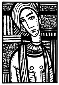
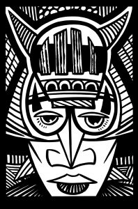
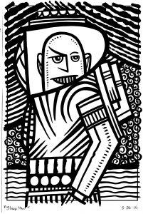
This second digital book of mine that’s only half an idea at the moment is another mixture of art and words but first I have to mix together some drawing and photography. It’s working title is “Big From Small and Small From Big”. That kind of describe what I want to do. At least visually. I’m mixing (page design-wise) my small baseball card size ink drawings with some of my digitally manipulated photographs that I call Photocaps because they have words on them. The ink drawings are going to be blown up much larger than the size I drew them at. This changes their context and make me look at them in a different way. Small gestures become large ones. It makes me look at the drawings in a whole new way. By default photographs are not life sized. They’re the largeness of life captured as an image a fraction of it’s real size. I had never really thought about that before. Pairing them with the ink drawings made me realize it. I’m not sure what is going to come out of that realization though.
I also have to decide on the exact size of the book. I’m a print guy. I really really want to make a print version of this. A real life book. But I doubt that is going to happen. But still I find myself reluctant to totally jump into the idea of purely digital. So I set up the design document with the automatic formatting for an iPad but I’ve found that makes me uncomfortable. Not for any technical reason but because I’m used to setting things up for print. It’s a weird psychological hurdle. I’ll get over it but until I do I haven’t.
I’ve been mostly working on some new Photocap photos. I’ve got the process down for them pretty good and sometimes they go quickly but often not as quickly as I expect. I make the Photocaps with Photoshop filter actions that I use to make the digital manipulations. That means in order to get a certain effect I run four or five different types of filters on the photos and manipulate the different layer styles and layer opacities to get the look I want. The good thing about that is I can figure out how to get the look and then record what I did with an Action (a macro). So next time I work on a Photocap I just have to press a button to get the same style. This saves a lot of time. Of course I’m always looking to make new filter recipes so I decided to work out a new one this week. That takes some time. I think it took me three hours to get what I wanted. But that beats three extra hours per Photocap.
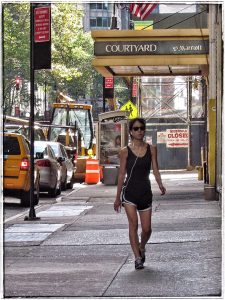
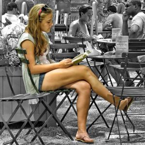
I start one of these Photocaps by looking through my files of street photos. I shortened the process a little bit this time by starting with some of my regular, already finished, five by seven inch street photos. I have about thirty street photos that that size that I made into finished photos and printed out. I have a little easel that I keep on my desk and I put one of the five by seven inch photos on it. I change the photo out every day or two. It gives me something to catch my eye every now and then. I found a few of those street photos to turn into Photocaps. They went smoothly.
When looking though all my unfinished street photos things go less smoothly. It’s good that I have a lot of them to look through but that also means I have to look through a lot of them. And that’s real work. I flip through them on screen just using the OS’s “Cover Flow” view searching for something that catches my eye. After it catches my eye I have to decide if I can work with it. It’s funny how some things stand out some days and not on others. Photos have caught my eye only to be cast aside on one day and another I figure them out. Some never catch my eye. Until they do.
If I’m lucky the words I want to put with the photo come to me as I’m looking at it. Often they don’t. But that just means I’ll have to think of them as I’m working on the image. Part of picking the image is believing I’ll be able to write some words to go with it. Even if I don’t have them right away I’ll get them. I thin this is why different photos stand out to me on different days. I’m trying to find the words as I’m looking.
So I got a handful of new Photomaps ready to go with my recently scanned in 160 ink cards. I’m still not sure what story I’ll get out of it all but I’ll work on it. It’s the only way to get work done.