It’s a Sunday afternoon (April 23, 2023) and I’m feeling in a nostalgic mood so I’m going to watch an episode of “Friends” and write a walkthrough. It looks like I’ve haven’t watched any episodes since my last walkthrough so I’m on Season Six and Episode Seventeen. “The One With Unagi.” I’m glad to be writing about this one because I remember it as one of my favorites. We’ve got a lot of crazy Ross in this one.
It first ran on February 24, 2000. Let me check my calendar to see what I was doing on that day. It looks like I only have one thing written for that day and it’s that I worked on some animated gifs for a company named Uproar. Though the next day (a Friday?) was a friends wedding. I also have a note on my calendar that says “Ed got fired.” I assume that’s my friend Ed but I have no idea where he got fired from. And I played touch football the following Saturday. That may have been one of the last times I did that. Let’s start the show.
It starts with them in Central Perk and Ross is saying, “Remember when I had a monkey? What was I thinking?”. I’ve always loved this reference to Season One because I always hated Ross’s monkey. There were never any funny bits with it and it was such a dumb sitcom thing to do. I glad they acknowledged it. Now on with the show.
I completely forgot this was the period when Joey was working as a waiter in Central Perk. He’s complaining about tips because he needs new headshots. He’s broke and wants to get paid for medical experiments (the start of the first plot). Gunther even chews Joey out for talking instead of working. But he’s incorrigible and here comes the theme sng.
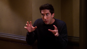
Rachel and Phoebe arrive at the coffee shop (Phoebe was already there in the opening so time must have shifted) and tell stories of the glories of their new self defense class. Ross is skeptical about their skills and so Ross tells them about his karate days and the concept of total awareness: Unagi. Hence the title of the episode (and the second plot). Now it’s the girls turn to be skeptical. Ross is at his best in this scene. The hand gesture that goes along with Unagi is brilliant.
Chandler enters and needs a late Valentine’s gift for Monica. Joey makes a crotchless panty comment that lands with a thud but is funny for us. The kicker is that Monica and Chandler promised to make each other gifts. As the plot unfolds we’ll find that neither is very good at making things. That’s our third plot.
Now Chandler is back as his apartment. He’s making about the dumbest thing I’ve ever seen with two pencils, a paper cup, and a wire coat hanger. It’s a no go. Monica walks in. She seems nervous but plays it cool. Maybe even a little over the top. Of course it’s revealed that she’s made nothing for Chandler.
New scene with Joey at the hospital looking to volunteer for a study. There is a $2000 identical twin study but Joey has no twin. He’ll still hit on the nurse/receptionist though. Not his lucky day.
Quickly we goto Ross hiding in the hallway and looking to surprise Rachel and Phoebe. His doing the double hand claw and shouting “Danger” never fails to crack me up. Of course the women are startled. Ross saying “Unagi” with the twisting double finger point at his own head cracks me up every time too. Crazy Ross rules. Rachel and Phoebe are flabbergasted. Top flight scene.
Back to an audition with Joey where we get to hear his inner monologue of him wishing he had a twin. The camera pulls back and we see a group of guys, about his size and shape, in a matching leather jackets. This is the fruition of the first plot as Joey tries to convince everybody that a random stranger is his twin. There is a lot of good silly in this episode.
Now we’re at Ross’s apartment as he is bringing in his laundry. Chandler walks in. Ross sensed it was him. Unagi. Chandler is uninterested. He’s looking for anything that looks homemade that he can give to Monica. Chandler leaves empty handed and then Phoebe and Rachel jump out of the curtain and yell “Danger!” Ross gives out a high pitched scream. A nice surprise for the audience too.
A new scene has Chandler searching his own bedroom for something to give Monica. A nice callback to the crotchless panty joke and then he finds a random mix tape. By the way, mix tapes in the year 2000 were not a thing anymore. We had moved on to mix CDs by then. He gives it to Monica but he has no idea what songs are on the tape.
Monica gives him a present in return but it’s one of Phoebe’s sock rabbits (they were mentioned in the beginning of the episode but I didn’t mention them. I forgot about this callback to them). Chandler knows than Monica didn’t make them so she’s busted and confesses. Monica is feeling so guilty that she promises Chandler the world. He doesn’t confess and accepts.
Now we’ve moved forward in time and see Monica and Chandler in bed after promises were kept. They are both happy and glowing. She’s even making him more promises.
The stranger (Carl) who Joey wants to play his twin walks into Monica and Chandler’s apartment and casually gets a soda as if he’s Joey. The two are stunned. Joey storms in as the not-twin gets his, “How you doing?” catch phrase wrong. Joey explains his crazy scheme. I love this crazy scheme. It’s so dumb that it’s genius.
Phoebe and Rachel are in Phoebe’s apartment. This has to be more Unagi stuff. They see Ross’s tall hair sticking up over the back of a chair as he hides to ambush them. I guess they ambushed him as in the next cut Ross is face down on the ground with the women on top of him trying to get him to say they have Unagi.
Now they’re going to wrap up the Joey plot as he and Carl show up for the twin study. Of course their ploy fails. It was obvious but I still found it funny.
Next Chandler returns to his apartment and Monica has a candlelight meal set up for him. Chandler is trying to get her to stop because he feels guilty. Monica puts on the tape and they dance to “The Way You Look Tonight.” Here comes the payoff!
Suddenly we hear the distinctive voice of Janice, Chandler’s old girlfriend, on the tape saying she likes the way he looks every night. It becomes obvious to Monica that she’s been had and Chandler didn’t make that tape for her for Valentine’s Day.
Here comes a goofy scene with Ross in a self defense class wanting to know how to beat up two women. It doesn’t go well for him.
Now Chandler is apologizing. It’s not going well for him either but it is funny and Chandler makes some headway. Except the tape is still playing and here comes Janice’s voice again. Roll credits
The credit scene is Ross trying to attack Phoebe and Rachel again but it turns out not to be them. Phoebe and Rachel do have a nice view of it from Central Perk as Ross has to run away.
Let me check to see what was cut out of this episode. Nothing. Nothing was added for the extended DVD cut so nothing had to be cut out for the HD edition.
I don’t even have to check what I rated this one a decade ago when I rated all the episodes. This was a five to of five stars for me. I especially liked the Unagi plot but they all amused me. There is a reason Unagi became a meme. It’s funny stuff.
