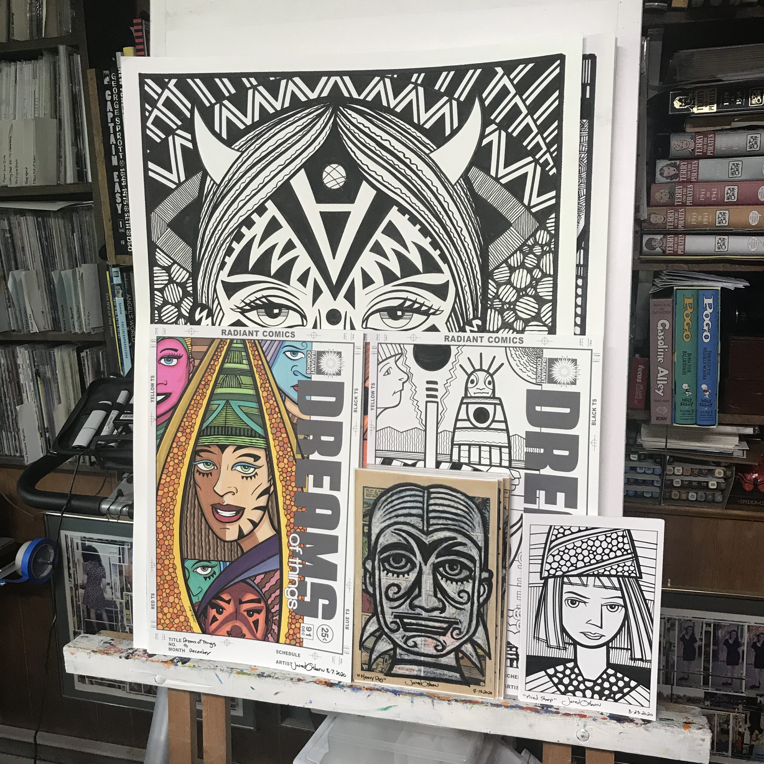
I’m back from the comic shop this week and I got four new comics.
Check them all out here:
I’m back from the comic shop this week and I got four new comics.
Check them all out here:
It’s time for another write along with “Friends.” I’m in the mood for one. I’m about to watch episode two “The One Where No One’s Ready” from Season Three. This one first aired on September 26, 1996. I’m going to check my calendar to see what I was doing that day. Right off the bat I know I had just turned 30 about two months before this episode. Looks like I commuted in to Manhattan that day to work in the Marvel Comics Bullpen. I did the prepress on some comic book covers.
I also noted that I went to Pearl Paint that day. It must have been at lunch time. I got $40 worth of paper and $67 worth of gouache paint. I think I was just getting into using gouache right around that time. Coincidentally, just this week, I was just cutting open old dried out tubes of gouache to put them in plastic cubbies. Then I added water to them to revive the paint. I haven’t touched my gouache in decade. A few of those tubes were probably even from 1996.
Before I start the episode I think this is one that annoyed me. It annoyed me because I felt Ross’s pain. I hate it when people are late. I’m considerate enough to plan out my time so that I don’t inconvenience anyone by being late and I expect that in return. It’s basic human manners. It was bad enough when in the episode when Rachel was late by accident but when she started being late on purpose it annoyed me to no end. At least that’s how I remember it. I’ll start the episode now and see how my memory stacks up.
The opening scene is Chandler and Joey being late. The annoyance starts early. Rachel shows up fresh out the shower with her makeup done and Roos thinks she’s close to being ready but she lets him know she’s not. And here comes the theme song. There were some drinking a cup of chicken fat jokes in there too that weren’t particularly funny.
New scene and Ross is nervous about a speech he has to give. That’s right, he has to give a speech and still everyone is giving him a hard time. Phoebe shows up dressed and ready to go. Yay! Now Chandler and Joey fight about who gets to sit in a chair. This plot is going to last the whole episode and is the funniest thing in the show. Or at least it builds to be. Monica shows up and she’s running late. Now some phone answering machine gags. One of the messages is from Monica’s old boyfriend Richard and she falls apart. The boys get a humus stain on Phoebe’s dress ruining her being ready.
This is a long scene. All the friends are in it and it all takes place in the apartment. They’re coming in and out of different doors with different plots and problems. We’ve got Phoebe’s stain, Monica calling Richard and messing with his answering machine, the Joey and Chandler fighting over a seat, and Ross being tortured by it all. I think that’s the whole show. We even break for a commercial and come right back to the apartment.
Monica is now falling apart as she thinks Richard is seeing someone new. Chandler looks good in his tux. He’s ready to go. Except he’s still in a fight with Joey. They have twelve minutes to leave and still the girls aren’t ready. Joey doesn’t want to give up his seat so he takes the chair cushions with him as he goes to change. Ross can’t do anything right as he tries to get Rachel ready.
Joey barges in and he is still not dressed because Chandler took his underwear in retaliation for Joey taking the seat cushions. Joey needs new underwear to wear with his rented tux because at the moment he’s not wearing underwear. This is when the phrase “Going commando” (for going without underwear) entered pop culture. The phrase was everywhere after this episode. Joey says “You hid my clothes and I’m going to do the exact opposite to you” setting up one of the classic gags from this show. Ross and Chandler have no idea what he means and neither did I as a viewer.
Phoebe shoes up with a giant Christmas ribbon covering the stain on her dress. Phoebe’s plot really isn’t especially funny this episode. Ross’s watch stopped and he gets even more stressed. He blows up a little but at Rachel and she reacts by torturing him even more. Monica is still upset and digging herself into more trouble. It’s not funny but it is heartfelt. Chandler has a good Donald Duck observation.
Rachel show up out of her room with sweats on and tells Ross she’s not going to go. She is so high maintenance. Ross is trying to make things better but he can’t. I feel for him.
Joey walks in through the door and we get our payoff. He’s wearing all of Chandler’s clothes. Well, maybe just some of them. He’s got about six shirts on and a bunch of pairs of shorts. It’s a great visual and a classic gag. This episode may annoy me and cause me more stress than any other but this gag makes it worth it. Joey lets Chandler know that he’s going commando in Chandler’s clothes. Heh, heh…
Now we get the climax with Ross trying desperately to make up with Rachel. Joey suggests Ross eat the chicken fat. This is a solid gag but it still doesn’t make me less annoyed with Rachel. Monica is still messing with Richard’s answering machine and it doesn’t go well for her. She looks good in her red dress though. Rachel’s mint green dress looks nice too. But I’m still annoyed with her.
The final credit scene is a solid call back to Chandler’s “You’re sitting in my chair” gag.
Now I’ll hit up http://uncutfriendsepisodes.tripod.com and see what was in these DVD episodes but was cut out of the episodes that are in syndication and streaming. They cut out Chandler yelling “Get up!” at Joey a bunch of times. Not missing much there. But they also cut out a good answering machine gag with Rachel’s sister calling. That was a funny moment. They also cut a “Does this match” scene. No great loss. Hey, they cut out Phoebe’s Crazy Straw joke. I liked that one. Then some small bits and bobs that don’t matter. The last thing the cut out was Ross’s Cro-Magnon PI joke from the final scene. I liked that.
So there you go. Another episode of “Friends.” It may be annoying but at least we got a classic Joey moment out of it.
The comic shop is still closed so I got no comic books.
I made a video though.
Check it out here:
I just finished another big ink drawing. 22×30 inches. I think this is the 12th one I’ve finished in 2020. I’ve gotten about one a week done. I can’t remember if it was the Fall of 2019 or the Fall of 2018 but I was getting two of them a week done during a two month period. That was the most into drawing them that I ever was. They usually take two or three days a piece so I was working on one nearly everyday at that point.
As I’m writing this we’re nearing the end of week two of COVID-19 lockdown. I’ve not been commuting and have been preparing to do remote teaching but it’s been hard getting things done. I’m used to being self motivated and making art on my own but I bet we’re all finding it tougher to get things done these days. I think part of why I’ve been working on these big ink drawings is momentum. I’ve been doing them for a while and it seems easier to continue doing them rather than trying to come up with something new. So I guess I’ll just keep going.
This new one is called “Mystic Barber.” I usually name these randomly but this name was purposeful. That’s because for the last two I came up with stories to go along with them as I was drawing them. This one became “Mystic Barber” because of the hair of the main character. It takes up a good portion of the picture. The smaller guy also has some wild hair so I figure they both must walk the Dreamworld and connect with it through their hair. They’re superheroes in the Dreamworld and make suer that everybody’s hair is working for them and not against them. When your hair turns on you it’s not a pretty sight.
I used quite a few techniques in this one. The blocks on the side were done with my Haff hatching machine and markers. That’s how I get those parallel lines. I used my regular Copic marker plus a Copic marker that I replaced the regular tips with flat calligraphy tips. That way I can get two more thicknesses of line. It gives those parallel lines a little bit more variety.
The wavy part of the background was done with India ink. The thicker lines are done with a brush and ink. I put those in first, near the beginning of making the drawing, but then wasn’t quite satisfied with them. I knew I has too much white space in that part of the background but I didn’t want more brush lines. I pondered it and at the very end of making the drawing I went in with a dip pen and India ink and put in all the thin wavy lines. The dip pen gave me a thin and consistent line. That’s something a marker can’t always do consistently as marker in sometimes bleeds a bit.
After I transferred the drawing to the paper I inked in the outlines of the figures and the shapes in the background. That’s how I usually do things. After the basics are in I figure out my patterns and techniques. The first thing I dealt with was the main figure’s hair. I thought if I could get that right the rest of the drawing would fall in line behind it. I think I was right. The big thick strokes were made with a big #6 round brush.
That was the easy part. I knew I wanted some smaller brush strokes too but I had no idea what kind. After much contemplation I decided on my busted brush technique. That’s when I use one of my old worn out brushes that no longer comes to a point but has many points. It puts down a bunch of thin lines all at once. I don’t usually use that technique in these big ink drawings but it was perfect for here. I like the way it came out and took me longer to figure out what to to than to do it.
The next thing I did was the black pattern on the main figure’s face. That was kind of odd because I usually save that for later on but I wanted to tackle it right away with this one. That may have been because I had no idea what I wanted to do. I usually have 90% of the drawing figured out in a small pencil drawing that I then transfer to the bigger paper but for this drawing it was more like 70%. I took out a pencil and drew right on the face. Since I used a jagged edge for the strange ear horn I decided to use a jagged edge in the face designs. Coming to that decision is what got things rolling. After that it was easy enough to execute.
Maybe that 70% number I mentioned before was really closer to 60% because I had to do a lot of drawing on the main figure’s body too. I had the basic shapes of his shirt but none of the patterns were there. I had to figure out the scales on his back, the stripes on his chest, the boxes on his stomach, and the coils on his arm. That took longer than I expected. I kept thinking that I was close to being done but then there was always more to figure out.
The smaller head at the bottom was the last thing done. At least most of the details. I did the glasses early on but his neck and shoulders weren’t done until the end. After taking so much time with the big guy’s shirt it took me it surprised me how little work it took to finish off the little guy. It shouldn’t have surprised me because it’s so much smaller an are but somehow it did. I was used to things taking a long time by then.
In looking at the finished drawing the little guy’s stare really jumps out at me. Partly it’s the glasses but mostly because it’s the largest area of white in the drawing and hence it’s the brightest part of the drawing. That really draws me to it. I also tweaked the lips on the big guy’s face to give him just a little bit of a closing mouth/crooked smile. It’s a weird expression. Weird is my forte though. I think I’ll go with it. And keep on making some weird big ink drawings.
The comic shop is still closed so I got no comic books.
I made a video though.
Check it out here:
I started working with gouache some time in the mid 1990’s. I wanted to learn it so I bought some tubes of gouache and practiced. Gouache is a watercolor with white added to it so it’s opaque where watercolor is normally transparent. It’s this opaqueness that drew me to gouache. I like opaque paint. It’s solid and makes a statement. If you thin gouache with water it can also be transparent like a normal watercolor so with gouache I could work with opaque and transparent color.
I enjoyed working with gouache as I learned it and after I learned it. It was a good medium for me. The first gouache I ever bought was a cheap pan set made by Pelikan. It was a good set and I still use one like it every now and then. I also bought many tubes of gouache over the years and liked to use them too. Linel and Windsor Newton were two of my favorite brands.
One of the reasons I liked gouache was it’s bright colors and immediacy. I could make a small gouache painting fairly quickly. When I put down some color on the paper it was there in only the time it took the water to dry. That was fast compared to the oil painting I also did. Sometimes fast is its own reward.
It was about ten years ago, around 2010, that I started getting into markers. Once again I was looking for bright colors and immediacy. It took me some time to develop a finished marker technique but after I did I went whole hog into illustration markers. They were really immediate. Markers have almost no drying time so I put color down on the paper and it was there in an instant. There is a satisfaction to that. It allows me to act right away. I put down one color, then another, and then another. I can keep going with color quickly and efficiently.
After getting into the markers I hardly ever used my gouache paints anymore. I would occasionally pull out the pan set because that was easy to use but the tubes of gouache that I had stored in a nice little twelve drawer unit that’s made for nuts, bolts, and other hardware doodads, sat there untouched. I can’t even remember the last time I touched that paint. Until this week that is.
Over the years I developed a way that I used my gouache. I have these little plastic containers called cubbies. Often I’m mix new colors out of my tubes of gouache. A lot of the time they were just tints of white if I needed a lighter version of a blue or some other color but sometimes if I needed more red in my violet I’d mix a new violet. I’d mix these colors in a plastic cubby and store the extra in it. The cubby was airtight so the paint would last in there. I built up quite a collection of mixed colors in cubbies. Those cubbies then sat there for a decade.
Over the last few years I’ve been making big ink drawings. 22×30 inch drawings in black and white made with markers, bushes, and India ink. I’ve enjoyed making them but earlier this year I was tired of black and white so I decided to add some color to one of them. I used some colored ink that I bought a few years ago and though I had some trouble with it the drawing came out alright in the end. The colored in worked well in this situation but it brought my mind back to my gouache.
My small plastic cabinet of gouache was still where it had always been but the paint in the tubes was rock hard. It had been that way for a long time. I also have these ArtBin storage boxes that I keep the cubbies full of paint in. The cubbies were dried out too. But the good thing about gouache, at least designer gouache (not acrylic gouache) is that you can rewet it. That means you can add some water to the gouache and make it good as new again. Most paint isn’t like that but gouache is.
Since I got it in my head that maybe I can add some gouache to my big ink drawings I decided I should buy some new tubes of gouache. I even looked up which tubes I should get on the Dick Blick website. But then I realized that I had still my old tubes of gouache and I should do an inventory first. It turns out I had a lot more tubes than I remembered so I’d use those first. Of course I’d have to rewet them all.
I ordered some new cubbies to get myself started. I ordered thirty of them thinking that would be way more than I’d need. Turned out I didn’t do a thorough inventory of my paint and until I started rewetting the paint I didn’t realize how much of it I had. I ended up needing almost all thirty of the new cubbies plus some of the old ones I still had lying around.
Rewetting the gouache that was still in the cubbies was straightforward. I’s put some water in the cubby with the dry paint, close the lid, and wait. After a couple of days I’d stir it up. The tubes took a little more doing.
To rewet a tube of gouache I had to get the gauche out of the tube. I’d cut off the back end of the tube with some scissors but then use an exact knife to cut off the cap end of the tube. After that I’d run the X-Acto knife along the side of the tube and open it up. When the tube was open I could scrape or dump the dried up paint into a cubby. This was messier work than I thought it would be. Little specks of paint get everywhere. I ended up working on a large rag so I could go outside and shake off the paint flakes every couple of tubes. That kept things neat.
It took me nearly the whole day to rewet all my gouache. I think I started at about nine in the morning and didn’t finish until the afternoon was almost over. It took a solid six hours to get it all done. I had not expected it to take so long. It ended up being quite tiring too. It took a lot of concentration and physical labor. It wasn’t digging ditches but cutting open tubes takes a toll.
In the end I’m glad I did it. When I was working on a big ink drawing this weekend I got it in my head that I could add some color to it. This time I used the colored inks and some gouache. I’m glad I had that choice because the color looks nice.
The comic shop is still closed so I got no comic books.
I made a video though.
Check them all out here:
In the first couple of months of this year I’ve been doing some new big ink drawings. I’m not quite doing them at the twice a week clip of last fall but I’ve been getting one of them a week done. Usually on the weekends. I enjoy making big ink drawings because I like creating images. Making big images is especially satisfying. Size really does matter. A five by seven inch drawing is fine but make the same drawing at 22×30 inches and it has a lot more impact on the viewer. It’s fun to make an impact.
I also like working with patterns. As you can see from the my big ink drawings I use a lot of parallel lines, swirls, and circles to fill the spaces of the drawings. Though I can also do this at a small size the patterns are harder to see when they’re smaller. The small patterns blend together into similar grey patterns. At the larger size the patterns become a different thing. They have more life.
My latest big ink drawing is called “Say it Slowly.” It was originally a 6×9 inch ink drawing that I made from one of my inkbook sketches. That’s when I named it. After I make a 6×9 inch ink or pencil drawing I name the drawing with whatever title pops into my head. I do that so I can identify the drawings in my notes and keep track of them if I need to find them. That’s how I end up with some funny names for my big ink drawings.
I use three different inks when I make these drawings. First I have the bottled ink I use with my brush. Right now I’m using the Dick Blick house brand Black Cat ink. That’s the ink I use for most of the drawing and the ink that I use to fill in all the large areas of black.
The second ink is the Copic marker black ink that comes in the markers. I also have black ink refills for the marker so I can add more ink when they dry out. Most of the straight lines are Copic black ink. I use the marker against a straight edge or French curve to get a solid even line.
The third type of ink is Rapidograph technical pen ink. I refill some of my markers with this ink and also occasionally use a technical pen filled with this ink too. Technical pen ink has a matte finish and you can see the difference between it and the Black Cat ink as the light moves across it. At a distance it’s all the same but as you move towards the drawing you can see the change in ink easier.
As I look at “Say It Slowly” it’s not like my usual big ink pieces. It only has two recognizable images in it. Two faces. A robot face (or helmet of some kind) and a woman’s face. The rest is filled with all sorts of shapes and patterns. There is no real background space in the drawing which is unusual for me. I often fill a lot of the negative space of big ink drawings with faces and other objects. But here I didn’t. I’m not even sure why. I didn’t notice it until the piece was well under way. Sometimes I work on instinct as much as intent.
Even with just the two faces I see a story in this image. I often see stories in the images I make but the stories are usually complex because the images are busy. This one is a little simpler. I see a story about a woman taking off her helmet. Her helmet is full of magic that is showing itself as she takes it off. Or maybe she’s putting the helmet on. And the helmet is smaller than her head so it has to be magic in order to fit. Either way the image is about a moment.
For a fairly simple image this one took me a long time to do. That’s the way it is with simplicity. It takes longer than you think. Often complexity is easier because there is a lot of stuff so and single image is less important than the whole. With simplicity often there is only one image so it is the whole. It has to be just right or the whole thing falls apart. It’s a lot of effort to make something look effortless.
Both the helmet and the face look a lot different than in the initial small ink drawing. The basic shapes are the same but the details are different. As you might expect there are more details on the larger drawing. The black markings on the face aren’t even in the original drawing. The helmet also has black markings that aren’t in the original. The eyebrows on the original helmet are just a single line instead of three lines.
I finished the helmet first in the big drawing and then finished the face. That’s because I had no idea how I was going to finish the face. It was much simpler for most of the three days I was working on this drawing but I knew I was going to do something with it. As I was working on the helmet and the background I was contemplating what to do with the face. It didn’t come to me for a long time. It wasn’t until the end when I put in the double cheek bones that I had an idea about its direction. Double eye brows and all the other face shapes came after that. With the giant eyes and lips the face took on a slightly clownish look. It went from a slightly weird face to a very odd mask.
The angles of the background lines were also important. I decided against eyeballing the angles and so I took the time to use my triangles to get the right 45º and 30º angles that I wanted. It took a while and a bunch on contemplation to get the textures and patterns I wanted. In the end I think it all holds together.
The comic shop is still closed so I got no comic books.
I made a video though.
Check them all out here:
Among the things I’ve been working on lately have been 6×9 inch ink drawings. I’ve been having at them without even the benefit of any pencil drawings first. I’ve been looking though my inkbook sketchbooks for a thumbnail image that I like, blowing it up digitally, printing the thumbnail out in blue line on a 6×9 inch piece of paper, and then I draw with ink right over that blue line to create a finished drawing.
I got a bunch of them done over the months of December and January and then I got it in my head that I wanted to make a mini-book out of them. I’d call it a mini-comic except they’re not really comics. There is no story or writing that goes with them. They’re pictures. The whole point of doing them was to be able to work out some images more quickly than I usually do and not to make comics.
If you remember earlier this winter I wrote that I started making and printing out black and white photos because I had an excess of black ink for my printer. Even with those photos I still had extra black ink and so decided I could print out some of my ink art since it was just made up of black lines. It seemed a natural.
I decided on a sixteen page book that was mini-comic size. That means a four pieces of 8.5×17 inch paper folded in half and stapled in the middle. Back in the 1990s I made mini-comics on a photocopier and had to make a paper “Master” of each page in order to photocopy it. This being the digital age instead of doing that I set up the comic digitally in Adobe InDesign. That’s a program specifically made for designing books, magazines, and other printed material so, though it took some time, it was easy to do.
Part of doing any kind of book is picking the paper you want to print it on. I checked my shelf to see what I had available and saw that I had some nice 47lb double sided matte paper to print on. It turned out to be a little too nice though. It seemed a little too thick for a small book. I had some plain paper too but that seemed a little too thin. I ended up putting together a prototype and the thicker paper worked well for the cover but the thinner paper was too thin for the interior. That and being plain paper it had no inkjet coating on it and so wouldn’t print art very well.
Searching for some new paper I jumped on the internet and found some Koala 120gms matte photo paper. It looked pretty good and after I ordered some and received it I found out it was indeed good paper. So now I had my magazine and art set up digitally, the paper for the cover, and the paper for the inside. I was ready to go.
I mentioned before that I made a prototype with the plain paper first. I do this because it can get a little tricky making your own mini-book. You have to make sure you print all the pieces in the correct order and on the correct pages so that when it folds over everything is in the right place. It’s best to do this with the cheaper plain paper.
What’s funny is that as I was putting this mini-book together I had no idea what the cover would be. I didn’t have a name, logo, or cover image for it and didn’t really want to take a lot of time to make them. This mini-book was all about me making a physical mini-book. I wanted to make something tactile. I had all the interior art laying around waiting to be made into something so that was a no-brainer but the cover stopped me in my tracks. I had nothing for it.
In the end I decided to go with my “Dreams of Things” logo. Why not? It was my fictional comic that I’ve drawn many covers for so I might as well make an mini art book out of it too. I used a face I already had drawn and never used for anything as the image for the cover. Covers 2-4 were also filled out with artwork other than the ink drawings I used in the body of the book. I have plenty of art finished so there was no need to work out a new piece for the cover if I didn’t want to.
After I had printed out all the pages I actually looked up a video on YouTube about how to fold a piece of paper in half. I’ve folded tons of pieces of paper in half including lots of mini-comics in the 1990s-2000s so why I felt the need to do this I don’t know. But I found a nice video by a woman who did a good job of explaining how to fold a piece of paper in half. She did it the exact same way I’ve always done it but it made me feel good to watch it. I even pulled out the bone folder (made out of plastic) that I got last year to press down on the fold.
I found the hardest part of making the mini-book to be the stapling. Maybe hard it the wrong word but I made the most mistakes during this part. I have a long reach “Swing” stapler from back in my mini-comic days that’s just the tool for the stapling job. Except that there is a bar to set that measures out the correct distance to sample at and I couldn’t quite get it right at first. Not all my staples landed directly in the middle of the fold and I had to take that staple out and put another in. That left extra holes in the paper. Oh, well.
I ended up making six copies of my mini-book and then was done. It took much more time to print them out, fold them, and staple them, then I thought it would. Then when I was done I looked at the copies, was proud for a moment, and then put them on the shelf not to be looked at for months. Once I scratched the itch of wanting to make something physical I had nothing to do with them. It’s not like anyone else cared that they existed. That’s life. On to the next thing.