Next up on my list of my artwork to write about is an oil painting. Unfortunately it’s from before the time when I was naming and dating all my artwork. Annoyingly I have no idea exactly when I painted it. The best I can do is mid to late 1990s. It doesn’t even have a name as all my paintings of the last ten years do. I’m disappointed in the me from that era (in a Calvin of “Calvin and Hobbes” sort of way) for not keeping track of things. As I now dig through my website I noticed I named it for that. I called it “Icon”. That’s a terrible name.
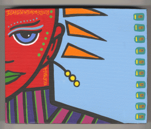
For the sake of this piece of writing I’m going to call the painting “Stained Glass Woman”. That’s more literal than my usual names but it turns out that if I have to name something fifteen years later literal is what I gravitate towards. Who knew? I choose to refer to stained glass in the title because that’s what I was going for here. Though it’s heavily textured oil paint with a lot of surface the imagery is influenced by stained glass pictures of saints and such.
To begin with the woman has a halo. Three halos even. Though none of them are circular. This was a curious bit of compositional cleverness that I came up with to make the space more interesting. Since her head is not up at the top of the painting where I would usually put a subject’s head there was a lot of space up there than needed to be dealt with. Therefore the top third to nearly half of the painting is about the halos. That’s more of the stained glass influence coming through.
The first halo is the one closest to her head. It may even be two halos in a way but I consider it one. We have the loop of red circles enclosing some beams of green that continue the color of her clothes onto the top of her head. I remember initially making this halo round but it didn’t seem to work. So I continued the edge of the circle down near her neck until it became the outside of a spiral. I like that much better.
The second halo is the segmented ellipse of blue that’s behind her head. It’s not even a complete ellipse as it gets cut off on the left side but the eye tends to complete such shapes. The ellipse is segmented into multiple shades of blue as it would be in a stained glass piece. I find it interesting that I didn’t segment the bottom arc of blue that comes out of her chin as I did the top arc of blue. This give the eye the largest uninterrupted piece of the ellipse to sweep across and complete the ellipse in the mind’s eye. Plus it balances out the shape of the arm below it.
The third halo is the collection of yellow triangles that are on top of the blue segmented halo. They are the most like “Rays of light” which is the description of a halo. They almost seem to be like lightning strikes to me. This is the part of the painting that is least like stained glass in my mind. They seem to have more in common with comic book motion lines to me. I like them but I also find them odd. They’re not as calm as the rest of the painting’s shapes. They add a little action to the whole thing. More action than in a stained glass piece.
The woman herself is a bit of a mystery. Who is she? I’m not sure. Her pose is one that I made up out of my head and is not based on reality but on turning the body into simple shapes. The figure itself has almost no stained glass influence in it except for maybe the design of the sleeves. Even her hair is a bit of a mystery as it’s a magenta-ish color and though she has hair coming down the back of her head the hair on top could easily be a skull cap of some kind. Plus she’s actually missing most of the top of her head. Her eyes are way too high on her head to be realistic but I did this to balance her out with the rather dense green part of the halo. Moving the eyes up high is something I don’t often do.
I remember this painting taking a long time to complete because of all the small interlocking shapes. My technique for painting in oil was to paint the black line first and then put down the color by pushing the paint up to the black line. The colored areas have much thicker paint than the black areas. The black edges are actually defined by the shape of the color and not the other way around as is usual. I find that the little blue shapes around the arms and hands do a good job of creating visual interest that can complete with the halo and keep the halo from being too dominant.
Since the shapes in this painting are so complex I played it a little safe with the color. The painting is primarily two analogous colors: green and blue. This keeps things harmonious but can also make things boring if you’re not careful. I played with some red, yellow, and violet in there to keep the eye moving and make things more interesting to look at. The red and the yellow are especially important as they, along with blue, are primary colors and therefore can have a lot of impact. They can leap forward on you so I used them where I wanted that to happen. The yellow really jumps out but I kept the red mostly on the edges and in the trim so it wouldn’t overpower things. Color is always a balancing act but one that I enjoy.
I’ve painted a lot of paintings over the years and most of them are tucked away somewhere. This is one of my favorites though so it’s been hanging on my studio wall since around the time that I made it. I made a few paintings about this size back then and used to hang them in this spot to dry. Then I put this one up and didn’t want to take it down. I liked it better than the others so there it’s stayed all these years. Yet this is the first time I’ve examined it in a while.


![Force-of-Gravity-[Converted]](/wp-content/uploads/2013/06/Force-of-Gravity-Converted-300x202.gif)


