I’m back from the comic shop this week and I got six new comics.
Check them all out here:
I’m back from the comic shop this week and I got six new comics.
Check them all out here:
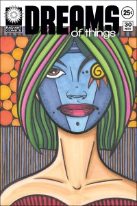
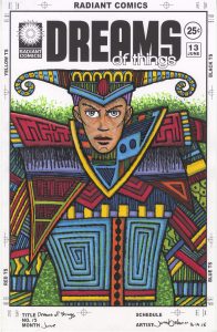
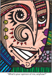
As far as I can tell the last time I wrote about an individual “Dreams of Things” cover was back at cover number 170. Being that I just finished number 224 that means that it has been a while. Time relentlessly moves forward.
Just after I finished marker coloring this cover I prepped a bunch of others so that I could draw them. I picked out eight thumbnail drawings from my 2022 Inkbook and digitally printed them out, in blue line, onto 6×9 inch Bristol paper. Now I will draw them over time.
But back to the cover that is in front of me. Number 224. The first color that jumps out at me when I look at this is the purple. Or rather the purples. There isn’t a ton of purple in this piece, it’s not a theme, but they seem to jump forward at me. There are three purples up top that are underneath the logo, two purples that stand out against the orange of the collar, and two more purples in the shirt.
The contrast between the orange and the purple in the collar might be my favorite part of this piece. I like the way they bounce off each other. Though the purple catches my eye first it’s the orange that really stands out in this piece. It’s bright and almost makes a bullseye of the brown face. It’s the only place orange is found.
I bought some new Artfinity markers since I last wrote about one of these covers and those purples are some of those new markers. It was nice to add some new colors to my marker palette.
As a side note I also bought some Blick markers last year and there was one, 010 Purple, that was my favorite new color in the group. Unfortunately the color proved to be fugitive. When I get new markers I swatch them out. I have a piece of paper with boxes on it and I sample the color by filling one of the boxes with it. I keep those swatches on my drawing table as I work to help me pick colors.
Over a few months time I noticed that the 010 Purple looked like it was changing color. It was getting less purple and more magenta. I drew a mark with the marker next to the old one and sure enough the old swatch had changed. In only a matter of three or four months. I’ve run into some markers that are fugitive, they lose their color over time, but it usually takes years for the color to fade. I’ve never seen anything like one that changes in mere months. I stay away from that marker now. I even went to the Dick Blick website and left a review to note that was happening.
Blue might be the dominant color in this piece. There is a lot of it. Blue is behind the person’s head, blue is in his shirt (I think of the person as a “He” but his gender is really unclear), and there is plenty of blue in the Mondrian-ish design down the bottom. There is a lot of variety that keeps the color from being overwhelming. The contrast between the dark blue and bright blue in the shirt makes for a nice look.
Green might be the number two color by volume. There is a green stripe across the top and a big green “U” shape in his shirt. I made them both with the side of the brush marker with a shakiness to the stoke so the greens look a bit like grass. Especially the top stripe. I like to put marker color down in textured patterns to mix up the look of things. Solid color needs something to contrast against.
On either side of the blue background are stripes of gray. I used these neutral grays to help the background stay in the background and not creep forward visually. The blue is bright and strong so the grays’ halo tame it. The horizontal texture also helps.
I actually colored this one from top to bottom. That’s not always how I work but this one ended up being done that way. As a consequence I had plenty of time to think about what I wanted to do with the color on the bottom and ended up thinking that I should keep the color flat and untextured down there. That led me to blue, red and yellow reminiscent of the work of the famous painter Mondrian.
I put the red down first as the faded red of his lips was the only other red in the piece. After that I put down more blue to tie in with the blue of the rest of the drawing and finally the yellow. The yellow on the bottom is the brightest part of the piece and demands attention. This makes a nice balance with the orange bullies of his collar.
Overall I like has this one came out. It’s different than a lot of my other “Dreams of Things” drawings in that the character is looking away from us. Usually my characters are staring right at the viewer. He has a sad look to him. Or at least a pensive look.
There is also not a lot of 3D space in this one. Often I have crazy otherworldly backgrounds but this one has a shallow, almost nonexistent, background. Just some blue and grey back there. The space of this painting is mostly a modernist space. It’s two dimensional and it plays with those two dimensions.
The Mondrian part sits up flat but the design of blues (with a bit of yellow) on his shirt, in the middle of the piece, uses color and shape to create depth. That dark blue recedes further away in space than even the background does.
One last thing to mention is that triangle of magenta at the bottom. I like the way it blends in with yet is in contrast with the Mondrian parts. It stands on its own (Mondrian didn’t use magenta) yet is part of the whole. I think that sums up what is happening in this piece. There are a lot of different things going on with the color but they’re also working together. That sounds good to me.
I’m back from the comic shop this week and I got seven new comics.
Check them all out here:
I just finished drawing a lot of cartoon art cards. Those are the cards that make up my “Drifting and Dreaming” comic strip that I run here on Sundays. A cartoon art card consists of a drawing of a weird character with a word ballon above the character’s head saying something amusing. I then take two of those and add a third regular art card between them plus write a little “Middle Story” that goes along with the cards.
Since I run them every Sunday, 52 a year, I need a hundred and four cartoon art cards plus another fifty two regular art cards. That’s a lot of cards to draw. In the past I have spent all year making them but in the last few years I’ve gotten them done in the first half of the year. That is I got all of 2024’s “Drifting and Dreaming” strips done in the first half of 2023. That means this year I’m working on 2025’s strips.
I use to do them individually whenever the mood struck me but then I shifted to doing them in ten card blocks. I’d get ten cards written and drawn before moving on to the next ten. That worked well for me but it often took a lot of the day to get ten cards done and I had to do that ten times.
Last year I think I got about 30 cards done before the end of 2022. I was in pretty good shape with that as it only gave me 74 cards to do before June 2023. I even got everything done before that date. At least I think I did. I remember finishing all the cartoon art cards but then it took me a while to write all the “Middle Stories” and get the final strips put together. It was a case of, “I got 85% of the work done so the other 15% can wait” and then the waiting got longer and longer. I eventually got it done though. After all there is one up every Sunday.
This past December (2023) I didn’t get any cartoon art cards finished. Not one. That meant that I had to get all one hundred and four of them done this year before my casual June deadline. I call it a casual deadline because it doesn’t matter. I could get them done in July, August, or never and it wouldn’t make much of a difference in my life. I do all my comic strips just for myself because they get me no money or acclaim.
For some odd reason getting no cartoon art cards done in December motivated me to want to get them done right away in January. All of a sudden I was all “It’s now or never.” I don’t know what made me feel that but I knew I had to shake things up and not make them as I had over the past decade. I decided to take advantage of the time between semesters and get them going.
Instead of doing them ten at a time I decided to do them fifty at a time. So on January 6th 2024 I wrote and lettered thirty of them, on the 7th I wrote and lettered twenty more, on the 9th I pencilled all fifty, inked all 50 on the 10th, marker colored the backgrounds on the 11th, and finished the marker coloring on all fifty cards on the 12th. I also scanned them in that day. That was a lot of art card work in a short period of time.
I thought I’d give myself a break after that and not do any for a few weeks. But then I wanted to get more of them done. So on January 13th I wrote thirty art cards, on the 14th I wrote twenty more and lettered them all, on the 16th I pencilled fifty of them, on the 19th I inked all fifty, on the 20th I colored all fifty, and finally I scanned them all in on the 21st. I also got the final four cards done on the 21st.
It always takes more work to scan in the cards than I think. That’s because I have to scan them in and set them up. Each card gets its own raw scan and then I put the cards into a template. There are ten cards per template. I actually have an Photoshop Action to help me put them in the template. I open the card and the template, select the area of the card, press the Action play button, and then the Action pastes the card into the template in the right place. That helps cut down the time it takes.
Another thing that takes some paying attention to is numbering the cards. With so many of them they each need a number so that I can keep track of them. I don’t number them as I finish them because I find it easier to number them after I scan them. The scanner automatically numbers them and it’s easier to write that number down on the back of the card than to try to scan them in order if I put a number on first. I check the number on the file and then write that number on the back of the card. It takes paying attention but less time and attention than the other way around.
The next thing I have to do is move the cards from the cartoon art card template to the “Drifting and Dreaming” template. I usually do that after I have all the “Middle Stories” written and then I’d add all three cards and finish the strip. This time I might move all the cartoon art cards first and then write. I like to mix things up.
I also have to make fifty two regular art cards. I did make some of those last year so it’s probably not the whole fifty two but I’m not really sure. I haven’t looked at how many I have. Or even if I have any. The regular art cards I make all year so I don’t pay attention to them. I could have made forty of them or I could have made five. I have to give them a look. Then maybe I can finish things. We’ll see.
I’m back from the comic shop this week and I got seven new comics.
Check them all out here:
I don’t have much of a “To Be Read” pile of comic books. Each week I buy form six to ten comic books, put them in the magazine holder next to my easy chair, and read them over the course of the week.
I actually read my comics twice before I file them away. I started doing that a lot of years ago. I used to read a comic and then file it away quickly but I felt I wasn’t getting a lot of enjoyment out of them. Sometimes a comic would only be hanging around for a day before being filed away to not be looked at again for a long time.
I thought back to my childhood when my comics would hang around with me and I’d read them over and over and that lead me to the decision not to file them away so quickly. Now I read them twice. Sometimes that takes only a week and sometimes two.
The second reading of a comic is always different from the first. That’s another reason I like reading them twice. The first reading is usually all about answering the question, “What’s going to happen?” but in the second reading I catch things that I missed. I’m not paying as much attention to the plot, because I know what’s going to happen, so the other elements can be seen more clearly.
One thing I’ve also noticed when reading things a second time is that the literary tool of foreshadowing is really only foreshadowing on the second read. You can’t tell “Hints of things to come” from any other element until you know what eventually happened. That’s not the most important observation the world but it’s something I’ve noticed lately.
I do have a “To Read” pile of collected editions and such. It can get pretty big on me. I have three magazine holders on the floor next to my chair that holds those books. I usually put new books in them that I’ve bought plus stuff I pull off my shelf to read again. Sometimes it gets too filled up with new stuff so I move some of those books to a “New Stuff” section of my shelf. I’ll move the books back when I plan to read them.
Right now in that section are:
Three Rocks: The Story of Ernie Bushmiller the Man Who Created Nancy by Bill Griffith. This one has been in that section for about two months. I really should start reading it.
Sin City Volume One by Frank Miller. I didn’t even know that this was still in there. I reread it a few weeks ago and then kept it out to talk about on my Friday night YouTube show. It can go away now.
Warlock 5 by Den Beauvais and Gordon Derry. I bought this back in the beginning of November (it’s January 14th as I write this) in a fit of nostalgia. It’s a collection of a black and white series from the 1980s. I always meant to check it out back then but never did. I read a good review of it and immediately ordered it. It’s good stuff and it took me back but I haven’t finished it. I should read some more of it.
Stream of Consciousness: The Ink Art of Boris Pelcer. Nothing to read in this one as it’s a small book of art but I want to look at it again before I shelve it.
According to Jack Kirby by Michael Hill. This one is text and not comics but it’s about the history of comics. It uses interviews and evidence to put across Jack Kirby’s POV on the creation of the Marvel Comics Universe. I’ve read about two thirds of it but still have to finish it.
Palookaville 24 by Seth. I read this one a while ago. I’ve been keeping it around just because I don’t want to shelve it just yet. I think I’ll look through it again.
The Jam: Urban Adventure – Beginnings and Super Cool Color Injected Turbo Adventures From Hell Volume Two by Bernie Mireault. I got both of these for Christmas and they’ve been in one of the magazine holders ever since. The Jam is on of my favorite comics from the 1980s. “Beginnings” is a collection of stuff I already have but haven’t read in years and the color book is new. Two more I have to get on top of!
Grendel: Devil By The Deed Master’s Edition by Matt Wagner. This is another favorite from the 1980s except Wagner has expanded the story. It’s gone from around 50 pages to around 100 pages. I’m interested to see what he does with it.
Brindavoine by Jacques Tardi. I got it in my head that I needed to read some more Tardi so I went to eBay to look for some books and found this one. It’s translated from Tardi’s native French and was a used library edition for only $10 shipping included. I have no idea what it is about.
New York Mon Amour by Jacques Tardi, Benjamin LeGrand, and Dominique Grange. Same price and eBay story as above except it turns out that I have most of this one. It’s a collection of trade’s NYC stories with the longest being “Cockroach Killer.” I already have a printing of that story from the early 1990s. I don’t have the shorter stories.
One Eight Hundred Ghosts by G. Davis Cathcart. I met Davis a little while ago and so wanted to check out his comic. It was originally a mini-comic but then Fantagraphics picked it up to publish. I just read it and it’s a cool story of a time traveling heist of intellectual property (a song). Good stuff.
I also have digital stuff to be read but I barely pay attention to that. I read all my novels and non fiction digitally but only some comic books. I usually read novels on the train as I commute but occasionally will see what comics I have loaded up on my iPad and read them.
What’s in your “To Be Read” pile?
I’m back from the comic shop this week and I got six new comics.
Check them all out here:
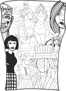
I just scanned in fourteen of my big ink drawings. That’s made me pensive. The last time I scanned in any of those was March 13, 2021. As I write this it’s January 8, 2024 so it’s just short of three years since I scanned any of my Big Ink drawings. That’s a long time. I’ve already written twice about scanning other Big Ink Drawings. Here in 2021: http://radiantcomics.com/art-writing-scanning-big-again/ and here in 2019: http://radiantcomics.com/art-writing-big-scans/ so there must be something about the process that makes me want to write stuff down.
Though it’s been three years since my last scanning of these I haven’t made many Big Ink drawings in that time. It’s less than five a year. I’ve made them at a greater clip than that in the past. Maybe they’ve just run their course with me. That’s happens. I make a certain kind of art for years but then I move on to something else. I sure have been making a lot of “Dreams of Things” drawings over the last three years. I’ve also put a lot of time into my Gatsby illustrated book. That doesn’t leave a ton of time for Big Ink drawings.
I scanned in the drawings on a whim tonight. I just kind of got tired of them hanging around and on the spur of the moment started scanning them in. I had to go get a table and move my scanner to a place where the drawing will fit on it but other than that it was normal scanning.
The Big Ink drawings are 22×30 inches and it takes four scans of my 12×18 inch scanner to scan one of them in. Even though I haven’t done it in a while I have the process down well. It took me just over an hour to make all 56 scans. I was scanning in greyscale so the scans themselves took less time than if I was scanning color drawings.
I made the decision to make the scans because I was tired of the Big Ink drawings hanging around and getting in the way. They generally sat on my easel and if I needed to use the easel I’d move the drawings to on top of my bed for the day and then move them back at night. I got tired of moving them. Once they were scanned I tucked them away in a large portfolio case and didn’t have to move them anymore.
I recently had to spend another hour scanning in the pages of my Ink Book for 2023. Normally I’m good at scanning in all of my drawings as a matter of course. Drawings don’t sit around for more than a couple of days without being scanned. With my Ink Books (a sketchbook I only draw in with ink) I usually take time every month or two to make scans. At a rate of about eight pages a month I don’t like to wait too long until I scan. Except for this year it turns out.
Have you ever thought you were keeping up with something just because you always have for years only to find out that you weren’t? At the end of December I went to scan in the last couple of months worth of Ink Book pages only to discover that I hadn’t scanned any of them in since March. I still don’t know how that happened. I could have sworn that I was scanning the pages in all along. I had to scan in seventy two pages. That was a surprise.
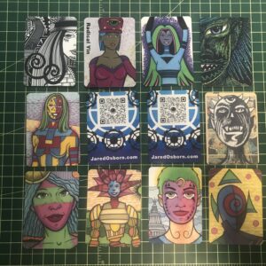
This weekend I also got new art supplies to try out. Some acrylic paint pens. Back in the 1990s I used to play the collectable card game “Magic The Gathering.” We used to have fun playing it at lunchtime at Marvel. I haven’t played the game in twenty years but I have bought some new cards. At least new to me. You can get about a thousand cards for around $30. I’ve bought some in the past just for fun but I’ve also always wanted to draw on them. That’s something people do.
The problem is that I always wanted to draw on them kind of casually. Other people draw and paint on them and sell them. That takes more time and effort that I have to give. The cards have a slick coating on them so it’s tough to work on them without a lot of preparation to the cards. Markers don’t really work on them without prep. Marker ink rubs right off the slick card surface.
I’ve even tried to paint on the cards at times but that never worked out. But when I tried some acrylic paint pens on them they worked okay. At least the paint stayed in place. The paint pens that I bought have big nibs on them so there isn’t a lot of detail work I can do with them so I still have to work out a style with them.
One of the points of the style is that the drawings have to be a bit spontaneous. I can’t do any underdrawing on them since I haven’t found a pencil that will draw on the cards. Since I was looking to do some casual drawings on them that’s not a bad thing but it can be frustrating. I don’t always want to do big chunky drawings.
Another note on those MTG card drawings is that I ordered even more paint markers. I’ve got a set of brush markers coming tomorrow. At ten dollars for twenty four of the bullet tipped markers and thirteen dollars for twenty four of the brush markers they’re a cheap buy. I figured I can get some more detail with the brush ones so that will be good.
One final thought is that I don’t really know how well the brush tip markers will work. Part of what makes the chunky bullet tip markers work so well on the slick card surface is that a lot of paint comes off the tip. I have a smaller more ballpoint pen type black paint marker and it works okay on the cards but there is a lot of skipping of the paint as it comes off the pen. I’ll see how well the brush tips work and will let you know.
I’m back from the comic shop this week and I got ten new comics plus a hardcover book.
Check them all out here:
I’m feeling nostalgic tonight so I think I’ll write a “Friends” walkthrough. I’m up to Season 7 Episode 8 “The One Where Chandler Doesn’t Like Dogs.” At least that’s the show I’m up to on my watch list. I haven’t been writing about every episode. I only write them when I feel like and just watch the shows in between writings.
The show originally aired on November 30, 2000. I watched it as it first aired but let me check my calendar to see what else I got up to that Thursday. I worked on a painting all that week. It was a painting I made for a friend. I took an old “Mystery in Space” cover and used that as a basis for about a 30×40 inch oil painting. I copied the entire cover as a painting and then painted shapes and designs over it. It’s hard to describe but I made three comic book cover painting around the turn of the century. I liked those paintings. Let’s start the show.
It’s a Thanksgiving episode. It starts with the bit where Chandler has them playing a game where they have to write down the names of all fifty United States in six minutes. The bit runs all show as Ross can’t get a few of them. I have never been a big fan of frustration humor. I usually just find it frustrating. I remember not loving this bit. Except for Joey. Joey comes up with 56 states. Phoebe comes up with celery. Here comes the song.
Tag (Rachel’s new assistant) isn’t coming to Thanksgiving diner! Oh no! (I’m not sure why I’m supposed to care). Ross gets the states game done and is all cocky about it. Of course he missed one. Make that four! How did he not notice that? Chandler tells us the beauty of the game is that it makes you want to kill yourself! It’s killing me as Ross gets more and more frustrated. Chandler and Ross make a bet. Ross gets no Thanksgiving diner if he can’t get all fifty states. Guess what? This is going to lead to more frustration. It’s a little too much for me.
Chandler and Monica have to go across the street to use Ross’s oven. This gives Phoebe the opportunity to try and sneak a dog she is watching out of the apartment but Ross catches on.
Monica and Chandler make it over there Ross’s apartment and make a few quips but then Monica looks out the window and sees the dog across the street in her apartment. She calls from Ross’s phone to her apartment and demands to know why there is a dog. Chandler claims he’s allergic to dogs so they can’t be there.
Meanwhile Tag shows up. He broke up with his girlfriend so he’s free.
Here comes Chandler bursting into his apartment and demanding to know about the dog. Monica is upset. Phoebe covers up poorly. The dog’s name is Clunkers. Funny name. Once again Chandler claims he’s allergies to dogs but Phoebe says, “That’s odd because this dog has been living here for the past three days.” He’s busted and has to come clean about not liking dogs. As a matter of fact he tells them that he hates dogs. This is a funny scene.
We’re back to Ross being frustrated at the States game. Oy!
Rachel wants to make a move on the recently dumped Tag. Joey has a funny line. And this is the episode where Joey says it’s a “Moo point.” It’s like a cow’s opinion. Classic joke from this series.
Chandler comes out in a pink turtleneck sweater to make a point about the dog. You had to be there but it’s a funny bit.
Rachel goes out onto the fire escape/balcony to comfort Tag. Joey ruins the sweet scene by giving away the info that Rachel likes Tag. That’s the “Situation” part of a situation comedy because no one would ever do that in real life. Rachel’s heartfelt speech gets interrupted by Tag seeing people breaking into his car. She gets no resolution.
Cut to Monica, Phoebe, and Clunkers across the street at Ross’s place. They don’t want to leave the dog behind so they sneak him back.
Ross continues to be frustrated. Oy again!
As they continue to hide the dogs from Chandler he decides to be the hero and bring the dog back from Ross’s apartment. He leaves the door open and then thinks the dog ran away (but it’s really back at his place).
Ross continues to be frustrated. Oy! Oy! Oy!
Now the show is moving fast!
Rachel comes back and is upset that she probably freaked Tag out. Joey gives her some bad but funny advice.
Chandler comes back upset that he lost the dog but the dog is there.
Ross continues to be frustrated.
Joey give Rachel some more funny bad advice.
Tag confesses to having feelings for Rachel too and he kisses her.
Here comes the credits’ scene. It’s the end of the Ross and the states bit as he shows up in the middle of the night looking to have some food. This is the funniest part of the frustrating bit. Except for the Joey parts.
Now I’ll check what was cut from the episodes for syndication. A couple of quick dog hiding jokes from Joey and Ross were cut. The whole pink sweater gag was cut. The setup scene between Monica and Chandler and the scene where Chandler is wearing the sweater. They cut the whole scene with Chandler in Ross’s apartment looking for the dog. They cut the whole scene where Joey is giving advice to Rachel after she screws it up with tag. That was a funny scene! That’s the end of the cuts but a lot of funny stuff was cut out for HD syndication.
My rating for this episode right now is three out of five stars. Maybe it was my mood but I found it only average. Let’s see what I rated it back in 201o. I gave it three stars out of five back then too so average it is.
As a side note I got a “Friends” Funko Pop this week. I don’t really collect them but I saw a Gunther Pop on Amazon for only four dollars so I ordered one on a whim. I got the chase variant where he is holding a “We reserve the right to refuse service to anyone” sign. It’s pretty cool but also makes me a little sad since the actor who played Gunther has passed away. It sits on my drawing table.