I’m back from the comic shop this week and I got four new comics.
Check them all out here:
Comment
I’m back from the comic shop this week and I got four new comics.
Check them all out here:

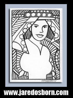
I haven’t done a cover analysis of a comic book cover in a while so I thought I do one again. I have a spot in my studio where I pile up comic books. Usually they’re ones I’ve recently bought. I put new comics in a magazine holder next to my chair, read them, and then move them a few feet away on top of my printer. There they sit for a couple of weeks until I read them a second time and then they get filled away for safekeeping. Also on top of my printer will be one old comic. A comic I pick out of my collection because I like the cover and want it to hang around for a little while so I can look at it. The comic book I just moved there today is “Creatures on the Loose” number twenty four starring Thonogor Warrior of Lost Lemuria. It has a July 1973 cover date. Forty five years old.
When I looked at this cover this morning it looked to me like the inks were by Ernie Chan and the faces were by John Romita. I wasn’t sure if John Romita drew it as, during this period, he sometimes art corrected faces on comics that other people drew and inked. I looked it up on the Grand Comic Book Database (the entry) and sure enough they have John Romita listed as the penciller and Ernie Chan as the inker. They also have a credit for the cover lettering. It was done by Bullpenner Morrie Kuramoto. That’s good to know because lettering plays a big part in this cover.
Let’s look at all the lettering. We get a logo (Thonogor), the comic’s title (Creatures on the Loose), a sub-title (Warrior of Lost Lemuria), a “Featuring”, and two pieces of hand drawn cover copy (Night-dark wings vs blood-red sword and Attack of the Lizard-Hawks). By the way that’s three compound words in two pieces of cover copy. That might be a record.
I almost like the Thonogor logo. It’s kind of cool with its rock-like look but it also looks a little cartoony and unserious for such a serious looking cover. It’s not bad but seems like it should be the logo for a story about a caveman and not a sword and sorcery logo. Thonogor was a book that was trying to take advantage of Conan’s sword and sorcery popularity. I like the way the two pieces of more mechanical type, above and below the logo, frame the more wild letter forms of Thonogor. I think this makes me like the logo better. It grounds it and makes the logo a little more serious than it might be on its own.
I’m a fan of 1970s Bronze Age cover copy. Cover copy, in general, fell out of fashion a long time ago but I still like it. I like titles, I like blurbs, and I like word balloons. This one has no word balloons but has one of each of the others. The one in the circle is the blurb. The cover copy is the part that’s hand lettered by Morrie Kuramoto. It’s just cool. It’s not perfectly mechanical like today’s computer type but it’s neat, precise, and nice looking.
Over all in the color scheme the red logo over the yellow background really pops. The logo almost leaps off the page at us. The neutral gray background on the bottom of the cover also helps to move the central image forward in space. The green of the lizard-hawk is a little bit dense though. It flattens out the composition a bit but I’m not sure what color would be better. The bright yellow that helps the logo stand out so well is working against figure of the lizard-hawk. Sometimes it’s all a compromise and there is no path to perfection.
The drawing itself is a lot of fun. We get a damsel in distress, a very Conan-looking sword wielding hero, a lizard-hawk, and a neat looking background monster. The orange haired woman, despite not having much to do, is in a nice twisting action pose. John Romita made her look interesting. That’s not something every artist can do with such little to work with. Thonogor himself is also in a good pose with legs and arms spread far apart and in action as he swings his mighty sword. The lizard hawk looks a little weird with his pink spikes but overall does a good job at being menacing. And for some reason I especially like the crocodile thing underneath them. My eye keeps being drawn to it.
The main drawback of the cover is that weird metal boat they’re on. Is it flying? Is it floating? Is it falling? I have no idea. I’m not even sure what the exact shape of the boat is. Is it flat across the back and the woman is shoved over to one corner or does it come to a point in the back and she’s ll the way at the stern? I’m not sure. I think it had a flat back but it could be a teardrop shape. This lack of clarity confuses the composition.
The Ernie Chan inks look good to me. His inks can overpower pencillers but I generally like them. He has an illustrative style with a lot of density to it. You can really see the density in the Lizard-hawk and he delineated Thonogor with a lot of weight, but kept the woman light. There levels of figure inking density on one cover. He didn’t do much with that boat though. It may have been a little doomed compositionally to begin with.
Overall I find this one a solid Bronze Age cover. That’s the era of the 1970s when I was a kid and first discovered comics so there is a little bit of nostalgia mixed in it for me too but I’m not a huge nostalgia person. Everything is of it’s time and this cover is too. I’m happy it also happens to be a pretty cool piece from its time.

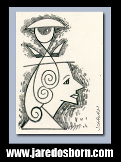
Its time again for me to pull an old painting out of storage and give it a look. I have recently been writing about my current work but sometimes I like to look at old stuff and examine it. For this week I’m looking at and eight by ten inch acrylic on canvas painting from April 24, 2008 called “Stay Ahead.” That name has no special meaning to me so I’m guessing it’s one of the ones I randomly chose. I name things that way all the time. I guess it’s not really random but I look a piece and try to make a name out of the first words that come to mind. Sometimes the names are inspired by the piece and sometimes they’re just words that float across to my conscious mind.
Though the painting is eight by ten inches it also has some depth to it. It’s a pre-stretched canvas that I bought form Dick Blick. Most canvases are made with stretcher bars that are three quarters of an inch thick but this canvas is made with stretcher bars an inch and half thick. I like the extra heft the thick bars give a painting but I haven’t used them in a while. I remember getting those thick canvases for fairly cheap but then the price went up on them. It didn’t make any sense to me to spend twice the price on a small canvas just for a little extra thickness. Plus they take up twice the room on my shelf.
The first thing I notice about this painting is the color red. Before I can even figure out what the image is I perceive the red. That’s unusual for my work. Normally it’s the image that I grasp first and then the color. Or maybe both at the same time if they’re inseparable. But with this one it’s that red. In looking at it I think that’s because of the shape of the green man’s body. It’s not a shape that says “Human figure.” It’s more like a triangle. The shape also takes up about half of the painting so it’s the dominant form but it’s visually behind everything making the shape sit back in space but it’s red color come forward demanding to be noticed. It’s an odd combination.
The bright red of the body almost makes a bullseye. A human figure is usually a positive shape but in this case since the yellow arrow is in front and the red body is in back, plus the body is obscured but the stuff in front of it, the yellow arrow becomes the positive shape. It’s what we see as solid object. This makes the red around the arrow, particularly the red to the arrow’s right, become a negative shape. I refer to it as a negative shape as opposed to negative space because it’s not “Empty” space as negative space normally is. The blue behind him is negative space the red between the arrow, the collar, and the green hand is a negative shape.
The second thing I find odd about this painting is the lack of face. There is only part of a face here. I like faces and like working with them and I cheated myself out of one here. I don’t know why. The color covering his face has a swirl in it, which is one of my favorite shapes, but is still not the most interesting thing in the world. I want him to pull down that collar so I can see what he looks like. Maybe that was the point. Any way I slice it I still want to see more of his face. I find the mystery a little annoying.
The second most dominant color, and it’s a distant second, is the blue in the background. It’s a tint of blue, which means it is blue mixed with white, and tinted blue almost always works as a background color. You can thank the sky for that because were used the the blue sky being behind things. The blue behaves nicely with the red. It lets the red be the star of the show but still makes its presence known. I like that about that blue. It’s a bit tricky finding the right tint of blue to do this. Often if there is too much white in the blue it sits to far back in space or if the blue has two much violet in it can move forward in space too much. I can’t remember which color blue I mixed this one from but I bet I mixed a lot of it and used it in a few paintings at the time.
The green adds a bit of mystery to the painting. It’s a dark color. Not quite as dark as the purple but since there is more green than purple the green is the dark color with the most influence. It draws my eye in as I look at the painting. I think it would be too dark without those light green stokes that are along the edges of the black line. The lines help the keep the dark green from receding too much and disappearing from our consciousness.
The collar and purple scarf confuse me. I’m not sure why they’re there. Neither the shapes nor the colors are particularly pleasing and they’re obscuring the face. Why? I don’t know. It’s also a different fashion than I usually draw. That part just leaves me cold but I’m not sure exactly why.
The part that makes me smile is the fake writing along the edges of the red. It’s something I don’t notice at first, it just reads as some yellow at a glance, but as my eyes move across the painting and I discover the writing it brings a smile to my face. I have a fascination with history and read about it all the time and I like ancient art and writing. Even if I can’t read the writing I find ti fascinating that it exists. Seeing the yellow pseudo-writing is like discovering and ancient text. So what if I can’t read it.
So there you go. This one is a mixed bag for me. I like it but there are parts that don’t do it for me. That’s how life is I guess.
I’m back from the comic shop this week and I got four new comics.
Check them all out here:

Today I’m going to take a look at one of my large marker drawings named “Obvious Gunner.” It’s 22×30 inches and is sitting on my easel at the moment. It’s from back in September of 2014 and I finished and signed it on the ninth. I’m not sure if I got it all done in one day. I could have but sometimes these big drawings took two days.
All of my large marker drawings start out as small drawings. It’s the same process that I always use. I find a small thumbnail drawing in my inkbook, blow it up to about 5×7 or 9×12 inches and then I redraw it. I don’t usually draw it much bigger than that for these large drawings because I’m just going for the bare bones. Changing the scale of a drawing can change a lot about that drawing so I keep it simple and then draw more once I’ve got it scaled up.
I use graphite paper to scale it up. First I scan in my small drawing and then I blow it up and print it out. I don’t have a 22×30 inch printer so print it in pieces on multiple pieces of paper. I tape the different sheets of paper together and then tape that in place on top of my large sheet of paper. After that I slip a piece of graphite paper in between the printout and the drawing paper.
Graphite paper is a thin sheet of paper with graphite (the “lead” in a lead pencil) applied to the back of it. Put it graphite side down on a clean piece of paper and then put your drawing on top of the graphite paper. Trace on top of your drawing and the pressure of the pencil transfers the graphite onto the clean paper leaving a line drawing. This is a messy process so try and keep things neat. Also the tracing won’t be perfect so you’ll have to redraw after this step but at least a lot of guide lines will be there.
After the pencil drawing has been transferred to the large paper is where the real drawing begins. Some of it in pencil and some of it in ink. Mostly ink. As you can see in the “Obvious Gunner” drawing there are lots of little details like the spiked edges of the black shape on his head and the stripes in his facial hair. None of these detail were in the small pencil stage. I add then in as I draw in ink.
I use my Copic or Shin Han markers to make these big drawings. I also use a lot of French curves, a ship’s curve, circle templates, and my Half hatching machine to keep the ink lines neat and precise. I use mostly the chisel tip and fine tip of the markers and not my usual brush point. I work on it standing up with the paper on the easel but when I make all those parallel lines with the Half machine I lay the drawing board down on the couch or floor. It has to be flat to use the hatching machine.
In looking at “Obvious Gunner” the first thing I notice is how much of the drawing has to do with graphic design. It’s about black and white and the patterns they make. A lot of my drawings have to do with graphic design but the ones in this large drawing series the most so. That’s the part I add to the drawing when it’s big. Most of the black shapes like the clouds and the various boxes are done right in ink at this stage.

Years ago I had a teacher remark that my paintings could be a little unsettling because it seemed they were looking at the viewer harder than the viewer was looking at the painting. I think that’s been a theme in my work that’s still with me all these years later. This drawing is looking out as us pretty intensely with two sets of eyes. The eyes on his face are dark with glints of white shining through but the eyes on his chest are large, bright, and looking at us even more intensely than the eyes on his face. They also both have some crazy graphic design eyebrows that disappear into the overall design.
One of the defining features of this drawing is its asymmetrical symmetry. It sure does look perfectly symmetrical at first glance but upon further review the left and right sides are not reflections of each other. This face has different markings on either side, the collar isn’t centered, one shoulder is sloped more than the other, and all the markings on the chest are similar but not the same. None of the circles on the left side of the chest match the ones on the right. I often find symmetry to be bad but balance to be good. I think I achieved a nice balance here.
The parallel lines are key to the look of this drawing. They give the illusion of grey among the blacks and whites and add a little bit of an Op Art element to the drawing. The Haff hatching machine I use to help make this lines is a ruler attached to an perpendicular metal rod. There is a little lever on the metal rod that I push down and the ruler moves down the metal arm anywhere from an adjustable one to five millimeters. I draw a line against the ruler, hit the lever, draw the next line, hit the lever again, and so on. It’s easy to use but the key is getting just the right distance between the lines.
The mountains in the background of this piece are made up of tight parallel lines. The white is about the same thickness as the black so it’s hard for the eye to tell which is the background and which is the foreground. This is the Op Art effect. Compare that to the short parallel lines near the top. With these lines the white is dominant so it clearly looks like black lines on a white background. Not as much Op Art here.
Graphic design, black and white, Op Art, staring eyes, and lots of lines and shapes. These are the hall marks of this and most of my other large marker drawings. I’m going to have to make some more.
I’m back from the comic shop this week and I got four new comics.
Check them all out here:
How did I get nothing done again today? I’ve had some sort of sinus infection. That’s how. I could feel it starting on Friday. You know that felling. The feeling of being a bit run down but nothing too bad. Sometimes that feeling goes away with a good night’s sleep but often it doesn’t. Usually that feeling means there is some sickness creeping up on me. I tried to rest on Friday to make myself better so I didn’t get anything done that day. Then I woke up on Saturday feeling even worse. So I rested most of the Saturday and watched some playoff football.
My symptoms weren’t that terrible. Sinus pressure, a stuffed head, weakness of body, and a general lack of focus. They made it tough to think. I took a nasal decongestant and that made me more comfortable but I still had no energy. It was better than having a flu though. That can really knock a person out. I had one of those a few years ago and was down for the count for a week. Couldn’t even get off the couch for more than an hour at a time.
Sunday I did get something done. I made five of my “Four Talking Boxes” strips. I make five of those every week and I’ve been doing three of them on Sunday and two of them on Monday for the last year or so (the days have varied over the years) but on last Sunday I decided to get all five of them done. It took about three times as long to do them as it normally takes me but I was glad to be doing something. Finishing them is also more of a technical process than a creative one so that was a bit easier on me. I didn’t have to think.
After getting all five strips done I had some more energy so I started another technical thing in the afternoon. I started recreating the Marvel Comics “Machine Man” logo as a vector graphic so that a friend of mine could use it in a cover recreation. I do this sometimes for friends and myself. I make a vector graphic in Adobe Illustrator out of an old comic book logo. It takes concentration rather than thinking or creativity so it’s something I can do when I’m not 100%. I didn’t finish it though. I ran out of energy eventually and rested the rest of Sunday.
On a side note I don’t do that well with either DayQuil or NyQuil. I gave up on DayQuil years ago because it makes be feel worse than the sinus infection. On Friday night I decided to try some NyQuil to help me sleep since I didn’t sleep well on Thursday night. Waking up on Saturday morning it felt like I was hit by a bus. I was weak and shaking from about 5AM until I got out of bed at 6:30 AM. I was happy when the effects wore off later in the morning and then I only felt bad from the sinus infection.
Monday rolled around and I was still not well. I got a little something done though. I finished the logo, trade dress, and template for “Machine Man.” It wasn’t a whole lot, not nearly as much as I got done on Sunday, but was something. I like to get things done. It gives me a good feeling. Getting nothing done isn’t how I like to spend my time. But I was still sick so I sat in a chair most of the day trying to rest. That’s what active people have the hardest time with when they are sick. Resting. Just sitting there when I want to be doing something. But resting has to be done.
On Tuesday I was feeling better but not well. I wanted to get stuff done but only managed to start my new sketchbook/inkbook for the year. I grabbed my small dictionary and randomly chose a word from it to name my sketchbook. It’s now called “Sidelong” as in “A sidelong glance.” I write that title on the cover and then write the definition on the inside front cover. It’s a habit of mine so that I can distinguish one sketchbook from another. I also managed to draw a page in it. Nine little ink drawings. Normally that would take me an hour but it took me twice that. Then it was back to the chair.
That brings us to today. Wednesday. I was feeling pretty good this morning. I’d say I was almost better. I drew another page in my ink book, went out to the store, and started working on an art card. I really thought I could get back to normal today and get some stuff done. Except I ran out of energy. That one little 2.5×3.5 inch art card took me way too long to draw. I kept having to sit down and rest and then get up to draw a bit of it. It was really frustrating. After I finished it I tried to get something else done but I couldn’t. No focus or concentration left.
It’s a snazzy little art card. It’s a person with a weird haircut and flowered robe on. It’s not the greatest thing ever but I like it. It looks a little more precise than usual. I think because it took me more energy than usual to concentrate I really made the shapes distinct.
So now I’m better but not quite better. I haven’t taken any medicine since Tuesday when I only took one does of nasal decongestant so my sinuses aren’t killing me anymore but they’re still slowing me down. Since I usually stand and work I’m really tired of sitting. But even if I couldn’t stand and draw for a while I thought I could get a little something done while sitting so I decided to write. So here I am now. I’m not going to tell you I’m better but I couldn’t have written this on Saturday.
I’m back from the comic shop this week and I got three new comics.
Check them all out here:
This week is a good time for a winter cycling update and the update is that it’s too cold to ride. That hasn’t happened often. I first started winter riding back in December of 2010 and I’ve kept it up ever since. Every winter and all winter. I even like riding my bicycle in the winter nowadays. It gets me out into the world. Put on enough warm layers and it’s like riding in the summer. Except for a couple of things. Winter riding takes some adjustments and there are a couple of drawbacks. When it gets really cold my legs don’t work as efficiently as in the warmth and ice make for a very bad ride.
Warmth really isn’t a big problem as long as I’m dressed properly. Lots of layers and a windbreaker. Still I have a temperature cut off. If it’s below 20ºF outside I don’t go for a ride. My legs just don’t work well below that temperature. They lose their strength and rhythm. I’ve found that in the cold I have to pedal differently that in the warmth. I have to slow things down in the cold. My legs don’t have that burst of energy that they have in the warmth. I put the bike in a slightly easier to pedal gear and go slow and steady. Everything becomes a little harder but doable. That is until it’s below that 20ºF mark. Then it becomes too hard to bother with the risk.
Over the past seven winters I’ve missed some days riding because of the weather. Usually a day or two here and there because of a snowstorm. I think the most I’ve missed was three days in a row. I usually wait a day after a snowfall for the roads to be cleared before I get out there again. I’ve missed a few days because of the cold but not many.
This winter has been different. It’s been extra cold. I usually cycle in the morning and there have been a few mornings over the years where I’ve been eyeing the thermometer waiting for it to make its way to 20ºF. It almost always does. This week not so much. So far it’s been a week since I’ve been able to ride outside. It’s crept up above 20ºF on some of this days but not until well into the afternoon and well after my ride time. We’re in a deep freeze here in the NYC suburbs.
I used to ride a stationary bike in the winter. I was a warm weather rider like everybody else but I grew tired of the stationary bike. It’s boring to ride one. I still have one though so I pulled it out of it’s stored away spot and set it up to ride. It’s one of those ones with electronics in it so I can set it up for a ride in the park, strength training, interval training, cross training, and maybe a couple of other things. Plus there are level settings for all those things that control the resistance. I really don’t know how to set it all up properly so I’ve switched between them to try and find one I like. So far they all seem about equally boring. Though I’m usually out on the real bicycle for around 45 minutes I set the stationary bike for half an hour. That’s all I can take.
One of the things I’ve discovered about exercising is that in order to do it regularly it shouldn’t be incredibly hard. Back when I was in my twenties I could exercise hard, build body mass, and test my limits as I saw fit. But starting back in my forties (maybe late thirties) things changed. Recovery times got longer and maintaining things got more important than trying to beat yesterday’s score. So now I know it’s more important to be on the stationary bike for half an hour than to not be on it at all. When something is too hard that’s when people stop doing that something. So half an hour it is.
One good thing about the stationary bike is that I can catch upon some TV shows that I wanted to watch but didn’t have the time for. I’ve been checking out “Glow” on Netflix this week as I’ve been on the stationary bike. It’s about the 1980s’ women’s wrestling TV show. It got good reviews when it first came out and I think it has lived up to them. It’s a drama with some comedy in it. It makes the ride go faster too. The first day I was on the stationary bike I didn’t have the TV on. That half an hour went slowly. With the TV show to distract me the time goes by a lot more quickly. I even took an extra “Ride through the park” one night just to burn off a little bit of extra energy as I watched TV.
The stationary bike that I ride on is a Schwinn with a big, wide, and padded seat. You’d think that would be more comfortable than my narrower bike seat but so far it’s not. After a week of riding my butt is less sore but I’m surprised it was at all. I’ve been riding my regular bike for years and years with no seat soreness. It also took a couple of rides to get the seat and pedal adjustments right so there have been physical adjustments to riding the stationary bike as well as mental ones.
As I write this the snow is piling up outside my window. What started out as a predicted one inch has moved on to a predicted six to ten inches. Yep, the storm blew inland. The worst part of it is that the snow isn’t going anywhere soon. We’ve got a single digit Fahrenheit weekend coming up. It’s been so cold that even the couple of inches of snow that fell last week never melted. Not good winter cycling weather. As I look ahead in the forecast it won’t be until Tuesday morning I could possibly ride. That’ll be twelve days without being able to get out on the bike. Unprecedented.
I’m back from the comic shop this week and I got four new comics.
Check them all out here: