I’m back from the comic shop this week and I got five new comics.
Check them all out here:
I’m back from the comic shop this week and I got five new comics.
Check them all out here:
“Have I wanted my time?” That’s a serious question that I sometimes ask myself while working on, or after working on, a piece of art. Of course it’s a question one can ask one’s self in many different parts of life but I’m only contemplating it in this art context right now. Though it’s not something I ask myself often. I’ve been making art for a long time and generally I know what I’m doing. But sometimes, usually when I’m trying something new, I don’t have as much confidence in a piece turning out like I want it to. That makes sense. If I’ve never quite done something before how do I know if it’ll turn out right? It’s always a risk to try something new but without it stagnation can set in.
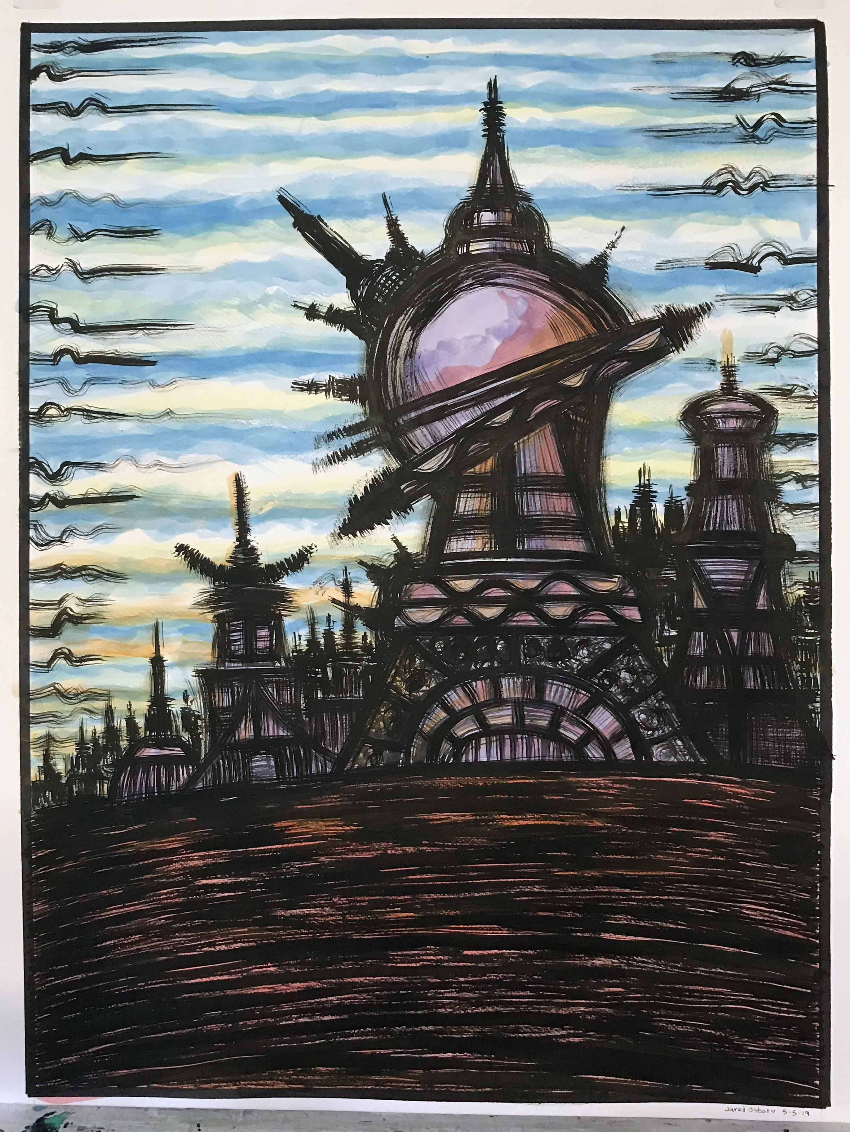
I recently wrote about the sci-fi fantasy landscapes that I was working on. They were mostly five by seven inch pieces except for the two of them that were nine by twelve inches. Those two were the biggest ones I had ever done in that style. So of course I got it in my head to go even bigger with them. For a lot of last winter I had been working on black and white drawings that were on 22×30 inch watercolor paper. Those are pretty big and I thought I could blow my landscape drawings up to that size. Then I sat on the idea for a month. That’s how these things go.
I draw the five by seven inch drawings in ink. I don’t drawing pencil lines first. I grab my busted brush, dip it in ink, and have at it. They’re small drawings so I can compose them fairly quickly and even if I mess up I can start a new one without much thought to losing one. They’re low risk. I can also play around with the compositions as I do more of them. After the ink I use some watercolor on them to give them a hint of color. Not a ton of color. I’m not going for full illustrative color. I just want some subtle suggestions of color. The black ink carries most of the drawing.
For the 22×30 inch drawing I knew I had to figure out the composition before hand. I didn’t want to be drawing on such a big piece of paper without mapping a few things out first. Especially since I would be using the same busted brush as on the small paper. The brush was a lot smaller compared to the big piece of paper so I wouldn’t be able to lay out the composition with a few flicks of the wrist. Instead I got my big and chunky General’s sketching pencil to draw with.
I also set down all of the small landscape drawings on my drawing table to look at (the big paper was on my easel). That way I could pick and choose elements from the small drawings to use in the big one. I liked a certain building in one, the way the horizon line sat on the paper in another, and a background in yet another. I didn’t want to have to make everything up from scratch for such a big drawing. I loosely laid out my composition in about half an hour and was ready to go with the brush after that.
I started working on the big domed building in the center of the drawing and worked out from there. I think I worked on the ground after that and then all of the small buildings in the background. It’s a simple composition. The drawing is really all about the brush technique. It’s about building architectural shapes with lots of fuzzy lines. The busted brush is an old watercolor brush that can no longer come to a single point like it’s supposed to. Instead five or six points shoot off it and every time I go to draw a line I draw three to six of them instead. The uncontrollability is part of the technique.
After I finished drawing it all in black I decided to put in some color too. I was really undecided about color before this point. I had only added color to one of my previous big drawings and I wasn’t happy with how it came out. I thought the black and white ones were better. But I decided on color and laid in a sky first. After that I added color to the buildings and the ground. It’s simple color. There is not a lot to it but it gets the job done.
I was questioning myself through this whole process. Did I really like it? Would it turn out well? Was I wasting my time? This drawing took me all of Sunday to do and at a few points I really did think I was wasting my time. I hate that feeling. There is only so much time and wasting it doing bad art is not a good way to spend it.
After I painted in the color I went back in with more black ink too. Since I was putting the color right over the black ink the black got a little dull. So I went in and reapplied some more ink. It was then that I sat back and thought to myself, “This needs more.” So I added more background buildings and more stuff onto the big building. Originally it only had a cap on top and not this other things shooting off the side of the dome. I liked it better with a little bit more intricacy to the big building.
That pretty much finished off the piece but I still wasn’t sure if I liked it or not. It was new and weird and I didn’t know if I was successful or not. So I finished for the night and decided not to look at it anymore. The next morning I had to commute into the city and do some teaching so I didn’t look at it much that morning either. Though I still wondered if I wasted my time. After being gone all day I got home around 5:30 PM. As I was putting my bag down and taking the stuff out of it I glanced over after not thinking about the drawing all day and liked it. I though to myself, “I didn’t waste my time.” And that was a nice thought.
I’m back from the comic shop this week and I got eleven new comics.
Check them all out here:
I’m coming off two weeks of being sick with a cold, sinus infection, or whatever the heck it was that I had. I couldn’t get any kind of artwork done for ten days in a row. Nothing. Well, I did manage to fill up a couple of pages in my ink book on two of my Monday commutes but that was it. I had no energy and couldn’t get anything done.
After that long layoff the first thing I tried to do was get a 6×9 inch pencil drawing done. I felt good in the morning so I decided to get going and pulled out a blue line drawing I had ready to pencil over. I lasted about an hour before I needed a nap. That kind of took me by surprise. Eventually I finished the drawing but it took me from 8AM until about 3 PM to do it. With a lot of rest in there too. That’s probably about three times longer than if I was well.
The next day I fared a little bit better with another pencil drawing. It was a much more complicated drawing but I didn’t need a nap an hour into it. It still took me longer to do than normal. Not only was I working slower but I needed to sit down and rest more often than normal. That was the story of my cold. I needed a lot of rest.
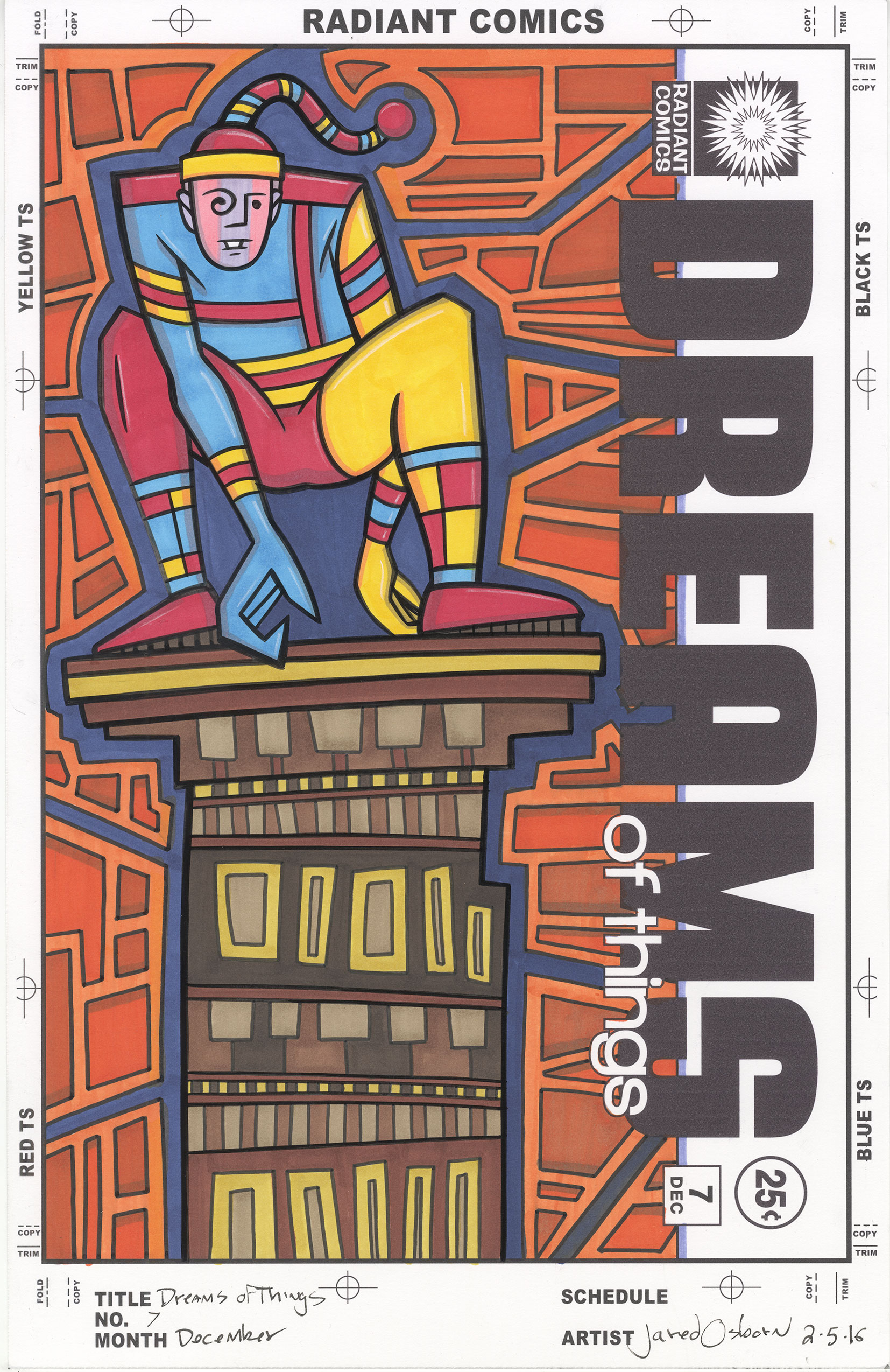
On day three of my getting back to work I finally got a bit more ambitious and to to work inking one of my faux comic book covers. It was “Dreams of Things” #71. I ink these covers in a couple of inking styles that I have developed and this one was done in my rough side of the brush technique. For years and years I had one basic inking technique. I’d dip my brush in ink and then draw a line with it that went from thick to thin in some proportion. I can make a really pretty line in ink and that’s what I did to build up an image.
For drawing straight lines I use a pen, such as a technical pen or marker, and draw it along the side of a straight edge, French curve, or circle template. That way I can make perfect straight lines to go along with my pretty thick to thin brush strokes. Besides adding various textures to things if they were called for that’s how I inked things for a long time.
A few years ago I stated working with my old inking brushes that were so battered and beat up that they could no longer make a pretty thick to thin line. That’s when I developed my busted brush technique along with my side of the brush technique. With “Dreams of Things” #71 I decided to go with my side of the brush technique. It’s a technique where none of the straight edges are drawn with an even or thick to thin line. I use the side of the brush to draw a rough textured line.
For whatever reason I didn’t have the energy to make things pretty on this third day of trying to get things done. I wanted to keep the drawing rough. That must have been the state of my mind. I worked on the main figure most of the day and built it up slowly over time. With lots of rest in there. I actually had the hardest time with the buildings in the background where I used a straight edge and marker. There wasn’t even much to them but they took way more of my concentration than I thought they should. Maybe the day was getting too long by then.
On the fourth day of trying to get things done I still wanted to keep things rough. I decided to make a couple of my 5×7 inch landscapes with my busted brush technique. I first drew the landscape and buildings in ink with my busted brush and then add some watercolors to that. I always think I should be able to get them done quickly but then they always take more time than I expect. That day was no exception.
The odd thing was that the next day I worked on “Dreams of Things” #72 almost exclusively with straight edges, French curves, templates, and a marker. No busted brush and no side of the brush technique. It’s weird how some days I have no patience for that way of working and other days it’s all I have the patience for. I grabbed my straight edge and made one line at a time. I didn’t even think a whole lot about it. One line just lead me to the next in a mechanical process. Once again I needed a lot more rest than usual but every time I got back to it I was ready to make another technical line. All the lines I couldn’t make the day before.
After finishing eighty percent of the drawing that way all that was left was some pretty thick to thin brush work. I was on top of it and I got that done easily. It was amazing to me how one day I could get things done with the side of the brush and the next it was my pretty line and neither could be done if the days were switched. You would think that I would have any of my techniques at my disposal at any time but it doesn’t always work out that way.
The one thing I knew I couldn’t get done was marker coloring one of my faux covers. I had a few of them ready to go and I contemplated doing one but I couldn’t bring myself to. All those colors and all those markers seemed too complicated. I don’t know why since I’ve done plenty of them before but my stuffy head wasn’t up to the task. The water color in the landscapes that I did was a simple task compared to a faux cover. Simple is how I had to make things this week. I can’t wait for my head to finally clear.
I’m back from the comic shop this week and I got four new comics.
Check them all out here:
I was thinking of things to make videos about earlier this week and I decided to pull an old Overstreet comic book price guide out of the closet. It came out in 1980 and it’s the tenth edition of the Overstreet guide. It was the first comic book price dude I ever bought and I was thirteen or fourteen years old when I first got it. I haven’t made a video about it (at least not yet) so I thought I’d write a little something.
First off it’s got an Alex Schomburg cover. This may have been my first exposure to him and I wasn’t impressed. It’s a World War Two cover featuring Captain America, the Human Torch, and Namor fighting Nazis. I remember it looking very old fashioned to me and now as I look at the cover it’s done in a weird style. Some of it is traditional line art with color inside the line and some of it (Namor) is painted with flesh tone lines. There is an awkwardness to it. I have long since found plenty of great Schomburg’s Golden Age covers from the 1940s to the 1950s. His covers are some of my favorites but not this one.
I can remember when I first bought this book I liked it not so much as a price guide, since I wasn’t buying a ton of old comics, but as a history book. It has all sorts of information on comics. For example I randomly opened a page and there is a listing for and old Marvel comic “Hedy Divine Comics.” It immediately tells us that it was formerly “USA” number 17 and titled “Hedy of Hollywood” from number 36 on. Number 22 came out in 1947 and number 50 in September of 1952. Then there is a note that says “18-21 exist?” Even the Overstreet guide did’t know everything about these obscure old comics.
The listing goes on further to tell us what issues had art with the more popular and famous artists in them. There are issues with Basil Wolverton and and some with Harvey Kurtzman art. I barely knew who those two guys were back then but now I knew some issues they drew. It was fascinating to me that I could open up to any page and learn something about comics that were made before I was born and knew nothing about.
Beside the price guide the book also has articles about comics. The first article is about grading comics and storing them. It has lots of stuff about bags, boards, and taking care of you comics. Serious stuff to a thirteen year old. That is followed by a 1979 market report. I had never seen anything like that before and was fascinated. It was all about a whole bunch of old comics that I had never heard of and that they were selling for record prices.
I got to see some old Schomburg cover printed about three inches tall in section called “Timelys – The Top Six” and “More Timelys” They had Sub-Mariner, Captain America, and the Human Torch comics in that section. Those were really cool to see. There was no internet and stuff like that was rarely reprinted back then so the price guide was the only place to see it. There is also a cover section in the back featuring random old comics from all sorts of publishers. That was also great. Where else was I ever going to see the bikini clad jungle woman who starred in “Zoot Comics?”
The book also has yellow pages in them. Ads that are actually on yellow paper. Ads for stores, ads for conventions, and a lot of ads for people buying and selling comics. I remember liking these ads because they made me feel connected to a larger comic book collecting community. There were people out there who liked comics as much as I did. Plus a lot of the ads had some nice art in them. There a few pieces by well known comic book artists that must have been commissioned by whoever was placing the ad.
Some of the ads even come with lists. Lists of prices of comics being sold and lists of prices for comics being bought. I think the buying lists were themes interesting to me fo how low the prices were. One ad says that he buys comics for 25% of the value listed in this guide. That taught me all I needed to know about selling comics. They probably were worth a lot less than anyone thought they were. With one hand the price guide giveth and with the other hand it taketh away.
Somewhere in the middle of the book is another article called “The Chronology of the American Comic Book.” That sounds pretty cool and it hits the highlights in only a few pages. But the one I’m really going to have to go back and reread is a 25 page article on the history of Marvel Comics. I don’t remember it at all but I must have read it a few times as a kid. As a fan of both history and comics this one was really up my alley.
And of course one of the fun things to do with old price guides is look up how cheap certain comics were back in the day. For example you could get a copy of the first appearance of Wolverine in “The Incredible Hulk” #181 for a mer $3.75. If you had the big bucks a copy of the first appearance of Superman, Action Comics #1, could be had for $9,800. Expect to pay over a million for that book today. And how much is the first appearance of Spider-Man in “Amazing Fantasy” #15 you ask? Well, that would be $900. It all sounds so cheap now but only if you have a time machine. Few people had ten grand lying around to get a copy of Action Comics #1.
Well, as any comic fan knows, we could sit around all day looking up nostalgia prices so I’ll cut it off here. Maybe someday I’ll make a video but until them writing will have to suffice.
I’m back from the comic shop this week and I got six new comics.
Check them all out here:
Composition is my strongest natural artistic talent. I know how to arrange things on an instinctive level. Of course talent has to be worked on or it doesn’t fully develop but it’s easier to work on a natural talent. There is nothing to force. A talent for composition is also hard to recognize in a young artist. It’s an obscured talent. There is so much to learn about making a drawing and composition usually isn’t at the head of the line. If you’re trying to draw a room and the couch doesn’t look like a couch no one notices that it’s in the exact right spot. It took a long time for me to realize that composition was my strong point and even then it didn’t matter to the world at large. It’s something that people appreciate but don’t notice on a conscious level. People know why art is pleasing to them but they don’t always know why.
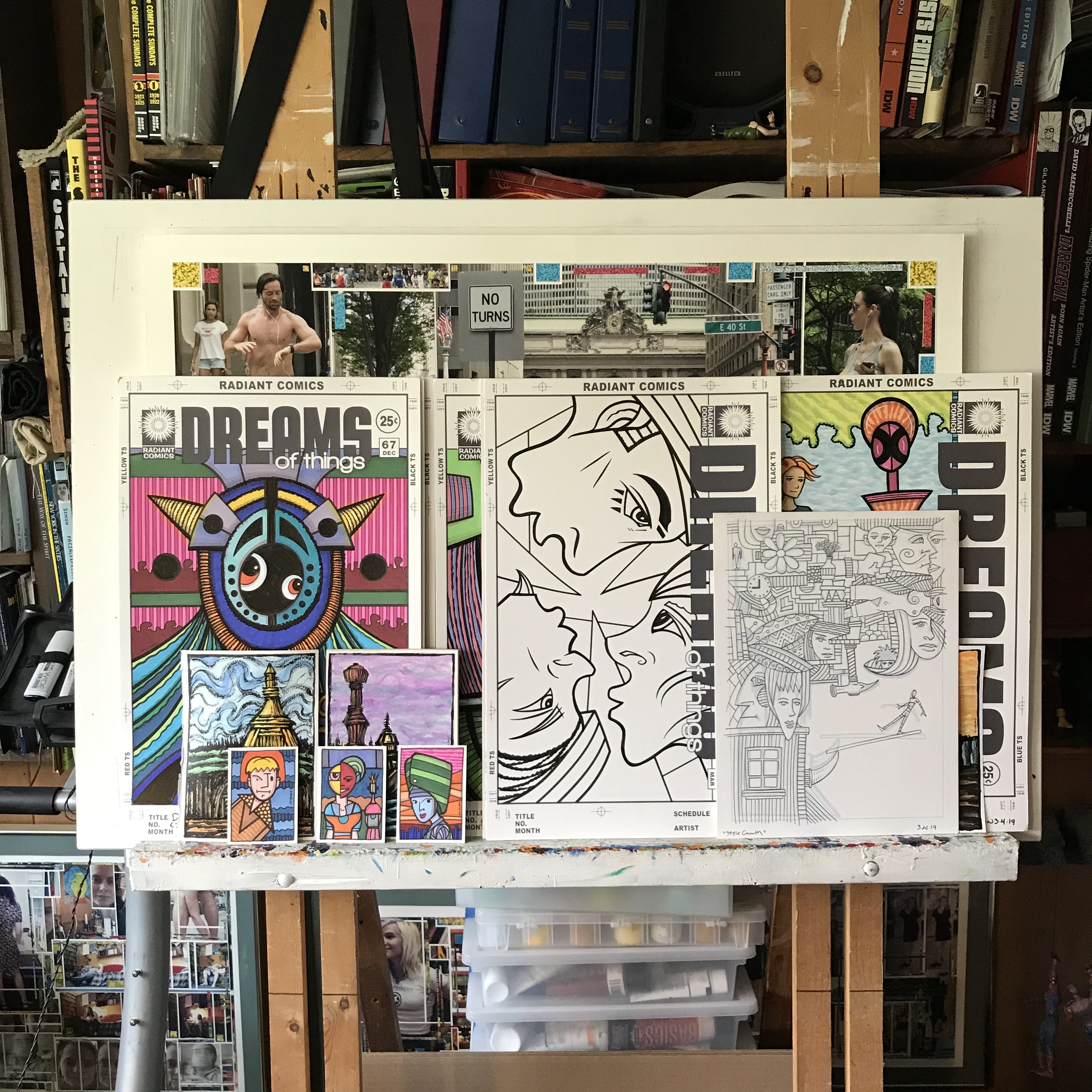
I bring up the subject because of the chance arrangement of art that I have on my easel at this moment. When I’m working on something big enough to need my easel that piece is all that’s on it. It could be either a big sheet of paper or a big canvas. But when I’m not working on my easel I put other art on it. Art I’m working on that I want to get a good look at. It’s important to step back and look at a piece from afar so I can judge it. I can see things in it that I can’t see when it’s on my drawing table. Sometimes the art display builds up on my easel. I put piece after piece on it as I finish them. I think the gathering of pieces appeals to my sense of composition.
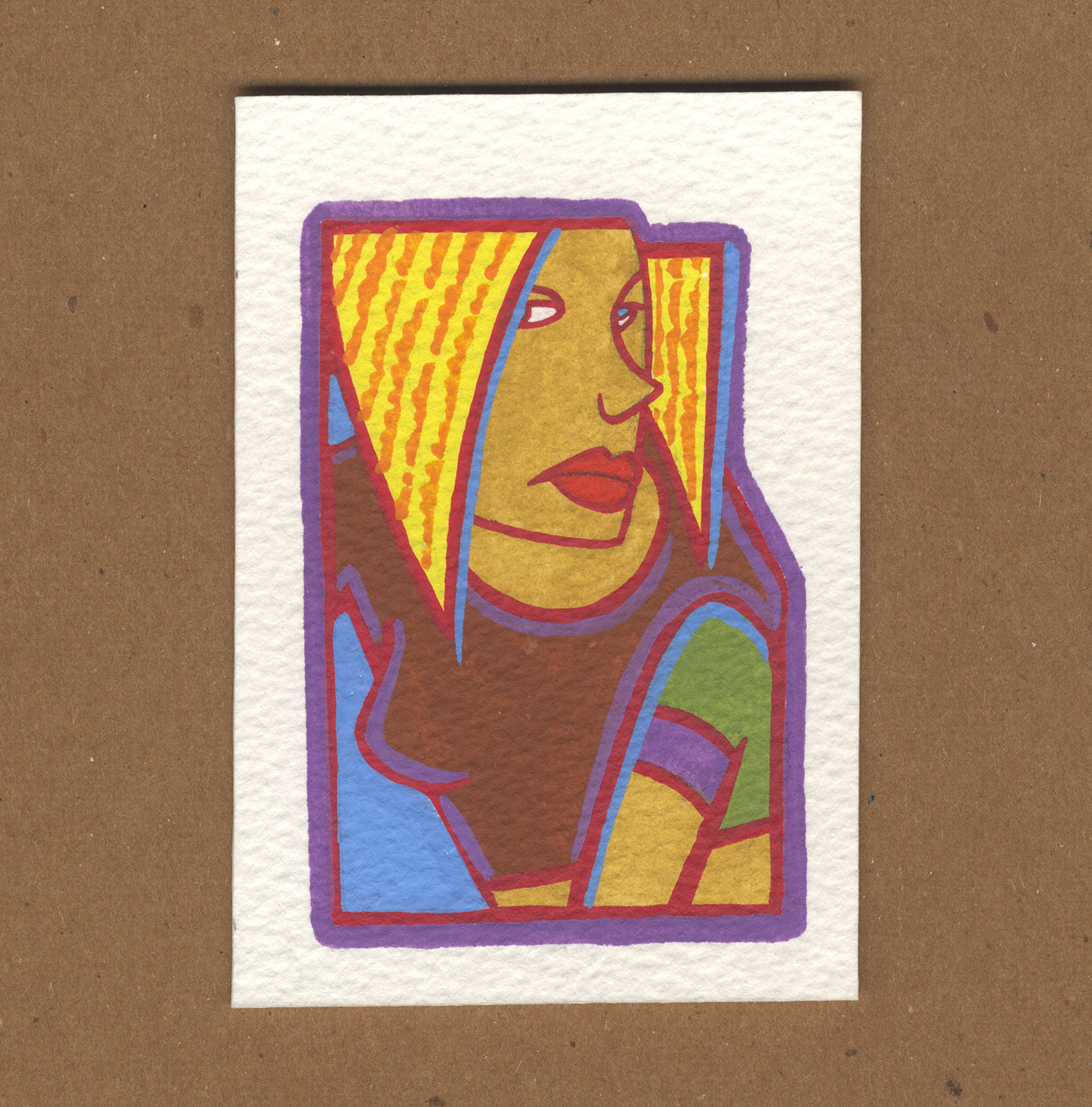
The art that stacks up on my easel can start to create its own random composition. Or maybe the compositions aren’t so random because I’m the one placing the stuff on there but either way the whole bunch of images together start to create a new image. Right now I have some 11×17 inch drawings, 9×12 inch ones, 5×7 drawings, and finally even some small 2.5×3.5 inch drawings on the easel. Some are in color while others are in black ink or pencil. That’s quite the variety. Things aren’t always that varied on my easel.
I don’t think I’ve finished much in the last week but I got a bunch of stuff in progress. Plus there are things on the easel from past weeks. First of all my big white drawing board in on the easel. That’s always there unless a canvas is in its place. After I made a bunch of big drawings this last winter I usually had one of those big drawings on the easel but I’ve since put one of my big 22×30 inch photos on it. That’s in the back though and you can only see the top five inches of it sticking out the top.
In front of that big photo yet behind everything else are are bunch of my “Dreams of Things” faux comic book covers. They’re the 11×17 inch ones. I can’t even tell how many are back there but I can see bits of three of them. Two are just small pieces and the third is about half the cover. The one I can see the least up becomes an abstract piece. It’s just line and color.
The one I finished most recently is the faux cover that’s only been inked so far so it’s in black and white. That one is almost all the way in front and punches a hole in the colored ones that are behind it. It’s a drawing of three faces in three different orientations and there is no up and down in it. It’s almost like it has its own gravity and is sucking in the other drawings.
In front of the black and white ink drawing is a 9×12 inch pencil drawing. I hesitate to call it black and white because it’s really grey and white. The pencil drawing has the finest lines in it of all the pieces and is made of tiny little shapes so it’s hard to see what I step back from the easel. It’s the one that invites the viewer up for a closer look. There is a little piece of a 5×7 inch color painting sticking out on its right size so we get a bit of color to contain the black and white.
On the left side down in front are three 2.5×3.5 inch color drawings in front of two 5×7 inch ink and watercolor paintings. The stack is three-two-one counting the “Dreams of Things” cover behind it. They’re all shifted a little bit to the right. That’s a pretty good composition even if by chance. I like the way the three art cards came out. They’re bright and colorful with some cheery people on them. It’s almost like they’re in the landscape that’s behind them.
There are more 5×7 inch landscapes in the stacks but only two of them plus the little bit of the one on the right can be seen. There are also two 9×12 inch landscapes in the stack but neither can be seen. Or wait. Maybe I have them at the bottom of a pile of books being flattened a little bit. It really doesn’t matter since they can’t be seen but I can still feel their presence even if another viewer can’t. I made them all together so I tend to think of them as a group.
This chance arrangement is only going to last a short while longer. Things get moved around on the the easel too much for anything to stay long. But I will have to keep these up in the same order for one more day. It took me too long to write this blog. I started in the morning and am finally finishing it as the sun is setting. That means I lost the light to take the photo I was planning to take of it. I’ll have to do that tomorrow. Things always take longer than I think they will.
I’m back from the comic shop this week and I got eight new comics.
Check them all out here:
I was recently talking to someone a lot younger than me who is a fan of the TV show “Friends.” As happens with most twenty year olds she became a fan of the show by discovering it on Netflix. She binge watched the entire series, all ten seasons, all 236 episodes, in six days. Not being a binge watcher I find it astonishing not only that she did that but that she could even do that. It’s a different world than when “Friends” started.
I caught the very first episode of “Friends” back when it debuted in 1994. I was a fan right from that first episode and watched them all as they ran over the next ten years. But it was never a show that I watched over and over in syndication like I did “The Simpsons” and “Seinfeld.” Back in the 1990s I could quote those two shows at a moment’s notice and often did. “Friends” was more of a show that I watched, enjoyed, and then forgot about. It wasn’t until the show was released on DVD that I watched them a second time. That was sometime around 2005 so it had been ten years since I saw the first couple of seasons.
After watching the series for a second time over the course of a few months a funny thing happened. It became my comfortable nostalgia show. I’ve heard the creators of “Friends” describe the show as being about that period in life where you’re young, you’ve got some free time, and your friends are your family. It’s a brief time and there is a lot of fun to be found. That rings true to me.
Since then I’ve probably watched the show four more times. It takes me a while to get through them because I only watch an episode every now and then. It must take me two years to watch the whole series. Weeks can easily go by without me watching any of them and then I can watch three or four in a week. It’s a show that can cheer me up a little if I’m feeling down. Or it can just pass the time as I’m taking a break for twenty minutes. There are plenty of other shows I can watch if I want a laugh (“It’s Always Sunny in Philadelphia”, “Broad City”, and “New Girl” come to mind) but if I want some nostalgic comfort “Friends” is the show for me.
One of the times that I watched the whole series I decided to rate each individual episode. iTunes has a column for rating shows by giving them one to five stars. After I’d watch an episode I’d give a rating. It took a long time to make it through the whole series that time but eventually I did. Sometimes after I watch an episode I go back and see what I rated it. Usually I agree with my ratings but sometimes not.
The one thing that’s changed for me is that I’ve grown to like Season Ten more than I used to. It’s the weirdest season and I embrace its weirdness now more than I used to. It’s like the writers had the freedom to throw a lot of the rulebook out the window because the show was ending anyway. To me that’s epitomized by the episode where Joey thinks he can speak French. It’s so absurd. It takes the “Joey is the stupid friend” to an unbelievable extreme.
Phoebe is trying to teach Joey to speak French but he just keeps speaking gibberish that he thinks is French. No one is that stupid and unaware. It’s completely unbelievable. I used to hate the episode. It would make me wince. But somehow I did a complete turnaround on it. Now I love the episode. It’s a complete farce, breaks all the rules, and is dumb as dirt funny. It’s become the symbol of how much I like Season Ten now.
I also now like the Joey and Rachel romance from the later seasons. I used to not like those episodes much because they were so uncomfortable. Then I read one of the creators say that of course it was uncomfortable. They wanted to explore an uncomfortable episode that sometimes happens among real friends. Now I embrace the discomfort. I lean into the discomfort with the characters and appreciate it much more. It’s good stuff.
I’m writing about this because I’m just finishing up watching the series again. It’s been a couple of years and I’ve found that I’ve been watching Season Ten fairly quickly this time around. I have only the last double length episode to go and I’ll probably be feeling a little bit wistful after I watch it.
With the show being about the period in life where your friends are your family the last show is about that period coming to an end. The famous theme song has the lyric “I’ll be there for you” but we know that will no longer be true for the characters in the show. Two of the six are moving out of the city to the suburbs and as we know from the follow up show Joey moves to Los Angeles. It’s not that they aren’t friends anymore but they’ll never be as close again. Physically and emotionally. They break the promise made in the theme song. It’s a bittersweet last show.
“Friends” is my go-to nostalgia show because I was watching it during the years when I was about the same age as the characters in the show and I was also working in and hanging out in NYC. But I wonder what the show will mean to young people who are binge watching it on Netflix? Will there be any nostalgia in it for them? Is it already nostalgic to them? It was made mostly before the digital age but that wasn’t really that long ago. Is it like watching a show about a simpler time to the always connected smart phone young people of today? I don’t know.
What I do know it that sometime this weekend I’ll watch the last episode. I’ll enjoy it but it will make me a little bit sad. To blunt the sadness I’ll watch the first episode sometime soon after the last one. That’s always a weird wraparound. There is no equivalent to that in real life. If only there was but we can’t turn back time.