This Corvid-19 pause/shutdown/quarantine is bringing me down. Just like everyone else. I’ve had a hard time getting anything big done, like my big ink drawings, or even thinking about any type of big projects, such as making a book out of my faux comic book covers. I read that’s because all of our brains are kind of in a survival mode where we’re all thinking about the right now and can’t plan long term. As a consequence I’ve been working on little things.
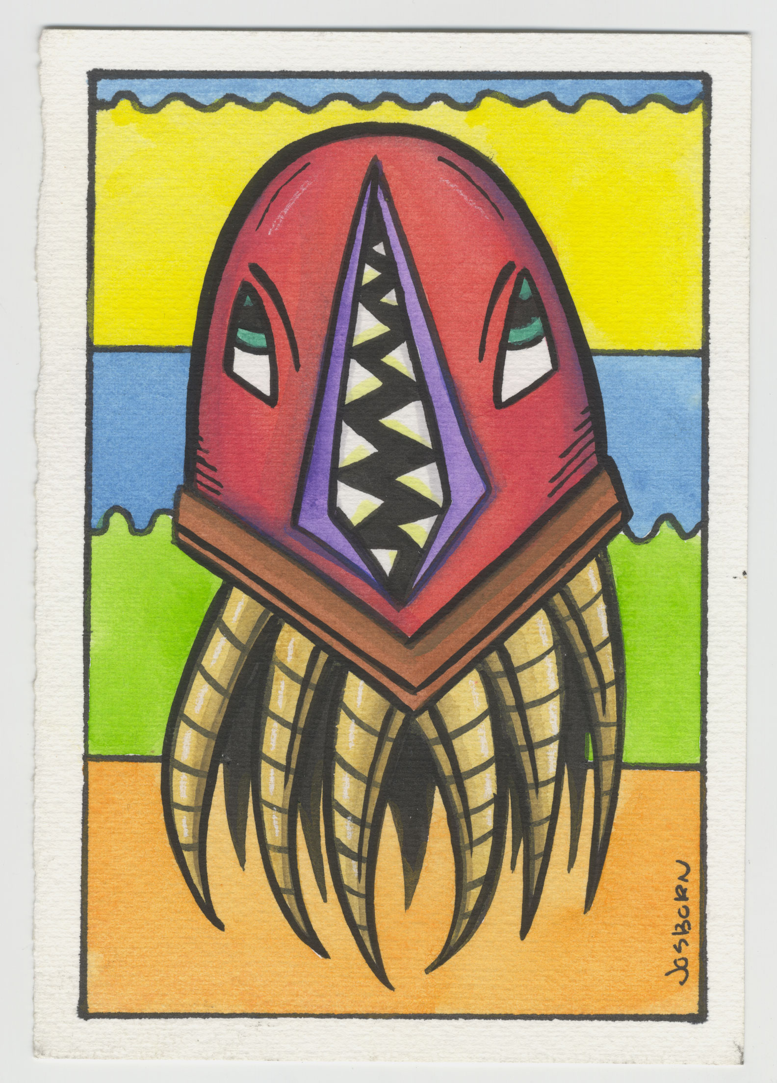
The little thing I’ve work on for the past few days are some of my tentacle monster drawings. I made some of them in the past, about 15 of them, but haven’t worked on them in a while. They’re just monsters made up of mostly some kind of big floating head with a sideways mouth and tentacles for the bottom of the body. I don’t know why I came up with them years ago but I can make lots of variations of them.
The original ones I made were drawn in black ink and then colored with markers on 5×7 inch paper. I used whatever paper was on hand. Mostly Bristol board but some of them are on a thicker mat board. I figured that’s what I’d do for these ones but then I looked at my markers and wasn’t in the mood. I had recently used my markers to color some of my faux comic book covers and I was tired of them. I decided to go with gouache.
I recently bought an empty watercolor pan set and filled up the pans with a bunch of tubes of gouache that I’ve had hanging around the studio for years. I figured it was a good time to try them out. I also have a Pelican pan set of gouache that I’ve been using for decades so I pulled that one out. Turns out that most of the colors overlapped on the two sets.
All there is to these Tentacle monsters is the monster, which takes up most of the picture, and a a background made up of five or so bands of color. The fun and variety in them is all according to the variations in drawing and color of the monsters.
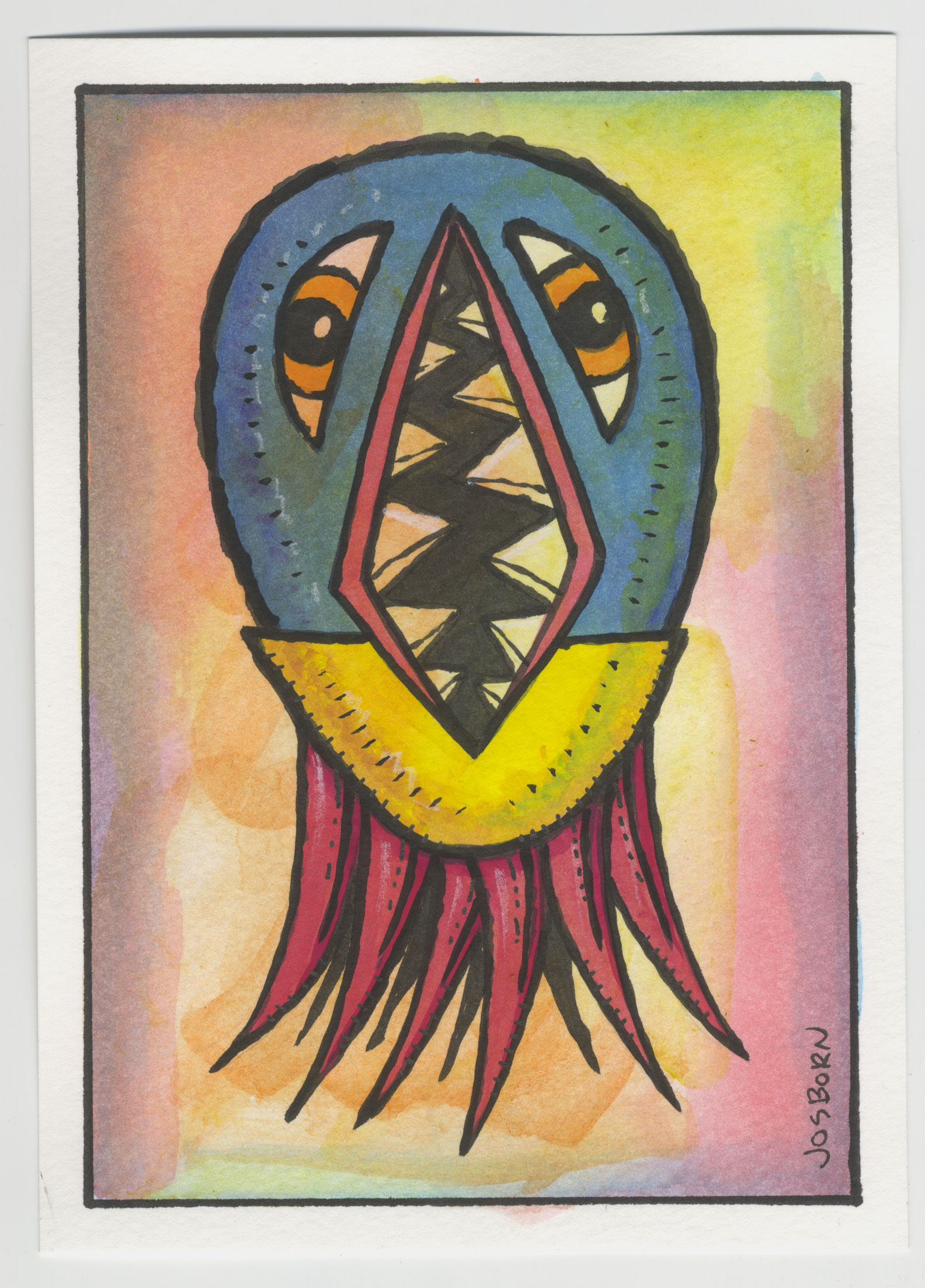
The first thing I do is draw the monster in pencil. This isn’t too hard. It takes some thought as the monsters are simple so getting variation in them is crucial. The vertical mouth and its two columns of teeth are almost always the same so I vary the shape of them slightly every time. The two eyes are also simple so I’ve go my eyes open for different ways to draw them from monster to monster. Then there is the overall shape. Sometimes it’s round, sometimes rectangular, and sometimes angled.
After the pencil drawing is made I hit the inking stage. I often use a marker to ink these things but this time I decided to go with brush and India ink. For the first four I used a classic Windsor Newton Series Seven brush and inked them in my normal thick to thin line weight style.
For the second four (I’ve made eight so far) I decided to pull out my cheap brush and use my side of the brush technique. That’s where instead of making a smooth line I make a rough line by drawing the tip of the brush across the paper sideways. I vary the pressure on the brush as I drag it making the line even more uneven. It gives the drawing a different look than my smooth line ones and sometimes it’s just fun to do. Perfect lines can be a drag and imperfect ones can be the antidote to that.
After the inking is done is when I add the color. It’s actually easy to do in marker. Marker is instant color and is dry right away. When I decided to use gouache that means it’s going to take a little more time as gouache is a water color and it takes time for the water to dry. That’s why it’s good to do four of them at once. I can switch between them when the water is drying.
The coloring is the part that takes the longest. Not only are there a lot of color decisions to be made on the monster but I also have to figure out the colors on the background. This is also where I find it easier to switch between the paintings. I can dip my brush in red and color a few red areas on one monster and then switch over and color some red on another. That way I don’t have to rinse my brush as often. It’s the little things.
After I get all the color done I usually have to go back into the drawing with ink again. The watercolor (or even the marker) sometimes goes over the black line. This tends to make the black ink a little duller. If I go back on top of the ink line with some more ink it brings the shine back to the ink and really livens the piece up.
The final thing I do with these tentacle monster paintings is to add some highlights to them with a white charcoal pencil. I like to keep the highlights subtle and the white charcoal works better for that than a white gouache does. It gives the drawings a little more life.
I’m not quite burnt out on this tentacle monsters yet so I have four more pieces of paper ready to go. This time I used four sheets of my 5×7 inch precut watercolor paper and took a different approach to the background. Instead of the five stripes of color I decided to pull out my liquid watercolor and put in some washes.
First it was yellow, then orange, then red, and finally some blue around the edges. I did this all wet-on-wet so the colors would blend into one and other. I also did it across the whole paper so now the tone of the background will show through the monster a little bit even after I paint him. It’s a technique I’ve used fo other things but it’s new with the tentacle monsters. I look forward to seeing how it’s tuen out. And that’s a good thing.