I’m back from the comic shop this week and I got five new comics and a catalog.
Check them all out here:
I’m back from the comic shop this week and I got five new comics and a catalog.
Check them all out here:
I haven’t written a “Friends” walkthrough in months so I feel like writing one now. Let’s see what episode that I’m on. Season Seven Episode 22, “The One with Chandler’s Dad.” It first aired on May 10, 2001. Let me check my calendar to see what I was doing that day.
It looks like I was working at Marvel Comics down in Manhattan that day and all week. The weekend before the tenth I was hame sick. I bet that was no fun. The weekend after that I have a note that I, “Took it easy” which means that I got no artwork done. I was probably still a bit rundown and off my game. I did make it to the comic shop and art store on Saturday the twelfth. That sounds like fun.
I notice this episode is about Chandler’s dad who was gay and a Vegas drag show performer. His dad was played by Kathleen Turner. The joke at the time was that Turner was always accused of having a manly voice so wouldn’t it be funny if she played a man in drag? I never found that bit funny. Let’s start the show.
We’ve got the three women in the apartment planning Monica and Chandler’s wedding. We start with a joke about Ross driving Monica’s new inherited (from their father) car. Joey walks in. The joke is that Monica lets everybody borrow the car except Rachel. Pretty bland opening and here comes the song.
Now Ross walks into the coffee shop after driving the Porsche. Rachel is there and she tries to talk him into letting her drive the car. Some typical Ross and Rachel stuff as she steals the keys (and some money) from Ross’s jacket.
Meanwhile back at the apartment Monica starts the main plot by saying, “We still haven’t gotten an RSVP from your dad.” That’s because Chandler never sent him an invite. Chandler was embarrassed by him growing up and doesn’t want to invite him. It’s revealed that he stars in a drag show in Vegas. A funny Phoebe joke ends the scene.
Cut to Rachel polishing Monica’s Porsche and getting in as Ross throws himself across the hood to stop her from driving away. Ross eventually gives in and goes for a ride with her. They drive off after a middling amusing scene.
Back at the coffee shop Joey and Phoebe are waiting as Phoebe’s new boyfriend picks her up. At least I think he’s new. I don’t remember him. Joey wants to get to know him better and asks him his name. It’s Jake. Ahhh… Now I remember this plot. Jake bends over and Joey is shocked to see that Jake is wearing women’s underwear.
Another apartment scene as Monica brings a suitcase to Chandler and announces that they’re going to Vegas. Chandler doesn’t want to go. So childhood embarrassment is revealed. Some funny stuff in there and eventually Chandler relents and off they go.
Joey enters the coffee place and explains to Phoebe about Jake’s underwear. Of course Phoebe is unfazed as it’s part of her kink. Joey thinks it’s weird but Phoebe tries to convince him.
Now a driving scene. We don’t get a ton of these in this show. Rachel is driving and reveals she doesn’t even had a license anymore. Ross is nervous and freaking out and then a cop pulls them over.
Joey is in his apartment and in a robe as he has just taken a shower. Rachel is his roommate at this point in the show and there is a basket of her laundry in the living room. There is never laundry lying around in this show so we know where this is going. He decides to try on a pair of her underwear.
Look! It’s Las Vegas! Chandler and Monica are at his father’s drag show. Chandler reveals that his father has tried to reconcile with him lately but he’s rejected him. Kathleen Turner makes her appearance on stage and the short scene ends.
Back to the road and the Porsche is pulled over. Rachel flirts her way out of a ticket as Ross is appalled by her behavior. This may be the funniest scene of the episode.
Kathleen Turner is putting on a show and walking around audience in the small club as she sings and makes jokes. Chandler tries to run out but she notices him. Stunned silence as the scene ends.
Here comes Joey again into Central Perk. He brags to Phoebe about wearing women’s underwear. After some humorous exchanges they both decide he likes them a little too much and he has to stop. That scene ends quickly.
Back to Vegas as Kathleen Turner interviews Chandler and Monica as part of her show. This is actually a very sweet scene as Chandler and his dad make up and Kathleen Turner gets invited to the wedding. Of course the scene ends with, “It’s Raining Men.”
Now we have to wrap up the driving scene as Ross is behind the wheel but he is driving way too slowly. Eventually he gets pulled over. He tries to flirt his way out of it but fails miserably. Here come the credits.
The credit scene wraps up the Joey and Phoebe plot as Joey asserts his manhood by hitting on a woman. It doesn’t go as well as usual due to some stay lady’s underwear.
Let me check the internet to see if anything was cut out of this episode for syndication. The cut a Phoebe being a vegetarian joke from the opening scene. They cut a couple of Chandler’s embarrassing stories about his Dad. They cut a Monica joining the Brownies joke. They cut the scene where Phoebe checks out Joey’s underwear as he bends over. They cut some jokes out of the scene where Rachel is driving. The cut some of Ross’s attempt at flirting. They cut a lot out of this one. And this was only a 22 minute show!
Now I’m going to look up what I rated this show at back in 2010. Right now I’d only give it two out of five stars. I think it was a weaker than average episode. None of the plot lines were particularly good. Chandler making up with his dad was nice though. Looks like I gave this one four stars back then?!? I could see maybe three (average) but not four (better than average). I must have been in a good mood that day back in 2010.
I’m back from the comic shop this week and I got four new comics and a book.
Check them all out here:
Sometimes getting things done is all about finding the right tool. In my case it was all about finding that one black marker. Of course it’s not like I don’t have a lot of black markers and a lot of black markers that I like but sometimes I find a good new one.
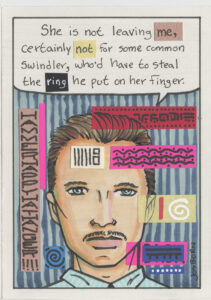
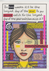
This week I’ve been working on some of my cartoon art cards that I use for my Sunday comic strip, “Drifting and Dreaming.” Since I use two of them per strip I have to make 104 cartoon art cards for a year’s worth of strips. Fo some reason I like to get a year’s worth of strips done at a time but it takes me months to get them all done.
I usually start making the strips a year before I need them. Right now it’s October of 2024 and I have all the “Drifting and Dreaming” strips for 2025 finished and ready to go. I think I started them in January 2024 and I usually finish all 52 strips by May. Then I don’t work on them much until the following January.
This year has been a little bit different. For the last few year I’ve had a big art project of my own to work on during the summer months but I never had one this year. So I’ve been working on all small stuff. Lots of 11×17 inch and smaller drawings and such but no big paintings or big ink drawings. I don’t know why. That’s just the way it’s been.
Over the last couple of weeks I’ve found myself working on some cartoon art cards. It’s a bit early to get started on 2026’s cards but I just felt like drawing some.
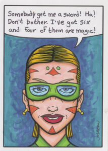
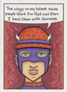
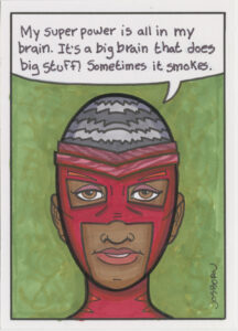
When I first started making these cartoon art cards (which are nothing but a cartoon head and shoulders of a character with a word balloon over their heads) I would draw them right in ink. I would have to make up the whole face as I went along with no pencil drawing to guide me and therefore no erasing. This served me well for years until I grew tired of it. I grew tired of it because I found myself repeating certain ways of drawing the faces.
That’s when I decided to do a quick pencil drawing first. Nothing fancy just some indications of features, hair, and shoulder clothing. That went well until this year when I, once again, found myself repeating myself. Turns I usually do that when I grow tired of a particular method. Or maybe the repeating myself is a result of the growing tired. I’m not sure which comes first.
So I changed it up again this year. Now I draw an even more basic face on ten cards in a row (I always do these cartoon art cards in batches of ten) as quickly as I can and then after all ten are done I go back and add a little more pencil detail to each face one by one. I found this a little more fun and freeing.
After the pencil work is done I would go in and draw the face over the pencil with an ink pen. It’s almost always been a Sign Pen refilled with India ink. A Sign Pen has a hard nib and is one of my favorite pens to draw with. Except I have grown tired of making these cartoon art card faces with the Sign Pen. I don’t know why except I wasn’t looking forward to finishing the drawings.
I love to try out new art supplies. I especially like to try out new black markers because they are cheap and plentiful. Last December (2023) I bought an eight pack of black calligraphy markers to try out. I don’t do calligraphy so I was trying them out to draw with. They weren’t anything special at the time so I put them away with all my other markers.
Since I was so bored with my usual Sign Pen I pulled a bunch of other black markers out to try. Lo and Behold I really liked one of those calligraphy markers. It’s one of the three brush markers in the set and it’s the medium point one. It’s not really a brush. It has a small rubbery tip with some flexibility to it but it takes some pressure to flex that tip. I ended up knocking through the first ten of the cartoon art cards because I was really enjoying that pen.
Next I had to try and find some more of them. I can use this one for a while and I know how to refill it with India ink but even so that tip is eventually going to wear down. I bought the pen set off of Amazon and knew I could easily get another set but I don’t want to buy an eight pen set to only use one pen. Not very cost effective.
This calligraphy set of markers I bought on Amazon was made in China. There are a ton of “Made in China” markers on Amazon and a lot of them are unbelievable cheap. They also tend to be the same markers with different branding on them. So I was pretty confident that I would be able to find the marker I was looking for somewhere on Amazon.
After looking for a while I realized that I couldn’t find the marker on its own. It was always part of a set. The original set was $13 for eight markers but I found what I thought was the same marker in a set of three markers for $6. I decided to order a set and see if it was the same marker. After all it was also made in China.
When I got the set of three calligraphy markers they looked slightly different. The barrels of the marker were a bigger style but the tip was nearly identical. It was nearly the same so I was happy with it. Maybe I can’t find it on its own but $6 a marker is better than $13 a marker.
I’m also going to have to check some of my other markers that I’ve bought but not used a lot. I think there have to be some of them with similar tips because it’s not like this marker felt like it had a tip I’d never drawn with before. It just hit the spot in the moment.
Now I’m looking forward to using the medium size brush tip calligraphy marker to draw more faces and cartoon art cards. That’s always a good thing.
I’m back from the comic shop this week and I got six new comics and two books.
Check them all out here:
As some of you who read this might know I have a YouTube channel. I’ve been showing off my weekly comic book hauls on that channel for just over ten years. For the last few years I’ve also been hosting a show on Friday nights with my friends Paulo, Wilson, and sometimes Chris where we sit around and talk comic books from 6-9PM. We have a good time.
One thing I was talking about this past Friday night (September 27) was why I love comic books. They are my favorite medium. I’ve talked about this idea about why I love comics a few times over the years but I don’t think I’ve ever written it down. So I thought I would do that here.
They way I describe why I love comic books is to compare them to movies (and TV) and books. I like both of those too by the way. I am a reader not only of comic books but also of regular books. I usually read a novel when I’m on the train commuting. I also usually watch on hour or two of TV every night before I go to bed. Each of those three mediums has its own experience.
Let’s start off with reading. When I read a book the words on the page create images in my head. They might not even be literal images all the time. They might just be a place in my head where the story takes place. Either way the story is not happening on the page. The story is happening in my mind. My mind uses the words on the page to create the story. That’s why some people find reading hard. They have to create the story in their head and that’s not easy for everyone. Of course the quality of the writing matters too.
When writing is good I can disappear into another world. People who praise novels usually talk about how it brings them to another time and place. That’s why people like it. They can be transported out of their lives in into someone else’s. The written word is transformed by someone reading it into an experience for the reader.
Movies, TV, and moving pictures on the other hand work a lot differently. The movie creates the world that we then move into. There is no onus on the viewer to create or imagine anything. We move into the movie maker’s world with our eyes and ears but not as much with our minds and/or imaginations. We don’t need to. The world is created for us to be taken to through our eyes and ears.
You can get into or escape into a movie just like you can in a book but the imaginary space they created in our minds is different. The imaginary space a book creates is almost all in our minds or imaginations. There is no dragon but the one we picture as we read a story about a dragon. In a movie the space still takes place a little bit in our heads but is mostly on the screen. They’ve made a dragon for us and we can see it on screen.
A lot more people watch movies as compared to read books because watching movies is easier. It’s more passive and demands less energy from us. A book makes us use our imagination or mind’s eye and that takes some energy and concentration. Maybe not a lot but more than a movie. It’s just a little bit harder to read than it is to watch.
Now we come to comic books. They are, of course, different than both movies and novels. They’re even different than looking at a painting or photograph. Comic have both writing and pictures in them and the pictures are generally drawn by an artist. Sometimes the artist does the writing too but often the writer is a separate person from the artist. So comic books are art, writing, and pages.
I’m a big fan of art and words paired together. Even if it’s not a comic book. A lot of the art I’ve made has words in it. Some of the same stuff I’m about to write about comics applies to all words and pictures art.
I often hear the question asked by comic book fans, “Which is more important? The art or the writing?” This is where I usually point the impossibility of answering that question because the art is at least half the writing. You can separate the words from the art but not the writing from the art. As a matter of fact there are comic books with no words in them. There is still writing though. The way the art tells the story is the writing.
When I’m reading a comic book, unlike a regular book, the writing does not create a space in my head where I am imagining the story. The artist has already imagined the story and the pictures are right there. The words and pictures combine to create a space in my imagination that tells the story. It’s not quite a space deep in my mind like a novel creates but a space that’s in my mind yet hovers above the printed page. My imagination blends the art and words together into the story they are telling. That’s how I get into a comic.
The writing part of the art is the visual storytelling. How the panels are composed, what is being shown, what angle is it being shown at, what is not being shown, what is happening between the panels, how big or small the panels are, what order the panels are in, how time moves between panels, what happens on page turns, and a lot of other stuff is all part of the writing of comic book art.
In what style the art is drawn is more of the art part of a comic book. How the drawings are presented is more the writing part of a comic book. There has to be a lot going on in both of them so they, along with the words, can create that space half on the page and half in my imagination.
It’s even tough to tell if I will like a comic before I read it. I can flip through a comic and be attracted to the art and maybe read a page or two but until I actually sit down and read it I don’t know. I have to “Read” the art and the writing together. Sometimes I’ll like the art to look at but it doesn’t read well. Sometimes the words don’t read well either. If both aren’t working together then that space in my mind is not created. It’s like watching a bad movie that you just can’t get into. You may as well turn it off. But when then work together it’s a beautiful thing.
I’m back from the comic shop this week and I got ten new comics and three books.
Check them all out here:
This week I’ve been writing some of my “Message Tee” comics. I finished up fifty two new drawings earlier in the year and now I have to put pithy sayings on their shirts. My method for writing these strips is to get a small notebook and write as many sayings as I can think of in the notebook. Or at least as many sayings as I can think of at the moment.
I like to have choices when I’m putting a saying on a comic so that I end up writing twice as many sayings as I need. Since I have fifty two drawings I write a hundred and four sayings. Usually I round it up to one hundred and five.
The reason for the extra one is because of the little notebook that I write in. It’s a 3.5×5.5 inch notebook and I can fit five sayings on a page. Each saying fits on two lines with a blank line in-between sayings. After I fill up a page I write the page number on it and also put a date on the page.
Usually I write these where ever I am. I’ve written them on my commute, I’ve written them in waiting rooms, I’ve written them sitting in my chair, and I’ve written them standing at my drawing table. But this year I wrote some of them as I was on walks. That was new.
As one of my forms of exercise and to get out into the open air I like to take walks. They’re not long walks as they only take me about half an hour. I’m not power walking or ruck sacking. I’m just out for a stroll. So one time I decided to take my notebook with me to see if I could come up with any ideas. I could.
The walk took me about an extra ten to fifteen minutes since I had to stop and write every time that I came up with an idea. I was also thinking about ideas nearly the whole walk. At first I was thinking I would stop after writing five ideas but then they came pretty quickly so I said ten ideas and then fifteen. I think I got all fifteen done and still had about a third of the walk to go. So after that I just relaxed and walked.
I ended up doing this twice or maybe it was three times. But finally there was one time I was sitting down and I said to myself, “I’m going for a walk in half an hour.” It was my plan to walk and write but then since I was just sitting and resting anyway I decided to write the fifteen lines then so I wouldn’t be bothered with the writing on my walk. So that’s what I did and it worked out fine.
I’ve also been getting ahead on the writing for my “Four Talking Boxes” strip. When I first started the strip way back when I would write five strips a week (that’s how many run per week). I started out three months ahead and kept it that way for a long time. I would write the strips in the beginning of the week and finish the art at the end. I never fell behind but I wanted to get further ahead with the writing.
At first I would write the strips whenever but eventually I settled into writing the strips Monday through Friday at breakfast time. That was my habit when I decided to get further ahead. I decided to write strips seven days a week with breakfast. So that’s what I did for a long time. Writing seven strips a week when I only need five means that I’m gaining two strips every week. I kept this up of so long that eventually I was a year ahead.
Being that far ahead was kind of absurd so I stopped. Then for the next few years I took time off from writing strips. Months would go by without me writing one and then I’d go back to writing seven mornings a week. I was just going by whatever I felt like doing. I never fell behind but eventually I got tired of losing track of how far ahead I was. I think I even got to the point where I was back to writing the strips the week I was finishing them. That’s when I decided to do them steady from Monday through Friday again.
At some point earlier this year I decided that I wanted to get ahead on the “Four Talking Boxes” writing again. I went back to writing seven strips a week. But instead of doing them at a set time I decided to do them whenever it crossed my mind. The game was that if I thought of it I had to do it. There were occasionally days when I never thought of it at all. Then I’d do two the next day when I thought of it. That method is working well and I’ve kept it going for about three months so far.
One thing I haven’t written is any of my “Drifting and Dreaming” strips. I have all fifty two of them finished for next year (2025) and usually I work on them from January to June but recently I decided to draw some new ones. I couldn’t get anything big started and so decided to make some “Drifting and Dreaming” art cards. I draw that whole strip on individual 2.5×3.5 inch pieces of paper.
I drew ten faces, got them ready to say weird things, and then couldn’t write anything. I needed to get 2025’s “Message Tee” comics written so it seemed absurd to be working on 2026’s “Drifting and Dreaming” writing. I put those cards aside and will get back to them after I finish my “Message Tee” strips.
That’s the state of my writing as I write this. Yes, I am still managing to get one thousand words a week written on this very blog that I started back in 2005. Time just keeps marching forward.
I’m back from the comic shop this week and I got ten new comics.
Check them all out here:
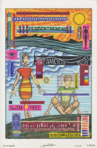
I’ve been hitting the computer hard these last couple of days doing some non-creative work in service of creative work. It’s more fun to do creative work but sometimes I have to do other non-creative stuff to further the goals of the creative stuff. This time it was setting up my “Dreams of Things” covers to comic books that don’t exist so that they can be made into prints.
All of my “Dreams of Things” covers are done physically. I draw them on paper with pencil and ink and then color them with markers. After I’m done with them I scan them into my computer so I can use them digitally.
I’ve done 250 “Dreams of Things” cover over the years and I always meant to set them up so that I could make prints out of them. Until last May I never did. They just kind of sat there on my computer without me ever working on them. That’s because it’s a lot more fun to make new covers than to set the old ones up for printing.
Last May when I decided to start setting them up I made some Photoshop Actions to help me with the process. Those are macros or automatic actions that can help with repetitive tasks. They are really helpful.
When making the “Dreams of Things” cover I print out the logos and trade dress right on the paper I will be drawing on. I like the way these mechanical logos look against the hand drawn comic and real comic book covers were done that way too. The mechanical logos were pasted on after the artwork was done in real covers but the end result was the same. Mechanical logos on the art.
The problem with doing the logos this way and then making a print is that a printed out logo that is then scanned back in can make the logo a little fuzzier than I want it to be. Plus on a lot of the covers the black color of the logo isn’t quite as dense as I want it to be. I think I was having problems with my printer at the time and just had to go with the slightly grey logos.
As a result of the grey and fuzzy logos I decided to digitally paste a new version of the logo over the old one. It had to cover the old one perfectly so I had to fiddle around until I got the logo just the right size. I knew this part of the process would take the most time but I also knew that it had to be done for the prints to look good.
Sometimes the covers have a horizontal logo and sometimes they have a vertical one. So I had to set up a template which had both on different layers so that I could chose to copy either one. Step one of my action is to choose the correct logo.
To set up the covers I have three files open in Photoshop. The file with the two logos, the file of the cover to be set up, and a file for the set up cover to go in and be printed out of.
I choose the correct logo from that file and then move over to the scan of the cover file. I hit the button to start the action and it pastes in the new logo and also types the issue number and month of the issue. I’m replacing those too because they are a little bit fuzzy. The action also does a little bit of color correcting to get the color more accurate.
The logo and numbers get pasted in but they are always a little bit off. I have to nudge them into place to cover up the old logo. Sometimes this takes ten seconds and sometimes it takes a few minutes. I also have to type in the new number and month because the action can only type in place holder text. It doesn’t know what month I want.
After the logo is covered over with a new digital version I save the document with all the new layers in it. That’s in case I have to go back and changes things. After that is saved I flatten the image so that the layers are gone and everything is flat and on the same level. I “Save As” that document and put “Flat” as the end of the file name. This is the one I need for the next step.
Now I start the action with the flat art files open and it copies the art, closes the file, and then stops and asks me to choose the printing template. After I chose the printing template it pastes the cover into it. The top layer of the template has a border and I have to shift the art slightly so that it matches the new border. I do this ten times until I have ten ready for printing 11×17 inch prints on ten layers.
I’ve been doing them ten at a time and it takes about 45 minute to an hour to get ten of them done. Sometimes I can go fast but at other times things come up that can slow one down.
One of the things that has slowed me down is missing scans. It seems they come in batches too. Usually after I finish a cover I scan it into the computer. Turns out I didn’t do that all the time. About every thirty covers there are missing scans. I don’t know why they come in batches but I’ve had to scan in three covers at a time about three times. It was getting weird.
The last step is to hit an action that turns the 11×17 inch prints into 8.5×11 inch prints. This is the size that I was printing them out at last May but since the art and original scans are at the larger size it only made sense to set them up that way first. I may not be printing them out at the larger size right now but when I’m ready to they’ll be all set up. That’s always a good thing.