I’m back from the comic shop this week and I got four new comics.
Check them all out here:
I’m back from the comic shop this week and I got four new comics.
Check them all out here:
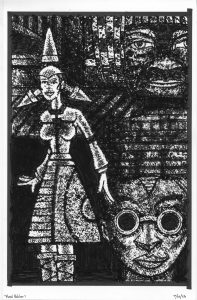
Some days I want to make some art but I have no idea what art I want to make. That’s one of the reasons I like to make a lot of different kinds of art with different techniques. Sometimes on days that I don’t know what I want to do I can go by feel. By that I mean literal physical feel. What it feels like to use the tools that make the art. I went by feel yesterday and chose to make some drawings in my “Monsters on Comics” series.
I started drawing monsters, and particularly monster faces, about fifteen years ago and it all had to do with an art show I saw back when I was in art school in the 1980s. I had a teacher for my visiting artist painting class named Emilio Cruz. He took us to a show at the Brooklyn Museum about the art of New Ireland. That’s an island in the Pacific where the people made these small sculptures, about a foot tall, of scary monsters. They kept them in their homes to remind them that there were bad things out in the world and everybody should try to stay on the straight and narrow. This idea inspired me to draw my own monsters.
If memory serves then the first monsters faces I drew were about 11×14 inches and were done with some kind of charcoal. There are a lot of different kinds of charcoal sticks and it took me a few tries to find the darkest and densest charcoal that was good for this task. It took a lot of rubbing to get the darkness I wanted. I didn’t end up making many of these.
A while (a year or two?) after I made those monster faces I started using my busted brush technique. This as using an old brush that no longer came to a point but split up into many points with ink on paper. I found this technique to be conducive to drawing monster faces. India ink is really dark and the texture made by the busted brush can be built up to make cool monster faces out of. I mostly worked on 6×9 inch paper to draw these monster faces but I occasionally made larger ones.
This leads us to my “On Comics” series and specifically my “Monsters on Comics” series. In case this is the first piece you’ve ever read of mine I’ll let you know that I am a comic book collector. That means I have a lot of comic books. I even have a lot of worthless comic books. I mean worthless because they are in such bad shape that they can’t even be read. They’re falling apart.
I decided that I wanted to do something with those comic books. I wanted to tear out the pages that were still in decent shape and draw on them. But draw what and with what? I ended up settling on drawing monster faces but it took quite a while to settle on which tools I should draw on the comic with.
First of all the paper from an old comic book is delicate. Most of the comics I was drawing on were from the 1970s and drawing on forty something year old yellowed newsprint isn’t easy. I couldn’t use a wet medium like ink because that would wrinkle the paper. It had to be a dry medium plus also be a soft medium. I wanted to not only use black but also use white. That way I could work back and forth from black to white. Plus the paper was too delicate for erasing so the white would serve as a cover up too.
I started out trying to use charcoal but all of the charcoal I had or found was too hard for the paper. There is not much tooth to the old newsprint so I had to rub really hard with the charcoal to make lines and shapes so it tore the paper too much. I did find my answer for the white in some sticks on conté crayon that I has lying around since the 1990s. It worked really well.
I eventually abandoned all my different charcoals and tried out some black markers. They worked. I especially liked using an almost dried out marker. It blended well with the conté crayon. The marker wouldn’t keep as perpetually almost dried out and when it did finally totally dried out I kept it around to blend with. I still use it in that capacity.
I made a bunch of drawings this way but then ran into a problem. I ran out of white conté crayon. Just buy some more you say. Which is what I did. The problem was that none of the conté crayon that I bought was soft enough. I bought the softest stuff I could find and it was the same grade of softness as the old stuff I had but it still too hard. It wouldn’t draw on the old newsprint. So I had to go in search of a new white to use.
It took some trial and error but eventually I found some white pastel sticks that worked really well. Pastel sticks are bigger than conté crayon so I couldn’t make as fine a line but it could cover big areas faster. Plus I had a little bit of that conté crayon left that I saved for small areas. I also added in a white charcoal pencil that only worked on really small areas but I found some use for it. I was back in business.
This all brings us to yesterday. That’s when I decided to make some art because of its feel. The feel I wanted was of the pastel rubbing on the paper. It’s hard to describe. It’s also similar to using charcoal. With a pencil you draw it along the paper and it leaves a light mark. With pastel or charcoal you have to use more pressure and it’s a much blunter tip so you have to rub it across the paper.
As you rub pastel across the paper a half inch chunky line is left behind. This has a nice feel. The black marker is put down with a delicate touch which contrasts with the pastel application. Then it’s back and forth. Chunky, delicate, chunky, delicate, and so on. Throw in some rubbing in there with the dried out marker. It all makes for a nice physical process that is a cool change of pace from a pencil, brush, or marker. I dig it.
I’m back from the comic shop this week and I got five new comics.
Check them all out here:
Back in my younger days I had a teacher say to me, “Every artist has a scale.” What that means is that artists have a size that they work best at. Big, small, or somewhere in-between, all of us have a scale that we are most comfortable with and prefer to work at. Over the years I’ve found this to be true, my scale is mostly large, but that’s not absolute. With some things my scale has changed over the years.
First of all scale has a lot to do with tools, space, and money. If you want to work large then you’d better have large tools. Drawing a wall size drawing with a regular size pencil is a tough task. Maybe some larger pencils will be in order. Large tools are often harder to come by too. Especially for young artists who probably don’t even know such tools exist.
Tool are related to money but space is even more so related. If you don’t have the money for a big studio space then you’re probably not going to work very large. It’s mostly successful (ie monied) artists who make huge wall sized paintings. If you’re of modest means, making a modest living, and not selling much art, then you probably don’t have the space to make wall size paintings. That’s why when I say my scale is large I don’t mean wall size paintings. My means are modest.
For a lot of my drawing on paper, ink or pencil, I like to work on 11×17 inch paper. That’s the size that most comic books are drawn at so it became my default size a long time ago. When I make my big ink drawing that are on much larger paper: 22×30 inches. That would be a big drawing to me. My acrylic on canvas paintings of the last few years have been on 24×36 inch canvases. Though I’ve painted on bigger canvases I don’t have the room for them these days.
In my Ink books (my sketchbooks) I draw small. The book itself is 5.5×8.5 inches and I get even smaller by drawing from six to twelve thumbnail drawings per page. When coming up with ideas I like to keep things small so only the basics get drawn. I try to strip off all the extraneous stuff that is better added after I nail down the basics.
I used to make all of my pencil drawings the same size as my finished ink drawings on 11×17 inch paper. I had to do it like that before the digital age as the only way it could be done was to ink right over the pencils. But in the mid 1990s when I got my first computer I could scan in my pencils and then print them out on another piece of paper to ink on. No longer did the pencils and inks have to be on the same piece of paper.
Since the work of pencilling and inking could now be done on two separate pieces of paper they also didn’t have to be the same size but for many years I still kept pencilling on 11×17 inch paper. Probably because I didn’t think about it that much.
At some point in the 2000s I started drawing on smaller pieces of paper. Sometimes a few different sizes. I’d start on 9×12 inch paper, make a drawing, then blow that drawing up to print on an 11×17 inch piece of paper and finish it. Sometimes I’d start the drawing on a 6×9 inch piece of paper and blow that up to 9×12 or 11×17 inches. Sometimes I found myself working at all three sizes to make a finished drawing. That started to be too much.
Nowadays I have mostly done all of the drawings for my 11×17 inch ink pieces at 6×9 inches. I’ve gotten used to that scale. Occasionally I blow one of those up to 9×12 inches when I need to figure out more detail but I almost never draw in pencil at 11×17 inches. I save that size for the inks.
The idea of scale came into my mind today as I was drawing some of my Great Gatsby illustrations. All of last year I did those drawings at 11×17 inches but this year I’ve been doing some smaller 6×9 inch spot illustrations. I’ve been trying to keep them simple. For the most part I’ve been successful at keeping them simple but occasionally one demands to be drawn bigger. Or sometimes small is not the right scale.
I was just working on a spot illustration that had a lot of sweeping lines in it. I was doing it on 6×9 inch paper and from the moment I made the first line I knew something was off. I’m not an artist who usually has to “Warm up” before drawing but as I was making this one I felt that I should have. My hand was not making the brush strokes like I wanted them too. Halfway through the drawing I thought that things were going wrong because 6×9 inches was too small. The scale was off.
I finished the drawing and even used some Pro White to try and fix the lines but I quickly decided to go big with it. I printed out another version of the drawing on 11×17 inch paper and got to work. The extra size made things a lot easier. I was able to get the lines I wanted and I finished the drawing fairly quickly. I think it took me less time to ink the big one than the small one. I was even able to add some details that weren’t in the small one.
This also isn’t the only one of the smaller spot illustrations that I’ve gone bigger with. I’ve done it with a few of them. Usually it’s after I finish the 6×9 inch drawing, contemplate it for a few minutes, and then say, “Screw it. I’m going bigger.” Some drawings demand to be done at a larger size. Maybe each individual drawing has a scale too.
I’m back from the comic shop this week and I got eight new comics.
Check them all out here:
Yesterday was my birthday, I turned 57, so today I am feeling a little bit nostalgic so I thought I’d turn on an episode of my go-to nostalgia show “Friends” to watch and write a walk through of an episode. I’m up to Season Six Episode Twenty One: “The One Where Ross Meets Elizabeth’s Dad.” We’ve got Bruce Willis playing Elizabeth’s dad in this episode. A bit of stunt casting getting a big movie star to guest star on a hit TV show.
It first ran on April 27, 2000. I was only 34 back when I watched this live on TV as it was being broadcast. Let me check my calendar to see what I was up to. I looks like I spent my day working at a place called Sterling Publishing. Coincidentally they were in the same building where Marvel Comics was at the time. 387 Park Avenue South. I was doing graphic design stuff for them. I also worked on a sketch for Oil Painting #13 whatever that is (I’d have to track it down). Plus I renewed my subscriptions to three magazines: Mac Addict, Dreamcast Magazine, and Archeology (which I still get.) I had a lot of magazine subscriptions in the 1990s. They were cheap!
Let’s start the show.
We begin in Central Perk with Rachel reading horoscopes. Chandler, Monica, and Phoebe act the horoscopes out as Joey walks in. Joey just booked a new TV show! He’s the lead! And all freaked out. A horoscope call back joke and the theme song starts.
Back to Central Perk. Phoebe is going to write another book. She’s written fourteen of them but none of her friends have ever heard of her writing any. Plot number one.
Here comes Ross. He’s been dating an ex-student of his, Elizabeth of the title, and her dad (Bruce Willis) wants to meet Ross. Bruce Willis being intimidating is the main joke of this plot line. I don’t remember finding that very funny but let’s see this time. Plot number two.
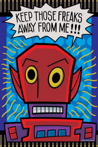
Joey arrives for his first day on the set of “Mac and C.H.E.E.S.E.” Where he has to act opposite a robot. He has to meet the guy who created and operates the robot but Joey mocks the robot he and the creator they don’t get along. This is our third plot.
At Central Perk again and here comes Liz and her dad to meet Ross. Paul (the dad) straightforwardly doesn’t like Ross and that makes Ross really nervous and uncomfortable and he rambles on and makes an embarrassment of himself. Here come the friends to talk Ross up. They don’t do that good a job. The stuff they say backfires on Ross. It’s mildly amusing. I also think it’s that I’ve never found people being uncomfortable to be very funny. Not my taste in humor.
Rachel walks and makes things worse for a moment.
Now we time skip forward and Monica and Phoebe are at the apartment as Phoebe is writing her book. Monica and Chandler have a cute conversation about toilet paper and then they realize Phoebe is using that in her book. This is how this plot plays out. Phoebe writing the stuff down that Monica and Chandler do.
Here comes Paul walking back into Central Perk and Rachel is the only one there. He lost his keys. They look for them, find them, and then flirting ensues. Flirting with Rachel was a lot of “Friends” in general.
Chandler and Monica are still in the apartment as Joey walks in. He tells them that the robot creator doesn’t like him. Joey gets a phone call from his agent. Turns out he’s in trouble and might lose the job. It’s up to him to make nice. Plot number three is pretty tame this episode. So is plot number two I think.
Another uncomfortable scene stats as Ross barges into Joey and Rachel’s apartment and Rachel is making out with Paul. That flirting escalated quickly! The conversation after Paul leaves between Ross and Rachel is funny. Good stuff there.
Now we’re at the other apartment with Joey explaining his problem. Monica tells him he has to turn on the charm. Meanwhile Phoebe is writing stuff down about Monica and Chandler. Monica is testy about it!
It’s the next day and Joey goes on his charm offensive with the robot guy. That scene was short. This plot isn’t very front and center.
Double date between Elizabeth, Ross, Rachel, and Paul! Even that doesn’t go well. Paul tries to apologize but then Ross makes things uncomfortable and Rachel piles on. The uncomfortable humor is piling up!
Back to the apartment where Chandler and Monica are bickering. They have a dispute about what time they were supposed to meet. Phoebe then spins in the chair to make a villainous entrance and declares that she has the time written in her book. Phoebe has demands. The time confusion was in the book. She let them suffer for the sake of literature!
Chandler and Joey are on Joey’s set. Wayne, the robot guy, walks in. He wants Joey’s help to get better with women. Chandler nudges him to do it.
Back to the double date. It’s not going well for Ross but he finally puts his foot down. That doesn’t go well either. But then everyone agrees to not like Ross (except Elizabeth).
The end credit scene wraps up the Joey plot line. He’s filming and talking to the robot who then starts to malfunction. Turns out Wayne is making out with a hot woman. Joey’s lessons stuck!
Now is the time when I mention that I always watch the DVD extended cuts of this show. Then I got on the web to see what was cut out of them for syndication. A nice Phoebe line about Rachel burning down their apartment was cut. They also cut one of Monica’s “Ross is dating a student” jokes. It was a funny moment too. A quick Joey on set joke was cut. They cut the whole intro scene with Monica, Phoebe, Chandler, and Paul shaking hands. A lot of flirting left on the floor. A Phoebe numbering the pages of her book joke was cut. They cut a joke about Chandler drawing naked picture of Monica. Never cut drawing jokes! Finally they cut some of the Wayne wants Joey to teach him jokes stuff. I liked those! I’m glad I don’t watch the short versions.
After watching this episode I’d rate it a three out of five stars. It was about an average show for me. Let me check my files and see what I rated in back in 2013 when I watched and rated all the episodes. Back then I gave it three out of five stars too. I guess my opinion hasn’t changed on this one. Happy nostalgia to you!
I’m back from the comic shop this week and I got nine new comics.
I like putting things in order. Arranging things into the places that make the most sense. I was doing that today, and over the last few days, for my comic books. Most people have their comic book collections in boxes, and I have some of those, but most of my comic book collection is on shelves.
Over the years I’ve built shelves everywhere I can. Along the walls of my studio, in my bedroom, and in the laundry room. I have a lot of shelves. It’s still not enough though. I’m planning on building some more in a hallway. It’s just a pass through hallway with nothing in it. I think I can build some shelf the length of it up over the door frames. They’ll be high shelves but pretty easily assessable and they can shelve books about ten inched high.
Meanwhile I’ve been moving other things around. I have two big book cases in my studio that both have four shelves a piece that fit comic books. Of course they’re both full so moving things around them means moving a lot of comic books around.
It started with the new Mister X comics and books that I bought recently. I wanted to put them all in one place. Usually I don’t put collected editions in among my comic books but for this I wanted to. The two Mister X books I already had plus the comic books in my Mister X collection already had their spaces but I needed a new place for both together. Hmmmm…
Often my comic books are shelved or boxed due to the order off their importance. If it’s on an easily accessible shelf then it’s important. If it’s in a box in a closet then it’s not important. I could get rid of those boxes more easily. So I picked out a spot on the shelf that had some less important books. I moved them onto a bedroom shelf after moving some even less important books onto a small new bedroom shelf that is high up. Then the Mister X books went in the important spot. That was easy enough.
The second book case in my studio has a lot of my indie comic books on it plus all of the series I’m currently buying. That’s the section that has to be adjusted the most. If a series I’m buying ends I move it into the section of comics with all the other ended indie series. Series I buy are constantly ending so I’m moving books in and out of that section two or three times a year. Long running series like Savage Dragon or Usage Yojimbo have their own place on other shelves so I never have to shuffle them around. That would be too much.
It was about time to shuffle my shelves and move the ended series when an idea struck me. That indie bookcase of ended series is also divided into two sections. Complete series and incomplete series. It’s been that was for thirty years. I think it made it easier for me to find stuff. I have card stock paper dividers between the comic series with the series name on the paper. If an incomplete series is only an issue or two the naming paper gets really close together and can be hard to thumb through. At least it was when all the papers were close together in that section.
But many years have gone by and lately I’ve been finding that system annoying. Two alphabet lists in one bookcase was no longer making things easier to find. I decided to mix the complete and incomplete series together. I’d say about two and a half shelves were complete series and half a shelf was incomplete. Either way I had to pull about half the comics off the shelf to begin with and all of them had to move eventually. Moving comic books is sweaty work.
The first thing I did was to clear out the bottom shelf of everything but the comics I’m currently collecting. During this I also had to pull out the series that have ended over the last few months. Right now the current comics take up about a third of the bottom shelf but that will grow to about half the shelf in six months or so.
Since there were many more completed series than incomplete ones I started by putting the end of the alphabet complete series on the shelf. After I had a bunch of them in place I mixed it the incomplete series from that end of the alphabet. I did that until I had the bottom shelf filled up. Then I went on to the second of the bottom shelf.
A word here about my paper dividers. Many years ago I used to get these scrap pieces of Bristol paper from when I worked at Marvel Comics. At the time this supply of paper seemed endless and so I used them as dividers. They worked pretty well. After the supply of them ran out I started to use a card stock paper. They’re not bad but they really do get bent over and folded up over the years. Sometimes I’ve used pieces of old backing boards and they work the best as they’re the thickest. I’d like to replace all my dividers but that’s a big job that’s also fairly pointless. Plus I’d have to buy a lot of backing boards. And maybe I should buy a label maker to make fancy labels! You see how I can turn a pointless job into a lot of work? That’s my super power.
This whole process took about three hours but I’m glad I got it done. It was a Sunday afternoon and I didn’t have any energy to work on art anyway. And here is the end of the story. I got the last book in place and stood back satisfied. I stepped back, took a look at my bookcase, and was happy in was in this new order. Then I turned around and saw another three or four short series on my drawing table. At least they were from the beginning of the alphabet and that’s where I ended so that I didn’t have to move too many comics. But it was a sitcom moment.
I’m back from the comic shop this week and I got eight new comics.
Check them all out here:
One of my favorite comic books from the 1980s is “Mister X.” It was originally published by Vortex Comics and, I think, they still own the copyright on the comic. However a variety of creators have worked on the comic over the years lead by Dean Motter who is credited as Mister X’s creator.
The comic first caught my eye sometime in 1984 because of the stylish Dean Motter and Paul Rivoche ads that ran in support of the book. I’m not even sure where I saw the ads but they mostly featured the eye catching covers that they did for the book. The ads certainly got me interested but I didn’t see an issue until 1985 when I bought a copy at my local comic shop. I’m not sure exactly when or how but I soon was able to get the first three issues too. Maybe my LCS had them as back issues or maybe I got them somewhere else but I was lucky enough to track them down. It went on my pull list after issue four.
Those first four issues were written and drawn by the Hernandez Brothers of “Love & Rockets” fame. This may have been my introduction to them. I had heard of “Love & Rockets” before “Mister X” but I don’t think I had any issues of it. I bought a couple of issues of “Mechanics,” which reprinted some of Jaime Hernandez’s “Love & Rockets” work, around this time but it was still a couple of years before I started reading “Love & Rockets” regularly.
I liked the Hernandez Bothers “Mister X” issues best and I was disappointed when they left the book. Issue five was drawn by the book’s regular colorist Klaus Shonfeld and inked by Ty Templeton. It was a pretty solid effort. I liked it too.
Starting with issue six the one named cartoonist Seth took over the pencilling (and sometimes inking) duties and the series lasted until issue number fourteen. In the years since I first saw his work on “Mister X” Seth has since turned into one of my favorite cartoonists. “It’s a Good Life It You Don’t Weaken” and “Cylde Fans” are two of my all time favorite comics, but back in the mid 1980s I slowly lost interest in Seth’s “Mister X” work.
Seth’s work in “Mister X” started out trying to keep a visual continuity with the earlier issues but as time went by the style of each issue changed and simplified. The later issues are much more recognizable as Seth’s mature style, which I now love, but I didn’t like it so much back then on Mister X. I think I stopped buying the book around issue nine. I didn’t even pick up issues 10-14 until the early 2000s (I’m still missing thirteen).
In 1989 Vortex Comics tried again with “Mister X” volume two. Shane Oakley drew it and Jeffrey Morgan wrote it (with D’Israeli taking over on art with issue seven). I bought the first issue and no more. I’m not sure why I didn’t like it. I always bought plenty of black and white comics but there was something about “Mister X” volume two being in black and white that bugged me. The color on volume one was really good so volume two being in black and white must have been a disappointment. I had already given up on it during volume one anyway.
Despite only reading one issue of volume two in my mind it became “The volume of ‘Mister X’ that I didn’t like. That’s when I thought of it at all.
In 2008 Dark Horse Comics came out with a hardcover collection of “Mister X” volume one and I had to get it. I bought it and enjoyed all the issues. Even the ones I didn’t like back in the 1980s. In 2011 Dark Horse Comics came out with a hardcover collection of volume two and I ignored it. Why wouldn’t I? It was the volume I didn’t like after all.
That brings us to a couple of weeks ago. Mid June of 2023. That “Mister X” hardcover has been on my shelf since 2008 but I think I last read it in 2009. That’s when I wrote a review of it on this very blog. (http://radiantcomics.com/comics-i-bought-march-5-2009-2/) The spine of the book showing on my shelf would always catch my eye and I’d think to myself that I want to read it again. But 14 years have past since I last read it so I obviously wasn’t in a hurry.
Then a funny thing happened. I somehow started wondering about volume two of “Mister X.” I have a philosophy now that if my opinion is over a decade old it’s expired. Often I can remember that I didn’t like a comic but I can’t remember the actual comic. Since I only read one issue of volume two thirty four years ago my opinion was clearly expired. Maybe volume two was good or maybe it wasn’t. I had no idea.
So I got on eBay and looked up the price on the hardcover of “Mister X” volume two. It was originally a $50 book but I managed to get a copy shipped to me for a total cost of $26. Not a bad price.
A week later I got the book and guess what? I loved it. I read all thirteen issues in it over the weekend. I hardly read any collected editions that fast. I usually like to skip between comics but “Mister X” was all I wanted to read those two days.
I’ve often described “Mister X” as a B-level comic, in general, but with A-Level stylishness. Over the years the various creators really have tried to make “Mister X” special. They use a lot of graphic design in the drawing to make more elaborate visuals than the average comic book. It’s a fun book to look at.
If not better written then volume one volume two is at least more consistently written. It only has one writer and two artists after all. The art is also terrific. Even though it’s black and white (and I’d love to see it colored) it’s really visually interesting. Both artists employ a ton of graphic design techniques to keep your eye moving and give you a lot to look at. This volume is A-Level straight across.
After reading volume two and loving it I went a little “Mister X” crazy. I went back on eBay to see what other “Mister X” volumes I was missing. Dean Motter has been doing “Mister X” stories over the last twenty years or so for Dark Horse Comics. I have all the stuff he did in individual comics but I started looking for the collected editions of them. I found two paperback volumes and got them both for about $8 shipped.
Then I started to wonder how much a CGCed ( a graded and slabbed comic) “Mister X” number one would go for. It turns out that it doesn’t go for much. There are only nineteen of them slabbed which means the book isn’t very popular. I ended up buying one graded at 9.2 (out of 10) for $35 shipped. I don’t usually buy slabbed books but for that price it makes a nice conversation piece.
Considering it costs around $25 to mail a book to CGC, have them grade it, and put it in the plastic case (the slab) the seller was not making any money. I’m sure he was happy to cover his costs at this point.
But I wasn’t done with my “Mister X” madness. I decided to look for how much it would cost to get the original 13 issues of volume two. I checked online at mycomicshop.com and they were about six bucks an issue. They didn’t even have every issue though so that was a no-go. Then I looked around on eBay, saw a set, and after a little negotiating I paid $50 for the full set shipped.
You’d think that was the end of it but it wasn’t. In my looking on eBay I saw an auction for the volume two hardcover that I just bought for $26. The auction was at $1.39 plus $6.99 shipping. Just because I thought that was too cheap a price I bid five bucks on it. The auction had days to go so I assumed I would get sniped and wouldn’t win but guess what? I won it for around $3.60. With taxes and shipping I paid about $12 for a book I just bought the week before for $26. How weird.
Now go read some Mister X!