I’m back from the comic shop this week and I got seven new comics.
Check them all out here:
I’m back from the comic shop this week and I got seven new comics.
Check them all out here:
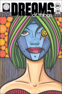
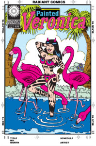
I’ve been trying something new this week in my “Covers to comic books that don’t exist” series. I’ve done a lot of covers over the years but in recent times the “Dreams of Things” series has taken over that genre for me. I’ve finished nearly 240 covers in that series. But I do have other titles in that genre that I’ve done. “Psychedelic Dreamer” is another title. I think I did about ten of those years ago.
All of the “Dreams of Things” covers are first drawn in pencil, then I finish the drawing with ink right over top of the pencil, and finally I color them right over the top of the ink with markers.
A few years ago I bought some color ink and worked out a new style of drawing using them. http://radiantcomics.com/art-writing-color-ink/. Instead of using black ink and filling in color over top of the ink I used lines of color to make the drawing. There was no black ink used at all and each line of the pencil drawing would be made with three or four lines of color. I liked the technique and made a bunch of drawings this way. Even a couple of my “The Great Gatsby” illustrations were made with this technique. I thought this technique was solid.
This week when I was thinking about new art things to do I decided to mix the comic book covers with this technique. Since my color ink drawings were usually only a single figure with no background it would be a challenge to adapt it to a “Comic book cover that doesn’t exist.”
The first decision was what series of comic book covers should I choose to do? I didn’t want to do “Dreams of Things” because that one was well sorted out. So I decided to go with “Psychedelic Dreamer.” It had psychedelic in the name and this technique was a bit trippy so I thought they would work well together.
What’s the difference in context between a ‘Psychedelic Dreamer” cover and a “Dreams of Things” cover? That was a question I had to answer. After all they both had “Dream” in their name and that would make them similar. I thought about it and observed that most of my “Dreams of Things” covers were about the dream space and the characters in that space. There were often more than one character in those covers and they exist in a landscape. With the few “Psychedelic Dreamer” covers I had done they were about a single figure. One dreamer. Often the background was a design rather than a landscape. I decided these would be my differentiating concepts.
I went to my inkbooks that hold all of my small drawings that I use for the basic ideas of my stuff and found a few thumbnail drawings to work with. I blew this small drawings up to be printed out on 6×9 inch paper in blue line. I printed out six of the blown up drawings to give myself some choices and then picked the one I liked best to draw.
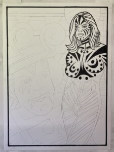
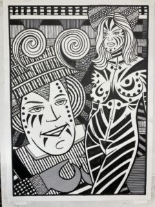
I ended up keeping it simple with a drawing of just the head and shoulders of a woman with a fairly simple background behind her. I made a finished pencil drawing, scanned that in, put that on my 11×17 inch “Psychedelic Dreamer” template, and printed that out to be worked on.
The “Psychedelic Dreamer” template has the logo, trade dress, and the printer markings around the outside of the image on it. I use the template to make the cover look as much as an actual comic book cover as possible. All Marvel and DC comic covers had printer markings on their borders from the 1960s to the 1990s. That’s the look I’m going for. Plus the logos and trade dresses on those covers were always pasted down stats (a kind of fancy photocopy) of the original hand drawn logo. That’s why I print the logo right on the paper.
One of the things I had to be careful about was the inkjet ink that the logos and such were printed with. It’s not waterproof ink. That’s not usually not a problem when I color with alcohol based markers but with water based inks they could smear the black inkjet ink. I would have to be careful with the ink near the borders and the logos.
When I started making these faux comic book covers I didn’t go in numerical order. I’d put whatever number I wanted on them. First I’d do issue #27 and then issue #9. Whatever I felt like. But when I finally settled on doing a lot of “Dreams Of Things” I then went in numerical order. As a consequence of that I had to choose what “Psychedelic Dreamer” number to use. Five was the first number I did back in the day so I chose to do number four this time. Maybe I fill them in backwards to number one.
Since I wasn’t using black ink I started out with a dioxide purple. This is a dark purple and, in effect, it became my black ink because it’s the darkest dark. I inked the figure as I normally would with black ink but left the background free of that dark purple. Then I went to work with the color ink.
The key to working in this technique is to build up color over time. And it takes a lot of time. It took me from 8AM until 5PM to get this one done. Marker coloring takes about half that time. Part of that is because I’m not filling in any of the drawing with color. Rather I’m making strokes of that color that fills in all the spaces. It makes for a completely different look.
I try to give it a psychedelic look and bounce the strokes of color off of each other. There is nothing realistic about the color and there is no blending going on. A stroke of bright red is right next to a stroke of bright yellow which is right next to a stroke of bright green. It takes some doing to get it all to look right.
I have about thirty different color inks to work with on “Psychedelic Dreamer.” That’s a lot fewer than the 200 or so markers that I have but they get the job done. With this technique I need a lot of contrast and differentiation between the colors so more colors wouldn’t necessarily help. Plus I found myself watering down a couple of colors if I needed a lighter version of a color.
In the end I think “Psychedelic Dreamer” #5 came out well. I’m working on #4 as I write this and the jury is still out on that one. I’m not quite happy with it yet but there is a long way to go. I’ll let you know how things work out with that one.
I’m back from the comic shop this week and I got fifteen new comics.
Check them all out here:
It’s not east trying new things. That statement can be attached to things in general but what I mean by it is that it’s hard to try new artistic things. That is what I was doing this week. I’ve been finishing up my Gatsby project this month. It’s still not done but it is a big project and I have no new big project in the works to replace it.
In recent years I’ve done big projects such as a series of 24×36 inch paintings or a series of 22×30 inch Big Ink drawings but I’m not in the mood for either of those. So what I’ve been getting done is a series of smaller things. They are the things I’ve always managed to get done such as my web comic, small 6×9 inch ink drawings, and my “Dreams of Things” covers to comic books that don’t exist.
It’s not like I haven’t gotten stuff done but it isn’t as satisfying as it could be. But I’m also not in the mood for anything big. It’s a conundrum. Then I had the idea to do something new. I’ve been seeing these videos online of people making art by layering the paper with images and paint and tape and whatever. They start with one thing and just go. The piece transforms many times until it reaches its final form. It looks cool in a video. I decided I wanted to give something like that a try. Without the video part.
I like to buy art supplies and I like to try out new art supplies. Usually when I put a big order in with an art supply website I throw in a few little things to try out. So I have a backlog of papers, pencils, pens, and other such things kicking around the place.
The first thing I did was to look through a pile of pads of paper that I have. I had black paper, plastic paper, watercolor paper, acrylic paper, grey paper, mixed media paper, and toned paper. The pages were anywhere from 10×15 inches to 5×7 inches. I picked out a few sheets of paper on the small side.
The next thing I did was to organize what paints and pens I wanted to use. I pulled out some black brush pens, a big black marker, a few sets of watercolor paints, a silver pen, white and black acrylic paint pens, and a set of Sharpie paint pens. I also pulled out a pouch of sample art supplies from Strathmore that were given to me.
I’m used to starting a piece with no idea of what I’m going to draw but this was a little different. I like making images. That’s the main thing I like in art. Usually I decide what kind of piece I want to make and then draw an image that goes with what I want to finished piece to look like. I say to myself, “I want to make a ‘Dreams of Things’ cover” or “I want to make a Big Ink Drawing.” Then I create the image and do all the steps that are necessary to finish the piece.
When I’m trying something new I have no idea what steps are necessary to finish the piece. That’s what I was doing on Friday. I didn’t start with any idea in mind how the piece was going to look in the end and therefore had no idea how to make an image for it. So I just grabbed some paint and threw it on the paper. Then I grabbed a marker and added to it. I also added some pencil drawing after that. I had no idea where any of it was going.
At some point after flailing around like this I decided I had to draw something. I didn’t want to make an abstract painting. So I started drawing a figure. It wasn’t a very good figure so I drew over it. After drawing a bunch of stuff with a bunch of different tools I decided to draw a face over the top of it. Faces are kind of my default subject matter so it was comfortable going to them but it didn’t make me happy. I was, after all, trying something new.
For the second one I threw down some watercolor paint but since I tried out the plastic paper I had to put it aside to let the paint dry. It didn’t sink into the paper. It sat on top of the plastic.
With the third one I went straight to drawing a face. I used various tools to draw the face but I didn’t like it much. So then I drew another face right over it. There is also lots of brush strokes, pencil lines, and color blobs that have nothing to do with the face. I was just trying stuff.
Eventually I was switching off working on all three paintings to give the paint time to dry and to let me get new ideas. I worked from about eight in the morning until about three in the afternoon on these three paintings. In the end they looked okay but I wasn’t very satisfied with them. After all I had no image in my head of what they could be so there was no satisfaction of making that idea come to life. They just were.
I was so unsatisfied with them that afternoon that I cleaned up really fast. All the paper and tools went away back to their spots and soon my drawing table was cleaned off and looked like it usually looks. It was like I couldn’t stand the disorder that the “New” imposed on me.
When I looked at the three small paintings the next day they weren’t half bad. They looked okay and there was the occasional nice idea in there. But I still wasn’t sure what they were and what good they did me. They were too new. I’m going to have to sit with them for a while.
Over the years as I’ve come up with new ideas and new techniques they rarely come quickly. Some have sat for months or years percolating in my brain. Usually it’s a mixture of new tools and techniques that I try out but don’t know what to do with until I get the idea to mix them with something else. So that day of trying all that new stuff is really just step one. But I have no idea how many, if any, more steps there will be.
Trying new stuff is hard.
I’m back from the comic shop this week and I got eight new comics plus some old Subbys.
Check them all out here:
Last week after I finally printed out a second proof of my illustrated version of “The Great Gatsby” things ground to a halt. I didn’t know what to do with it and had no idea what to do next. I had a half baked idea that it needed more double page illustrations but I had no idea of what they should be. I tried working up sketches for a couple of them but got nowhere. So I put it aside and worked on other things.
Then, as I was thinking about it this week, the problem I was having with it hit me. I didn’t like the design of the book very much. The illustrations for the book took so much work that when I finally did some design work on it (last year) it was really only very basic design. I left most of the page open with the type filling only about 60% of a single 9×12 inch page. It was, sort of, modeled off another book I saw and that one had very minimalist design. So did mine but mine was boring.
I think it was last summer (August 2023) that I was working on a print and needed a digital texture in it. That’s the sort of thing that I like to do with ink and then scan it in (Making Textures Blog). So instead of making one texture I filled a 68 page sketchbook with them. Then, in April (2024), I filled a 84 page sketchbook with more textures. So I had 152 textures all scanned in and ready to use for whatever I needed them for.
I enjoyed making the textures but laughed a little bit at myself. I needed one or two textures for the original print but I filled the whole 68 page book with them instead. I overdo things like that at times because I know that it’s good to have a library of textures to choose from. It’s easier for me to make a whole bunch of them at once than to make them one at a time as I need them. And it paid off that I had them all ready to go.
I decided that what the design for the Gatsby book needed was some texture and color for visual interest. I had about two inches of white space on the outside edge of the pages and an inch and a half on the bottom of the pages to play with. I decided to put an “L” of texture on the left hand page and then mirror that as a reverse “L” on the right hand page. It is still a fairly simple design but I think it works well. Especially with each double page spread having its own texture.
The next thing to do was to figure how to actually execute the design. It’s around a 200 page book and every page (minus the illustrated pages) had to have this design put on it. The first thing I did was to figure out the Photoshop work. I made a CMYK 9×12 inch 450dpi template and then opened a texture. Each texture was made with black ink but I decided I wanted them to be in color. So I turned the original greyscale file into a DuoTone document. This meant that I could pick a color and the black and grey would be turned into that color.
After turning the grey texture into a color I pasted it into the CMYK 9×12 inch 450dpi template. I sized it properly and moved it in place. The next step was to mask out where the text would be. I wanted the texture on the edges and not behind the type. So I figured out the proper place for the texture and then used a layer mask to hide the texture where the type would be. I also made the edge of the mask fuzzy so there wouldn’t be a sharp line where the texture ended.
The next step was to bring the Photoshop texture into the inDesign design file. That just meant making new layer named “Background” and placing the texture in a box on that layer. Simple stuff.
I also leveraged the template to make each texture a little easier to place. When I finished texture 15 I would “Save As” and name the document texture 16. Then I would open texture sixteen, turn it into a DuoTone color document, and then paste it into the texture 16 document. After adjusting it I could copy the layer mask from the old one and give it all a save.
None of that was hard but I had to do it all about eighty times. I worked on it for about three hours on Friday and then another five hours on Saturday before it was done. It was boring and repetitive to do but I like the way it looks now. I still don’t think I’m done with it yet But it looks better than it did.
One more things that I have to do before I print another proof is to proofread the whole thing. “The Great Gatsby” has been in the public domain for a couple of years now and I got a copy of the text off the internet when I started this project. The first thing that I did was to typeset the whole thing but there were a lot of formatting problems with it. That often happens with large blocks of text that you’ll find on the internet. Formats aren’t compatible and things get scrambled. That and typesetting for a book is it’s own specific thing compared to type that was prepared for the internet. It took a while to typeset the whole thing but I still found mistakes I had to fix as I went. It really does need a good proofread.
I had been treading water with this project for a few months now. That’s okay because there is no deadline on it and I have other things to do but it does feel good to get going on it and get a design that I like better. We’ll see where it goes from here.
I’m back from the comic shop this week and I got eight new comics.
Check them all out here:
I am still trying to finish up my Great Gatsby illustration project. I’ve been working on making my own illustrated version of the book for over two and a half years. It’s almost done.
Last week I printed out a second proof of the book. Unlike the first proof (Printing Out Proofs) it went smoothly. I made a PDF of the whole book, broke that pdf into sixteen page chunks, printed out those chunks, folded the pages in half, and stapled the pages with my old mini-comics long reach stapler. It all went as expected and I had no problems.
One thing I did differently than the first proof was the binding. For the first proof I clamped the pages in place (about twelve sixteen page sections), drilled four holes near the spine, and put short lengths of cord through the holes. After I tied off the cords they became loops that were the binding. It was nothing fancy. A couple of the knots came untied over time too. It was tough tying them again.
This time, after it was all printed out, I tried to think of a new way to bind them. The “Tied with cord” method didn’t work out as well as I would have liked. The cord coming untied was not a help. Then I remembered rings. In my brain was some foggy memory of people binding stuff with big rings. It was something I had never done but I looked up binding rings on the internet and found them.
The rings were about an inch and a half across and through they look big and clunky they do the job. I drilled holes through the paper and put the rings through. The rings open up and then close again so it was easy to get them through. They make it easier to look through the proof too compared to the cord. The cord tended to want to keep the pages in place while with the rings the pages slide around the ring easily. At least so far. I haven’t put the proof in my bag and traveled with it. I did that with the corded one and that is when the cords started to untie and it got tricky.
This second proof also got the cover and end papers printed out with it. The first proof only had the interior pages since I hadn’t finished setting up the cover and end pages just yet. The end pages consisted of the 120 faces that I wrote about last year. 120 Faces
One thing that wasn’t in this proof was the second cover that I did. I somehow misplaced the files for it. There was an illustration that I did for the interior that I used for a class demonstration and made a cover out of the illustration. I ended up liking that cover so I worked on the design some more and finished it up as a cover. I wanted to use that as the back cover in this proof but couldn’t find the finished design. I thought I had put it in my “Gatsby” folder but it wasn’t there. It has disappeared on me. I may have to remake it.
I still haven’t proofed the actual text of the book. It’s now a public domain book and I downloaded the text of the book and typeset it in inDesign but I had to clean up a lot of the formatting. I found some very obvious mistakes in the text as I looked through the first proof but I didn’t actually read it. I plan to eventually sit down with the book, play the audio book, and read along with the audiobook to see if there are any mistakes. That’s the best plan for proofreading it that I came up with but it’ll take five or six hours so I haven’t done it yet.
The main thing I did with this second proof was to get all the illustrations in place. I have the book set up so that, except for the chapter illustrations which are on the left, all the illustrations are on the right hand side. Things didn’t go quite as planned in the first proof so I had to work that all out.
What I found out looking at the second proof was that I’m not sure if I like all the illustrations on the right hand page. I don’t know why. I like the idea in general and I have no problem with it in the digital file but in looking at the proof it didn’t work for me as well. I’m going to have to think about it some more.
One thing that I really liked in this proof was the double page spreads. There are only two of them in the book and one of them was messed up in the first proof but in flipping through the second proof they really looked good. Being twice the size of all the other illustrations they stood out. It gave me the idea to make a couple of more double page illustrations but I haven’t gotten any ideas for them and that pushes off the finishing of the book too.
In the end it really doesn’t matter if I push off finishing the book though. It’s not like anyone is waiting for it and I have no real plans for publishing it myself so me finishing it up is in no hurry.
To finish up this blog I have to tell you that I searched some more for that second cover that I had made and I found it. As I said it was a demo that I had done for a class I was teaching and so it was in a folder with a weird name. The folder was named “Cover Gatsby Spine Folder.” I think that’s because I made a cover template for them and the book cover had a spine in it. I did a search for “Gatsby” on the Google Drive of my classes and a whole bunch of stuff came up. I looked through a lot of them and then the cover finally appeared. Yee-haw!
I’m back from the comic shop this week and I got sixteen new comics.
Check them all out here:
Let me tell you about the Marvel Comics Tenth Anniversary covers. I’m going to tell you about them because I don’t think a lot of people know this information. Besides some people that I’ve told no one calls Marvel’s Tenth Anniversary covers anything but the covers in a box.
In the early 1970’s, for about a year (August 1971-September 1972), Marvel had a unifying cover design on their comic books. It consisted of a box in the lower two thirds of the cover that the art resided in with the logo and trade dress outside the box on the upper third of the cover and about a quarter inch border around the outside of the box on both sides and the bottom.
People are split on this period of Marvel’s covers. Some people really can’t stand the “Covers in a box” but then a lot of them are among my favorites. Being that I started collecting comic books in the mid-1970s, I put it at early 1976, those comics were a little before my time but I still occasionally found them around the neighborhood from older kids. They always caught my eye.
Over the years I would collect those particular covers whenever I saw them. There was never any organization to my collecting of them but if I saw one, and could get it, I would. One of the reasons I think I liked them is that a lot of them were done by Gil Kane. He did a lot of covers for marvel in the early to mid-1970s and he was good at them. He could draw, was skilled at design, and could tell a story with a cover.
Probably my favorite cover from this period was Sub-Mariner number 48. That cover is indeed pencilled by Gill Kane and inked by the creator of the Sub-Mariner Bill Everett. It features Dr. Doom on the cover and it hits home for me. Everett’s inks especially look good over Kane. He gives the piece a style and finish that wasn’t usual for Marvel covers.
In 1990 I got to work for Marvel Comics in the production bullpen and I had the privilege of working with art director and legendary artist John Romita. He had been at Marvel for over twenty years at that point and he was art director back when these cover come out. So one day I decided to ask them why they decided to go with a unifying design.
John told me that the design was to celebrate the tenth anniversary of something. He couldn’t remember if it was for the tenth anniversary of the Fantastic Four or Spider-Man. We both figured it must have been the FF because their comic came out before Spider-Man’s comic and the dates line up since 1961 was the year of Fantastic Four number one. But we ended up calling them Marvel’s Tenth Anniversary covers because that was what they were really celebrating. The birth of the Marvel Universe.
The odd thing is that despite this period of covers being well known I don’t think many people know they were done for a tenth anniversary. I’ve never read it anywhere. As far as I know I’m the only one who ever asked John Romita a question about it. I find that strange. But I try to spread the information. I have told this story more than once on my YouTube channel and whenever anyone shows one of the covers I leave a comment that they are the tenth anniversary comics.
I mention those covers because recently I’ve been buying some of them. Specifically issues of Sub-Mariner. On that book the covers lasted from issues 43-56. Fourteen issues. I already have issues 47-51 and 54 so that’s six out of the fourteen. Sub-Mariner isn’t a very desired book and none of these issue are “Key” issues so they don’t go for much money.
Last week was when I decided to look for some of these comics on eBay. There are plenty of them to be found but they are often in bad shape and sellers are looking for more than I want to pay. I ended up looking at a lot of different copies of these but settled on two issues that were fairly cheap and looked in pretty good shape.
I ended up with issues 45 and 46 and I paid, all in, ten dollars for one of them and eleven for the other. Being that there was a five dollar shipping cost the issues themselves were only around five dollars. I got the comics and at a glance I’d grade them at around a 6.5 to 7 out of ten. They both have covers that are in nice shape and that is what I really want. I don’t actually want to read these issues. I just like the covers.
Both of the covers are pencilled by Gil Kane and inked by Frank Giacoia. I like both of them. So now I have 45-51 and 54. Eight out of fourteen. Plus just yesterday I purchased issue 55 for about ten dollars all in. When that gets here I’ll have a ninth one in the set.
Now for the big purchase story. Well, relatively big. I mentioned up top that Sub-Mariner 48 was one of my all-time favorite comic book covers. It is and so I decided to see what a graded and slabbed copy of it would go for. That’s when someone pays a company to grade their comic and then put it in a tamper resistant archival plastic container (a slab). That makes it easier to buy and sell high-end comics.
I don’t usually buy slabbed comics since I’m much more of a reader than a collector but sometimes I do buy them. Usually they are cheap and even odd misfit slabbed comics. I find them to be conversation pieces.
I saw a slabbed copy that was an 8.5 and looked good. It had a price on it of $100 plus another $25 in tax and shipping. I didn’t want to spend that much but it had a “make me an offer” button and so I did. I offered $80 and the offer was automatically rejected. That happens when the seller has a minimum in mind and sets it up to automatically reject any offers below that minimum. So I said, “Oh, well” to myself and put it out of my mind.
Then two days later an offer showed up form the seller for $82.50. It was just $2.50 more than I was willing to spend two nights before so I gave it a little thought and then pulled the trigger. It cost about $105 dollars all in but I had the money and wanted the conversation piece. The copy I have had since childhood is actually in good shape but the 8.5 slab is in even better shape. It’s fun to look at. And sometimes I just need a little fun. And some Marvel Tenth Anniversary comics.