I’m back from the comic shop this week and I got eight new comics.
Check them all out here:
I’m back from the comic shop this week and I got eight new comics.
Check them all out here:
Here is a weird little side project I got done this week. It’s called “Painted Veronica #34.” It’s starts with a Friday night YouTube show that I do with a couple of friends, Paulo and Wilson, in which we talk about comics live on YouTube for three hours. As part of the show we play a game involving three comic books called “Read, Rip, and Slab” with is a comic book version of the classic game “Kiss, Marry, Kill.” As this game has evolved over time we’ve added couple of things to it such as hypothetically adding pink flamingos onto one of the comic book covers to watch the action going on.
These flamingos lead us to one of our views pointing out an Archie comic that already had pink flamingos on the cover. That comic is Veronica #34 from some time in the early 1990s. As a consequence I looked up that comic on eBay to see how much a copy sells for. It turns out that Archie comics that have Betty or Veronica on the cover in bikinis go for a premium. This is one such cover so the asking price for a copy is between twenty five and forty dollars.
I’m mostly a buyer and reader of new comic books. I go to my local comic shop every week and buy whatever new comics that are out that interest me. But occasionally a back issue will catch my interest and that’s when I turn to eBay. Often the back issue is fairly obscure so that the internet it the best place to find it. When that happens I don’t buy the issue right away but take some time to find a good copy at a good price.
That’s how I ended up watching the price on Veronica #34 and seeing that it was never going to be cheap. I didn’t want to spend $25 on a comic that I only wanted for a whim. It’s not like a lot of them were selling either. It looked like the same copies just sitting there in eBay stores.
After a couple of months of not buying the comic I decided to make my own version of the cover. I’ve drawn a few cover recreations over the years just for fun and I thought I would do this one. That’s when I decided to take it a step further.
In my series of “Covers to Comics That Don’t Exist” I have this one series called “Painted Women.” In that series I draw a female figure and then draw tattoos all over her. The tattoos are mostly geometric shapes and lines. I treat the body as a canvas for an abstract painting. I decided I wanted to mix the Veronica #34 cover with the painted lady concept.
I had a similar idea a few years ago with the cover to DC Comics’ “Showcase #79” featuring the character Dolphin but I don’t think I quite pulled it off. I don’t think the tattoo designs were strong enough. I was going to make sure to work on that with Painted Veronica.
The first thing I did was to redraw the original cover. I grabbed a photo of the cover that I found on the internet, blew it up, and printed it out in blue line on an 11×17 inch piece of paper. That way I can draw right on top of the original drawing.
Often I draw with a .7mm 2B or 4B mechanical pencil. For whatever reason whenever I’m making a cover recreations I use a .5mm 2B mechanical pencil. The thinner line helps me see what the original artist was doing. So that’s what I did. I redrew the entire cover with that pencil. Then I set to work on the tattoos.
For the tattoos I went with the shapes that the body suggested. Short shapes and long shapes depended on the length of the body part. The shapes that went around the forearm were short and the ones that went the length of the thigh were longer. I was just trying to make it look interesting. I even put some eyeball designs on the bikini.
After the pencilling was done I scanned the drawing in. At this point I also had to recreate the “Veronica” logo. I did that in Adobe Illustrator and then added the “Painted” logo from my “Painted Ladies” series. I added those logos plus my Radiant Comics logo in place of the Archie one to the pencil drawing and printed it out on an 11x17inch piece of paper to be inked.
The inking was straight forward. I kept the inks fairly thin lined like the original. At first I used a pen to put down a lot of the ink lines in the background and then I switched over to a brush for the main figure and the flamingos.
At first I was thinking about coloring the piece with markers but the original colors were simple and it would be easy to reproduce them digitally. So that’s what I did. After scanning in the inks I set it up for color in Photoshop and it only took me a couple of hours to color it. At some time I might go back and marker color it too and make the color more interesting but for now it’s okay.
After all the color was done I made a print of the cover. I’ve got some nice thick matte paper for my printer that’s 11×17 inches so I could make a full size print of the art. It always takes a couple of test prints to get the color just right and fix any mistakes. It’s amazing to me how there are always a couple of things in any given print that I don’t see on screen but once the piece is on paper they jump out at me. It’s usually not big stuff but little details here and there that might not be right. This is when I fix that stuff.
In the end I like how “Painted Veronica” came out. It’s a bit of fun.
I’m back from the comic shop this week and I got eight new comics.
Check them all out here:
I haven’t done this in a while so this week I’m going to take a look at a single piece of art that I’ve done recently. I’m going to go with one that’s on my easel at this moment so it’s a bit of a random pick. As a matter of fact I just cleaned off my easel of a bunch of things. I don’t always use my easel for painting so when I’m not in the middle of a painting I stack up the art on paper that I’ve made. That way I can get a look at my current stuff.
My easel was getting full of pieces on paper and some were begging to fall of it so just this week I grabbed a bunch of older pieces from the stack and put them away into portfolio books for storage. That way I can still easily get to them if I want to. I moved a lot of my paper work from boxes in a cabinet to portfolio books on a shelf just last year. But on to the piece that’s in the front.
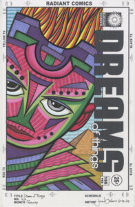
“Dreams of Things” #239 is another in my “Covers to Comic Book That Don’t Exist” series. It’s hard to believe that I’m closing in on having made 250 of these covers. When I look back at them (such as when I put them all in portfolio books) I can see patterns in them. Themes that I had, mostly in my subconscious mind, that would come and go in them. That makes sense since I come up with these images using a Surrealist Automatic Drawing method that mines the subconscious for ideas.
Recently I noticed myself doing a lot of “Dreams of Things” with two faces on the page. Often one was above the other in a two headed monster look. I don’t know why I was on that two headed kick but this one ups the ante with four heads in one piece.
The bottom head is the foundation on which the other three heads sit. There are even a couple of inverted triangles that support the composition. The first is that wide rainbow triangle behind the bottom head. It supports everything on top of it. Then there is the yellow triangle of hair that the bottom face has. That hair anchors the two faces above it to the bottom face. These triangles of support are important to the piece because they ground everything. Without them the heads would look like they’re floating and I don’t want that.
The background of the piece is all shapes and textures. There is very little deep space back there. It’s more of a modernist flat art space. I kept the space in back easy to understand because the space around the heads isn’t easy to understand. The scene makes no three dimensional sense but it makes compositional sense. At least that was what I was going for.
One of the first things I notice about this piece is the eyes. All four characters are looking at us a little bit differently. Often I have my characters staring directly out at the viewer. But in this case only the bottom one is doing that. The one on the left is almost but not quite looking at us. The one on the right is looking at us but softly and nearly out of the corner of his eyes. The one on top is squinting off into the distance. Four characters and four looks. I don’t often do that.
I just referred to one of the characters as “He” but as often happens in my drawings the faces are androgynous. In my head they are male or female but then they can switch on me. You can see them as whatever gender you like. It’s okay to call them he, she, or they. I do all the time.
I also like to vary the skin color of my characters a lot. If I don’t pay attention to that I’ll make everybody a similar skin color to my own. That’s just how the human unconscious mind works so I try to make conscious choices to keep things varied.
In a fantastical drawing like this one it’s easy to vary the colors of the faces since I’m not tethering it to reality. The brown and peach color faces are close to reality but the hot pink and blue/orange faces are from a dreamworld.
I think the first face color I put down was the blue/orange one. I started far out there. Sometimes when I have a face that’s facing forward I like to split it in half with color. I’m not 100% sure why but I think it’s because a face like that can be a wide expanse of the same color and that can get boring. If I split it up with wild colors it’s more interesting. I went for some monochrome two tone speckles on the face too.
The next two faces are the more realistic ones. They bring some regularness to the craziness of the rest of the piece. The brown face has stripes on one side and blue hair so it’s not too grounded in reality. The peach face also has a grey hat over its orange hair so the grey sits back in a neutral space and lets the colors pop out in front of it. Otherwise all that orange would be fighting for attention with the hot pink face.
The top face is the most colorful one in the piece. Hot pink with darker pink rugged stripes, a purple shirt, and yellow hair with its own stripes running opposite of the face stripes. I think it makes a nice cake topper.
Overall I like the way this one came out. Part of that is that I broke my own two face mold that I had been doing lately and made something similar but also wildly different. I wasn’t sure if I could even pull off four faces piled onto a cover like that but I think I did. It may not be my favorite piece ever but I like it.
I’m back from the comic shop this week and I got eight new comics.
Check them all out here:
I haven’t written a “Friends” walkthrough I’m months but I’m feeling nostalgic tonight so I thought I’d write one. Let me check what episode I’m up to. I’m on Season Seven Episode Seventeen “The One With the Cheap Wedding Dress.” That means I’ve watched ten episodes since I last wrote one of these. I don’t write one for every episode I watch. Just when I’m in the mood.
The episode originally aired on March 15, 2001. Let me check my calendar and see what I was doing that day. Looks like I was working at Marvel Comics that day doing the production work on some of their covers. I was commuting to Manhattan so I also bought a ten trip bus ticket for $105 on that day. There is a note that on the following Saturday I was doing some character design stuff. I wonder what characters I was designing? They were obviously for my own work but I have no idea what characters they were. Plus I bought some old Iron Man (issues 97-100) and Hulk (Issue 200) comics off of eBay that week.
Let’s start the show. It starts out in Central Perk and it looks like Monica and Chandler are planning their wedding and are choosing appetizers and a band. Chandler wants the “Swing Kings” to play the wedding. I think we get Joey’s “Peanut Butter Fingers” joke here. Ahh… there it is. I always liked that joke. Joey really sells it. Here comes the theme song.
The scene changes and now we have Chandler and Ross outside on the street checking out the new woman moving into the neighborhood. It’s a woman named Kristen who Ross takes a liking to so he and Chandler chat her up. Ross hits her with some awkward sewage history. Good stuff. Chandler is a terrible wingman but she accepts Ross’s offer to take her to dinner.
New scene and the three women are shopping for Monica’s dress. It’s the whole try on wedding dresses as you drink champagne thing that I’ve only ever seen (or even heard of) on TV and the movies. Monica finds the dress she wants but then makes the mistake of telling a stranger (Megan, another bride to be) that she is going to get the same one at a huge discount sale in a couple of days. You know that won’t end well.
Back to a street scene and Joey stumbles on the same woman (Kristen) moving in. Joey is a bit more charming. Of course he asks her out too and gets a dinner date for the night after Ross’s. A quick but amusing scene setting ups the Ross and Joey conflict..
Now we cut to a couple of days later at the big wedding dress sale at Kleinman’s. It’s a mob scene. There are women everywhere lined up to get in the store. Monica is psyching Rachel and Phoebe up to help her find the dress. She’s even got whistles for them! She finds the dress but guess who else grabs it at the same time. Of course it’s the woman she told about the sale. Some whistle humor ensues as Rachel can’t take the bargain shoppers. Then Monica pins the other woman and wins the dress! Victory!
Meanwhile back in Central Perk Ross and Chandler are discussing Ross’s date from the other night. It went well enough that there will be a second date. Ross leaves and Joey shows up. Chandler figures out they are dating the same woman and is gleeful. Ross walks back in and Chandler sets them up in funny fashion to know the truth. The joy Chandler takes in this is great.
We get a scene cut but we’re still in the coffee shop but now Joey and Ross are on the couch next to each other trying to figure things out. They will each go out on one more date with her and let her decide. Some funny stuff here.
Back at Monica’s apartment all three women are admiring the wedding dress as the phone rings. It’s Megan on the phone who lets Monica know that Megan booked the Swings Kings on the day of Monica and Chandler’s wedding. If Monica gives her the wedding dress she can have the Swing Kings. Monica is in a bind and Rachel makes some solid whistle jokes.
Night falls and as Ross gets ready for his date Joey stops by. A little competitive jockeying by the boys. Ahh.. This is also where the face cream “T-Zone” jokes are from. That’s a memorable part of the series for me.
Now back to the apartment as Chandler gets home and Monica has to break the Swing Kings news to him. But first the three women are trying to talk him out of the band. He wins Monica over with sentimentality but the problem isn’t solved just yet as we cut to a NYC skyline shot.
Ross is out on his date with Kristen but guess who shows up. It’s Joey to sabotage him. Of course they get competitive trying to embarrass each other. Some good stuff here but Kristen had enough and disappears on them. Since these are the extended edition DVD copies that I watch Joey actually says, “Does a bear shit in the woods?” at one point. I had forgotten that. That line didn’t make it onto the air.
Chandler walks into his apartment and greets Monica but she won’t come out of their room because she’s wearing the wedding dress. He promises not to like it so she can return it. Of course he loves it but she’s booked the Swing Kings so off the dress goes. After he’s banged her in it of course!
Here come the credits and the episode ends with Monica walking in as all three guys who are watching TV on the couch. Then we get that memorable turnaround shot of all three of them with grey face cream on their noses and foreheads. Their T-zones. This shot gets shown all the time on highlight reels of the show.
Now I’m going to check what was cut out of this episode for syndication. Looks like nothing was cut out. Except of course for the “Shit” line. I guess there was no extra stuff to put into the extended episode.
Now let’s see what I rated this one back a decade ago when I rated them all. As of right now I’d give it a four out of five stars. It was an extra funny episode. I only gave it three stars back then. That means I thought it was an average episode. Maybe it was because I was feeling extra nostalgic today but it really did earn that fourth star from me. Good stuff.
I’m back from the comic shop this week and I got five new comics and a book.
Check them all out here:
I’ve spent a lot of time over the years scanning and organizing photos and I was back at it again this week. It was sometime in the early 2000s when I first scanned in all of the negatives from the photos I took. I shot on film from about 1984 until around 2001. It took me forever but I scanned in all those negatives and then organized them.
Over the years I mostly took photos of my family and friends. After scanning them in I put the digital photo files into folders on my computer with the date, event, and place as the name of the folder. Then I named each photo file with the names of who was in the photo. This took forever but I’m glad I did it. For me it is the best way to organize things.
I’ve been working on Apple Macs since around 1994 but I never took to their photo organizing program or anyone else’s. I don’t find them of much use. They want to organize things their way which isn’t my way. I also have a dedicated hard drive for all my photos and any photo organizing program I’ve tried wants to create its own version of my photos even if it’s only in “Cache.” This takes up a ton of hard drive space on my main drive and slows things down. No thank you.
My iPad has become my default photo album but it has some problems too. The main problem being getting the photos onto the iPad. I found the easiest way was to duplicate all my folders of photos into their own “Save to the iPad” folder plus save all the photo files as jpegs. I generally save my photo scans as tifs but those files were too big for the iPad software to deal with.
Then I tell the iPad to sync all the photos in my “Save to the iPad” folder with my iPad. You would think that the iPad would look at both sets of folders, determine what’s not on the iPad, and copy the new folders of photos over. That’s exactly what my photo backup software does. But no. The iPad deletes all the phots off the iPad and puts them all back plus the new ones. I’ve got 28,000 photos synced so it takes three or four hours to sync. That’s crazy. My photo backup software takes minutes to copy new photos onto the backup drive.
One thing the iPad has is facial recognition software. It can find all the faces of my friends and family and label them. Years ago I thought that was pretty cool and spent some time labelling all the faces. Then all that work was wiped out with an iOS software update that re-synced my photos and got rid of all that facial data. That was frustrating.
I usually only sync my photos with my iPad once a year since it’s such a pain. It’s been over a year so I decided to give it a go. But first I would try naming some faces to see if they would stick. I spent some time naming a bunch of people and then synced. The names stayed this time. Mostly. Though the photos are the same files it has to re-find all the faces. I think. It’s all pretty confusing.
I even had to sync the photos with the iPad twice. I put a bunch of new photos on and then realized there were some old photos that were new to me that I wanted on too. So even with the six hours of syncing most of the faces stuck. Even so it says that it will take time to find all the faces again. But at least I didn’t lose everything as I did with that upgrade years ago.
For the last few days I’ve been spending some time going back into my old photos and labelling the faces. I started in the 1980s and have almost finished with the 1990s. It starts out slow because the software doesn’t know many of the faces but as people begin to repeat over and over it learns the faces fairly well.
What is extremely weird about the software is when it doesn’t notice faces. It can pick up partially obscured faces but often won’t pick up obvious faces. There can be three people with clear faces and it only notices two of them. Plus there is no way to tell the software that a face is there. I can’t even select a piece of the photo and type a name. If the software doesn’t find a face where there is one then you’re out of luck. That’s strange.
Another photo based thing that I was doing today was scanning. I have a bunch of old family photos that have sitting around for a while that I’ve been meaning to scan. Today was finally the day that I would do them.
Back in December 2022 I got a new Epson v600 scanner. It can do transparencies so I’ve mostly used it for scanning old 120 negatives. It does a good job with those but I got to try it out with photos on the flatbed for the first time.
It’s an 8.5×11 inch scanner and most of the photos that I was scanning were 3.5×5 inches or smaller. I could load about six of them onto the scanner bed at a time and batch scan them. All I had to do was turn on “Auto Cropping” and the software would detect each photo and set it up for its own scan. So I load on the photos, hit the “Preview” button, made sure the preview of where it is going to scan looks good (or adjust things, and then hit the “scan” button. The rest it does automatically. It is a lot easier than the old way I had to do it. I used to have to scan each photo one by one. Or scan them all as one file and then cut them up in Photoshop. That was way more tedious.
Way back in 2006 I wrote a short blog about the emotional toll that scanning old photos takes (Dancing in the Footsteps of the Past) and that is still in effect. As I name all these faces I see everyone I know growing older. Same have even died. It can be a tough thing but I still enjoy putting all those photos in order and making them easy to find, use to make art, or just look at. If only making things easy wasn’t so hard.
I’m back from the comic shop this week and I got eleven new comics.
Check them all out here:
I’m a methodical artist. That means that the way I do things is important. The method. If I want to make some art I have certain ways of doing it. I don’t have just one way though. I have a lot of different methods. Sometimes it’s not even about whatever style I’m working in or the tools I’m using but in the way I’m organizing the tools. That’s how things were this week as I worked on another color ink drawing.
I wrote last week about how I was working on some new color ink drawings in my “Comic Book Covers to Comics That Don’t Exist” series. I’ve continued with a couple more of them and came up with a small tweak that helped me get them done. It wasn’t a tweak to the way I used the ink or laid down the brush strokes but a tweak to how I physically used the ink containers.
First of all I don’t have any of the color inks in their original bottles. Back in 2020-2021 when I first started buying color ink in order to work out a style with them I also bought some Rubbermaid 1/2 cup food containers. They come with lids and stack on top of one and other. I have about thirty of them and poured a whole bottle of ink in each one. I find it easier to dip my brush into those Rubbermaid containers than in an ink bottle. Plus I can spin the brush tip against the side of the container to point the tip. It’s a method that works well for me.
The containers of ink sit over on a side table that I have filled with various art supplies. The fact that they stack and click together makes them take up less room than they otherwise would. I also have a page full of swatches of the ink colors. How I was working earlier in the week was that I would pick a color from the swatches, go over to the table and pick out the ink, and then bring it to my drawing table and use it. I’d usually leave the ink right on my drawing table when I went to pick another color. The containers would then build up on top of my drawing table and crowd me a little.
Here is where me being methodical comes into play. That method of piling up the ink containers on my drawing table wasn’t working for me. As the table got more crowded it somehow crowded my thinking too. It wasn’t the end of the world but it also wasn’t serving me so I wanted to try something else.
My solution to the crowding was simple. I would only leave one container of ink on my drawing table at a time. So for the next color ink drawing that I did I would pick a color, walk over to the table the inks were on (it’s only a couple of steps away), pick a color, bring it over to my drawing table, used the color, and then return it to the side table with the rest of the inks.
I found this helped me out a lot. I was only thinking about one color at a time and there weren’t other containers of ink to distract me. Especially since I was trying to avoid spilling any ink. Y’see my black ink (which I wasn’t using) has a special place in my side tray that is outside of the swing of my arm. I can’t accidentally knock over my black ink because it is a little too far away for that. But with the multiple containers of color ink flat on my desk there was a much higher chance of spillage. I even did spill a some ink at one point. That was annoying.
The one ink container at a time really cut down on my chances to knock some ink over. It helped me think a little more clearly too. As soon as I was done with a color, at least for that part of the drawing, it was away from my drawing table and back in place on the side table. No clutter under my arms.
The funny thing is that when I’m working with markers I work in a similar way but it’s still a bit different. I have all 200 or so of my markers on a side tray on the left hand side of my desk. They are close at hand so I can easily get to them and pick a color. That part is a little bit different than the color inks but not the next part.
When I work with markers I only have one marker at a time out of their holders. I’ve seen people work with markers and they pull a color out of their marker holder but then put it on their desktop as they finish using it. People can work with a dozen or more markers kicking around their drawing surface. Not me. I can’t do that.
If I pick a light green marker to work with then I pull it from its slot in the marker holder and then use it. After I’m done using it the marker goes right back into its slot and I choose another color to use. Even if I know I’m going to use a color agin in the piece I don’t leave it out on my desktop. It goes back into its spot. I need the top of my drawing table fairly clear. It’s never totally clear but I don’t need extra markers rolling around it.
So that’s it. Simple stuff. That’s what method is sometimes. It’s not always about whatever technique that you’re using in a piece. Often it’s just about the physical process of working and how you organize your tools.
I have to say that I was much happier working with only one color ink on my drawing table at a time. At first I thought this method would be too distracting as I had to take a couple of steps every time I wanted a new color but instead it actually helped me concentrate.
Sometimes it’s the little things that help me get things done. That’s why it’s good to pay attention to them.