Comics I Bought This Week: June 1, 2013
I’m back from the comic shop this week and I got four new comics:
Alright. I’m bored with reviewing comics for the time being so instead I thought I’d review some comic book covers. Old ones mostly I’d guess but I really haven’t though that far ahead. I’ll just start.
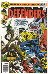
”The Defenders” issue #37 with pencils by Gil Kane and inks by Mike Esposito (possibly with some John Romita “Corrections” in there.)
This is a comic book cover from my childhood. It’s cover dated July 1976. It’s the first issue of “The Defenders” that I remember buying. I’m guessing that the cover caught my ten year old eye. Gil Kane has drawn a lot of strong covers as he’s good with the human figure and has a good sense of design. I like this cover’s diagonal composition as he sets Plantman back in space and has Luke Cage running from close to us back and up towards Plantman. All those flying thorns help sell the diagonal. You don’t see a ton of covers set on a diagonal like this one.
A lot of people don’t like word balloons on comic book covers but I do. As long as they work. They often really do stink up the joint. Here I think the two balloons work both compositionally and as an element of the story. The story is that Luke Cage is so bad-ass that he doesn’t give a crap about Plantman’s murderous thorns and is going to kick his ass and there is nothing Plantman can do about it. A fun time.
I like the way my eye moves in a circle while looking at this cover. The first thing that catches my eye is that first balloon. I read it, move onto the second, read that one, see Luke Cage, follow him up to Plantman through a hail of thorns, and then am back on the first balloon. It’s an interesting circular dynamic set inside a diagonal. I have to pull my eye out of it to even notice Dr. Strange and the Red Guardian. They’re there to make the thorns look a little more dangerous and emphasize Luke Cage’s toughness. So are the rips in Cage’s shirt. That’s a nice touch.
The “Evil in Bloom” title logo is superfluous though. You could erase that from the cover and never miss it. Same with the UPC box but that’s there for sales tracking reasons not for eye pleasing reasons. This is right about the time UPC boxes started appearing on comic book covers. They’ve been a bane ever since.

Discussion ¬