Comics I Bought This Week: July 6, 2013

I’m back from the comic shop this week and I got six new comics:
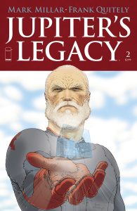
This week’s comic book cover to look at and examine is “Jupiter’s Legacy” #2. I though it would be interesting to look at a recent comic that I bought and check out its cover. This one kind of leapt out at me as a pretty good cover but also a solid example of how comic book covers have changed over the last two decades or so.
Gone are the comic book covers that tell stories and here come the comic books covers that are striking images. At least that’s what they are trying to be. A lot of times modern comic book covers end up being mediocre pin-ups but I think this cover ends up being a striking image. First off it’s of a new character. A new character who is also an older man. In a comic book world where Batman and the Avengers each have half a dozen or so comics about them this is unusual. The power of the image is all in the drawing and design and not in the emotional attachment anyone has for an already beloved character.
The design is simple and uncluttered. We get a plain dulled down red box on which the white logo sits. The logo is simple too. No outline, drop shadow, or dimension has been added to it. It’s done in a Roman style font that fits in well with the whole Jupiter angle. It’s understated and so not the most exciting logo and trade dress in the world but it’s appropriate.
I like Frank Quitely’s drawing. It’s thin-lined and lumpy. If someone described it to me without me seeing it I wouldn’t think it would be up my alley but it is. He pulls it off. I’m not even sure how. The striking part of this cover is the execution of the drawing. The cover is not even telling a story as I think most good comic book covers do. Sure there is some symbolism there but it’s not a story if I have no clue what the symbols mean. A man holds some sort of hologram cube with a small figure in it out in front of himself. He might be handing it to us or showing it to us. Either way it doesn’t matter. What matters it that Quitley makes it work. The passive yet intense look on the man’s face, the foreshortening of the arm, and the twist of the body are all well done. The clouds are mere suggestions of clouds but that’s okay. They’re there as a backdrop.
All in all I can’t say this is a favorite cover of mine but it is a good one. Plus it’s a nice example of a modern cover that’s trying to take the concept of pin-up cover to the next level and trying to make a striking image. I think it succeeds on that count. That it does it without a familiar character says a lot about its quality.
Discussion ¬