Art Writing: “Color Ink and Dreamers”
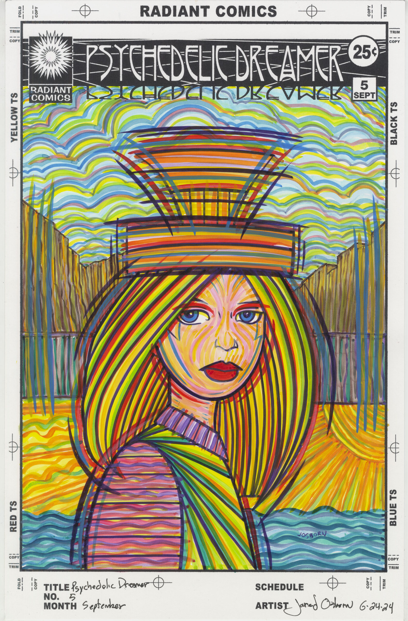
I’ve been trying something new this week in my “Covers to comic books that don’t exist” series. I’ve done a lot of covers over the years but in recent times the “Dreams of Things” series has taken over that genre for me. I’ve finished nearly 240 covers in that series. But I do have other titles in that genre that I’ve done. “Psychedelic Dreamer” is another title. I think I did about ten of those years ago.
All of the “Dreams of Things” covers are first drawn in pencil, then I finish the drawing with ink right over top of the pencil, and finally I color them right over the top of the ink with markers.
A few years ago I bought some color ink and worked out a new style of drawing using them. http://radiantcomics.com/art-writing-color-ink/. Instead of using black ink and filling in color over top of the ink I used lines of color to make the drawing. There was no black ink used at all and each line of the pencil drawing would be made with three or four lines of color. I liked the technique and made a bunch of drawings this way. Even a couple of my “The Great Gatsby” illustrations were made with this technique. I thought this technique was solid.
This week when I was thinking about new art things to do I decided to mix the comic book covers with this technique. Since my color ink drawings were usually only a single figure with no background it would be a challenge to adapt it to a “Comic book cover that doesn’t exist.”
The first decision was what series of comic book covers should I choose to do? I didn’t want to do “Dreams of Things” because that one was well sorted out. So I decided to go with “Psychedelic Dreamer.” It had psychedelic in the name and this technique was a bit trippy so I thought they would work well together.
What’s the difference in context between a ‘Psychedelic Dreamer” cover and a “Dreams of Things” cover? That was a question I had to answer. After all they both had “Dream” in their name and that would make them similar. I thought about it and observed that most of my “Dreams of Things” covers were about the dream space and the characters in that space. There were often more than one character in those covers and they exist in a landscape. With the few “Psychedelic Dreamer” covers I had done they were about a single figure. One dreamer. Often the background was a design rather than a landscape. I decided these would be my differentiating concepts.
I went to my inkbooks that hold all of my small drawings that I use for the basic ideas of my stuff and found a few thumbnail drawings to work with. I blew this small drawings up to be printed out on 6×9 inch paper in blue line. I printed out six of the blown up drawings to give myself some choices and then picked the one I liked best to draw.
I ended up keeping it simple with a drawing of just the head and shoulders of a woman with a fairly simple background behind her. I made a finished pencil drawing, scanned that in, put that on my 11×17 inch “Psychedelic Dreamer” template, and printed that out to be worked on.
The “Psychedelic Dreamer” template has the logo, trade dress, and the printer markings around the outside of the image on it. I use the template to make the cover look as much as an actual comic book cover as possible. All Marvel and DC comic covers had printer markings on their borders from the 1960s to the 1990s. That’s the look I’m going for. Plus the logos and trade dresses on those covers were always pasted down stats (a kind of fancy photocopy) of the original hand drawn logo. That’s why I print the logo right on the paper.
One of the things I had to be careful about was the inkjet ink that the logos and such were printed with. It’s not waterproof ink. That’s not usually not a problem when I color with alcohol based markers but with water based inks they could smear the black inkjet ink. I would have to be careful with the ink near the borders and the logos.
When I started making these faux comic book covers I didn’t go in numerical order. I’d put whatever number I wanted on them. First I’d do issue #27 and then issue #9. Whatever I felt like. But when I finally settled on doing a lot of “Dreams Of Things” I then went in numerical order. As a consequence of that I had to choose what “Psychedelic Dreamer” number to use. Five was the first number I did back in the day so I chose to do number four this time. Maybe I fill them in backwards to number one.
Since I wasn’t using black ink I started out with a dioxide purple. This is a dark purple and, in effect, it became my black ink because it’s the darkest dark. I inked the figure as I normally would with black ink but left the background free of that dark purple. Then I went to work with the color ink.
The key to working in this technique is to build up color over time. And it takes a lot of time. It took me from 8AM until 5PM to get this one done. Marker coloring takes about half that time. Part of that is because I’m not filling in any of the drawing with color. Rather I’m making strokes of that color that fills in all the spaces. It makes for a completely different look.
I try to give it a psychedelic look and bounce the strokes of color off of each other. There is nothing realistic about the color and there is no blending going on. A stroke of bright red is right next to a stroke of bright yellow which is right next to a stroke of bright green. It takes some doing to get it all to look right.
I have about thirty different color inks to work with on “Psychedelic Dreamer.” That’s a lot fewer than the 200 or so markers that I have but they get the job done. With this technique I need a lot of contrast and differentiation between the colors so more colors wouldn’t necessarily help. Plus I found myself watering down a couple of colors if I needed a lighter version of a color.
In the end I think “Psychedelic Dreamer” #5 came out well. I’m working on #4 as I write this and the jury is still out on that one. I’m not quite happy with it yet but there is a long way to go. I’ll let you know how things work out with that one.