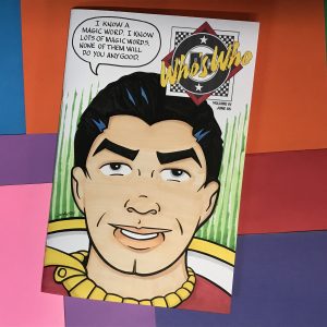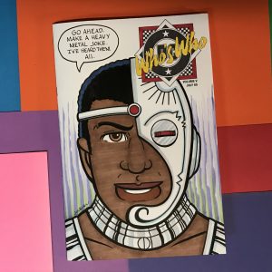
I just spent way too much time drawing a couple of sketch covers. These were two hand bound sketch covers. That means instead of buying two new comics that have a blank cover made for drawing on I instead picked out two old comics from my collection, pulled the staples, wrapped drawing paper around them, and put the staples back in. I used two old “Who’s Who?” comics from DC.
Sometimes I do sketch covers just as I would any other piece of art for art’s sake and sometimes I do them to try and sell them on eBay or Etsy. That’s an important distinction because If I’m making them for sale I have to watch how much time I spend on them. Sketch covers don’t sell for very much money. Most I see sold go for between $25 and $50. So I can’t spend half a day trying to make $25. It’s kind of moot because no one ever buys my sketch covers but I did just spend half a day trying to earn $25. That really makes for a failure of a day.
I love drawing faces. They’re one of my favorite things to draw and I draw them all the time. But when I draw faces I’m always looking for something new in a face. Some shape, form, or composition that is new to me. A little bit different. Faces give you a lot of leeway to steer away from reality and still have everybody know what you’re drawing. The problem I have with drawing comic book characters is that their faces are set in stone. If they’re not drawn a certain way then there is no point in drawing them.
When drawing an established character the number one thing you have to do is make that character easily recognizable. If you make a drawing of Spider-Man and nobody knows that it’s Spider-Man then you’ve failed. You’ve made the drawing pointless. You may as well have drawn any old face. Since I was doing a couple of DC Comics sketch covers I picked a character from each comic to draw on the cover. Cyborg and Shazam (the original Captain Marvel).
I’m pretty good at simplifying things. It’s one of my drawing strengths. I’ve made plenty of baseball card size drawings of super hero faces and they’ve come out pretty well. It does take me a bit of time to figure out exactly how to draw them but not an excessive amount of time.

The problem is that I wanted to draw these sketch cover heads as if they were my sketch card heads except the size was much bigger. 6.5×10 inches as opposed to 2.5×3.5 inches. That’s a different type of drawing. Things change in a drawing when the scale changes. A solution to a drawing problem at one inch isn’t the same solution at one foot. That’s the nature of drawing and scale. A nature I struggle with on occasion.
I just got a new 5.5×8.5 inch spiral bound sketchbook. I decided that would be a good place to do some drawing of superhero faces. I like to give each of my sketchbooks a purpose and that would be a good purpose for this one. I could make the drawings, scan them into the computer, size them, and then transfer them to the sketch cover. So that’s exactly what I did. But boy did it take time.
For some reason when drawing a fixed character head at that size symmetry is always a problem for me. The left and right sides don’t always match. Human faces are rarely symmetrical in real life but often in my drawings they are even more off. I have to really pay attention and use tracing paper to mirror my sides of the face in order to get things right. When drawing a head that is not a defined character I’m often looking to make things little asymmetrical so now doing the opposite takes time. Even with the character Cyborg, who has an asymmetrical head, I had to work hard to get the symmetry correct. One eye kept floating up and I had to bring it down.
Shazam’s head was a tough one too. He’s a character from the Golden Age of Comics and the artists who draw him back then were really good at simplifying. Of course they weren’t drawing his face six inches tall. I had to take his simplicity and try to make it work at a size it wasn’t meant for.
One of the things about comic book drawing is that as a drawing gets bigger more detail is supposed to be added. Superman’s face at an inch tall doesn’t look the same as Superman’s face at three inches tall. That’s just the way things are done. In an animated cartoon a character’s face is the same no matter what size it’s drawn at but not in a comic book. So I was not only drawing Shazam’s face but I was drawing it at a size it wasn’t meant for. That took more time than I anticipated.
After I had the drawings finished and transferred them to the sketch cover paper it was time to ink and color them. This had me baffled. I wasn’t sure how I wanted to ink them. The Cyborg face ended up being pretty complex with circle template and French curve work to be done. The Shazam head was simpler but also puzzling.
Usually I ink with a brush. That’s my default tool and what I’m best with. But I was baffled by the Cyborg face so I decided to go ahead and start my inking with a marker. I used a single line weight and inked over my pencil line. I put off 90% of the inking decisions. Then I stopped Cyborg and started inking Shazam. I used my brush for the Shazam face. It worked well for that and I was fine with how it came out. I was much happier than with the Cyborg face so then I went back to Cyborg with the brush and finished inking that one too.
After the inking I decided to keep it simple with the coloring. I used my markers as I always do with these sketch covers but I kept the molding to a minimum. I stuck with bright and flat color for the finish. It was a long journey to the finish but I got there.