I decided to pull a random 8×10 inch acrylic on canvas painting off my shelf where I have them stored in a paper envelopes in order to write about it. A writing and art exercise. I pulled down “Sun Sign #4.” I think it’s from before I was in the habit of putting a date on everything. I signed the back of the canvas and wrote the name on it but somehow not a date. I checked my digital calendar and it looks like I do have a date for it on there. I finished painting this on October 27, 2003 along with Sun Signs #5 and #6 too.
First of all I can tell this is one of my earliest 8×10 inch acrylic on canvas paintings because of the canvas it’s painted on. It’s a pre-stretched canvas. That means I bought it from the store this way. It’s the cheapest canvas possible and I can tell that because the staples that hold the canvas to the wooden stretchers are on the side of the stretchers. The more expensive canvases have the staples on the back. Though these days I think even most store brands (as this one is probably a Dick Blick canvas) have the staples on the back. So side staples are a thing of the past.
Back in the early 2000s I was just starting out painting with acrylics on these small canvases. The idea was that I would be able to work out more ideas and images faster than doing large oil paintings. I love large oil painting but if I’m not selling them, and I wasn’t, they take up a lot of time and room.
As you can tell by the fact that I got two other small painting done that day I liked to do these small paintings in groups. Usually groups of four. I don’t know why I only had three in this group but it was the beginning of my habit. Working on four at a time meant that I could always put one aside, give it time to dry, and have another ready to work on. It sped things up.
I like images. Though I occasionally make abstract art for the most part my work all has a subject matter. A person, a place, or a thing. Mostly people. I enjoy drawing things that no one has ever seen before. I like mining my imagination for stuff that I’m not even sure where it comes from. I like to walk the edges of the dreamworld and see what I see. This painting is not like that. Or maybe it’s just kind of like that a little.
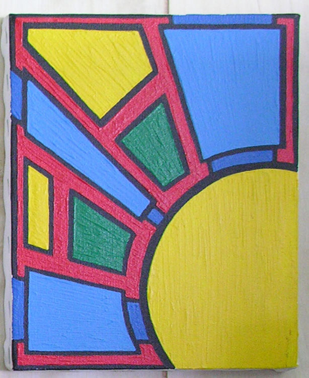
“Sun Sign #4” is an abstract or symbolic painting. It’s the sun but not the literal sun. It’s a circle of yellow with rays of color coming out from the center of it. It is not painted to be realistic but anyone who looks at it will probably think it’s the sun. Since the circle of yellow bleeds off the bottom of the painting it would be either a rising or setting sun.
I painted this in my “Black line filled with color” style that I first started developing way back when I was an undergrad ay SUNY Purchase. First I draw a sketch on the canvas, then I paint on the black line, and then I fill in the color using brush strokes that follow the form. Or at least the shape. Sometimes the painting doesn’t have a form. This one really doesn’t because the design is basically flat.
This painting also owes a lot to Mondrian. He’s the one who pioneered this type of painting with black lines and colors. Mine may not be exactly like his but it’s from the same school of thought. Color, line, surface, and the way paint is applied to the canvas can make a painting.
I only have the one Sun Sign painting in front of me so I’m not sure what distinguishes this one from the others. Beside that they all have different colors and designs is one really different from the others? Is it really that if you’ve seen one you’ve seen them all? That might be true if you were to only see one at a time as I’m doing now. But I know that numbers impress people.
If I were to put twenty of these on a wall a viewer would be much more impressed by them than if they were only to see one. If a viewer saw twenty of these he or she would automatically compare and contrast them and pick out their favorite one. That’s how the human mind works and is another reason I did three of these in a day to make eight total. Eight is more impressive than one.
For this particular one I only used five colors. Black, the three primary colors (red, yellow, and blue), and green. But the blues aren’t even real primary colors. They’re tints of a primary. That means I added white to blue to make a lighter blue. They’re subdued and not as visually strong as if they were pure color. This allows the strong red of the background to move forward in space and the eye starts confusing the positive and negative space as you stare at it. It makes the painting more active.
The yellow is the most dominant color in the painting as there is a large and continuous arc of it but the red still give it a run for its money. The blue sits back a little bit but there is a lot of it fighting for influence. The blue also has an ally. The two blocks of green. They are across the color wheel from red which makes them complimentary colors that want nothing to do with each other. Compliments fight each other. The color has a precarious balance.
The brush strokes follow the forms of the rays of the sun. The brush strokes in the sun itself are straight up and down but the others are all at diagonals. They emphasize the radiating rays of the sun. I like that.
All things considered I don’t have a ton to say about this one painting. It doesn’t have an image of a person or place for me to contemplate. But it does have a familiarity. It’s the sun. We all know what that is and it means something to all of us. I’m good with that.