It’s time to pull something out from my art files and give it a look. Usually I’ve written these about my paintings but I think today I’m going to dig into my drawings. I have a couple of cabinets I use as flat files and store my old drawings in them. I built boxes of different sizes for them a few years ago. I think I’ll dig into one of my 11×17 inch boxes and see if there is anything that I want to write about in there.
I pulled out an old Epson paper box that I store drawings in. It’s Super A3/Super B size (13×19 inches). This is the biggest paper my printer (and all my printers before this) can handle. It reminds me that before I even had a computer I used to use old stat paper boxes to store drawings in.
A stat machine used to be a common thing in publishing. It was used to make copies of black and white art. It’s sort of like a photocopier except that is was around a long time before photocopiers and didn’t make copies on regular paper. A stat machine was also called a stat camera because that’s what it was. A giant camera that used a chemical based photographic method to take pictures of art and copy that art onto a piece of photographic paper.
When I worked at Marvel in the early 1990s they had two stat cameras and they were making photostats all day long. So they went through a lot of photostat paper. That paper used to come in boxes that were around 11×17 inches and up. Some boxes were 16×20 inches and probably even bigger. When the boxes were empty the stat guys would throw them out or give them to anyone who wanted them. Since comic book paper is 11×17 inches there were lots of people who wanted those boxes to store art in. I was one of them and still have some of those boxes to this day.
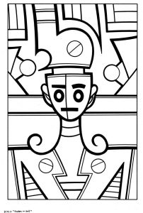
Looks like I have about 20 pieces of paper in this box so I’ll pull one of them out and see what it is. It’s a 10×15 inch black and white ink drawing on a 11×17 inch piece of paper. It’s named “Snakes in Soil” and has the date August 19, 2011 on it. It looks familiar but I don’t know if I ever made a finished color print out of it. Sometimes I do that and sometimes I don’t.
It’s a picture of a teacup shaped face that looks like some kind of art robot hooked into a machine like background. I hesitate to use the words “Robot” and “Machine” because the shapes and space the image exists in really isn’t that real world. It’s more artistic than machine like but it’s drawn with a lot of straight lines which makes the piece look mechanical without really being mechanical. It looks like a lot of the lines were drawn with a pen and French curve but then gone over with a brush and ink to thicken them. That’s a common technique I use to keep the my line from getting too mechanical and dead.
I like the shapes in this drawing. I think I did a nice job with them. It looks to me like I was trying to integrate the background and foreground into a shallow space made up of these shapes. I also like the swirls they come off his shoulders. This is something I tend to do every now and then and it looks good in black and white but I usually find it hard to color. The swirl shapes make sense as black and white lines but when color is added the color usually dominates the thin shape and the background color becomes more dominant than the foreground line. That can sometimes be a problem.
An odd thing about this drawing is that I can see about eight small areas that I used white out on. I’m usually a very neat artist and almost never use white out (it’s probably really a white gouache) on my drawing so I wonder why I messed up the drawing in this case?
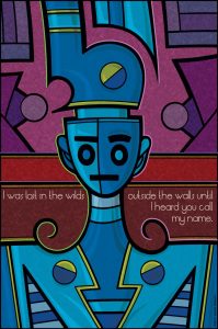
Since this art has a date on it I decided to look up that date on my calendar. I use the Mac Calendar program to keep track of the stuff I work on. So as I look back to August of 2011 I can see that four days after I finished this drawing I colored it and turned it into a print called “I Was Lost in the Wilds.” This doesn’t even ring a bell but I can now look that up and see how I colored it.
It’s print number 73. The line I put on it is “I was lost in the wilds outside the walls until I heard you call my name.” I’m looking at a printout of it now in my 11×17 inch book of prints. It looks nice. I did a good job with the color. I can see right away that I dealt with the swirl shoulder by adding a line of color to it. This allows the shape of the swirl to remain the focal point rather than getting lost in the background.
I also find it interesting how the black and white drawing is all about integrating the foreground and background but the color version is all about keeping them separate and distinct. The foreground is all blues and the background all reds plus there are even color outlines on parts of the foreground to separated it from the background. It really is a completely different piece when the color is added.
There is also a ton of texture in the final print. The entire background has a light cross hatching texture all over it while the foreground has an even lighter cross hatching texture. That texture serves to unify the piece even as the color makes the two pieces distinct.
I also like that the type is asymmetrical.
So that was interesting for me. I picked a drawing and saw where it led. I’m tempted to look through the whole box of drawings but I thing I’ll save that for another time. Half the fun of writing this blog was that I had no idea what I would pull out of the box. So I’ll save that fun fo another time. I hope you found this interesting too.