I think I’m going to pull an old painting out of storage, take a look at it, and write about it. I don’t think I’ve done that in a long time. I’ll grab one of my 8×10 inch acrylic on canvas paintings.
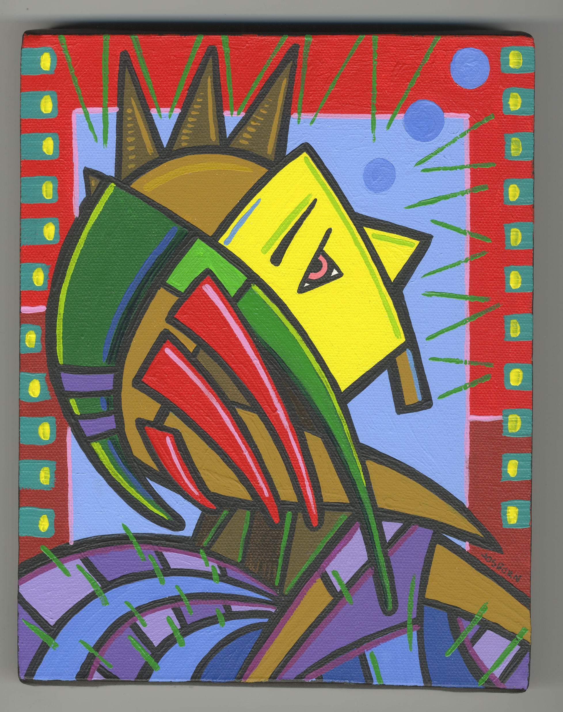
The painting I pulled out is called “Sleeves of Grass.” It’s got the date on it of July 10, 2009. As it’s December 12, 2021 as I write this that makes it over 12 year old. A pretty good chunk of time has gone by since I painted this.
It’s a painting of a person who appears to be in some sort of clothing or armor that’s made of art. It’s certainly not made of anything practical. It’s a profile view with the head and shoulders in frame. It’s also an androgynous figure. There are no clues to if the figure is male or female. A lot of my art is like that. This could be an alien for all I know.
I think there is a balance to the color in this one. I’m trying to determine is there is a dominant color in the painting but I don’t think there is. The red border might be but the blue inside rectangle balances the red out very well. I think balance might be the theme of my color in this one.
The yellow of the face is the brightest color in the piece. That makes it the whitest white. That’s important in the color theory I’ve been using since college. I use color and create depth by organizing around the values of the colors. The brightest color always moves forward in the viewer’s eye. It stands out. So when someone looks at this painting the yellow face stands out the most. Everything else revolves around that.
The light blue rectangle in the middle background was an interesting choice. It’s the second brightest color in the painting and it’s right next to the brightest color. That really draws the eye to the face and everything else swirls around it.
There are a lot of stretched and bent triangles in this painting. I think that adds to the swirling felling of it. The bottom of the painting has purple and blue bent triangles that makes up a bunch of cloth in what may be a cloak or cape. There is a lot of alien-ness to this painting. It’s tough to make out the clothes. What kind of headdress it that? Are those spikes on his forehead? Is this a martial outfit or some kind of fancy dress? I have the questions but not the answers.
I often make art where I don’t have all the answers. I like that. I enjoy looking at a piece and wondering. I like to go to place on the edge of the dreamworld and bring back images that I can’t quite explain but like asking questions about. I like finding meaning in them.
There are a lot of neutral browns in this painting. Neutrals are an important part of organizing the color in a painting. It terms or brightness they’re usually in the middle so they are never the brightest white or the darkest black of a painting. They sit there in the middle of the spacial structure. The brights pop over them and the darks sit behind them. The neutrals do their job here separating the colors.
The bent red triangles near the middle of the painting really stand out well over top of the neutrals. They kind of unite with the red outside border to almost creates a dominant color but not quite. The influence of the light blue knocks them down a bit. I notice there is a darker red on the sides of the border. The dark red even starts higher up on the left side. I bet I did that to knock down the amount of bright red. If the dark red was bright then it may have thrown the color balance off. I bet that’s why I put it there.
The color that does the least heavy lifting is the blue down the bottom. Blue and purples actually. They work together in harmony and since they’re analogous colors they don’t fight with each other at all. They sit down there and provide a strong foundation for the image. They’re the ground that the tree is planted in.
The three circles of blue in the upper right corner are interesting. They don’t bring much attention to themselves by virtue of being near a bigger area of brighter blue but they stand out on pondering. They become part of the story. What are they? Why are they there? Are they a line of sight? A super power? Once again, questions.
The finishing touches were those decorative brush strokes on the right and left sides. Some blue/green rectangles with marks of yellow in them. They’re there for the color balance and to give the eye something to look at. I always do them last and they are not part of the color sketch. I like to leave room for spontaneity when I’m painting and they are it.
The thing green brush strokes are a little more important. I’m sure I did those at the end too and they bring the painting together for me. In terms of both design and color they are there to make the painting come alive. They’re gestures that suggest direction, lines that suggest detail, and with enough of them they influence the color too. For little thin lines added at the end they do a remarkable lot of the heavy lifting.
I like this one. I don’t think it’s one of the most striking images I’ve ever made but it holds up to viewing. As I look at it I get more and more intrigued by it. There is a complex organization to it that becomes more noticeable the more I look at it.
The last thing I’ll observe is the pink brush strokes on top of the red triangles. They work for me. I’m not sure why but I’m attracted to them. My eye keeps looking at them. I’m good with that.