In the first couple of months of this year I’ve been doing some new big ink drawings. I’m not quite doing them at the twice a week clip of last fall but I’ve been getting one of them a week done. Usually on the weekends. I enjoy making big ink drawings because I like creating images. Making big images is especially satisfying. Size really does matter. A five by seven inch drawing is fine but make the same drawing at 22×30 inches and it has a lot more impact on the viewer. It’s fun to make an impact.
I also like working with patterns. As you can see from the my big ink drawings I use a lot of parallel lines, swirls, and circles to fill the spaces of the drawings. Though I can also do this at a small size the patterns are harder to see when they’re smaller. The small patterns blend together into similar grey patterns. At the larger size the patterns become a different thing. They have more life.
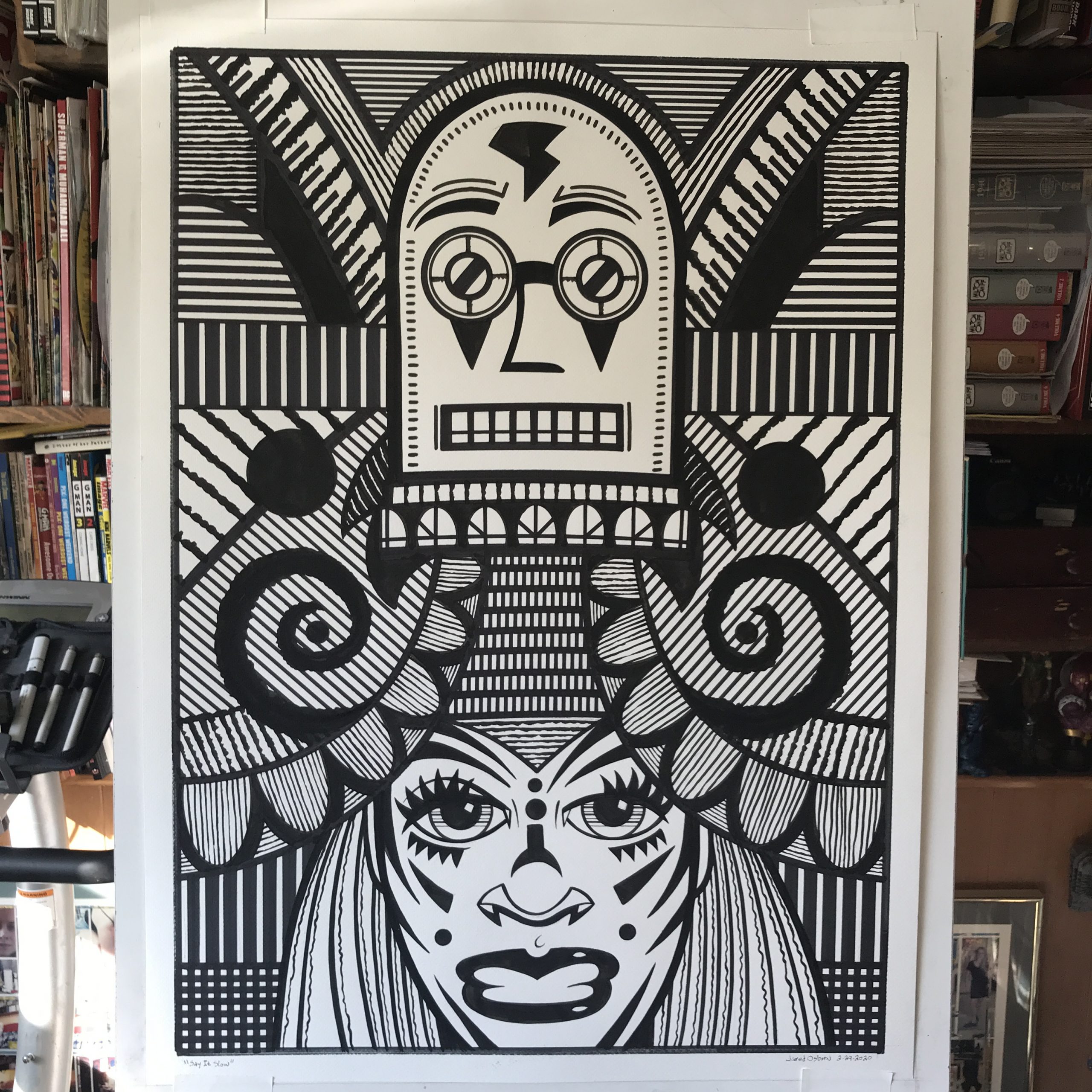
My latest big ink drawing is called “Say it Slowly.” It was originally a 6×9 inch ink drawing that I made from one of my inkbook sketches. That’s when I named it. After I make a 6×9 inch ink or pencil drawing I name the drawing with whatever title pops into my head. I do that so I can identify the drawings in my notes and keep track of them if I need to find them. That’s how I end up with some funny names for my big ink drawings.
I use three different inks when I make these drawings. First I have the bottled ink I use with my brush. Right now I’m using the Dick Blick house brand Black Cat ink. That’s the ink I use for most of the drawing and the ink that I use to fill in all the large areas of black.
The second ink is the Copic marker black ink that comes in the markers. I also have black ink refills for the marker so I can add more ink when they dry out. Most of the straight lines are Copic black ink. I use the marker against a straight edge or French curve to get a solid even line.
The third type of ink is Rapidograph technical pen ink. I refill some of my markers with this ink and also occasionally use a technical pen filled with this ink too. Technical pen ink has a matte finish and you can see the difference between it and the Black Cat ink as the light moves across it. At a distance it’s all the same but as you move towards the drawing you can see the change in ink easier.
As I look at “Say It Slowly” it’s not like my usual big ink pieces. It only has two recognizable images in it. Two faces. A robot face (or helmet of some kind) and a woman’s face. The rest is filled with all sorts of shapes and patterns. There is no real background space in the drawing which is unusual for me. I often fill a lot of the negative space of big ink drawings with faces and other objects. But here I didn’t. I’m not even sure why. I didn’t notice it until the piece was well under way. Sometimes I work on instinct as much as intent.
Even with just the two faces I see a story in this image. I often see stories in the images I make but the stories are usually complex because the images are busy. This one is a little simpler. I see a story about a woman taking off her helmet. Her helmet is full of magic that is showing itself as she takes it off. Or maybe she’s putting the helmet on. And the helmet is smaller than her head so it has to be magic in order to fit. Either way the image is about a moment.
For a fairly simple image this one took me a long time to do. That’s the way it is with simplicity. It takes longer than you think. Often complexity is easier because there is a lot of stuff so and single image is less important than the whole. With simplicity often there is only one image so it is the whole. It has to be just right or the whole thing falls apart. It’s a lot of effort to make something look effortless.
Both the helmet and the face look a lot different than in the initial small ink drawing. The basic shapes are the same but the details are different. As you might expect there are more details on the larger drawing. The black markings on the face aren’t even in the original drawing. The helmet also has black markings that aren’t in the original. The eyebrows on the original helmet are just a single line instead of three lines.

I finished the helmet first in the big drawing and then finished the face. That’s because I had no idea how I was going to finish the face. It was much simpler for most of the three days I was working on this drawing but I knew I was going to do something with it. As I was working on the helmet and the background I was contemplating what to do with the face. It didn’t come to me for a long time. It wasn’t until the end when I put in the double cheek bones that I had an idea about its direction. Double eye brows and all the other face shapes came after that. With the giant eyes and lips the face took on a slightly clownish look. It went from a slightly weird face to a very odd mask.
The angles of the background lines were also important. I decided against eyeballing the angles and so I took the time to use my triangles to get the right 45º and 30º angles that I wanted. It took a while and a bunch on contemplation to get the textures and patterns I wanted. In the end I think it all holds together.