Presentation counts. I’m not the only who uses that quote so it must count for something. But sometimes I amaze myself when I get caught up in how my work presents itself. I think that’s one of the reasons I like to work with themes or at least formats that are the same. For example I have a whole bunch of eight by ten inch paintings on stretched canvas. I could make them all different sizes but I stick to that one size for any small canvas I want to paint. They fit together nicely because even if the subject matters don’t go together at least they present as a set because they’re all the same size.
I have a series of eighteen by twenty-four inch canvases too. Not to mention I usually work at standard two and a half by three and a half inches, five by seven inches, and eleven by seventeen inch sizes for my drawings. I occasionally like to work at odd sizes, I’ve done some ten by twenty-four inch drawings for example, but they are always hard to display with the others or put somewhere safe. If they don’t stack with the other drawings then they can get bent and twisted. So I mostly stick to my normal sizes.
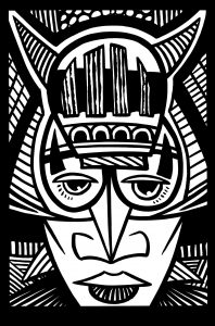
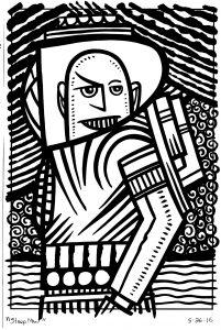
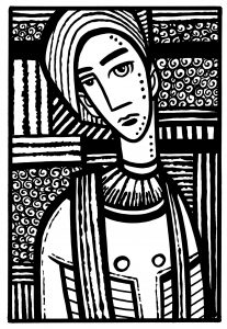
I bring this all up because of some ink drawings I was doing this week. They’re the same type of ink drawings that I wrote about a few weeks ago. Six by nine inch drawings ( a standard size for me because I cut a nine by twelve inch pieces of paper in half) that I’ve been making with brush and ink over a blown up blue line thumbnail drawing from my sketch book. It’s based on the small drawing but there is plenty of room to fool around with the ink.

I have a bunch of older ink drawing that I made at the same size with almost the same technique. I pulled all of the six by nine inch ink drawings out of their varying drawers and piles to look at them all together and see how they worked as a series. I had about twenty of them all told. The problem was that since I had done them over a year and a half worth of time they had slightly different borders. On some of them I had a quarter inch black border made with a marker. On others I had a thin maker border that I drew over into the white space on the edges of the paper. Those have a messy over-splash of lines border. And the third type was a black border where I brushed ink all the way to the edge of the page. So I had white, black, and messy and they didn’t look great together as a series.
As I look back I remember leaving some of the borders messy on purpose because the first ones that I did I made the filled in black borders and it was a bit of a hassle and warped the paper a little bit. More wet medium on paper usually means more warping of paper. I think that’s why I moved to the messy border look. Less work and I liked it better than the black border. Except now I don’t. In seeing them all together the messy border looked too random and not thoughtful. So I was stuck. I could either blacken in the border with ink or put down a quarter inch marker border to cover the mess. Turned out a quarter in wouldn’t be enough. It was either blacken the border or do nothing.
The funny thing is that a lot of artists I know would do nothing. They wouldn’t give a thought to the whole situation. They’re not as interested in format as I am. Plus I thought about doing nothing. I had about ten drawings to black in the borders on and that was going to take half an hour. Surely I could do something more interesting with half an hour. But no, now it was in my head. So I took the half an hour and made all the borders black. I must say they look better that way.
The next step in the formatting insanity was when I noticed that there were now four more full black bordered ones than quarter inch black bordered ones. Somehow that couldn’t stand and I worked on four new quarter inch bordered ones to even it up. It didn’t even matter if the two border formats were uneven since I’d be doing more of them in the future and that would automatically make them uneven but at the moment I needed them to be.

Usually I don’t even have much of an obsessive personality but when it comes to formatting and presentation I need things just right. Six eight by ten inch paintings look better side by side than if they were differing sizes. You can make a theme through presentation and that’s good stuff.
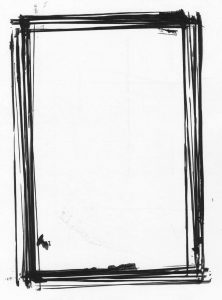
One unintended thing to come out of my blacking in the borders was the piece of paper that I was using as a backing board. Since I was putting ink on the drawings all the way to the edge (and beyond) I knew I’d need a larger piece of paper underneath to catch the over-ink so it wouldn’t end up messing up my desk. That means each time I ink a drawing’s border I winded up with black ink defining the border of the paper on my backing paper. It made sort of a frame on the backing paper. After two or three of these I noticed the frames were all slightly off kilter of one and other. I wasn’t putting each piece of paper in the same exact spot after all. Those layers of framing were looking pretty cool. I knew I might have something I could uses so for the rest of the drawings I was careful not the mess up the backing board too much. In the end I had ten frames or so all overlapping each other. It looks pretty cool. I have no idea what I’ll use it for but I scanned it in and we’ll see what the future holds.


Discussion ¬