Some days I have no idea what I want to do creatively so I go with a whim. A whim is an idea without much depth or thought to it. It crosses my mind for a moment and captures my imagination and motivation. There is usually not much more to to it that “Hey, what if I were to do this simple thing?”. Simple in terms of concept but not necessarily in terms of execution.
Two things I’ve been working on a lot in the recent few weeks are my cartoon art cards and my big ink drawings. The cartoon are cards are small 2.5×3.5 inch drawings of a cartoon face with a word balloon above his or her head with a saying in the balloon. My big ink drawings are 22×30 inch drawings done in black ink an usually of a scene with a face or figure (or two) in it done in a design-ie style. Lots of black shapes that make no sense in reality. This week my whim was to think “What if I made one of my cartoon art cards at my big ink drawing size?”. Then I decided to do it.
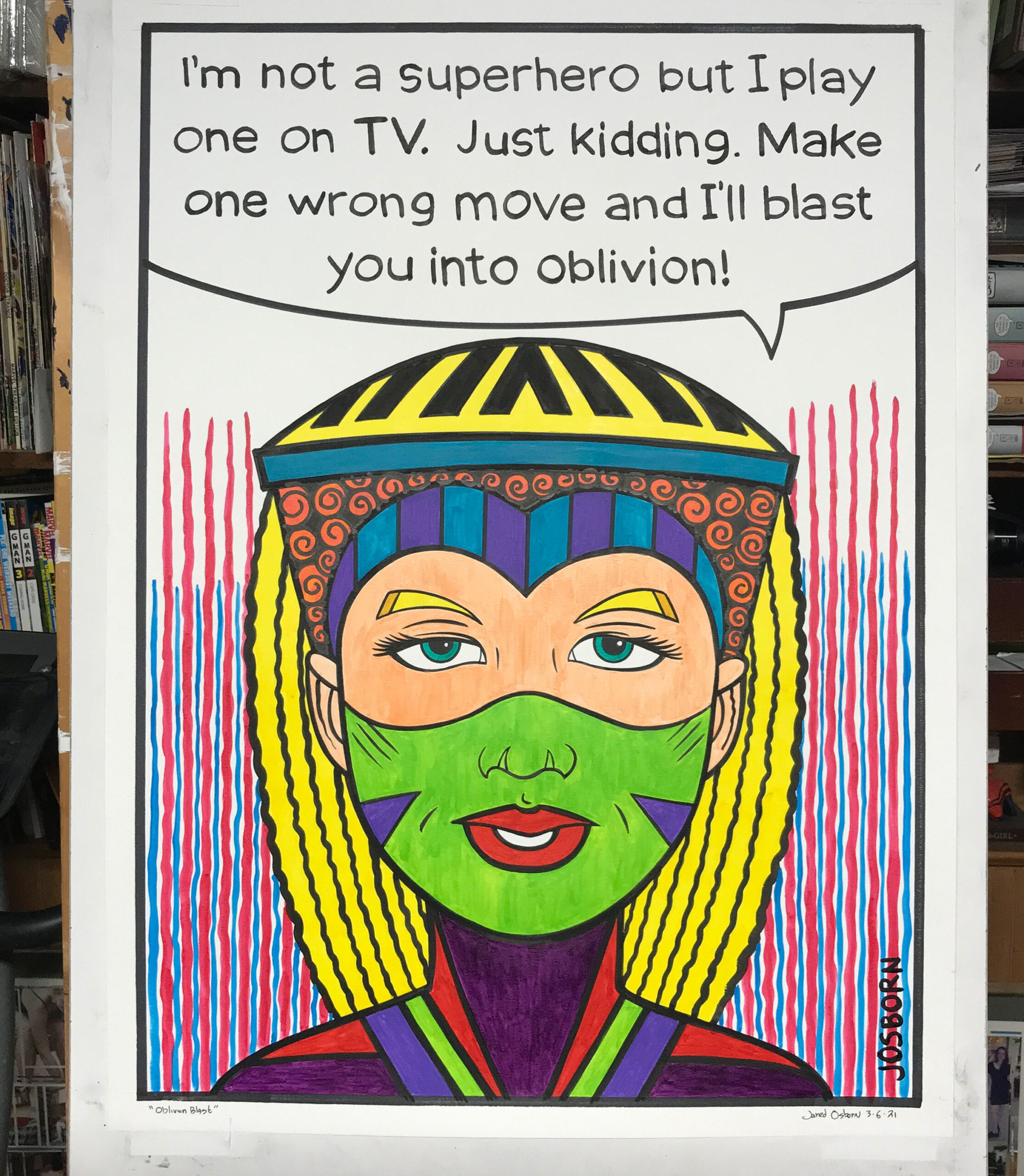
The first thing I did was pull out my binder full of art cards that I’ve drawn. I have over 2000 of them. I look through a binder to try and find one that I might blow up. But they were really too small to make me think they would blow up well. So I started from scratch. I pulled out a 5×7 inch piece of paper and started drawing a face on it. I decided to go with a super-hero face so I could have her saying something super-heroic.
It took about an hour and a half to draw the face. For some reason I struggled to make the face symmetrical. I measured out the distance between eyes, erased a lot, and even used s piece of tracing paper and flopped the drawing of the left side of the face. Still something wasn’t quite right about it. That’s because in going from 5×7 inches to 22×30 inches I knew my small mistakes would be magnified. In the end, after I scanned the drawing in, I digitally duplicated and then flopped the left side go the face so it was identical to the right side. That did the trick.
After scanning in the drawing I blew up the drawing to 20×28 inches (I leave a one inch border on the paper) and printed it out on eight 8.5×11 inch pieces of paper. After taping the paper together I use that and graphite paper to transfer the drawing onto my big sheet of watercolor paper. This is how I make all my big ink drawings.
As I was drawing the face I was thinking about what the word balloon should say. I ended up with, “I’m not a superhero but I play one on TV. Just kidding. Make one wrong move an I’ll blast you into oblivion.” That’s how this drawing got named “Oblivion Blast.” I didn’t letter any of that on the little sketch but typed in onto the scanned in drawing and them traced over the letter as I transferred the drawing with graphic paper.
Once the drawing and lettering were in graphite on the big paper I decided to do the lettering first. I thought about doing it with a marker but wasn’t sure if that could get what I was going for. I decided to use a brush. I have a number 6 Windsor Newton Series 7 watercolor brush that I use for ink. I thought I’d try that out. After a few practice letters on a scrap piece of paper I knew that was what I wanted. I set about inking with the brush over my penciled letters. It went fairly quickly and ended up looking okay. It looks like hand lettering on a comic book only bigger.
After the lettering was done I went about inking the piece. That was straight forward as always. I used a ship’s curve and marker for a few of the long curves but then did the rest with a #3 watercolor brush. I even thickened up those long curves with a brush. After the inking was done I took a photo of the piece with my iPad and then used Procreate and that photo to make a color sketch. But first I had to make a new color palette in Procreate.
I’ve bought about twenty new bottles of color ink this year. After I get the ink I make a swatch of the color on a sheet of paper. That’s so I can refer to the swatches to see what to color looks like in real life. In order to make a digital color palette in Procreate I took a photo of my swatch sheet and then sampled each color. That way as I made my color sketch I would have a near approximation of my ink choices.
Coloring this piece took a long time. Maybe five to six hours. It turns out that using ink to color in big flat areas is harder than it seems. I had to take my time and evenly spread the ink on the paper with no dripping. Ink doesn’t dry particularly flat over large areas so I had to use two coats to try to even things out. After putting all the color in I hade to go back in with black ink to strengthen up some of the lines that color leaked into.
The final color I put in are the red and blue streaks in the background. In the small ones I often put in solid backgrounds but I didn’t think they would look good this big. In some 5×7 inch cartoon art cards I’ve use backgrounds such as this so I was sure they would look good. I even ended up putting a big “JOSBORN” signature in the bottom right as I do with my small art cards.
It’s a little bit funny but when I show off a big drawing like this over social media it can look a little underwhelming. The audience can’t see that it’s a big drawing. On Instagram it’s the same size as a 2.5×3.5 inch drawing. Without another drawing to compare it to the size is lost. So I decided to ink and color the 5×7 version.
When I inked the 5×7 version I didn’t flop half the drawing like I did the big one. That’s because the differences in the left and right sides of the face aren’t as noticeable at the smaller size. So I inked it, erased the pencil lines (which greyed out some of the black ink), inked it a little more, and then colored it with marker. It was only after that was all done that I did the lettering. But first I decided to write something different. I didn’t want both drawings saying the same thing. “I’m not really going to blast you into oblivion. I’ll probably just break a bone or two.” The new one says. A bit of a continuation.
In the end I like the two drawings. Not the greatest things ever but kind of cool. Not bad for a whim.